
Using this method you can create an email that has responsiveness baked in to the layout, without any need for CSS or media queries in the <head>, so that even in the worst case scenario of email rendering, your layout will remain intact.
Is Developing HTML Email Still Hard?
HTML email has come a long way in the past ten years (yes, it used to even worse!) but there are still a surprising number of things that can go wrong when coding responsive emails for the inbox.
These days, most email apps do a pretty good job of adhering to the latest HTML and CSS standards, but security or other restrictions sometimes mean that services will adjust or strip out key portions of your email’s code, like the all-important <head>, which often contains crucial CSS and media queries. It’s difficult to keep track of every instance where this type of thing occurs, let alone what you need to do to mitigate the effects in each scenario.
But what if you could build an email template that was responsive, even in environments with no support for modern CSS like media queries, or scenarios where only the <body> of your email is delivered? What if, every time you heard about some new email app that everyone’s trying, instead of shaking with fear, you could feel safe and secure in the knowledge that your responsive emails probably look fine?
This tutorial is all about creating a great experience in email clients which have no nested CSS or media query support whatsoever, using the the fluid hybrid method of HTML email development. The fluid part refers to the fact that we use lots of percentages and elements that can move and expand to fit the space they are given. The hybrid part is because we also use max-width to constrain these free-flowing elements, and restrict the overall size of our email on larger screen sizes.
All in all, it’s a lightweight, fully responsive email without media queries that comes in at a tidy 17kb.
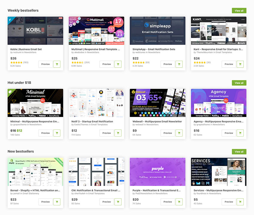
Popular HTML Email Templates on Envato Market
If you’re looking for a ready-made, professional solution, grab one of our best-selling HTML email templates on Envato Market. We have hundreds of responsive options from as little as $5, with easy to customize features to get you started.
Not what you’re looking for? No problem, this tutorial will teach you how to build your own.
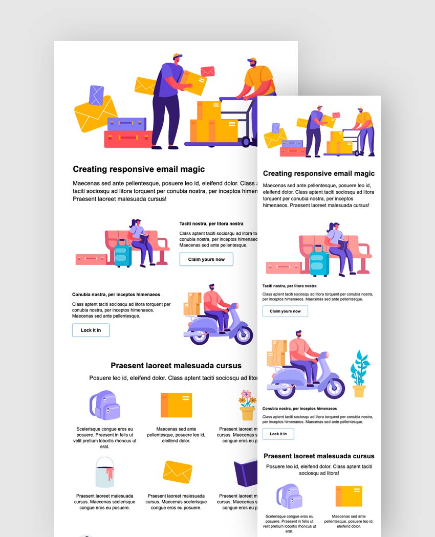
The Email Template We’re Going to Build
Here’s a demo on CodePen to show you the responsive HTML email we’ll be building. Feel free to fork it and use it in your own projects!
All the graphic elements in the template are part of the Flat People Characters collection by alexdndz available on Envato Elements.
5 Major Problems We’re Aiming to Solve
1. Gmail’s app still doesn’t support the <style> tag for non-Gmail accounts
This is the big one. The Gmail app is massively popular on iOS and Android, it can be set as users’ default mail app on any smartphone, and it supports all non-Gmail accounts. But viewed in the Gmail app, emails for non-Gmail accounts don’t support <style> tags, so media queries, which we can usually rely on to optimise our emails for small screens, aren’t supported. This tutorial will show you how to make emails that are responsive, even in this scenario.
2. It’s really hard to keep on top of email services and their level of CSS support
New email providers and apps appear all the time. Some of them have great CSS and media query support, but some of them focus more on email workflows and don’t support <style> tags or media queries at all. Some of them differ across platforms – for example, the Yahoo mail app for iOS supports <style> in the head, whereas on Android it doesn’t, unless you include your entire <head> twice, which isn’t possible from every sending platform.
This tutorial will show you how to make an email that is always responsive, even in a worst-case scenario where CSS support is nonexistent, so you don’t have to worry about how your emails render in all those unknown use cases.
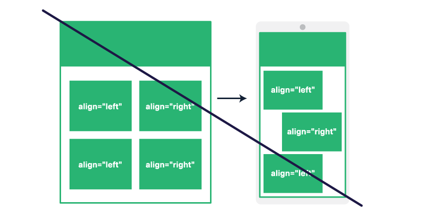
3. Using traditional methods like float or align to create columns results in unsightly stacking on mobile apps without media query support
The method in this tutorial uses a different approach which ensures that your columns all stack in the centre on mobile, no matter what. (You can also easily set them to align to the left or right if you prefer.)
4. When you use float or align to create columns, you lose the ability to vertically align them
This tutorial will also show you how to vertically align multiple columns to the top, middle, or bottom.
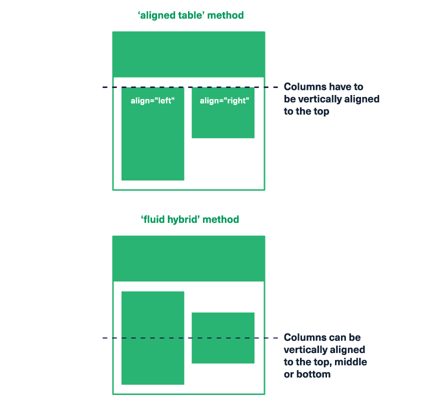
5. When you use float or align to create columns, you have to place them in separate divs or table rows, so they can’t flow and stack naturally at different screen sizes
This tutorial will also show you how to have content blocks that stack and flow as you would expect them, with total control over their horizontal and vertical alignment.
1. Getting Started
Start with a blank file and save it as index.html, then copy and paste the following code into it:
<!DOCTYPE html>
<html lang="en" xmlns="https://www.w3.org/1999/xhtml" xmlns:o="urn:schemas-microsoft-com:office:office">
<head>
    <meta charset="utf-8">
    <meta name="viewport" content="width=device-width,initial-scale=1">
    <meta name="x-apple-disable-message-reformatting">
    <!--[if !mso]><!-->
    <meta http-equiv="X-UA-Compatible" content="IE=edge" />
    <!--<![endif]-->
    <title></title>
    <!--[if mso]>
    <style type="text/css">
        table {border-collapse:collapse;border-spacing:0;margin:0;}
        div, td {padding:0;}
        div {margin:0 !important;}
	</style>
    <noscript>
    <xml>
        <o:OfficeDocumentSettings>
            <o:PixelsPerInch>96</o:PixelsPerInch>
        </o:OfficeDocumentSettings>
    </xml>
    </noscript>
    <![endif]-->
</head>
<body style="margin:0;padding:0;word-spacing:normal;background-color:#ffffff;">
    <div role="article" aria-roledescription="email" lang="en" style="-webkit-text-size-adjust:100%;-ms-text-size-adjust:100%;background-color:#ffffff;">
        <table width="100%" align="center" border="0" cellpadding="0" cellspacing="0" role="presentation">
            <tr>
                <td align="center">
                    [content goes here]
                </td>
            </tr>
        </table>
    </div>
</body>
</html>
Let’s run through all the elements above in more detail.
DOCTYPE
<!DOCTYPE html> signals that we intend to use HTML5. Some email clients impose a different doctype and some may remove it, but in most cases you end up with the HTML5 doctype one way or another. (Note that not all HTML5 elements are supported when it comes to email, so always check support levels first at the fantastic resource caniemail.com.)
HTML Tag
<html lang="en" xmlns="http://www.w3.org/1999/xhtml" xmlns:o="urn:schemas-microsoft-com:office:office"> starts our HTML document and defines the XML and OOXML (Office Open XML) namespaces which we need for Outlook on Windows, as we’ll see below.
Charset Meta Tag
<meta charset="utf-8"> defines Unicode character encoding for our email, which generally covers most characters for most languages, however you may need to change this if you need to use any characters that aren’t included in the UTF-8 character set.
Viewport Meta Tag
<meta name="viewport" content="width=device-width,initial-scale=1"> allows us to specify that the viewing area for our email should be width of the device screen, and that the initial zoom should be 100%.
Apple Scaling Meta Tag
<meta name="x-apple-disable-message-reformatting"> prevents Apple from doing any unwanted scaling or zooming out of your email on iOS devices.
IE9 Meta Tag
<meta http-equiv="X-UA-Compatible" content="IE=edge" /> is used to improve rendering in Internet Explorer 9 or lower, which is getting less and less common, so you could use your discretion with this one. In the past it was also used to improve rendering on Windows Phones. It is placed between <!--[if !mso]><!--> and <!--<![endif]--> so that it’s hidden from Windows Live Mail, which otherwise won’t display images if this tag is used. (Big thanks go to Don Braithwaite for that fix.)
Title Tags
We’ll include <title></title> although I find that it’s best to leave it empty. Sometimes you’ll come across an app or email sending platform that displays this title immediately after the Subject Line of the email in the inbox preview, which is not ideal.
If MSO
Next, between <!--[if mso]> and <![endif]--> we have some styles that will only apply in Microsoft Outlook. We’ll prevent gaps and cellpadding on our tables using border-spacing:0; (the CSS equivalent of using cellspacing="0" on table elements). We then zero margins on all div elements and use !important because otherwise Outlook adds a lot of extra, unpredictable and unwanted space to our layout.
XML Tag
Then we have our XML tag, and inside we have our OOXML element <o:OfficeDocumentSettings> with some settings that tell Microsoft Outlook we’re operating on a base resolution of 96dpi. This setting ensures that Microsoft Outlook always accurately transforms everything in our email to adapt to the screen zoom percentage configured in Windows settings for high-DPI displays (which is most displays these days). This is all inside a <noscript> tag so T-Online doesn’t display the “96” (thanks to Mark Robbins for this fix.)
Inline CSS
You’ll notice there’s no <style> tag here. We’ll do all our CSS inline, which is still best practice for email until non-Gmail accounts in the Gmail app stop stripping the <head> of your emails. We’ll come back at the end to add some media queries as an enhancement for those clients that do support them.
Body Tag with Basic Styles
<body style="margin:0;padding:0;word-spacing:normal;background-color:#ffffff;"> sets some basic styles on the body tag. Most important is word-spacing:normal, another life-saving fix from Mark Robbins, because otherwise Gmail sets word-spacing to 1px on the body, which adds a 1px gap between our columns and causes them to stack.
Wrapper Div
<div role="article" aria-roledescription="email" lang="en" style="-webkit-text-size-adjust:100%;-ms-text-size-adjust:100%;background-color:#ffffff;"> is our outer wrapper, also based it on Mark’s example. It contains our main content, sets some CSS to ensure correct sizing of text, and sets our language, here to English. It also contains some settings to make our email accessible by defining the primary email area’s role as an article, and being slighty more specific with aria-roledescription="email". This is so that screen readers will announce that it’s an email, or at least that it’s an article, which defines it as a primary piece of content and will assist with navigation.
And while this layout will be using divs rather than tables where possible, we do include one big wrapper <table> here to help us center the main body of the email inside it. This is needed in particular for Comcast webmail (USA) and Libero webmail (Italy) which both fail to center our content without it. We should always set the role of any table used purely for layout to presentation so that screen readers won’t announce the presence and structure of the rows and columns (which is helpful for actual tabular data) but will instead only announce the content inside.
2. Creating the Structural Outer Container
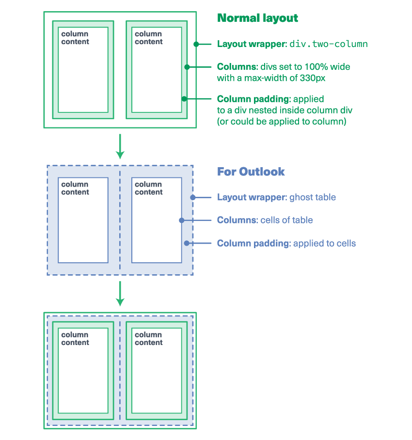
First up, we need to add an outer container, which is actually two containers, since we need to cater separately for Outlook on Windows on the one hand, and all other email clients on the other.
This is because the bulk of our email will be created using <div>s that use max-width in CSS to set their dimensions and display:inline-block; in CSS to place multiple columns side-by-side. Unfortunately, Microsoft Outlook on Windows doesn’t properly support any of that, so we need to use some old-fashioned tables to keep it happy. We only want these restrictive table layouts to apply to Outlook though, so we nest the code inside conditional [if mso] comments which hide it from other email clients. Any table set up for Outlook like this is known as a ghost table.
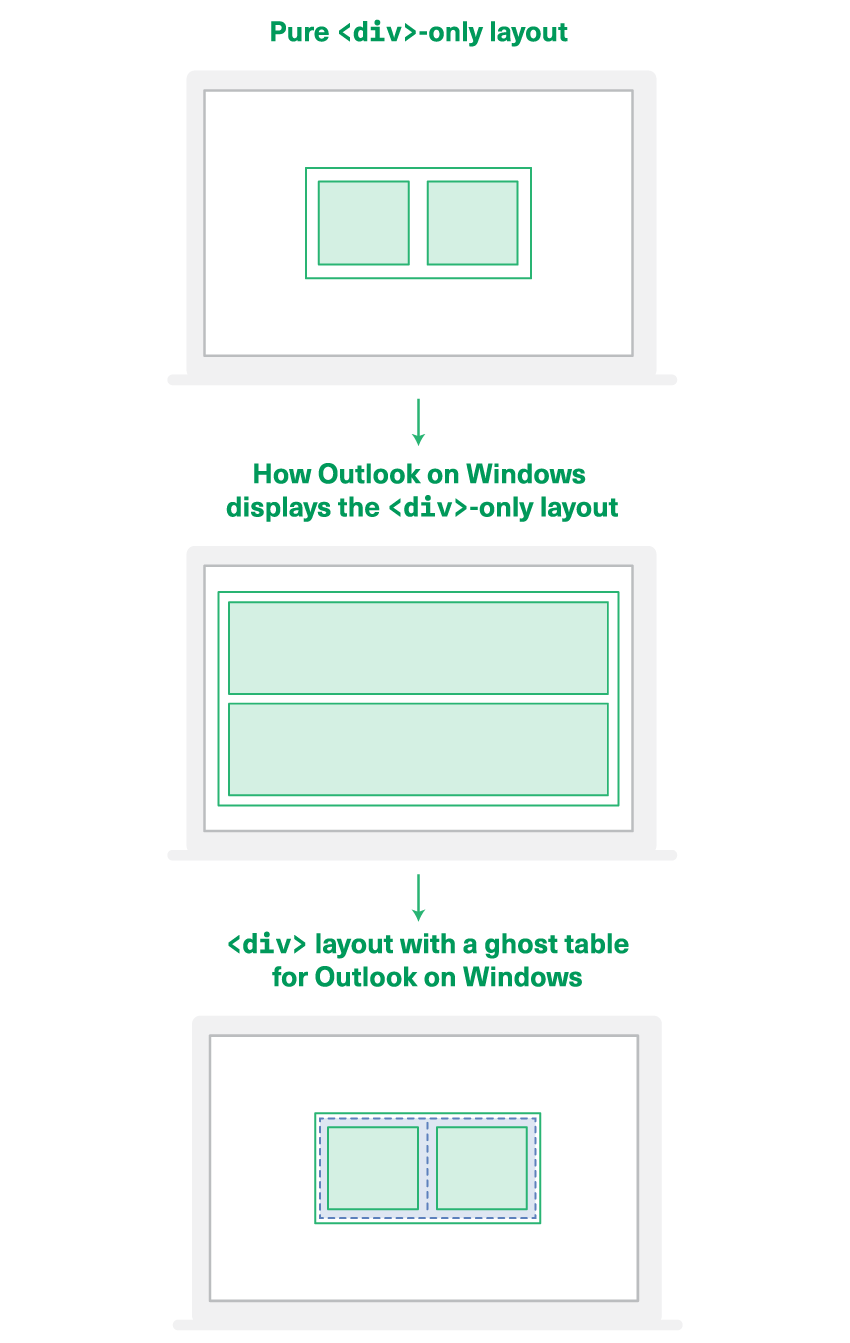
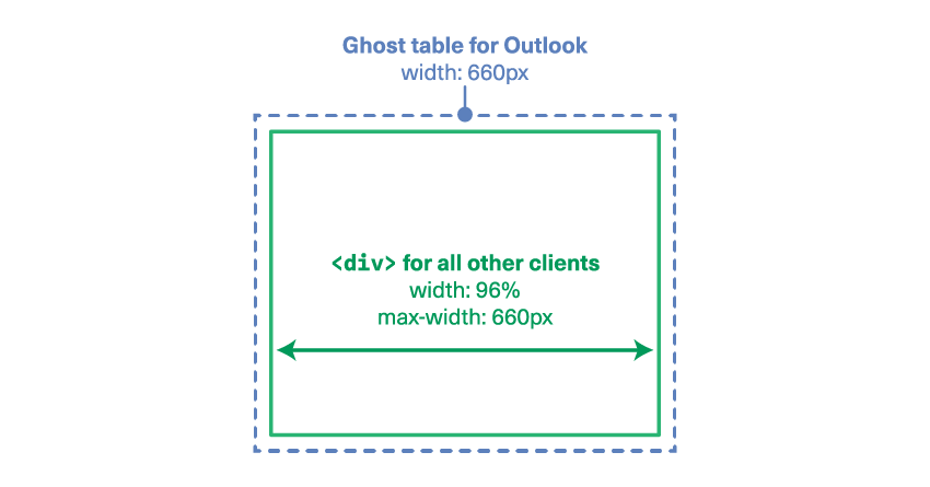
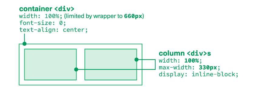
div widths and positioning.So first up we’re going to add a ghost table and a div that together comprise a wrapper at our desired width for this email, 660px.
Replace the [content goes here] marker in your file with the following code:
<!--[if mso]>
<table role="presentation" align="center" style="width:660px;">
<tr>
<td style="padding:20px 0;">
<![endif]-->
<div class="outer" style="width:96%;max-width:660px;margin:20px auto;">
    [content goes here]
</div>
<!--[if mso]>
</td>
</tr>
</table>
<![endif]-->
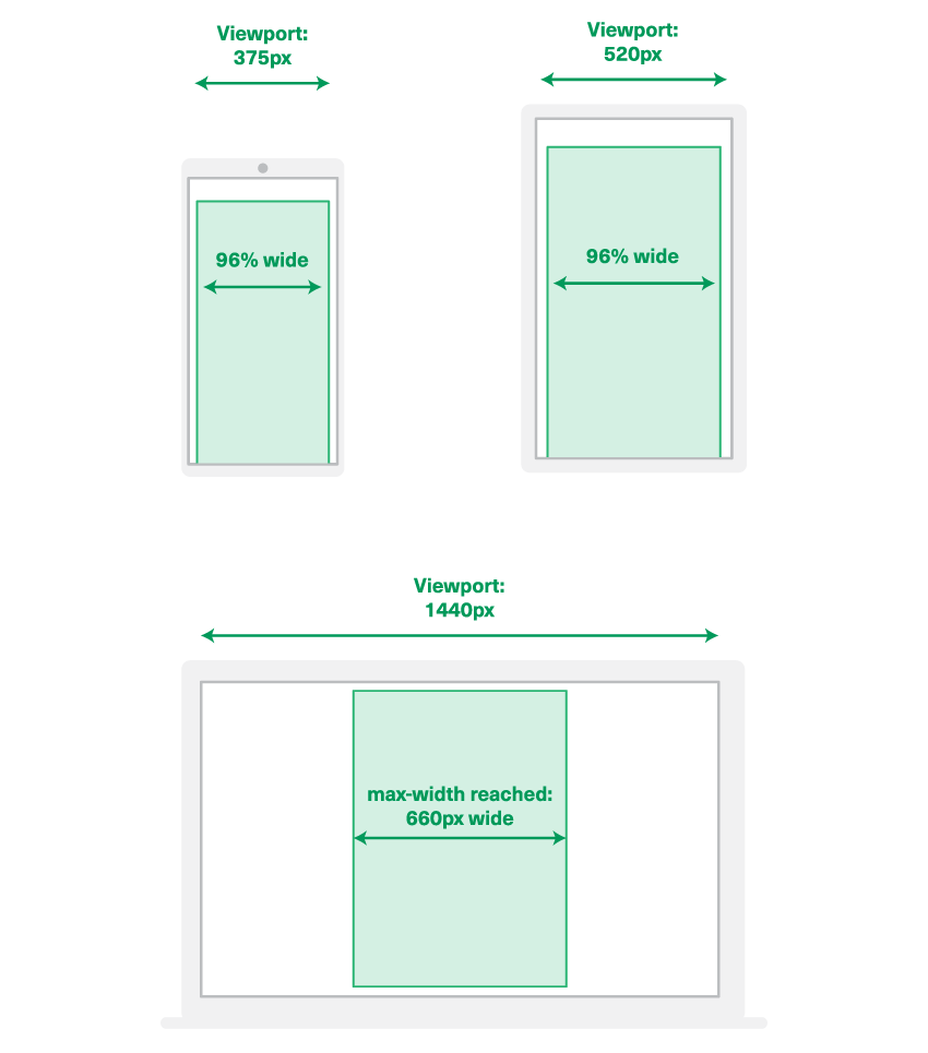
Here you can see our ghost table is 660px wide, and the div inside is 96% wide, up to a maximum of 660px. This will mean that on smaller screens we have a small 2% buffer on either side, as a little bit of padding.
This div also has a top and bottom margin of 20px, to give it some vertical breathing room, and because that won’t render in Outlook, we’ve added top and bottom padding to the ghost table’s td as well.
3. Adding a Single Column Layout with a Full-Width Banner Image
Now we have our outer structure, it’s time to start adding some content.
If you are following along step by step, stop now to download the tutorial files and move the /images directory so that it’s in the same folder as your index.html file. You can grab the source files in the following ways:
- Visit the Github repository to fork it
- Download the .zip directly from Github
- Visit the demo on CodePen to fork it
As mentioned, we’ll generally be favouring divs over tables, but for single-column layouts it uses less markup to just use one table for everybody, rather than a div with a ghost table. So let’s replace [content goes here] with this code:
<table role="presentation" width="100%">
<tr>
<td style="padding:10px 10px 20px 10px;font-family:Arial,sans-serif;font-size:24px;line-height:28px;font-weight:bold;">
<img src="http://webdesign.tutsplus.com/images/header.png" width="640" alt="" style="width:100%;height:auto;" />
</td>
</tr>
<tr>
<td style="padding:10px;text-align:left;">
<h1 style="margin-top:0;margin-bottom:16px;font-family:Arial,sans-serif;font-size:26px;line-height:32px;font-weight:bold;">Creating responsive email magic</h1>
<p style="margin:0;font-family:Arial,sans-serif;font-size:18px;line-height:24px;">Maecenas sed ante pellentesque, posuere leo id, eleifend dolor. Class aptent taciti sociosqu ad litora torquent per conubia nostra, per inceptos himenaeos. Praesent laoreet malesuada cursus!</p>
</td>
</tr>
</table>
<div class="spacer" style="line-height:26px;height:26px;mso-line-height-rule:exactly;"> </div>
In our first row we have a cell with 10px padding on the sides, a little extra on the bottom. Inside this cell is our header banner image its own row so that there’s plenty of space for any ALT text in a nice large font size. (In my case, this image is purely decorative, so it doesn’t need any.)
We set the image width="640" in the HTML for Outlook, and then in the CSS we set style="width:100%;height:auto;" so that the image will be 100% wide in other clients, and always in proportion.
In the second row, we apply the same 10px padding to the sides, as well as text-align:left; to stop the text from being centered in some clients who would inherit it from the td align="center" above it.
For our text we can use <h1> and <p> tags since margin is supported on these tags across the board (padding, not so much). We do apply all our styling inline to these elements though, because some webmail clients have font styling that will be forced onto them unless you explicitly override it at the element level.
At the very bottom, you can see we’re using a spacer div to create some padding between this layout and the next. I prefer to use these between blocks because Outlook can be quite unpredictable with margins on block-level elements, and I find it much easier when building modular layouts to keep the spacing as discrete pieces of code. However if you prefer, you can apply padding inside your elements to create vertical space. When you do want to create spacers like this, you can just set a line-height, a height, and set mso-line-height-rule:exactly; which is a Microsoft Office property that prevents it from treating your line-height as a minimum.
Also note that it’s very important to apply the same padding on the left and right of all your columns, so that they will be uniform when they stack on top of each other.
Now you should have your single-column layout ready to go, so let’s move on to multiple columns.
4. Adding a Two-Column Layout Which Will be Centered on Mobile
Directly underneath the closing </div> tag from the spacer above, paste the following:
<div class="two-col">
    <!--[if mso]>
    <table role="presentation" width="100%">
    <tr>
    <td style="width:50%;">
    <![endif]-->
    <div class="column">
        [content goes here]
    </div>
    <!--[if mso]>
    </td>
    <td style="width:50%;">
    <![endif]-->
    <div class="column">
        [content goes here]
    </div>
    <!--[if mso]>
    </td>
    </tr>
    </table>
    <![endif]-->
</div>
This gives us a very basic layout of a parent div with two columns inside which are scaffolded by a ghost table for Outlook with two cells, each 50% wide.
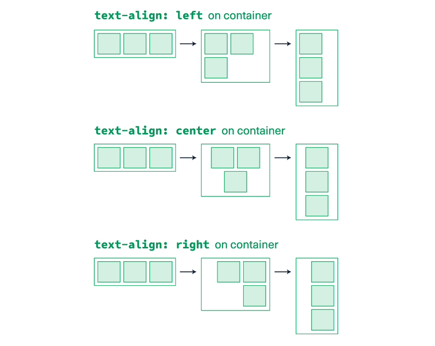
First we want to ensure the font-size is set to zero on our container, because our columns need to sit snugly side by side, and without this you can end up with extra spacing that causes them to stack. We also need to add a text-align property which will control the alignment of the columns inside. So change the opening div tag to the following:
<div class="two-col" style="text-align:center;font-size:0;">
To get the columns within to float side by side on desktop, but stack in the centre on mobile, we combine this use of text-align: center on the container with display: inline-block on the columns.
All inline-block elements obey the text-align property on their parent, so we can simply set left, center or right on the container to specify where the columns should sit when they are stacked.
Getting Multiple Columns to Work
So let’s add the display setting to each column, and specify their widths. We want them to be 100% wide on smaller screens, up to a maximum of 330px wide on desktop.
Change each div.column tag so that they both look like this:
<div class="column" style="width:100%;max-width:330px;display:inline-block;">
Now everything is set up to work as multiple columns.
Next we want to set the vertical alignment for our columns, and you can choose between top, center and bottom. When you have a multi-row layout, which we’ll cover in Step 6, your choice will also set the vertical alignment on a row-by-row basis, even when your columns stack down onto new lines. It’s pretty nifty!
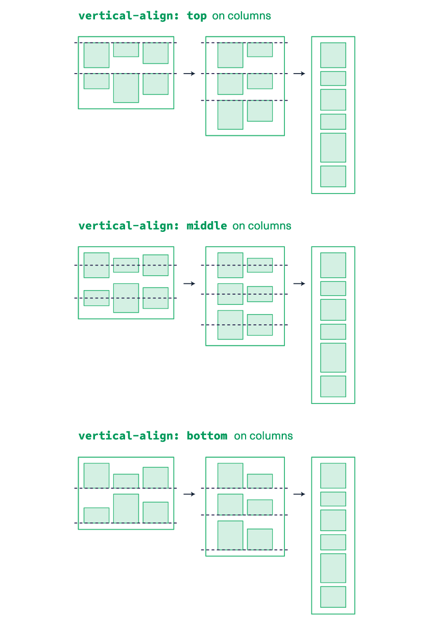
We need to add some code in two places for this one. On our column divs, add vertical-align:middle; to the CSS, so they look like this:
<div class="column" style="width:100%;max-width:330px;display:inline-block;vertical-align:middle;">
And for Outlook, we add the HTML valign attribute to each cell too. This always has to match whatever you’ve set on the corresponding column div, so if you change the columns to vertical-align:top; you must also set all your ghost table cells to valign="top" too.
Edit the ghost table cells to look like this:
<td style="width:50%;" valign="middle">
And finally we’ll add some padding. For Outlook, we can simply add this to the ghost table cells:
<td style="width:50%;padding:10px;" valign="middle">
For our columns, I actually like to nest an extra div inside with the padding. I do this because the box model in CSS means that any padding added to an element gets applied to the outside, increasing its total width (e.g. a 330px column with 10px padding on either side becomes 350px wide). Normally in HTML you can use box-sizing: border-box; so that any padding is included in the width, but it’s not well supported across email clients. So to save myself the hassle of doing lots of calculations of column widths minus padding, I prefer to nest.
So inside each div.column, replace [content goes here] with this:
<div style="padding:10px;">
    [content goes here]
</div>
Now we’re all set up, and our structure is complete! The layout and ghost table work together to give us our two-column layout.
Now We Just Need to Add Our Content
To the first column, we’ll add an image, which I’ve wrapped in a paragraph tag to give it some text styling for the ALT text. Replace the first [content goes here] with this:
<p style="margin:0;font-family:Arial,sans-serif;font-size:14px;line-height:18px;">
    <img src="http://webdesign.tutsplus.com/images/two-column-01.png" width="310" alt="" style="display:block;width:100%;height:auto;max-width:310px;" />
</p>
This is a fairly standard template for fluid hybrid images; we set the width="310" for Outlook, then include display:block; to prevent gaps underneath the image in Gmail, set the width to 100% and height to auto in the CSS, and then limit it to max-width:310px;.
And to our second column replace the [content goes here] with this code, which includes a few paragraphs of text, and a link button using Mark Robbins’ method:
<p style="margin-top:0;margin-bottom:12px;font-family:Arial,sans-serif;font-weight:bold;">Taciti nostra, per litora nostra</p> <p style="margin-top:0;margin-bottom:14px;font-family:Arial,sans-serif;">Class aptent taciti sociosqu ad litora torquent per conubia nostra, per inceptos himenaeos. Maecenas sed ante pellentesque.</p> <p style="margin:0;font-family:Arial,sans-serif;"><a href="https://example.com/" style="background: #ffffff; border: 2px solid #8dc1d6; text-decoration: none; padding: 10px 25px; color: #000000; border-radius: 4px; display:inline-block; mso-padding-alt:0;text-underline-color:#ffffff"><!--[if mso]><i style="letter-spacing: 25px;mso-font-width:-100%;mso-text-raise:20pt"> </i><![endif]--><span style="mso-text-raise:10pt;font-weight:bold;">Claim yours now</span><!--[if mso]><i style="letter-spacing: 25px;mso-font-width:-100%"> </i><![endif]--></a></p>
The second div is now displaying invisible, centered text, because it’s inheriting the zeroed font size and centered text-alignment from the container. So we’ll add some font-sizing and text-alignment to the div tag so it now looks like this all together:
<div style="padding:10px;font-size:14px;line-height:18px;text-align:left;">
<p style="margin-top:0;margin-bottom:12px;font-family:Arial,sans-serif;font-weight:bold;">Taciti nostra, per litora nostra</p>
<p style="margin-top:0;margin-bottom:14px;font-family:Arial,sans-serif;">Class aptent taciti sociosqu ad litora torquent per conubia nostra, per inceptos himenaeos. Maecenas sed ante pellentesque.</p>
<p style="margin:0;font-family:Arial,sans-serif;"><a href="https://example.com/" style="background: #ffffff; border: 2px solid #8dc1d6; text-decoration: none; padding: 10px 25px; color: #000000; border-radius: 4px; display:inline-block; mso-padding-alt:0;text-underline-color:#ffffff"><!--[if mso]><i style="letter-spacing: 25px;mso-font-width:-100%;mso-text-raise:20pt"> </i><![endif]--><span style="mso-text-raise:10pt;font-weight:bold;">Claim yours now</span><!--[if mso]><i style="letter-spacing: 25px;mso-font-width:-100%"> </i><![endif]--></a></p>
</div>
All combined your entire section should look like this, and we’ll add a spacer at the bottom too:
<div class="two-col" style="text-align:center;font-size:0;">
<!--[if mso]>
<table role="presentation" width="100%">
<tr>
<td style="width:50%;padding:10px;" valign="middle">
<![endif]-->
<div class="column" style="width:100%;max-width:330px;display:inline-block;vertical-align:middle;">
<div style="padding:10px;">
<p style="margin:0;font-family:Arial,sans-serif;font-size:14px;line-height:18px;">
<img src="http://webdesign.tutsplus.com/images/two-column-01.png" width="310" alt="" style="display:block;width:100%;height:auto;max-width:310px;" />
</p>
</div>
</div>
<!--[if mso]>
</td>
<td style="width:50%;padding:10px;" valign="middle">
<![endif]-->
<div class="column" style="width:100%;max-width:330px;display:inline-block;vertical-align:middle;">
<div style="padding:10px;font-size:14px;line-height:18px;text-align:left;">
<p style="margin-top:0;margin-bottom:12px;font-family:Arial,sans-serif;font-weight:bold;">Taciti nostra, per litora nostra</p>
<p style="margin-top:0;margin-bottom:14px;font-family:Arial,sans-serif;">Class aptent taciti sociosqu ad litora torquent per conubia nostra, per inceptos himenaeos. Maecenas sed ante pellentesque.</p>
<p style="margin:0;font-family:Arial,sans-serif;"><a href="https://example.com/" style="background: #ffffff; border: 2px solid #8dc1d6; text-decoration: none; padding: 10px 25px; color: #000000; border-radius: 4px; display:inline-block; mso-padding-alt:0;text-underline-color:#ffffff"><!--[if mso]><i style="letter-spacing: 25px;mso-font-width:-100%;mso-text-raise:20pt"> </i><![endif]--><span style="mso-text-raise:10pt;font-weight:bold;">Claim yours now</span><!--[if mso]><i style="letter-spacing: 25px;mso-font-width:-100%"> </i><![endif]--></a></p>
</div>
</div>
<!--[if mso]>
</td>
</tr>
</table>
<![endif]-->
</div>
<div class="spacer" style="line-height:24px;height:24px;mso-line-height-rule:exactly;"> </div>
There we have it! Now you should have a two-column layout which stacks vertically when you resize your browser and shrinks as appropriate when you make the viewport narrower than 330px.
5. Adding a Two-Column Layout That Will Reverse When Stacked on Mobile
Now we’re going to duplicate the layout above, but flip it so that the image is on the right and the text is on the left when viewed on desktop, while ensuring that the image still comes first when viewed on mobile.
When stacking, the item that comes first in the code will always end up on top. So we can still code our layout with the image first and content second, but then make use of the dir="rtl" attribute in HTML and the corresponding direction:rtl; property in CSS to ensure that the columns are laid out right-to-left when they appear side by side.
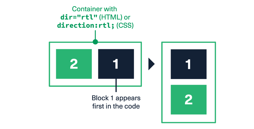
dir="rtl" (HTML) or direction:rtl (CSS) is set on their containerTraditionally this property is for denoting a language with text that runs right-to-left, for example Arabic. When applied to layout elements, it will tell each email client to render our elements in the opposite order. We always use the CSS version for our div content because GMX & Web.de don’t support the HTML dir attribute but they do support direction in CSS.
So underneath the spacer added above, you could copy and paste the entire div.two-col again, or paste the code below, which has the same structure but slightly different content:
<div class="two-col" style="text-align:center;font-size:0;">
<!--[if mso]>
<table role="presentation" width="100%">
<tr>
<td style="width:50%;padding:10px;" valign="middle">
<![endif]-->
<div class="column" style="width:100%;max-width:330px;display:inline-block;vertical-align:middle;">
<div style="padding:10px;font-size:14px;line-height:18px;">
<p style="margin:0;font-family:Arial,sans-serif;">
<img src="http://webdesign.tutsplus.com/images/two-column-02.png" width="310" alt="" style="display:block;width:100%;height:auto;max-width:310px;" />
</p>
</div>
</div>
<!--[if mso]>
</td>
<td style="width:50%;padding:10px;" valign="middle">
<![endif]-->
<div class="column" style="width:100%;max-width:330px;display:inline-block;vertical-align:middle;">
<div style="padding:10px;font-size:14px;line-height:18px;text-align:left;">
<p style="margin-top:0;margin-bottom:12px;font-family:Arial,sans-serif;font-weight:bold;">Conubia nostra, per inceptos himenaeos</p>
<p style="margin-top:0;margin-bottom:14px;font-family:Arial,sans-serif;">Class aptent taciti sociosqu ad litora torquent per conubia nostra, per inceptos himenaeos. Maecenas sed ante pellentesque.</p>
<p style="margin:0;font-family:Arial,sans-serif;"><a href="https://example.com/" style="background: #ffffff; border: 2px solid #8dc1d6; text-decoration: none; padding: 10px 25px; color: #000000; border-radius: 4px; display:inline-block; mso-padding-alt:0;text-underline-color:#ffffff"><!--[if mso]><i style="letter-spacing: 25px;mso-font-width:-100%;mso-text-raise:20pt"> </i><![endif]--><span style="mso-text-raise:10pt;font-weight:bold;">Lock it in</span><!--[if mso]><i style="letter-spacing: 25px;mso-font-width:-100%"> </i><![endif]--></a></p>
</div>
</div>
<!--[if mso]>
</td>
</tr>
</table>
<![endif]-->
</div>
Now all we need to do is tell the ghost table and the parent div to lay out their contents in a right-to-left direction, so add direction:rtl; to the container div’s CSS so it now reads:
<div class="two-col" style="text-align:center;font-size:0;direction:rtl;">
And add dir="rtl" to the ghost table:
<table role="presentation" width="100%" dir="rtl">
If you save it now and take a look, you’ll see the columns have switched sides, but the text is looking weird. That’s because the text is also inheriting the direction property, so we need to reset it on our divs and ghost table cells. Firstly, add direction:ltr; to each column div, so they now look like this:
<div class="column" style="width:100%;max-width:330px;display:inline-block;vertical-align:middle;direction:ltr;">
And then dir="ltr" to each ghost table cell:
<td style="width:50%;padding:10px;" valign="middle" dir="ltr">
Now our English text runs from left to right as it should.
So to recap, our entire row should now look like this, and we’ll also add another spacer at the bottom, like so:
<div class="two-col" style="text-align:center;font-size:0;direction:rtl;">
<!--[if mso]>
<table role="presentation" width="100%" dir="rtl">
<tr>
<td style="width:50%;padding:10px;" valign="middle" dir="ltr">
<![endif]-->
<div class="column" style="width:100%;max-width:330px;display:inline-block;vertical-align:middle;direction:ltr;">
<div style="padding:10px;font-size:14px;line-height:18px;">
<p style="margin:0;font-family:Arial,sans-serif;">
<img src="http://webdesign.tutsplus.com/images/two-column-02.png" width="310" alt="" style="display:block;width:100%;height:auto;max-width:310px;" />
</p>
</div>
</div>
<!--[if mso]>
</td>
<td style="width:50%;padding:10px;" valign="middle" dir="ltr">
<![endif]-->
<div class="column" style="width:100%;max-width:330px;display:inline-block;vertical-align:middle;direction:ltr;">
<div style="padding:10px;font-size:14px;line-height:18px;text-align:left;">
<p style="margin-top:0;margin-bottom:12px;font-family:Arial,sans-serif;font-weight:bold;">Conubia nostra, per inceptos himenaeos</p>
<p style="margin-top:0;margin-bottom:14px;font-family:Arial,sans-serif;">Class aptent taciti sociosqu ad litora torquent per conubia nostra, per inceptos himenaeos. Maecenas sed ante pellentesque.</p>
<p style="margin:0;font-family:Arial,sans-serif;"><a href="https://example.com/" style="background: #ffffff; border: 2px solid #8dc1d6; text-decoration: none; padding: 10px 25px; color: #000000; border-radius: 4px; display:inline-block; mso-padding-alt:0;text-underline-color:#ffffff"><!--[if mso]><i style="letter-spacing: 25px;mso-font-width:-100%;mso-text-raise:20pt"> </i><![endif]--><span style="mso-text-raise:10pt;font-weight:bold;">Lock it in</span><!--[if mso]><i style="letter-spacing: 25px;mso-font-width:-100%"> </i><![endif]--></a></p>
</div>
</div>
<!--[if mso]>
</td>
</tr>
</table>
<![endif]-->
</div>
<div class="spacer" style="line-height:24px;height:24px;mso-line-height-rule:exactly;"> </div>
And that’s all there is to it! You’ve now created a flipped column layout that will reverse when stacked.
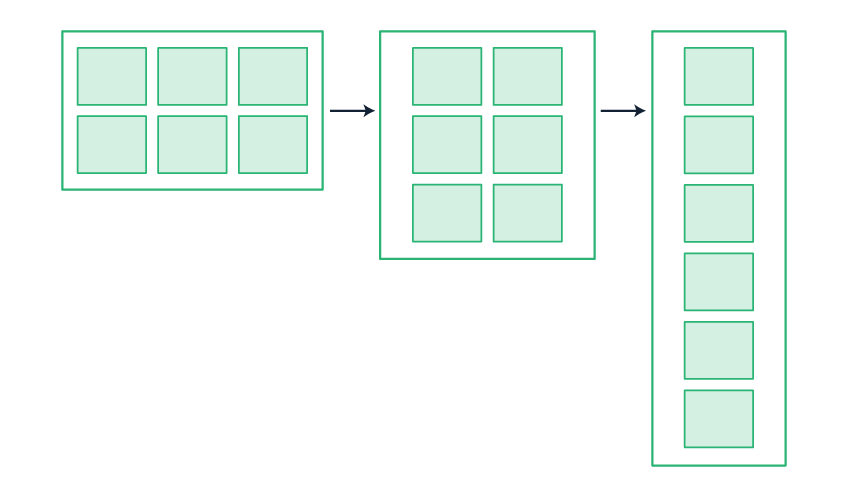
6. Adding a Three-Column Layout With Multiple Rows
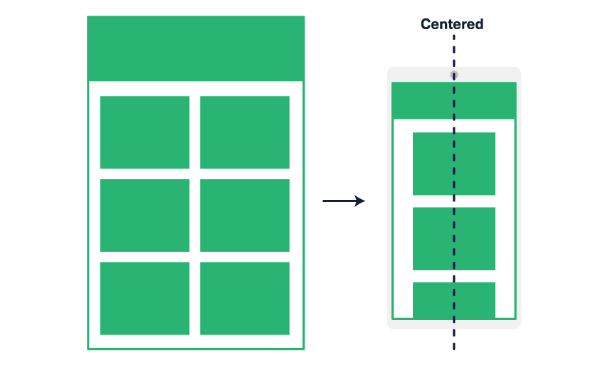
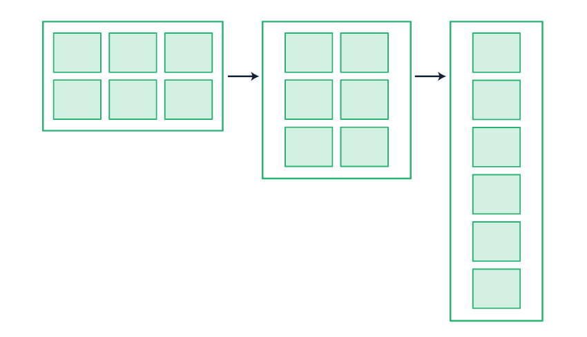
As with our two-column layout, here we are going to create columns that stack in the center on mobile by using the combination of text-align: center on the container and display: inline-block on the columns inside.
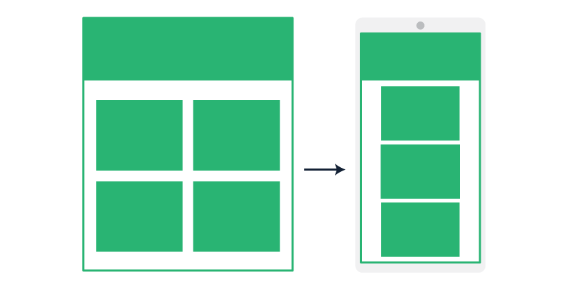
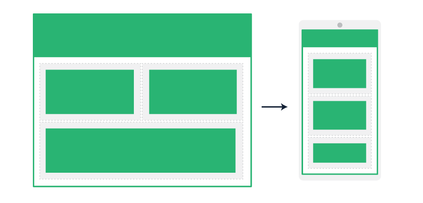
To achieve multiple rows and columns, you can add as many inline-block elements to a single container as you like. This way, when the viewport becomes too narrow to fit all of the columns, they reflow to fit the space available. This means you are able to achieve (for example) a 3×2 column layout that stacks down to 2×3 columns and finally 1×6 columns on mobile:
Firstly, our section here also has a single-column heading and intro, so we’ll add that first. As at Step 3, we will just use a table because it uses less code than creating a div and a ghost table. So underneath the spacer from above, paste the following
<table role="presentation" width="100%">
    <tr>
        <td style="padding:10px;text-align:center;">
            <h1 style="margin-top:0;margin-bottom:12px;font-family:Arial,sans-serif;font-size:24px;line-height:28px;font-weight:bold;">Praesent laoreet malesuada cursus</h1>
            <p style="margin:0;font-family:Arial,sans-serif;font-size:18px;line-height:24px;">Posuere leo id, eleifend dolor. Class aptent taciti sociosqu ad litora!</p>
        </td>
    </tr>
</table>
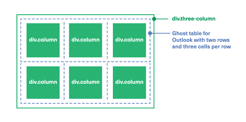
Underneath this, we’ll add our three column container, with our text alignment setting:
<div class="three-col" style="font-size:0;text-align:center;">
    [content goes here]
</div>
Next, replace [content goes here] with the following ghost table:
<!--[if mso]>
<table role="presentation" width="100%" style="text-align:center;">
<tr>
<td>
<![endif]-->
<div class="column"></div>
<!--[if mso]>
</td>
<td>
<![endif]-->
<div class="column"></div>
<!--[if mso]>
</td>
<td>
<![endif]-->
<div class="column"></div>
<!--[if mso]>
</td>
</tr>
<tr>
<td>
<![endif]-->
<div class="column"></div>
<!--[if mso]>
</td>
<td>
<![endif]-->
<div class="column"></div>
<!--[if mso]>
</td>
<td>
<![endif]-->
<div class="column"></div>
<!--[if mso]>
</td>
</tr>
</table>
<![endif]-->
The main thing to observe in the code above is that in the middle of the ghost table, we end the table row and start a new one, with </td></tr><tr><td>. You don’t need to separate the rows of divs, however you do need to add additional <tr>s to your ghost table for Outlook for every ’row’ of columns that you are going to end up with. This achieves a layout like this:
For the rest of this layout, the process is almost identical to what we saw in Step 3. The only difference is that we have three columns, so they are all set to be a third of the width of our email, 220px wide. And rather than setting the ghost table cells to be a percentage, since it would need to be 33% for Outlook which is slightly imprecise, we’ll set it to be the pixel width on each cell. Replace each td in the ghost table with this markup:
<td style="width:220px;padding:10px;" valign="top">
Note that it’s always a good idea to set pixel cell widths in ghost tables by using CSS rather than HTML because Outlook treats these accurately when adjusting for Windows’ DPI scaling. If you set your cell widths in HTML like width="220" you can end up with unpredictable results in Outlook on Windows.
We’ll match the ghost table cell formatting for each of our columns, so adjust each column div tag so they all look like this:
<div class="column" style="width:100%;max-width:220px;display:inline-block;vertical-align:top;">
And once that’s applied to each, we simply need to add our inner padding div, some content, our text styling, and throw in a spacer underneath. With that added, it all comes together like this:
<div class="three-col" style="font-size:0;text-align:center;">
<!--[if mso]>
<table role="presentation" width="100%" style="text-align:center;">
<tr>
<td style="width:220px;padding:10px;" valign="top">
<![endif]-->
<div class="column" style="width:100%;max-width:220px;display:inline-block;vertical-align:top;">
<div style="padding:10px;font-size:14px;line-height:18px;">
<p style="margin-top:0;margin-bottom:10px;font-family:Arial,sans-serif;"><img src="http://webdesign.tutsplus.com/images/three-column-01.png" width="100" alt="" style="width:100%;height:auto;max-width:100px;" /></p>
<p style="margin:0;font-family:Arial,sans-serif;">Scelerisque congue eros eu posuere. Praesent in felis ut velit pretium lobortis rhoncus ut erat.</p>
</div>
</div>
<!--[if mso]>
</td>
<td style="width:220px;padding:10px;" valign="top">
<![endif]-->
<div class="column" style="width:100%;max-width:220px;display:inline-block;vertical-align:top;">
<div style="padding:10px;font-size:14px;line-height:18px;">
<p style="margin-top:0;margin-bottom:10px;font-family:Arial,sans-serif;"><img src="images/three-column-02.png" width="100" alt="" style="width:100%;height:auto;max-width:100px;" /></p>
<p style="margin:0;font-family:Arial,sans-serif;">Maecenas sed ante pellentesque, posuere leo id, eleifend dolor.</p>
</div>
</div>
<!--[if mso]>
</td>
<td style="width:220px;padding:10px;" valign="top">
<![endif]-->
<div class="column" style="width:100%;max-width:220px;display:inline-block;vertical-align:top;">
<div style="padding:10px;font-size:14px;line-height:18px;">
<p style="margin-top:0;margin-bottom:10px;font-family:Arial,sans-serif;"><img src="images/three-column-03.png" width="100" alt="" style="width:100%;height:auto;max-width:100px;" /></p>
<p style="margin:0;font-family:Arial,sans-serif;">Praesent laoreet malesuada cursus. Maecenas scelerisque congue eros eu posuere.</p>
</div>
</div>
<!--[if mso]>
</td>
</tr>
<tr>
<td style="width:220px;padding:10px;" valign="top">
<![endif]-->
<div class="column" style="width:100%;max-width:220px;display:inline-block;vertical-align:top;">
<div style="padding:10px;font-size:14px;line-height:18px;">
<p style="margin-top:0;margin-bottom:10px;font-family:Arial,sans-serif;"><img src="images/three-column-04.png" width="100" alt="" style="width:100%;height:auto;max-width:100px;" /></p>
<p style="margin:0;font-family:Arial,sans-serif;">Praesent laoreet malesuada cursus. Maecenas scelerisque congue eros eu posuere.</p>
</div>
</div>
<!--[if mso]>
</td>
<td style="width:220px;padding:10px;" valign="top">
<![endif]-->
<div class="column" style="width:100%;max-width:220px;display:inline-block;vertical-align:top;">
<div style="padding:10px;font-size:14px;line-height:18px;">
<p style="margin-top:0;margin-bottom:10px;font-family:Arial,sans-serif;"><img src="images/three-column-05.png" width="100" alt="" style="width:100%;height:auto;max-width:100px;" /></p>
<p style="margin:0;font-family:Arial,sans-serif;">Praesent laoreet malesuada cursus. Maecenas scelerisque congue eros eu posuere.</p>
</div>
</div>
<!--[if mso]>
</td>
<td style="width:220px;padding:10px;" valign="top">
<![endif]-->
<div class="column" style="width:100%;max-width:220px;display:inline-block;vertical-align:top;">
<div style="padding:10px;font-size:14px;line-height:18px;">
<p style="margin-top:0;margin-bottom:10px;font-family:Arial,sans-serif;"><img src="images/three-column-06.png" width="100" alt="" style="width:100%;height:auto;max-width:100px;" /></p>
<p style="margin:0;font-family:Arial,sans-serif;">Praesent laoreet malesuada cursus. Maecenas scelerisque congue eros eu posuere.</p>
</div>
</div>
<!--[if mso]>
</td>
</tr>
</table>
<![endif]-->
</div>
<div class="spacer" style="line-height:50px;height:50px;mso-line-height-rule:exactly;"> </div>
And that’s it! Now you should have a three-column layout that collapses down to two columns and finally to one on the smallest screens.
7. Adding a Two-Column “Sidebar” Layout
Now we’ll create a layout with one wide column plus a narrower sidebar that contains an icon.
We want these to stack in the center so we’ll set up our container div with that text alignment. Paste the following code underneath the last spacer:
<div class="sidebar" style="font-size:0;text-align:center;">
    [content goes here]
</div>
Now, replace [content goes here] with our ghost table and column divs. Once column is 100px wide, and the other is 560px.
<!--[if mso]>
<table role="presentation" width="100%">
<tr>
<td style="width:100px;">
<![endif]-->
<div class="small" style="width:100%;max-width:100px;display:inline-block;">
    [content goes here]
</div>
<!--[if mso]>
</td>
<td style="width:560px;>
<![endif]-->
<div class="large" style="width:100%;max-width:560px;display:inline-block;">
    [content goes here]
</div>
<!--[if mso]>
</td>
</tr>
</table>
<![endif]-->
Now let’s set our vertical alignment by adding valign to the ghost table cells, and vertical-align to each div. Our smaller column code will look like this:
<td style="width:100px;" valign="middle">
<![endif]-->
<div class="small" style="width:100%;max-width:100px;display:inline-block;vertical-align:middle;">
And the wider one like this:
<td style="width:560px; valign="middle">
<![endif]-->
<div class="large" style="width:100%;max-width:560px;display:inline-block;vertical-align:middle;">
Now we’ll add our padding and align our text to the center on the smaller ghost table cell:
<td style="width:100px;padding:10px;text-align:center;" valign="middle">
And the larger ghost table cell:
<td style="width:560px;padding:10px;text-align:center;" valign="middle">
And to ensure our divs match, nest another div inside each, replacing the [content goes here] markers with this:
<div style="padding:10px;font-size:14px;line-height:18px;">
    [content goes here]
</div>
Now we can add our content. On the small column, replace [content goes here] with this:
<img src="http://webdesign.tutsplus.com/images/sidebar-01.png" width="80" alt="" style="width:100%;max-width:80px;height:auto;" />
And on the large column replace it with this:
<p style="margin:0;font-family:Arial,sans-serif;">Praesent laoreet malesuada cursus. Maecenas scelerisque congue eros eu posuere. Praesent in felis ut velit pretium lobortis rhoncus ut erat. <a href="http://www.example.com/" style="color:#a16767;text-decoration:underline;"><strong>Read on</strong></a></p>
Putting it all together, it should look like this. I’ve also added some font styling the padding div in the small column, for any ALT text that gets displayed. And we’ll add a spacer at the end too:
<div class="sidebar" style="font-size:0;text-align:center;">
<!--[if mso]>
<table role="presentation" width="100%">
<tr>
<td style="width:100px;padding:10px;text-align:center;" valign="middle">
<![endif]-->
<div class="small" style="width:100%;max-width:100px;display:inline-block;vertical-align:middle;">
<div style="padding:10px;font-family:Arial,sans-serif;font-size:14px;line-height:18px;">
<img src="http://webdesign.tutsplus.com/images/sidebar-01.png" width="80" alt="" style="width:100%;max-width:80px;height:auto;" />
</div>
</div>
<!--[if mso]>
</td>
<td style="width:560px;padding:10px;text-align:center;" valign="middle">
<![endif]-->
<div class="large" style="width:100%;max-width:560px;display:inline-block;vertical-align:middle;">
<div style="padding:10px;font-size:14px;line-height:18px;">
<p style="margin:0;font-family:Arial,sans-serif;">Praesent laoreet malesuada cursus. Maecenas scelerisque congue eros eu posuere. Praesent in felis ut velit pretium lobortis rhoncus ut erat. <a href="http://www.example.com/" style="color:#a16767;text-decoration:underline;"><strong>Read on</strong></a></p>
</div>
</div>
<!--[if mso]>
</td>
</tr>
</table>
<![endif]-->
</div>
<div class="spacer" style="line-height:10px;height:10px;mso-line-height-rule:exactly;"> </div>
Now you should have your left sidebar layout and when you resize your browser to make it smaller, the icon will jump above the text and sit in the centre.
8. Adding a Reversed “Sidebar” Layout
To add some more visual interest, let’s reverse our second sidebar layout so that the icon is on the right for desktop, but still stacks first on mobile. We’ll follow exactly the same process as in Step 5. We can essentially duplicate the sidebar layout above, or take this example layout with slightly different content:
<div class="sidebar" style="font-size:0;text-align:center;">
<!--[if mso]>
<table role="presentation" width="100%">
<tr>
<td style="width:100px;padding:10px;text-align:center;" valign="middle">
<![endif]-->
<div class="small" style="width:100%;max-width:100px;display:inline-block;vertical-align:middle;">
<div style="padding:10px;font-family:Arial,sans-serif;font-size:14px;line-height:18px;">
<img src="http://webdesign.tutsplus.com/images/sidebar-02.png" width="80" alt="" style="width:100%;max-width:80px;height:auto;" />
</div>
</div>
<!--[if mso]>
</td>
<td style="width:560px;padding:10px;text-align:center;" valign="middle">
<![endif]-->
<div class="large" style="width:100%;max-width:560px;display:inline-block;vertical-align:middle;">
<div style="padding:10px;font-size:14px;line-height:18px;">
<p style="margin:0;font-family:Arial,sans-serif;">Maecenas sed ante pellentesque, posuere leo id, eleifend dolor. Class aptent taciti sociosqu ad litora torquent per conubia nostra. <a href="http://www.example.com/" style="color:#a16767;text-decoration:underline;"><strong>Register today</strong></a></p>
</div>
</div>
<!--[if mso]>
</td>
</tr>
</table>
<![endif]-->
</div>
And as at Step 5, to reverse the order we simply need to add our direction:rtl; to div.sidebar, and dir="rtl" to the ghost <table> tag.
Then, to ensure the contents run in the right direction, we add direction:ltr; to both of our columns, and dir="ltr" to each of our ghost table cells.
Once done, it all looks like this, with our final spacer added underneath:
<div class="sidebar" style="font-size:0;text-align:center;direction:rtl;">
<!--[if mso]>
<table role="presentation" width="100%" dir="rtl">
<tr>
<td style="width:100px;padding:10px;text-align:center;" valign="middle" dir="ltr">
<![endif]-->
<div class="small" style="width:100%;max-width:100px;display:inline-block;vertical-align:middle;direction:ltr;">
<div style="padding:10px;font-family:Arial,sans-serif;font-size:14px;line-height:18px;">
<img src="http://webdesign.tutsplus.com/images/sidebar-02.png" width="80" alt="" style="width:100%;max-width:80px;height:auto;" />
</div>
</div>
<!--[if mso]>
</td>
<td style="width:560px;padding:10px;text-align:center;" valign="middle" dir="ltr">
<![endif]-->
<div class="large" style="width:100%;max-width:560px;display:inline-block;vertical-align:middle;direction:ltr;">
<div style="padding:10px;font-size:14px;line-height:18px;">
<p style="margin:0;font-family:Arial,sans-serif;">Maecenas sed ante pellentesque, posuere leo id, eleifend dolor. Class aptent taciti sociosqu ad litora torquent per conubia nostra. <a href="http://www.example.com/" style="color:#a16767;text-decoration:underline;"><strong>Register today</strong></a></p>
</div>
</div>
<!--[if mso]>
</td>
</tr>
</table>
<![endif]-->
</div>
<div class="spacer" style="line-height:40px;height:40px;mso-line-height-rule:exactly;"> </div>
And there you have it! Now we have two sidebars with icons on opposite sides, but they remain above the text when everything stacks on mobile.
9. Adding Progressive Enhancement With Media Queries
Now you have a complete email template that is responsive everywhere without a single media query in sight! But of course there are many email clients that do support media queries, so now we can go about progressively enhancing our already fabulous template with a few tweaks so that it looks top-notch in as many email clients as possible.
Adding Media Queries
Firstly, we’ll set our three-column columns to be 100% wide on screens up to 350px wide, but then for screens that are between 351–460px wide, we can actually fit two columns side by side, so we’ll set them to 50% there. On the columns all we have to do is override the max-width because, as you’ll recall, they all already have a width of 100% and it’s just the max-width that is restricting them.
With our two-column columns and images, we’ll just set those to be 100% wide on all screens up to 460px wide.
For screens that are a minimum of 461px wide, we’ll then specify percentage max-widths for all the columns, so that they will all be in proportion even if the viewport or viewable region (in Gmail webmail for example) is narrower than our email width of 660px.
So add this to the <head> of our document:
<style type="text/css">
    @media screen and (max-width: 350px) {
        .three-col .column {
            max-width: 100% !important;
        }
    }
    @media screen and (min-width: 351px) and (max-width: 460px) {
        .three-col .column {
            max-width: 50% !important;
        }
    }
    @media screen and (max-width: 460px) {
        .two-col .column,
        .two-col img {
            max-width: 100% !important;
        }
    }
    @media screen and (min-width: 461px) {
        .three-col .column {
            max-width: 33.3% !important;
        }
        .two-col .column {
            max-width: 50% !important;
        }
        .sidebar .small {
            max-width: 16% !important;
        }
        .sidebar .large {
            max-width: 84% !important;
        }
    }
</style>
And voilà! Layout perfection at every screen size.
These are just some adjustments to demonstrate what’s possible—you can play around with this as much as you like to achieve your desired outcome across a whole range of device sizes that support media queries.
And There You Have it!
Well done! We now have a fully-functioning responsive HTML email using just a handful of media queries and coming in at under 17kb. Go forth and experiment with different layouts using the principles you have learned in this tutorial – there is a lot you can do once you’ve mastered the basics.
Icons and Illustrations
All the graphic elements in the template are part of the Flat People Characters collection by alexdndz available on Envato Elements.
And don’t forget, if you’re about to kickstart a new project browse through our best-selling responsive email templates on Envato Market.
More HTML Email Development Tutorials
 Email DesignBuild an HTML Email Template From Scratch
-
EmailWhat You Should Know About HTML Email
-
AccessibilityA Beginner’s Guide to Email Accessibility (Checklist + Resources)
-
EmailThe Complete Guide to Designing for Email
-
MailChimp22+ MailChimp Templates for Every Purpose and Occasion
-
MailChimpBest Mailchimp Templates to Level Up Your Business Email Newsletter 2021


