Throughout the upcoming demos which are beginner-friendly, the markup and concept will remain more or less the same; there will be a gallery of images where only the first one will be visible initially. As we scroll, the gallery will become sticky, and at that point, all its images will appear in different ways.
For all the demos, I’ve set the end value to +=500% which will make the animation longer. This way, the gallery will be sticky for 500% extra scrolling after its initial start. For instance, if the start position is 1,000px, the end position will be around 6,000px. To see this in action, print the start and end scroll positions of your ScrollTrigger instance. Pick a smaller value if you prefer a quicker sticky effect.
1. Right-to-left horizontal animation
In this first case, we have some full-screen slides. As we scroll, we’ll move all slides simultaneously to the left by giving them a negative translation X value.
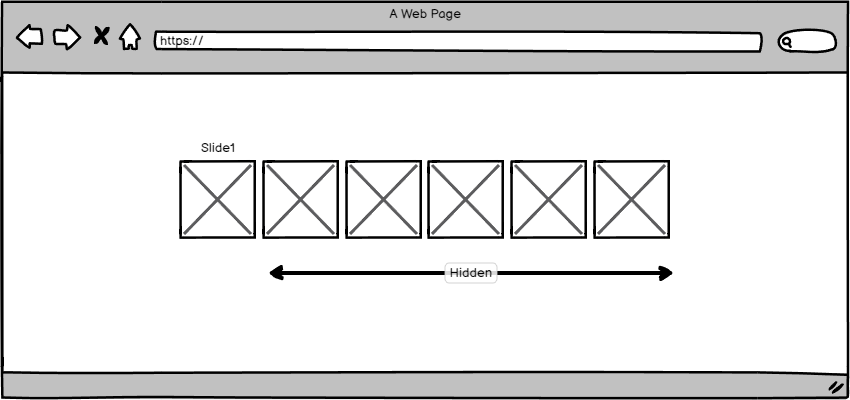
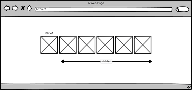
2. Left-to-right horizontal animation
But what if we want to reverse the previous animation and achieve a right-to-left movement?

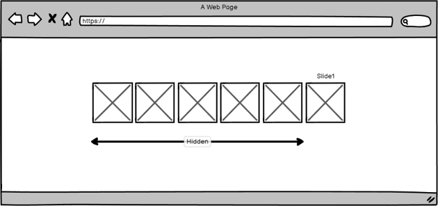

In such a case, we’ll assign the dir="rtl" attribute to the slides container and a positive translation X value to all slides.
3. Right-to-left horizontal animation (nesting)
In this slightly more complex example, we’ll build on the first demo and use ScrollTrigger’s containerAnimation technique to create nested ScrollTriggers. That said, during the horizontal movement of our slides, we’ll watch when their captions come into view and then animate their content.
4. Right-to-left horizontal animation (alternative)
Moving on, now let’s alter the slide width to be at most 50vw, depending on the screen size. This time, instead of moving the slides, we’ll move their wrapper.
The amount of movement we have to scroll will result from subtracting the slides’ container width (including the non-visible content) from the window width.
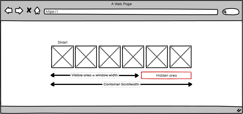
Last but not least, to make the effect responsive, we’ll use function-based values (see also this page) and apply invalidateOnRefresh: true via the ScrollTrigger configuration settings.
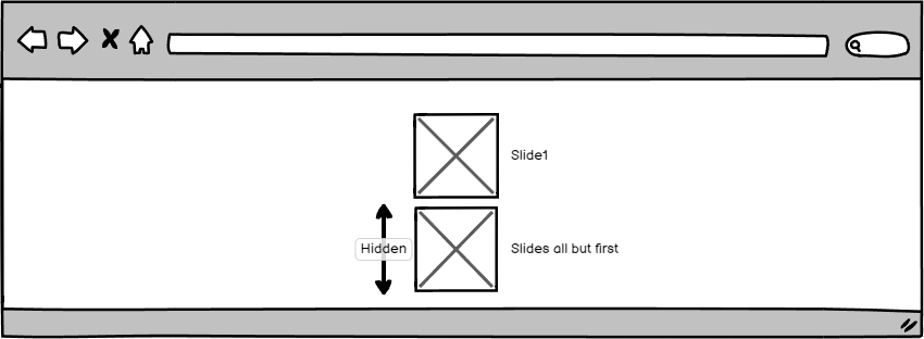
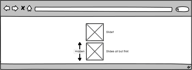
5. Top-to-bottom horizontal animation (stacked sections)
In this scenario, we stack the slides and hide their captions. As we scroll, each slide will appear on top of the previous one while its caption will fade. As the slides are stacked, we’ll show them sequentially by staggering them.
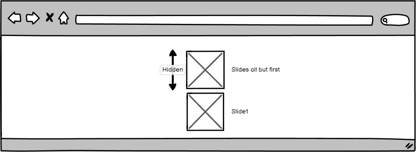


Notice the use of the “<“ symbol that makes the captions’ animation happen at the beginning of the associated slide animation.
In the same way, we can apply a bottom-to-top animation.
6. Right-to-left horizontal animation (stacked sections)
Following the previous demo, here we have the same animation concept. This time, the animation movement will occur from right to left while the captions stand to the left.
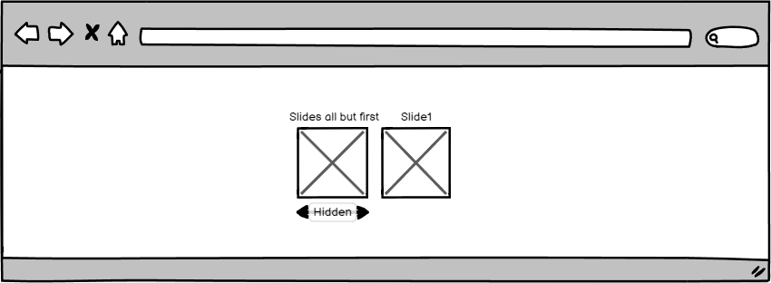
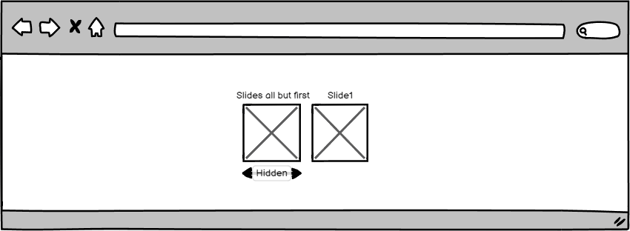

In the same way, we can apply a left-to-right animation.
7. Clip-path horizontal animation (stacked sections)
In this last demo, the slides remain stacked but appear with an impressive bottom-to-top clip-path animation.

For this animation type, we first assign appropriate z-index values to the slides.
Of course, we can alter the clip-path animation direction as we wish.
Conclusion
That concludes another GSAP tutorial, folks! I hope you enjoyed the scroll-based sticky sections we built today and gained some inspiration! Go ahead, dive into ScrollTrigger’s docs, be creative, and build even more amazing stuff!
Last but not least, I have added all the demos of this tutorial to a CodePen Collection. Be sure to check it out and give it some love!
As always, thanks a lot for reading!