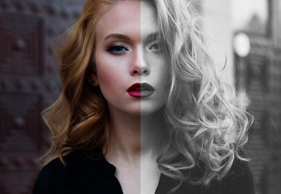
In a previous tutorial, we learned how to create a grayscale-to-color effect on scroll. To implement it, we took advantage of modern front-end features like CSS Grid, the clip-path property, and the Intersection Observer API.
Today, we’ll use these tools and the knowledge gained from that tutorial to build another cool scroll effect. As we scroll, page elements will sequentially appear with a slide animation. This is a common scroll effect that you might see on portfolio websites.
What We’ll be Building
Without further intro, let’s check out what we’ll be building:
Note: Be sure to read the aforementioned tutorial as we’ll grab some code snippets from it.
1. Begin With the HTML Markup
We’ll start with a wrapper section element that will contain nested sections. Each sub-section will have one of the following three possible layouts:
- An image on the left, text on the right.
- Big text on the right.
- Text on the left, the image on the right.
Here’s a visual representation of these layouts:
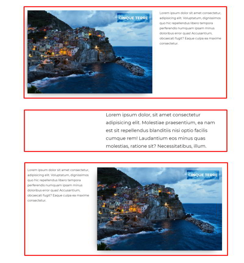
It’s worth noting that for all layouts, we’re going to use the same Pixabay image. You might remember that we’ve already used it in another scroll tutorial.
The required markup:
<section class="main-section">
  <section class="grid">
    <figure>
      <img src="http://webdesign.tutsplus.com/IMG_SRC" alt="">
      <figcaption>...</figcaption>
    </figure>
    <p>...</p>
  </section>
  <section class="big-text">
    <p>...</p>
  </section>
  <section class="grid grid-alternate">
    <p>...</p>
    <figure>
      <img src="http://webdesign.tutsplus.com/IMG_SRC" alt="">
      <figcaption>...</figcaption>
    </figure>
  </section>
</section>
2. Define the Styles
Coming up next, we’ll write down the most important aspects of our styles. For this demonstration, we won’t discuss the reset rules as they aren’t anything important. So, straight to the point:
- We’ll define the
grid,grid-alternate, andbig-textclasses to capture the different layouts. The first two take advantage of CSS Grid, while the last one sets a maximum width withmargin-left: auto. - Just to practice with a new CSS function, we’ll use
clamp()to create fluid typography. - Each
figureelement will have an absolutely positioned::beforepseudo-element. That element will act as an image overlay and be animated first. - All animated elements will initially be hidden thanks to the
clip-pathproperty. Again, to really understand how this property works, check out this tutorial. - To chain the animations, we’ll pass appropriate values to the
transition-delayproperty of each element. Feel free to make them dynamic by using CSS variables. - On screens up to 1000px wide, all elements will be stacked. Additionally, on image sections, the image will always come before the text.
Here are the corresponding styles based on these assumptions:
/*CUSTOM VARIABLES HERE*/

body {
  font: clamp(16px, 2vw, 22px) / 1.7 "Montserrat", sans-serif;
}

.main-section {
  max-width: 1400px;
  padding: 0 30px;
  margin: 120px auto;
}

.main-section section + section {
  margin-top: 120px;
}

.main-section .grid {
  display: grid;
  grid-column-gap: 60px;
  grid-template-columns: 2fr 1fr;
}

.main-section .grid-alternate {
  grid-template-columns: 1fr 2fr;
}

.main-section .big-text {
  max-width: 800px;
  margin-left: auto;
  font-size: clamp(24px, 2vw, 32px);
}

.main-section figure {
  position: relative;
  box-shadow: -1rem 1rem 3rem -2rem rgba(0, 0, 0, 0.5);
}

.main-section figure::before {
  content: "";
  position: absolute;
  top: 0;
  right: 0;
  bottom: 0;
  left: 0;
  background: var(--blue-sudo);
  transition: clip-path 0.3s;
}

.main-section figure img {
  display: block;
  clip-path: inset(0 100% 0 0);
  transition: clip-path 0.6s 0.3s;
}

.main-section figure figcaption {
  position: absolute;
  top: 20px;
  right: 20px;
  padding: 10px;
  font-weight: bold;
  text-transform: uppercase;
  color: var(--white);
  background: var(--blue);
  mix-blend-mode: overlay;
  transition: clip-path 0.3s 0.9s;
}

.main-section figure::before,
.main-section figure figcaption {
  clip-path: inset(0 0 0 100%);
}

@media (max-width: 1000px) {
  .main-section {
    margin: 60px auto;
  }

  .main-section section + section {
    margin-top: 60px;
  }

  .main-section .grid {
    grid-template-columns: 1fr;
    grid-row-gap: 30px;
  }

  .main-section .grid-alternate figure {
    order: -1;
  }
}
3. Animate on Scroll
As we scroll, we’ll animate only the image sections (i.e. those that have the grid class). More specifically, we’ll animate the following elements with this order:
- The
::beforepseudo-element of thefigureelement (the one with the dark background). - The image.
- The image caption.
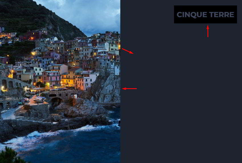
When at least 50% of each figure element enters the viewport, it will receive the is-animated class. Otherwise, it will lose this class and become hidden.
So when the half part of a figure is within the viewport, the associated child elements will appear sequentially from different directions. First, the ::before pseudo-element will appear from the right, then the image from the left, and finally its caption from the right.
The JavaScript code that we’re going to need is taken from the grayscale-to-color effect tutorial. We just have to match different elements:
const targets = document.querySelectorAll(".main-section .grid figure");
const isAnimated = "is-animated";
const threshold = 0.5;

function callback(entries, observer) {
  entries.forEach((entry) => {
    const elem = entry.target;
    if (entry.intersectionRatio >= threshold) {
      elem.classList.add(isAnimated);
      //observer.unobserve(elem);
    } else {
      elem.classList.remove(isAnimated);
    }
  });
}

const observer = new IntersectionObserver(callback, { threshold });
for (const target of targets) {
  observer.observe(target);
}
Here are the associated CSS rules that create the sequence of animations:
.main-section figure::before {
  transition: clip-path 0.3s;
}

.main-section figure img {
  clip-path: inset(0 100% 0 0);
  transition: clip-path 0.6s 0.3s;
}

.main-section figure figcaption {
  transition: clip-path 0.3s 0.9s;
}

.main-section figure::before,
.main-section figure figcaption {
  clip-path: inset(0 0 0 100%);
}

.main-section figure.is-animated::before,
.main-section figure.is-animated img,
.main-section figure.is-animated figcaption {
  clip-path: inset(0);
}
Note: Instead of the clip-path property, we could equally have used transform to accomplish the same effect. Check out the third example of this tutorial for more info.
Conclusion
That’s it, folks! Today we went through a way for sequentially revealing elements on scroll by taking advantage of amazing new front-end tools. Most importantly, we built this effect without using any libraries.
Hopefully you’ll be able to enrich your pages with a similar effect.
As a side note, before deciding to use these features on a project that requires support for older browsers, check the browser support at caniuse.com.
Here’s a reminder of what we built:
If you have ever used the clip-path property to build something helpful, let us know! As always, thanks a lot for reading!
