Derided by design fans but loved by millions of Microsoft users, Comic Sans is one of the most popular—and divisive—fonts ever created. Since its release in 1994, Comic Sans has been a consistent feature of everyday life, with the typeface being used on signage, menus, logos… and even tombstones.
Given the widespread popularity of the font, why do people hate Comic Sans so much? Here, discover more about how Comic Sans was created and how it came to be reviled over time. For Comic Sans fans, or simply designers looking for a superior alternative, scroll down to the bottom of the article for a selection of great fonts that look like Comic Sans or offer a new twist on comic type styles.
Looking for more fonts similar to Comic Sans, and other comic book fonts? Inject your designs with playfulness and fun with these fonts like Comic Sans on Envato Elements.

What Is Comic Sans?
What is Comic Sans, and who created it? Comic Sans is a sans serif script typeface. Designed by Microsoft type designer Vincent Connare and released by Microsoft in 1994, the font is inspired by comic book lettering.
The History of Comic Sans
In a 2014 interview, Connare said that “people who don’t like Comic Sans don’t know anything about design,” and that these individuals “don’t understand that in design you have a brief.”
Whether you like, love, or loathe Comic Sans, it can be argued that it was created for a very specific purpose. It’s the ways in which the font has been used for other, often unsuitable, purposes that have turned people so against Comic Sans, to the point that there are even websites and groups dedicated to banning the font from public use.
To understand and, indeed, to appreciate the font as an intrinsic feature of design history, we must turn back the clock to 1994.
In October 1994, Vincent Connare was shown a beta version of Microsoft Bob, a program that was intended to introduce computers to younger users. In the speech bubbles of cartoon characters, such as Bob’s ‘assistant’ Rover the dog, the programmers had opted for Times New Roman. Connare felt this font choice was too formal for a program that was intended to be user-friendly, so he started working on a typeface based on the style of lettering in comic books he had on his desk, such as The Dark Knight Returns and Watchmen.

While Comic Sans inventor Connare was too late to have his font included in Microsoft Bob, the programmers of Microsoft 3D Movie Maker were quick to adopt it. The font was later included as a system font with the release of Microsoft 95. Comic Sans also became the default font for both Microsoft Publisher and Microsoft Internet Explorer, paving its path towards world domination.
Why Do People Hate Comic Sans?
Perhaps because the handwriting style of Comic Sans made it stand out in a sea of traditional typefaces on Windows computers, computer users were incredibly quick to adopt the font for a range of homemade projects.
Originally the font of choice for children’s school projects, Comic Sans was soon being splashed across store signage, billboards, and even items that were a seemingly inappropriate fit for the casual, childlike font, such as job applications and tombstones.
Comic Sans gravestones might have been the nail in the coffin (sorry) for the popularity of Comic Sans (google them—it’s a thing!), and circa 2000 Connare was receiving emails and letters from people who were genuinely angry about the widespread use of a font they deemed ugly, inappropriate, and ill-designed.
Connare, however, has no regrets. He went on to work for type foundry Dalton Maag in London, and says he “would love to make something again that everyone loved and others would hate” (Dezeen, 2014).
Nonetheless, Connare seems to stand relatively alone in a world of vigilant Comic Sans haters. Two graphic designers, Dave and Holly Combs, set up a website dedicated to a “Ban Comic Sans” campaign, while the creator of the original comic book lettering that had inspired the design, Dave Gibbons, has described Comic Sans as “a real mess”, with a “particularly ugly letterform”.
Type as Social Design: Comic Sans and Dyslexia
The enduring popularity of Comic Sans with Microsoft users seems to stand in stark opposition to the opinion of many designers, and in many ways its usage credits it a place in the history of successful designs.
However you feel about Comic Sans, you can’t deny that it represents a success story in social design. Its informality and legibility have even resulted in unexpected and beneficial usages, such as its recommendation by the British Dyslexia Association and the Dyslexia Association of Ireland as an accessible font for dyslexic individuals (alongside another sans serif, Arial).
If you’re not quite ready to give Comic Sans a second chance but want to channel its casual, comic-book spirit, read on to discover our selection of fonts similar to Comic Sans. From the playful mood of Swingsnug to the characterful personality of Trevor, the fonts below owe an undeniable debt to Comic Sans and Vincent Connare.
Similar Fonts to Comic Sans
Perhaps you are one of the individuals brave enough to admit that you love Comic Sans… or maybe you still need some convincing. Either way, the fonts below all pay tribute to the original Microsoft creation, from faithful imitations—fonts that look like Comic Sans—to fonts like Comic Sans in mood, genre, or personality alone. Discover 15 similar fonts to Comic Sans that will help your projects to feel that little bit lighter and brighter.
1. Comic Boys
Comic Boys is a playful display font in a marker style. The user-friendly font has been designed with young children, cartoons, and comics in mind. A faithful tribute to Comic Sans.
2. Quick Run
A modern brush typeface by designer Bara_project, Quick Run is a more condensed and lively take on Comic Sans styling, with a dynamic, energetic style. Use it for signage, marketing, and logos for a fun and informal feel.

3. The Comic Struve
The Comic Struve is a handwritten font created by Stringlabs Studio. With a bouncy, childlike feel, the font also contains quirky glyphs for creating unique and playful typography for books, posters, and comics.
4. Sans Andreas
If you’re looking for a slightly more formal take on Comic Sans, Sans Andreas, which comes complete with four weights and multilingual support for 23 languages, has a more comic-faithful style that retains the legibility of Comic Sans. Flexible enough to use as body text and headlines, this is a versatile take on a comic style.

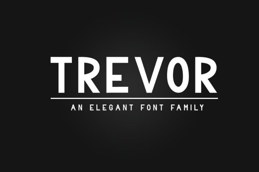
5. Trevor
The least similar font to Comic Sans on this list, Trevor nonetheless retains the same playful spirit of the Microsoft font. Designed as a display font for titling, posters, and branding, Trevor is a great choice for designers who want to introduce comic styling to their layouts in a more sophisticated way.
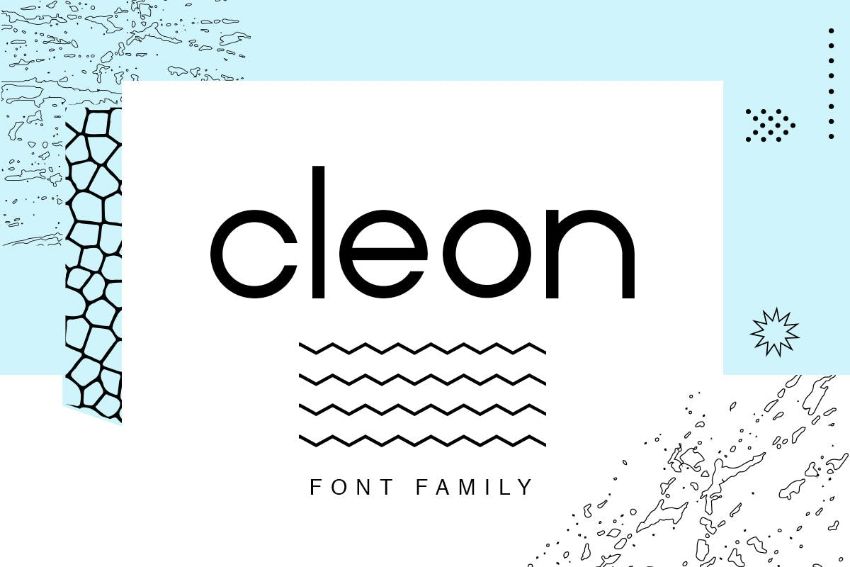
6. Cleon
Looking for a rounded font similar to Comic Sans? An elegant and clean sans serif that has a similar readability and personality to Comic Sans, Cleon is the result of blending comic type styling with geometric sans serifs. Clean, friendly, and open, this is a sans serif that doesn’t take itself too seriously.
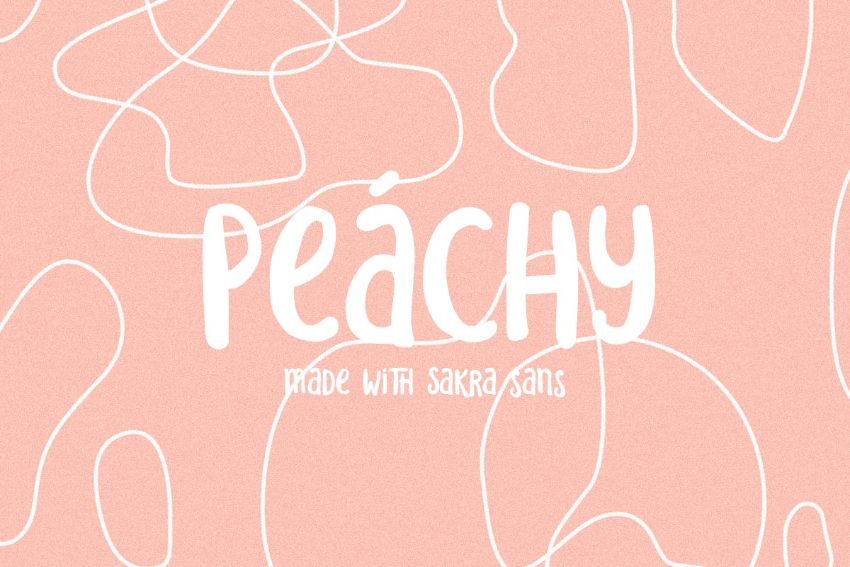
7. Sakra Sans
Sakra Sans is a simple and casual sans serif typeface based on real handwriting. With a childlike, naive style, the font is a fitting tribute to Comic Sans, but it will find its best use on 90s-themed marketing and branding aimed at millennial and Gen-Z audiences.
8. Coco Banana
Described by its designer, Gagat Anggi, as a playful, handwritten font with a fresh and fun feel, Coco Banana is delectable and approachable, making it a great choice for cafe and food branding. Try the font on menus or signage to introduce a fun element to food and beverage-themed designs.

9. Coffee Morning Sans
One of the features that made Comic Sans so popular with users was its imperfections and quirks. Coffee Morning Sans takes the same approach, resulting in a casual, unique typeface that features alternative ligatures for extra personality.

10. Olive Sans
A condensed and playful sans serif typeface that makes a fantastic pairing with 80s-themed designs, Olive Sans is a font with strong similarities to Comic Sans. Handwritten and condensed, the font has a jaunty style that would suit a range of informal purposes.
11. Qarmic Sans
Probably the most faithful tribute to Comic Sans in the list, Qarmic Sans is a clean and professional take on the font, with useful glyphs and wingdings. All of this makes it an excellent alternative choice for Comic Sans devotees.

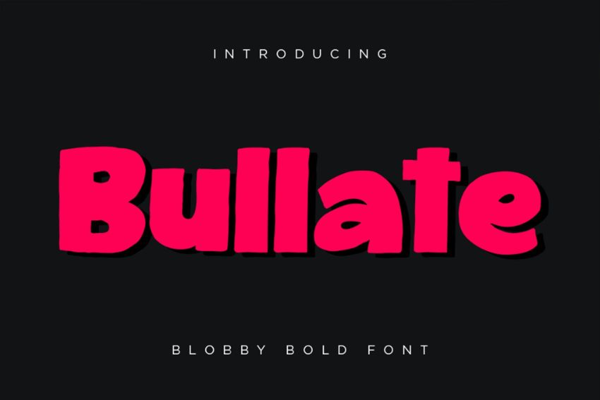
12. Bullate
Bullate is an optimistic hand-drawn sans serif font, inspired by comic books and children’s branding. Described as a blobby, bold font, Bullate bridges the gap between Comic Sans and comic book noir. It looks fantastic set in bright, neon color palettes and contrasting inky black.
13. Leading Role
Released by font foundry EDRIC Studio, Leading Role is a sans serif cartoon font with naively drawn lettering, making it appear more hand-crafted than other fonts that look like Comic Sans. Offset its naivety with a serious monochrome palette.

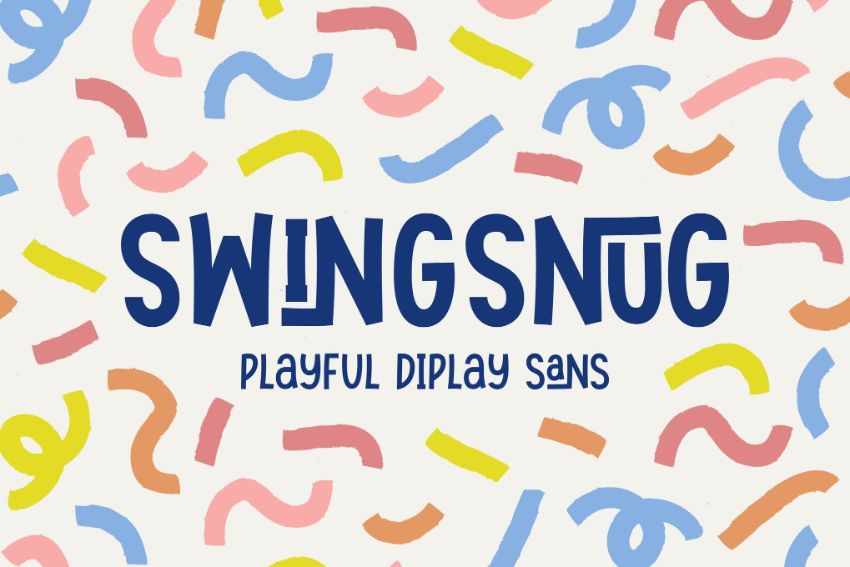
14. Swingsnug
Swingsnug is a fun, jaunty display sans serif with an on-trend marker style. Team it with colorful photography on magazine covers or ads for contemporary, spirited designs for food or retail brands.
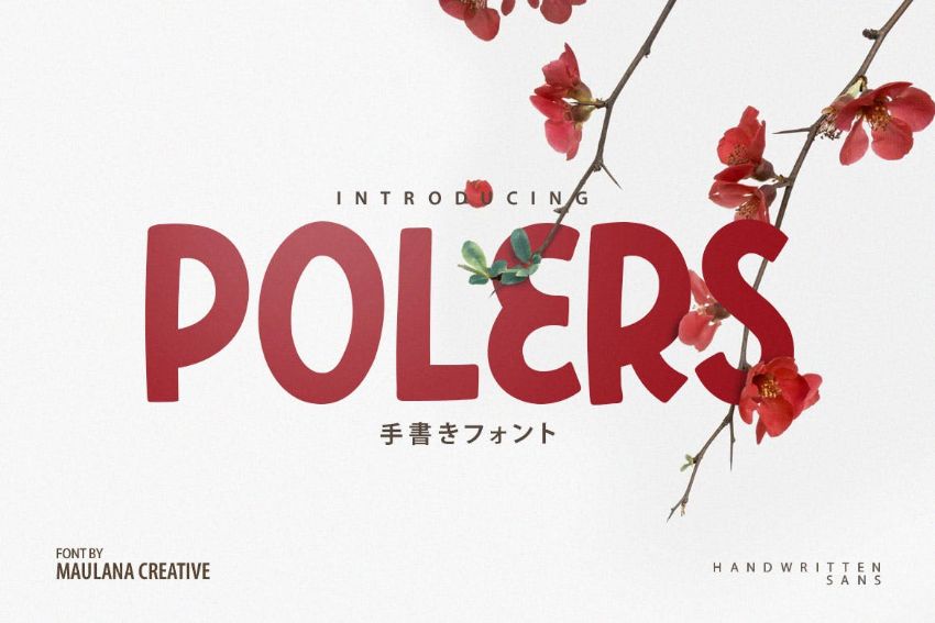
15. Polers
A handwritten sans serif font with a restrained personality, Polers is a stylish take on the pop-culture style used by Comic Sans. Created by Maulana Creative, this display font will be particularly effective on large-scale print work, such as posters or ads.
Still on the Hunt for Fonts Similar to Comic Sans?
From the bouncy optimism of Coco Banana to the more subdued styling of Polers and a range of other Comic Sans font alternatives in-between, we hope you’ve found a font similar to Comic Sans in the edit above that will suit your next project.
If you’re still looking for the perfect rounded font similar to Comic Sans or other fonts that look like Comic Sans, make sure to check out these great Comic Sans alternatives on Envato Elements.
Discover more awesome alternative fonts and fantastic font edits below:
-

15 Fonts Similar to Helvetica
-
Gotham Font History: From GQ to the Barack Obama Campaign
-
Fonts Similar to Futura & What Font Pairs Well With Futura
-
How to Combine Fonts, How Not To, and the Best Font Combinations
-
25+ Best Free Calligraphy Fonts (Free Downloads)
-
All About the Futura Font and Its History