With responsive design being big in web design it’s important that you design your website so that it can be used on different devices.
There are a number of different media queries that you can use on your design, if you don’t know where to start with media queries here is a good boilerplate to go with.
This snippet gives you a generic base for your media queries but if you want to target a specific device then you need to change these media queries.
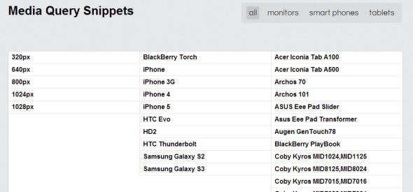
Here is a website that gives you a list of targeted media queries based on some of the most popular devices people use to view a website.
Here are some example snippets.
IPhone5
@media screen and (device-aspect-ratio: 40/71) {
}
or
@media screen and (device-width: 320px) and (device-height: 568px) and (-webkit-device-pixel-ratio: 2){
}
Blackberry Torch
@media screen and (max-device-width: 480px) {
}
Samsung S3
@media only screen and (-webkit-device-pixel-ratio: 2) {
}
Google Nexus 7
@media screen and (device-width: 600px) and (device-height: 905px) and (-webkit-min-device-pixel-ratio: 1.331) and (-webkit-max-device-pixel-ratio: 1.332) {
}
IPad Mini
@media screen and (device-width: 768px) and (device-height: 1024px) and (-webkit-device-pixel-ratio: 1) {
}
IPad 3
Landscape
@media (max-device-width: 1024px) and (orientation: landscape) {
}
Portrait
@media (max-device-width: 768px) and (orientation: portrait) {
}
Galaxy Tab 10.1
Landscape
@media (max-device-width: 1280px) and (orientation: landscape) {
}
Portrait
@media (max-device-width: 800px) and (orientation: portrait) {
}