
It is very common to find dropdown navigation elements within website layouts. Developers use these types of hidden menus for displaying extra links which are typically related to the main topic. Other examples may use sliding panels or varying accordion-style menus to accomplish the same interface.
But for this tutorial I want to build a simple jQuery-powered dropdown menu. This can work well using the animate method for generating delayed effects. Along with the typical JS codes I have also worked some CSS3 transition effects into the stylesheet. Any webmaster who can edit these codes will surely find use in a pre-built customized navbar solution.


Setting the Document
First we need to create the basic HTML5 template which is used in most of my tutorials. We need the latest version of jQuery hosted from Google’s web API. Also I have added my own stylesheet named styles.css which we can go over quickly.
lt;!doctype html> <html lang="en-US">
<head>
<meta http-equiv="Content-Type" content="text/html;charset=utf-8">
<title>Horizontal Dropdown Navigation Bar Demo</title>
<meta name="author" content="Jake Rocheleau">
<link rel="shortcut icon" href="http://spyrestudios.com/favicon.ico">
<link rel="icon" href="http://spyrestudios.com/favicon.ico">
<link rel="stylesheet" type="text/css" media="all" href="styles.css">
<script type="text/javascript" src="https://ajax.googleapis.com/ajax/libs/jquery/1.9.1/jquery.min.js"></script>
</head>
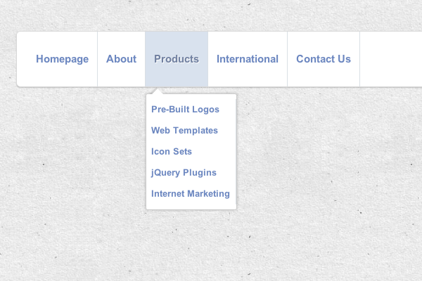
Now the real meat of our content is handled by an unordered list at the top of the page. I have wrapped all the list items inside an HTML5 <nav> element for more SEO benefits. Additionally the final wrapper div is what keeps everything centered on the page instead of fixed at 100% width. Here is my sample menu code:
<nav>
<ul id="ddmenu">
	<li><a href="#">Homepage</a></li>
	<li><a href="#">About</a>
	<ul>
		<li><a href="#">Our Mission</a></li>
		<li><a href="#">The Team</a></li>
		<li><a href="#">History</a></li>
	</ul>
	</li>
	<li><a href="#">Products</a>
	<ul>
		<li><a href="#">Pre-Built Logos</a></li>
		<li><a href="#">Web Templates</a></li>
		<li><a href="#">Icon Sets</a></li>
		<li><a href="#">jQuery Plugins</a></li>
		<li><a href="#">Internet Marketing</a></li>
	</ul>
	</li>
	<li><a href="#">International</a>
	<ul>
		<li><a href="#">China</a></li>
		<li><a href="#">Japan</a></li>
		<li><a href="#">Canada</a></li>
		<li><a href="#">Australia</a></li>
		<li><a href="#">South America</a></li>
	</ul>
	</li>
	<li><a href="#">Contact Us</a></li>
</ul>
</nav>
The code isn’t too scary at all. Each of the list items will trigger when we hover inside and display the highlighted effect, followed by our dropdown animation. All of the internal UL elements are contained inside the original list item. This way we do not lose focus after hovering the mouse over a new dropdown menu.
Navigating the Stylesheet
All of my stylesheet documents contain important browser resets as default properties. Many developers like to include the direct file of Eric Meyer’s resets but this can get a bit messy. Also he may not keep that document saved in the same spot on his server, so hotlinking is generally a bad idea. Here are my custom resets with a few extra properties.
html,body,div,span,applet,object,iframe,h1,h3,h3,h4,h5,h6,p,blockquote,pre,a,abbr,acronym,address,big,cite,code,del,dfn,em,img,ins,kbd,q,s,samp,small,strike,strong,sub,sup,tt,var,b,u,i,center,dl,dt,dd,ol,ul,li,fieldset,form,label,legend,table,caption,tbody,tfoot,thead,tr,th,td,article,aside,canvas,details,embed,figure,figcaption,footer,header,hgroup,menu,nav,output,ruby,section,summary,time,mark,audio,video {
border:0;
font-size:100%;
font:inherit;
vertical-align:baseline;
outline:none;
-webkit-font-smoothing:antialiased;
-webkit-text-size-adjust:100%;
-webkit-box-sizing:border-box;
-moz-box-sizing:border-box;
box-sizing:border-box;
margin:0;
padding:0;
}

html {
height:101%;
}

body {
background:#eaeaea url(images/bg.png);
font-size:62.5%;
line-height:1;
font-family:Arial, Tahoma, sans-serif;
padding-bottom:60px;
}

article,aside,details,figcaption,figure,footer,header,hgroup,menu,nav,section {
display:block;
}

ol,ul {
list-style:none;
}

blockquote,q {
quotes:none;
}

blockquote:before,blockquote:after,q:before,q:after {
content:none;
}

strong {
font-weight:700;
}

table {
border-collapse:collapse;
border-spacing:0;
}

img {
border:0;
max-width:100%;
}
One slightly interesting note is with the -webkit-font-smoothing property. This handles anti aliasing on all fonts when running a Mac OS X or iOS browser. Now moving onto the navigation menu I have added codes for handling all the hover effects and fixing list item displays. We need to have all the anchor links floating left and using a full pixel value with line-height.
#ddmenu {
display:block;
width:100%;
height:80px;
background:#fff;
border-radius:6px;
border:1px solid rgba(0,0,0,0.15);
box-shadow:0 1px 1px rgba(20,20,20,0.2);
cursor:pointer;
outline:none;
font-weight:700;
color:#8aa8bd;
margin:0 auto;
padding:0 15px;
}

#ddmenu li {
display:block;
position:relative;
float:left;
font-size:1.45em;
text-shadow:1px 1px 0 #fff;
border-right:1px solid #dae0e5;
}

#ddmenu li a {
display:block;
float:left;
line-height:78px;
font-weight:700;
text-decoration:none;
color:#6c87c0;
-webkit-transition:all .2s linear;
-moz-transition:all .2s linear;
-o-transition:all .2s linear;
transition:all .2s linear;
padding:0 12px;
}

#ddmenu li:hover > a {
color:#7180a0;
background:#d9e2ee;
}

#ddmenu ul {
position:absolute;
top:88px;
width:130px;
background:#fff;
display:none;
list-style:none;
border-radius:3px;
border:1px solid rgba(0,0,0,0.2);
box-shadow:0 0 5px rgba(0,0,0,0.2);
margin:0;
padding:7px 0;
}
Adding the selector #ddmenu ul targets all the internal ul elements inside each list item. I find this important because each of them requires a specific distance from the container using absolute positioning. Now I have also added linear transitions onto all the anchor links which display on hover.
Moving onto the biggest and final piece is creating the top tooltip element in CSS3. This can be done using rotation properties and applying a universal border with a darker background for the shadow. By using an offset position one will appear on top of the other and looks blended perfectly into the dropdown menu.
#ddmenu ul:after {
content:"";
width:0;
height:0;
position:absolute;
bottom:100%;
left:8px;
border-color:#fff transparent;
border-style:solid;
border-width:0 8px 8px;
}

#ddmenu ul:before {
content:"";
width:0;
height:0;
position:absolute;
bottom:100%;
left:4px;
border-color:rgba(0,0,0,0.1) transparent;
border-style:solid;
border-width:0 10px 10px;
}

#ddmenu ul li {
display:block;
width:100%;
font-size:.9em;
text-shadow:1px 1px 0 #fff;
}
If you like the styles try copying and pasting them into a code snippet for later. I always have difficulty locating good CSS3 arrows and these codes are fairly straightforward. It doesn’t even require extra HTML elements to get this displaying properly.
Animating with JavaScript
Now we do have the option of choosing CSS3 by taking advantage and using transition dropdown menus. But I feel this is actually too “flat” in comparison with JavaScript and more specifically, jQuery animations. Plus consider the fact that CSS3 animations will only work in newer browsers and it seems like JavaScript is our best option.
I have created a new script block of code down at the very bottom of our page body. The first section is checking for any clicks on the anchor links to stop them from loading into the URL. Since none of the HREF values go anywhere this is a common practice with tutorial demos.
<script type="text/javascript">
    $(document).ready(function () {
        $('a').on('click', function (e) {
            e.preventDefault();
        });
        $('#ddmenu li').hover(function () {
            clearTimeout($.data(this, 'timer'));
            $('ul', this).stop(true, true).slideDown(200);
        }, function () {
            $.data(this, 'timer', setTimeout($.proxy(function () {
                $('ul', this).stop(true, true).slideUp(200);
            }, this), 100));
        });
    });
</script>
Now the 2nd chunk of code is where all the magic happens. We attach an event listener for whenever the user hovers over a list item. This will automatically stop any other animation in progress and display the new sub-menu by using .slideDown(). There is also a slight delay on the slideup effect to make sure the user is really done accessing the links. This can be accomplished by using the JavaScript setTimeout() method.
Live Demo – Download Source Code
Final Thoughts
There are plenty of existing tutorials surrounding dropdown menus, but very few are offering creative animated systems. You should check out my live demo example and see how this design will behave in a real webpage. Also keep in mind that you can restyle any of the links to work with any color scheme or design interface.
Be sure and download a local copy of my source code files and toy around in your own time. This can provide a solid base for constructing a more developed navigation system. There is even room to append a 2nd or 3rd tier of links which flyout from the right or left side. Additionally feel free to share your own thoughts or questions in the post discussion area below.