
With the arrival of ultra high definition screens (think Retina) new design challenges have arisen;
we need to find ways to accomodate all devices. Take displaying icons for example. We could lean on serving images at 200%,or using SVG,but it’s also possible to build a surprising amount of graphics with CSS alone. Let’s build an elaborate icon with just one HTML element.


Useful Stuff to Know Before Beginning
The main problem with single elements resides in the fact that we’re limited to the number of “building blocks” we can use. Luckily,there are some tricks:
Pseudo Elements
Pseudo elements (also referred to as generated content) don’t exist in the document markup itself (the DOM) but are created by the CSS. They offer you the possibility to add to your default element two others which can (more or less) use the same properties.For example,take this markup:
<div class="square"> </div>
Then apply the following style rules:
.square {
	position:relative;
	background:blue;
	width:50px;
	height:50px;
}
.square::before {
	position:absolute;
	left:-50px;
	content:'';
	height:50px;
	width:50px;
	display:block;
	background:green;
}
.square::after {
	position:absolute;
	left:50px;
	content:'';
	height:50px;
	width:50px;
	display:block;
	background:red;
}
For the purpose of this exercise we’ll use pixel values,though it’s often advisable to use flexible units of measurement such as ems.
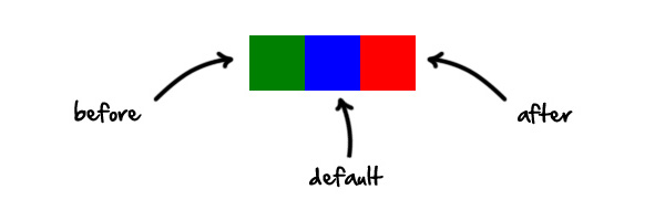
Note:The double colon (::),as opposed to a single colon,is CSS3 syntax. It differentiates pseudo elementsfrom pseudo selectors,such as hover.We’ve given ourself two more building blocks,but it’s worth noting that some CSS3 properties won’t work with generated content:
- Transitions
- Animations
Another things to know is that generated content will be displayed on top of the default element,unless they have z-index:-1. Browsers interpret them as if they are located withinthe default element. If we were to represent the pseudo elements with actual markup the code would be as follows:
<div class="square">
<div class="before">
</div>
<div class="after"></div></div>
.square {
	background:blue;
	width:50px;
	height:50px;
	position:relative;
}
.square .before {
	left:-50px;
	position:absolute;
	content:'';
	height:50px;
	width:50px;
	display:block;
	background:green;
}
.square .after {
	content:'';
	height:50px;
	width:50px;
	background:red;
	position:absolute;
	left:50px;
}
Box Shadows
If pseudo elements alone don’t give you enough “blocks” to build your icon,you can also use box shadows. This technique will allow you to create as many “clones” as you want. Let’s look at an example with a circle:
<div class="circle"></div>
.circle {
	position:relative;
	background:blue;
	width:50px;
	height:50px;
	border-radius:50%;
	box-shadow:-110px 0 0 -20px purple,-60px 0 0 -10px red,80px 0 0 10px green,180px 0 0 20px orange;
}
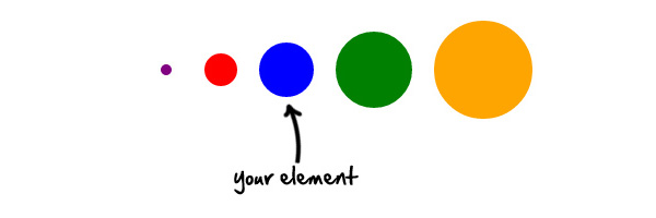
As you can see,the box shadows allow you to reduce or increase the size of your inital shape and place it where you want.The property detail box-shadow:80px 5px 1px 10px greencan be broken up as follows:
- 80px ->
offset-xThis allows you to place your shadow along the x axis,taking as origin the center of your original shape - 5px ->
offset-yThis allows you to place your shadow along the y axis,taking as origin the center of your original shape - 1px ->
blur-radiusThe larger this value,the bigger the blur,so the shadow becomes bigger and lighter - 10px ->
spread-radiusPositive values will cause the shadow to expand and grow bigger,negative values will cause the shadow to shrink - green ->
colorThe color of your shape:)
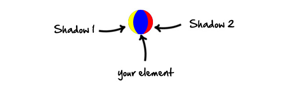
Note:The first shadow defined will always appear above subsequent shadows.The insetvalue also allows various possibilities:
<div class="ball"></div>
.ball {
	position:relative;
	background:blue;
	width:50px;
	height:50px;
	border-radius:50%;
	box-shadow:inset 20px 0 0 -10px yellow,inset -20px 0 0 -10px red;
}
Gradients
For those of you interested in Internet explorer,it’s worth noting that CSS gradients are only compatible with IE10. For other browsers,remember the apprpriate vendor prefixes.Like shadows,gradients can be combined and placed independently. Using gradients to create shapes is a bit more complicated than the previous properties,so let’s focus on a “simple” example.In this example we will create four different circles using radial gradients and we’ll distribute them within the parent element.
<
div class="background"></div>
.background {
	background:radial-gradient(center,ellipse,rgba(0,0,0,1) 10%,transparent 10%,transparent 100%),radial-gradient(center,ellipse,rgba(0,0,0,1) 30%,transparent 32%,transparent 100%),radial-gradient(center,ellipse,rgba(0,0,0,1) 50%,transparent 52%,transparent 100%),radial-gradient(center,ellipse,rgba(0,0,0,1) 60%,transparent 62%,transparent 100%);
	background-color:red;
	background-repeat:no-repeat;
	background-position:0px 0px,50px 0px,50px 50px,0px 50px;
	background-size:50px 50px;
	width:100px;
	height:100px;
	position:relative;
}
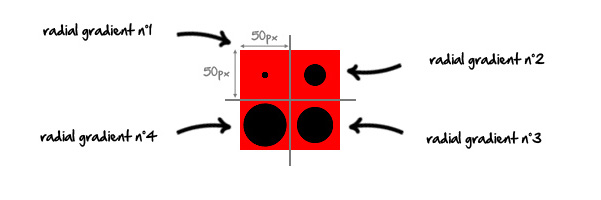
To understand this demo you have to imagine a grid on the element. Each cell of the grid would be a different gradient. In this case cells are 50px by 50px (background-size:50px 50px;).I have deliberately spread them within the element but be aware that they can also be superimposed. Each cell can be placed on a separate x and y axis,with origin in the upper left corner of the base element (
background-position:0px 0px,50px 0px,50px 50px,0px 50px;).The Gradient property in detail:
background:radial-gradient(center,ellipse cover,rgba(0,0,0,1)
- center ->
position:Could also be expressed as background-position(center = 50% 50%). - ellipse ->
shape:Could be circle or ellipse,in this example both do the same things… - rgba(0,0,0,1) 10% ->
color and limit :Increase the limit value to enlarge the circle. - transparent 10% ->
color and limit :This limit value defines the end of your previous color. Specify a limit slightly higher than the previous limit to allow for smoother edges. - transparent 100% ->
color and limit :The gradient will then be transparent from 10 to 100%.
To help with creation of CSS gradients,you can use a generator such as Collorzilla’s Gradient Editor.Now that we have seen how to create a maximum of building blocks from a single div,let’s practice!Here’s what we will create using just one div (bonus at the end!):

Step 1:The Body
Here comes the one single HTML line of this tutorial:
<div class="ladybug"></div>
To allow our icon to be easily resizable we will use flexible units of measurement;
em and %. Thanks to this you will be able to resize as you wish,simply by altering the font-size on the element. I develope this in Chrome,I’ll let you change the vendor prefixesdepending on your browser.We’ll start by giving shape and color to our ladybug’s body:
.ladybug {
	position:relative;
	font-size:60px;
	width:1.8em;
	height:2em;
	border-radius:50%;
	background-color:#E11;
}

Now let’s apply the points on the body using the radial-gradient property.
.ladybug {
	position:relative;
	font-size:60px;
	width:1.8em;
	height:2em;
	border-radius:50%;
	background:-webkit-radial-gradient(center,ellipse,rgba(0,0,0,1) 30%,transparent 33%,transparent 100%),-webkit-radial-gradient(center,ellipse,rgba(0,0,0,1) 50%,transparent 55%,transparent 100%),-webkit-radial-gradient(center,ellipse,rgba(0,0,0,1) 50%,transparent 55%,transparent 100%),-webkit-radial-gradient(center,ellipse,rgba(0,0,0,1) 40%,transparent 43%,transparent 100%),-webkit-radial-gradient(center,ellipse,rgba(0,0,0,1) 40%,transparent 43%,transparent 100%),-webkit-radial-gradient(center,ellipse,rgba(0,0,0,1) 45%,transparent 50%,transparent 100%),-webkit-radial-gradient(center,ellipse,rgba(0,0,0,1) 45%,transparent 50%,transparent 100%);
	background-color:#E11;
	background-repeat:no-repeat;
	background-position:0.66em 0.2em,0.3em 0.6em,1em 0.6em,0.9em 1.1em,0.4em 1.1em,1.1em 1.5em,0.2em 1.5em;
	background-size:0.5em 0.5em;
}

Excellent work – we’ve finished with the body for the moment.
Step 2:The Head
This part is the quickest. We’ll draw a half circle black and place it on top of the body. For this we will use the pseudo element ::before.
.ladybug::before {
	content:'';
	position:absolute;
	display:block;
	height:0.5em;
	width:1.2em;
	top:-0.24em;
	background:black;
	left:0.3em;
	border-radius:50% 50% 0% 0% / 100% 100% 0 0;
}

Step 3:The Eyes
Here we will create eyes using the pseudo element ::afterand the box shadow property. We begin by creating our basic circle (the pupil) then we will “clone” this element to create the white of the eye,the outline and the other eye.
.ladybug::after {
	content:'';
	position:absolute;
	display:block;
	height:0.1em;
	width:0.1em;
	background:black;
	top:-0.1em;
	left:0.5em;
	border-radius:50%;
	box-shadow:0 0 0 0.1em white,0em 0 0 0.13em black,0.7em 0 0 0 black,0.7em 0 0 0.1em white,0.7em 0 0 0.13em black;
}

Step 4:The Legs
You must be thinking “we have a left over element”. Don’t worry,we will reuse the same box shadow used for eyes.
.ladybug::after {
	content:'';
	position:absolute;
	display:block;
	height:0.1em;
	width:0.1em;
	background:black;
	top:-0.1em;
	left:0.5em;
	border-radius:50%;
	box-shadow:0 0 0 0.1em white,0em 0 0 0.13em black,0.7em 0 0 0 black,0.7em 0 0 0.1em white,0.7em 0 0 0.13em black,1.2em 0.5em 0 0.02em black,1.35em 1.1em 0 0.02em black,1.2em 1.65em 0 0.02em black,-0.5em 0.5em 0 0.02em black,-0.65em 1.1em 0 0.02em black,-0.5em 1.65em 0 0.02em black;
}
Our ladybug icon is finally finished!
Step 5:The Bonus!
We’re actually not quite finished. I promised you a bonus and here it is. Animation is one advantage CSS has over SVG;
let’s animate our ladybug on mouseover. Here is the bonus CSS code:
@-webkit-keyframes ladybug {
	0% {
		background-position:0.66em 0.2em,0.3em 0.6em,1em 0.6em,0.9em 1.1em,0.4em 1.1em,1.1em 1.5em,0.2em 1.5em;
	}
	50% {
		background-position:0.66em 0.8em,0.66em 0.8em,0.66em 0.8em,0.66em 0.8em,0.66em 0.8em,0.66em 0.8em,0.66em 0.8em;
	}
	100% {
		background-position:0.66em 0.2em,0.3em 0.6em,1em 0.6em,0.9em 1.1em,0.4em 1.1em,1.1em 1.5em,0.2em 1.5em;
	}
}
.ladybug:hover {
	-webkit-animation:ladybug 1s;
}
We begin by defining some keyframes which we name ladybug. We then trigger those keyframes into action on the hover state of our icon. The keyframes each alter the background position of our ladybug’s spotsFinally,here is the full CSS code:
.ladybug {
	position:relative;
	font-size:60px;
	width:1.8em;
	height:2em;
	border-radius:50%;
	background:-webkit-radial-gradient(center,ellipse,rgba(0,0,0,1) 30%,transparent 33%,transparent 100%),-webkit-radial-gradient(center,ellipse,rgba(0,0,0,1) 50%,transparent 55%,transparent 100%),-webkit-radial-gradient(center,ellipse,rgba(0,0,0,1) 50%,transparent 55%,transparent 100%),-webkit-radial-gradient(center,ellipse,rgba(0,0,0,1) 40%,transparent 43%,transparent 100%),-webkit-radial-gradient(center,ellipse,rgba(0,0,0,1) 40%,transparent 43%,transparent 100%),-webkit-radial-gradient(center,ellipse,rgba(0,0,0,1) 45%,transparent 50%,transparent 100%),-webkit-radial-gradient(center,ellipse,rgba(0,0,0,1) 45%,transparent 50%,transparent 100%);
	background-color:#E11;
	background-repeat:no-repeat;
	background-position:0.66em 0.2em,0.3em 0.6em,1em 0.6em,0.9em 1.1em,0.4em 1.1em,1.1em 1.5em,0.2em 1.5em;
	background-size:0.5em 0.5em;
}
.ladybug:before {
	content:'';
	position:absolute;
	display:block;
	height:0.5em;
	width:1.2em;
	top:-0.24em;
	background:black;
	left:0.3em;
	border-radius:50% 50% 0% 0% / 100% 100% 0 0;
}
.ladybug::after {
	content:'';
	position:absolute;
	display:block;
	height:0.1em;
	width:0.1em;
	background:black;
	top:-0.1em;
	left:0.5em;
	border-radius:50%;
	box-shadow:0 0 0 0.1em white,0em 0 0 0.13em black,0.7em 0 0 0 black,0.7em 0 0 0.1em white,0.7em 0 0 0.13em black,1.2em 0.5em 0 0.02em black,1.35em 1.1em 0 0.02em black,1.2em 1.65em 0 0.02em black,-0.5em 0.5em 0 0.02em black,-0.65em 1.1em 0 0.02em black,-0.5em 1.65em 0 0.02em black;
}
@-webkit-keyframes ladybug {
	0% {
		background-position:0.66em 0.2em,0.3em 0.6em,1em 0.6em,0.9em 1.1em,0.4em 1.1em,1.1em 1.5em,0.2em 1.5em;
	}
	50% {
		background-position:0.66em 0.8em,0.66em 0.8em,0.66em 0.8em,0.66em 0.8em,0.66em 0.8em,0.66em 0.8em,0.66em 0.8em;
	}
	100% {
		background-position:0.66em 0.2em,0.3em 0.6em,1em 0.6em,0.9em 1.1em,0.4em 1.1em,1.1em 1.5em,0.2em 1.5em;
	}
}
.ladybug:hover {
	-webkit-animation: ladybug 1s;
}
Conclusion
Through this tutorial I hope I’ve shown you the potential of CSS,and what’s possible with a single HTML element. It’s always wise to consider browser support for the CSS properties discussed in this tutorial,making sure that they degrade gracefully.
Thanks for reading!