
The best way to understand any process is to carry it out yourself, from the ground up. Today, we’re going to do just that with email design, by building an HTML email template from scratch.
“The sooner you stop fighting the quirks of email, the sooner you can use them to your advantage.” – Caity G. O’Connor
Editor’s note: this tutorial was originally written by Nicole way back in June 2013. Since then it’s become the go-to reference for industry leaders all over the world, and has been used by millions of beginners as a starting point for their adventures with HTML email templates. We’ve kept it updated so it’s as relevant today as it was when it was first published.
Popular HTML Email Templates on Envato Elements
If you’re looking for a ready-made, professional solution, grab one of our popular HTML email templates on Envato Elements. We have hundreds of responsive options all included with your Elements membership, with easy to customize features to get you started.
Not what you’re looking for? No problem, this tutorial will teach you how to build your own!
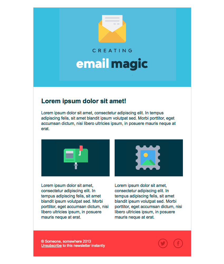
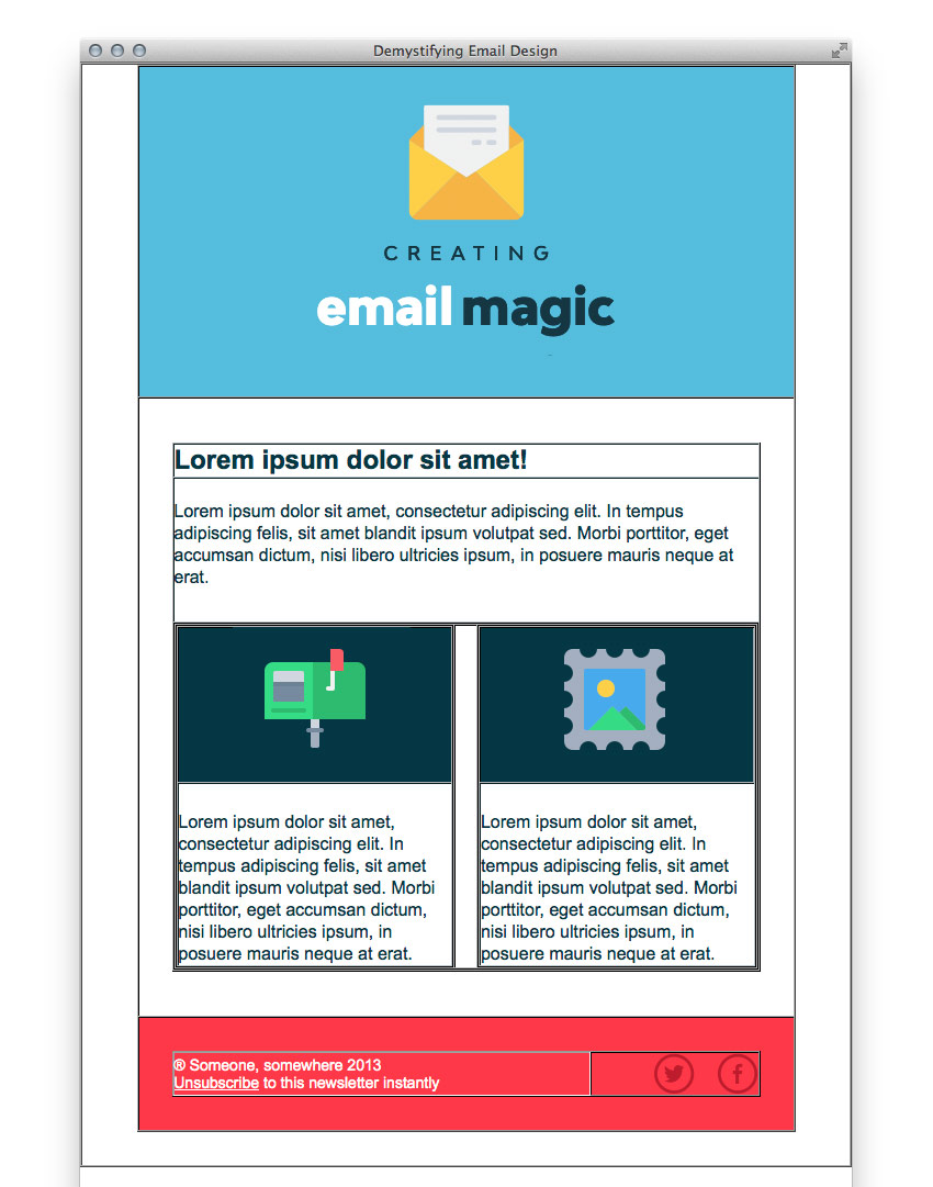
The HTML Email Template We’re Building
Here’s the HTML email we’ll be building, feel free to fork the pen and use it yourself. Bear in mind that when we’re viewing this template through a web browser we’re much less likely to run into problems than with email clients.
1. Begin Your HTML Email Document
To begin with, it’s worth mentioning where I pulled some of the resources from.
- The lovely 2D icons are by Justicon on Envato Elements
- The social media icons are from Metrize Icons
Now, as we discussed in the previous tutorial, you’ll need to begin your HTML email template with an XHTML doctype, and the correct language for your subscribers, i.e. <html lang="en-GB">:
<!DOCTYPE html PUBLIC "-//W3C//DTD XHTML 1.0 Transitional//EN" "http://www.w3.org/TR/xhtml1/DTD/xhtml1-transitional.dtd">
<html xmlns="http://www.w3.org/1999/xhtml" lang="en-GB">
<head>
    <meta http-equiv="Content-Type" content="text/html; charset=UTF-8" />
	<title>Demystifying Email Design</title>
	<meta name="viewport" content="width=device-width, initial-scale=1.0"/>
</head>
</html>
With that sorted, we can commence building the rest of the structure.
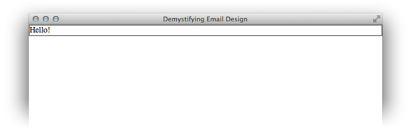
2. Create the Body and Main Table
First, we’ll add an overall structure for our email, starting with a <body> tag. We’ll set the margin and padding on the body tag to zero to avoid any unexpected space.
We’ll also add a table with a width of 100%. This acts as a true body tag for our email, because styling of the body tag isn’t fully supported. If you wanted to add a background colour to the ‘body’ of your email, you’ll need to apply it to this big table instead.
Then we’ll add role="presentation" to the table. This makes it more accessible, as it tells screen readers to treat it as a visual table, not a data table.
Set your cellpadding and cellspacing to zero to avoid any unexpected space in the table.
Note: We’re going to leave border="1" on all of our tables, so that we can see the skeleton of our layout as we go. We’ll remove them at the end with a simple ‘Find & Replace’.
<body style="margin: 0; padding: 0;">
    <table role="presentation" border="1" cellpadding="0" cellspacing="0" width="100%">
		<tr>
			<td>
				<p style="margin: 0;">Hello!</p>
			</td>
		</tr>
	</table>
</body>
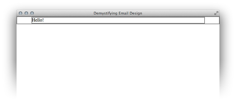
Now place a centered table of 600 pixels wide inside the container table. 600 pixels is a safe maximum width for your emails to display comfortably within most desktop and webmail clients on most screen resolutions.
Set this width using HTML instead of CSS, by using the width attribute.
“Style text elements with style=”margin: 0;”. This resets the spacing around them to make it more predictable”
We’ll replace our little ‘Hello!’ greeting with this table. Style text elements with style=”margin: 0;”. This resets the spacing around them to make it more predictable:
<table align="center" border="1" cellpadding="0" cellspacing="0" width="600" style="border-collapse: collapse;">
    <tr>
		<td>
			<p style="margin: 0;">Hello!</p>
		</td>
	</tr>
</table>
We’ve also added an inline style property that sets the border-collapse property to collapse. If we don’t do this, newer versions of Outlook will add a small space between our table and our border.
3. Create the HTML Email Template Structure and Header
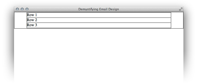
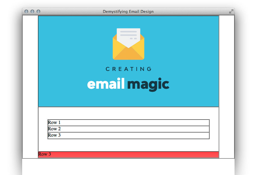
In our design we can see that the email is divided into three logical sections, so we’ll create a row for each.
Let’s duplicate the single row we already made so that we have three in total. I’ve changed the text inside them so that we can easily identify each row.
<table align="center" border="1" cellpadding="0" cellspacing="0" width="600" style="border-collapse: collapse;">
    <tr>
		<td>
			<p style="margin: 0;">Row 1</p>
		</td>
	</tr>
	<tr>
		<td>
			<p style="margin: 0;">Row 2</p>
		</td>
	</tr>
	<tr>
		<td>
			<p style="margin: 0;">Row 3</p>
		</td>
	</tr>
</table>
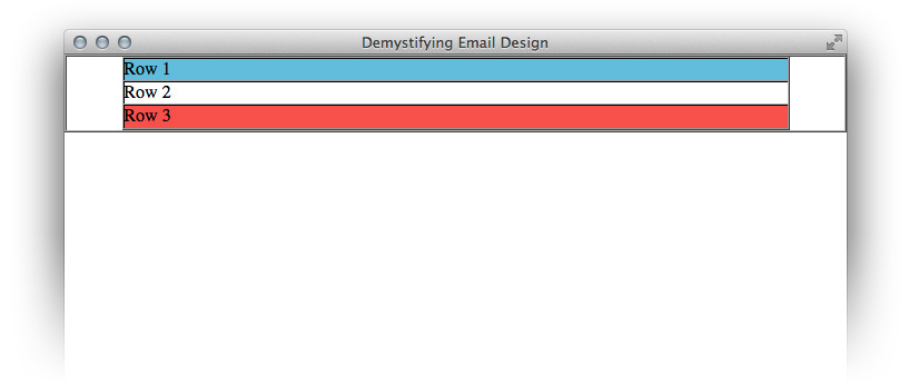
Now we’ll colour them according to the design. As bgcolor is a valid HTML attribute, we’ll use that to set the background color instead of CSS. Always remember to use the full six characters of a hexadecimal code, as three character shorthand won’t always work.
<table align="center" border="1" cellpadding="0" cellspacing="0" width="600" style="border-collapse: collapse;">
    <tr>
		<td bgcolor="#70bbd9">
			<p style="margin: 0;">Row 1</p>
		</td>
	</tr>
	<tr>
		<td bgcolor="#ffffff">
			<p style="margin: 0;">Row 2</p>
		</td>
	</tr>
	<tr>
		<td bgcolor="#ee4c50">
			<p style="margin: 0;">Row 3</p>
		</td>
	</tr>
</table>
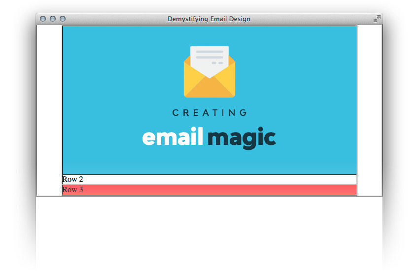
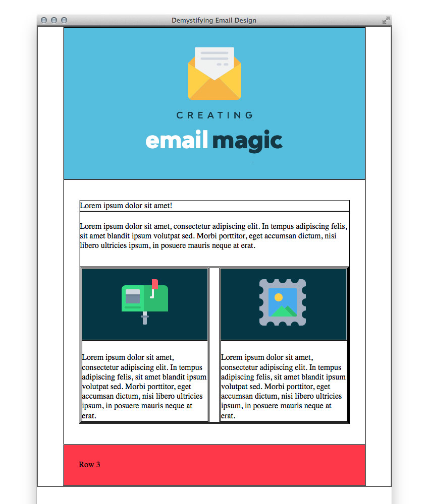
Ok, next up we’re going to focus on Row 1. We want to adjust the padding on the cell and then insert our image.
Using Padding
When using padding in email, you can either specify every single value (top, right, bottom and left), or if the top and bottom values, or the left and right values, are the same, you can specify padding in pairs, i.e. padding: 10px 20px;. If they’re not the same values, you can also use shorthand, i.e. padding: 10px 10px 8px 5px;, but if you are having trouble you may wish to write it out longform, i.e. padding-top: 10px; padding-right: 10px; padding-bottom: 8px; padding-left: 5px;.
If you are having even greater trouble with padding (for example, if your send platform is stripping out your CSS), don’t use it at all. Simply use empty cells to create space. There is no need to use spacer GIFs, just make sure you add style="line-height: 0; font-size: 0;" to the cell, place an inside and give it an explicit height or width. Here is an example:
<tr><td style="font-size: 0; line-height: 0;" height="10"> </td></tr>
Next, we’ll use some inline CSS to add padding to the cell. Then we’ll insert our image, adding alternative text, and adding style="display: block;" which is a common fix that stops some email clients adding gaps underneath your images. We’ll center the image by adding align="center" to our <td> tag. We’ll also add an alt attribute which is important for when our email is being read by screen readers, and when its images aren’t displaying. And that’s our HTML header done!
Note: If any part of your emails content is really important to its message, don’t use an image for it. Remember, images are blocked by default on most email clients, so if there’s an aspect of your email that is crucial, never create it as an image. In this example, however, my header is pretty superfluous.
<td align="center" bgcolor="#70bbd9" style="padding: 40px 0 30px 0;">
    <img src="http://webdesign.tutsplus.com/images/h1.gif" alt="Creating Email Magic." width="300" height="230" style="display: block;" />
</td>
4. Create the Content Area
First off, we’ll add some padding to the middle cell so that the table inside has some space around it, as per our design.
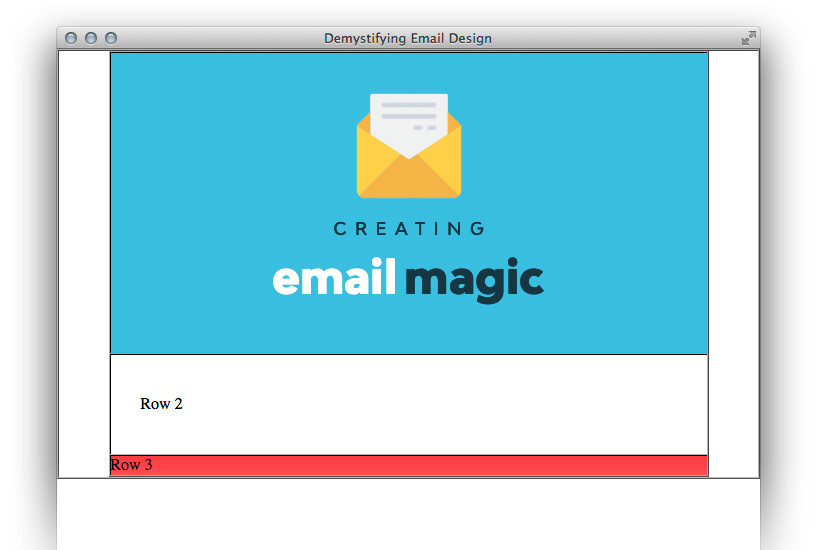
Now we’ll add a table with three rows for our main content – one for the headline, one for the introductory text, and one for the row with two columns. We’ll set the width of this table to 100% rather than using a pixel value because this will help us further down the track if we want to make our email responsive.
If you always have pixel widths on everything, you can end up with a lot of values to override with media queries. If your nested table widths are based on percentages, then when you adjust the width of the parent element, everything will adapt accordingly.
<td bgcolor="#ffffff" style="padding: 40px 30px 40px 30px;">
    <table border="1" cellpadding="0" cellspacing="0" width="100%" style="border-collapse: collapse;">
		<tr>
			<td>
				<p style="margin: 0;">Row 1</p>
			</td>
		</tr>
		<tr>
			<td>
				<p style="margin: 0;">Row 2</p>
			</td>
		</tr>
		<tr>
			<td>
				<p style="margin: 0;">Row 3</p>
			</td>
		</tr>
	</table>
</td>
Now we’ll add in our content, and add some padding to the middle cell.
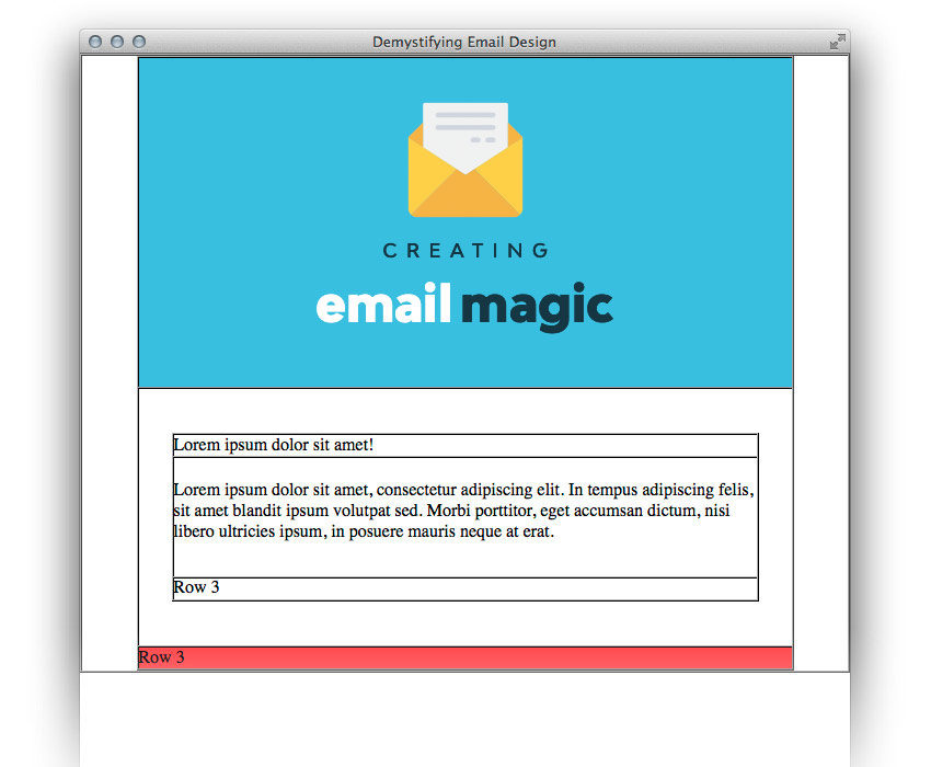
<table border="1" cellpadding="0" cellspacing="0" width="100%" style="border-collapse: collapse;">
    <tr>
		<td>
			<p style="margin: 0;">Lorem ipsum dolor sit amet!</p>
		</td>
	</tr>
	<tr>
		<td style="padding: 20px 0 30px 0;">
			<p style="margin: 0;">Lorem ipsum dolor sit amet, consectetur adipiscing elit. In tempus adipiscing felis, sit amet blandit ipsum volutpat sed. Morbi porttitor, eget accumsan dictum, nisi libero ultricies ipsum, in posuere mauris neque at erat.</p>
		</td>
	</tr>
	<tr>
		<td>
			<p style="margin: 0;">Row 3</p>
		</td>
	</tr>
</table>
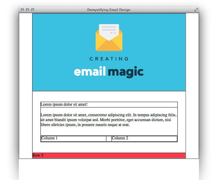
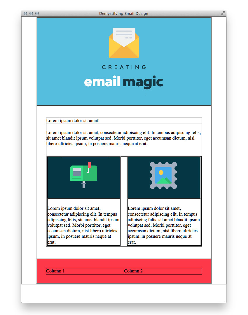
Now we’re going to add our two columns of content to Row 3. Because we want a ‘margin’ in between these two cells, but margin isn’t supported, we’ll create a three-column table with an empty cell between the two outer columns.
As much as I like to stick to percentages, when you have content that is a specific size, it can be tricky to convert it to a percentage (in this example, the columns would be 48.1% which could become confusing). For this reason, since our two images are 260px wide, we’ll create columns that are also 260px wide, with a 20px margin cell in the middle. (This will total 540px, which is the 600px width of our table minus the padding of 30px on either side.) Be sure to zero your font-size and line-height and add a non-breaking space character in the margin cell.
We’ll also set the valign to top for both cells so that they will vertically align to the top, even if one column has more text than the other. The default vertical alignment is middle.
<table border="1" cellpadding="0" cellspacing="0" width="100%" style="border-collapse: collapse;">
<tr>
<td width="260" valign="top">
<p style="margin: 0;">Column 1</p>
</td>
<td style="font-size: 0; line-height: 0;" width="20"> </td>
<td width="260" valign="top">
<p style="margin: 0;">Column 2</p>
</td>
</tr>
</table>
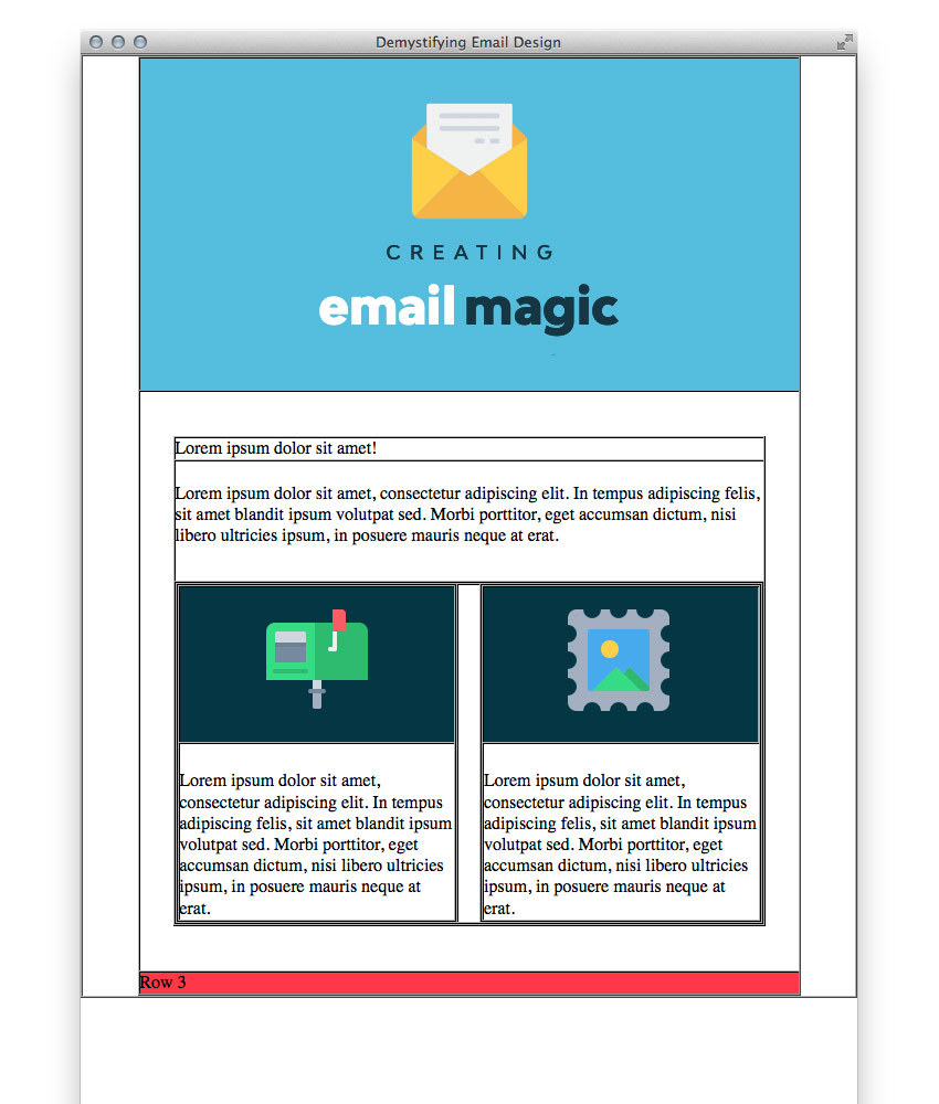
Now let’s add our images and content to those columns. As we need multiple rows, we’ll nest yet another table because we can’t use any colspan or rowspan tags. We’ll also add some padding in between the image and copy in each column.
<table border="1" cellpadding="0" cellspacing="0" width="100%" style="border-collapse: collapse;">
<tr>
<td width="260" valign="top">
<table border="1" cellpadding="0" cellspacing="0" width="100%" style="border-collapse: collapse;">
<tr>
<td>
<img src="http://webdesign.tutsplus.com/images/left.gif" alt="" width="100%" height="140" style="display: block;" />
</td>
</tr>
<tr>
<td style="padding: 25px 0 0 0;">
<p style="margin: 0;">Lorem ipsum dolor sit amet, consectetur adipiscing elit. In tempus adipiscing felis, sit amet blandit ipsum volutpat sed. Morbi porttitor, eget accumsan dictum, nisi libero ultricies ipsum, in posuere mauris neque at erat.</p>
</td>
</tr>
</table>
</td>
<td style="font-size: 0; line-height: 0;" width="20"> </td>
<td width="260" valign="top">
<table border="1" cellpadding="0" cellspacing="0" width="100%" style="border-collapse: collapse;">
<tr>
<td>
<img src="images/right.gif" alt="" width="100%" height="140" style="display: block;" />
</td>
</tr>
<tr>
<td style="padding: 25px 0 0 0;">
<p style="margin: 0;">Lorem ipsum dolor sit amet, consectetur adipiscing elit. In tempus adipiscing felis, sit amet blandit ipsum volutpat sed. Morbi porttitor, eget accumsan dictum, nisi libero ultricies ipsum, in posuere mauris neque at erat.</p>
</td>
</tr>
</table>
</td>
</tr>
</table>
Here we’ve set the width of the images using HTML at 100% of the column width. This, again, is so that if we make this email responsive, we only have to use media queries to change the width of the parent element.
We’ll have to override the height in pixels because using style="height: auto" now won’t work in everything (cough cough, Outlook). So we’ll set it using pixels. This means we’d have to set height: auto!important on those images using media queries to override the pixel value, but we could do that with a single class. As we set the width as a percentage, we won’t need to override that. The fewer things to override, the better.
5. Style the Email Template Footer
Now we’ll add our padding to the footer row.
<td bgcolor="#ee4c50" style="padding: 30px 30px;">
    <p style="margin: 0;">Row 3</p>
</td>
Inside that cell, we’ll nest another table to get our two columns.
<table border="1" cellpadding="0" cellspacing="0" width="100%" style="border-collapse: collapse;">
    <tr>
		<td>
			<p style="margin: 0;">Column 1</p>
		</td>
		<td>
			<p style="margin: 0;">Column 2</p>
		</td>
	</tr>
</table>
We’ll create another little table for our social media icons. We’ll set its parent cell to align="right". Make sure you set border="0" on these image links (to avoid a blue link border) and don’t forget display: block.
<td align="right">
<table border="0" cellpadding="0" cellspacing="0" style="border-collapse: collapse;">
<tr>
<td>
<a href="http://www.twitter.com/">
<img src="http://webdesign.tutsplus.com/images/tw.gif" alt="Twitter." width="38" height="38" style="display: block;" border="0" />
</a>
</td>
<td style="font-size: 0; line-height: 0;" width="20"> </td>
<td>
<a href="http://www.twitter.com/">
<img src="images/fb.gif" alt="Facebook." width="38" height="38" style="display: block;" border="0" />
</a>
</td>
</tr>
</table>
</td>
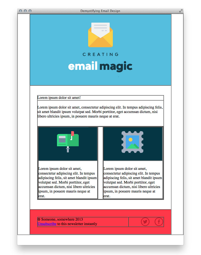
Now we’ll add our text and add a width to our cells, just to be safe, even though there is a lot of white space between them. We’ll set this cell to 75% and the other to 25%.
<td width="75%">
<p style="margin: 0;">® Someone, somewhere 2025<br/>
Unsubscribe to this newsletter instantly.
</td>
And there we have it; our HTML email template layout is complete!
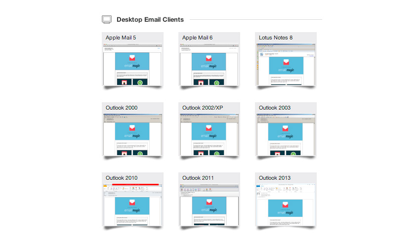
6. Run Litmus Test
As we’ve mentioned many times, HTML in email is a minefield. Let’s run this through Litmus to make sure nothing is bad or broken, and the structure of the email looks great. Here’s a summary of my test:
7. Style the Text
Our first row is the headline. We’ll create it using the <h1> tag, and add its font-size style inline.
<td style="color: #153643; font-family: Arial, sans-serif;">
    <h1 style="font-size: 24px; margin: 0;">Lorem ipsum dolor sit amet!</h1>
</td>
We’ll also add this inline style to all the other cells of text:
style="color: #153643; font-family: Arial, sans-serif; font-size: 16px; line-height: 24px;"
Next we need to style the footer text, and we’ll also tidy up our unsubscribe link. We’ll style our unsubscribe link using CSS.
<td style="color: #ffffff; font-family: Arial, sans-serif; font-size: 14px;">
<p style="margin: 0;">® Someone, somewhere 2013<br/>
<a href="#" style="color: #ffffff;">Unsubscribe</a> to this newsletter instantly</p>
</td>
Then we’ll add in some CSS into the <head> of our email, to prevent the unsubscribe link appearing blue on Apple devices.
<style type="text/css">
    a[x-apple-data-detectors] {color: inherit !important;}
</style>
And there we have it! Everything is in. Time to turn off the borders and see it looking beautiful. Go through and replace every occurrence of border="1" with border="0".
At this point, it’s looking a little sad floating in white space, so let’s go up to our first 600px wide table and add:
style="border: 1px solid #cccccc;"
Now it doesn’t look like it’s floating anymore. As a final touch, I’m going to add 30px of padding to the bottom of the very first cell, to prevent our email from stopping abruptly at the bottom in some webmail clients (like Apple Mail), and 10px of padding at the top, so that our blue header has a little bit of breathing room.
<td style="padding: 20px 0 30px 0;">
And that’s it! You’re all ready for a final test with Litmus, or Email on Acid.
You’ve Created a Simple HTML Email!
Before we call it a day, if you have used any comments in your markup, get rid of them. Some email clients can choke on comments so it’s wisest not to have any unnecessary code anywhere in your files.
Now is a good time to do a final test, and then, your HTML email is ready to send!
Download Email Templates
If you need more options, then one of our responsive email templates may be just what you need. Subscribe to Envato Elements and you’ll be given unlimited access to hundreds of customizable email templates, as well as stock photography, icons, graphics, and many other creative assets for your projects.
 Campaign Monitor18 Great Campaign Monitor Templates for Email and Newsletters
-
MailChimpBest Mailchimp Templates to Level Up Your Business Email Newsletter 2020
-
MailChimpMastering MailChimp: Best Templates and Email Tips for MailChimp Newsletters
-
MailChimp20+ Best Responsive Mailchimp Templates for Mobile Email
-
MailChimp22+ MailChimp Templates for Every Purpose and Occasion


Learn More About HTML Email
To take what you’ve learned to the next level! Check out our Mastering HTML Email learning guide for more tutorials on HTML email templates, email design, coding responsive email, accessibility, marketing, transactional email, email service providers (ESPs), development workflow tips, and more!
-
EmailWhat You Should Know About HTML Email
-
EmailThe Complete Guide to Designing for Email
-
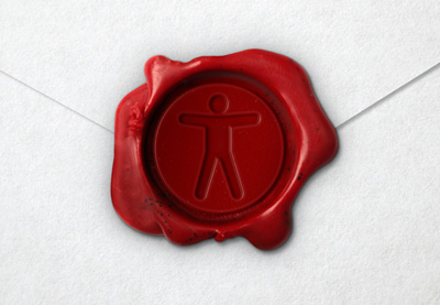
AccessibilityA Beginner’s Guide to Email Accessibility (Checklist + Resources)
-
EmailCreating a Future-Proof Responsive Email Without Media Queries
-
Email DesignHow to Formulate an Email Design and Development Strategy
-
Email MarketingHow to Boost Email Conversions With Personalization and Dynamic Content
-
Email DesignDesign Considerations for Multiple Email Clients and Devices


