Drop caps are a form of decoration sometimes used at the beginning of a block of text; the initial letter running several lines deep and indenting the body text within these lines.
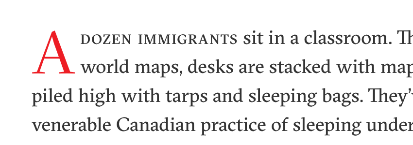
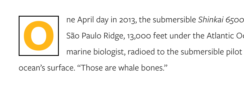
It’s a typographic tradition as old as the history of typesetting itself, and these days we can emulate it with CSS using the ::first-letter pseudo element. Styling that first letter, however, is notoriously clumsy, but the proposed initial-letter property aims to fix that. Let’s examine what it is, what we can do with it, and what we can expect in the future.
The Current Approach
Let’s begin with a demo; a paragraph of text.
Now we target the first character in that paragraph using the ::first-letter pseudo element. The current styling approach would be to float that character with p::first-letter { float: left; }, pulling it out of the flow within the paragraph, and then to size it accordingly:
This isn’t bad, and can be further tweaked with line-height, positioning and so on. It’s also very well supported. But it’s certainly not perfect; to properly enjoy what drop caps can give us we need more precise control, and flexibility.
A New Solution
The initial-letter property, currently being discussed as an Editor’s Draft by the W3C (about as early on in the standardising process as it’s possible to be), aims to give us the precise typographic control we want. It’s used in combination with first-letter.
The first value it takes determines the size of the initial letter, in terms of how many lines it occupies.
p::first-letter {
  initial-letter: 3;
}
Here’s what that looks like:
Caveats
Sorry, stop right there. Support for this is still very poor. At the time of writing, the demo above will only display correctly if you’re using Safari OS X, or an iOS browser, and only because we’re using the prefixed webkit syntax: -webkit-initial-letter: 3;
Here are some screenshots if you can’t see what I’m seeing:
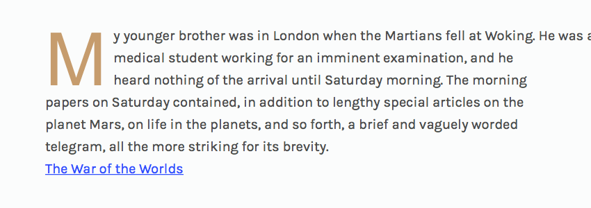
The first thing you might notice is the different fonts. No browsers seem to play nicely with initial-letter and web fonts. Any fonts installed on your system work fine, though they must be explicitly declared; using a general serif or sans-serif; at the end of the font stack doesn’t appear to have any impact. You’ll need something like font-family: "my web font", arial; to beat the browser fallback.
The second thing you’ll see is the top line of text shooting off the right of the page. This is a bug, so for the time being we’ll need a workaround. Happily, it’s possible by forcing the boundaries of the initial letter beyond the top of the containing paragraph (thus making the browser understand that the top line shouldn’t equal the width of the whole container). A nice big margin-top value will sort things out:
Second Value
Okay, let’s carry on. The second value initial-letter accepts is optional. It determines by how many lines the letter sinks in, for example:
p::first-letter {
  initial-letter: 3 2;
}
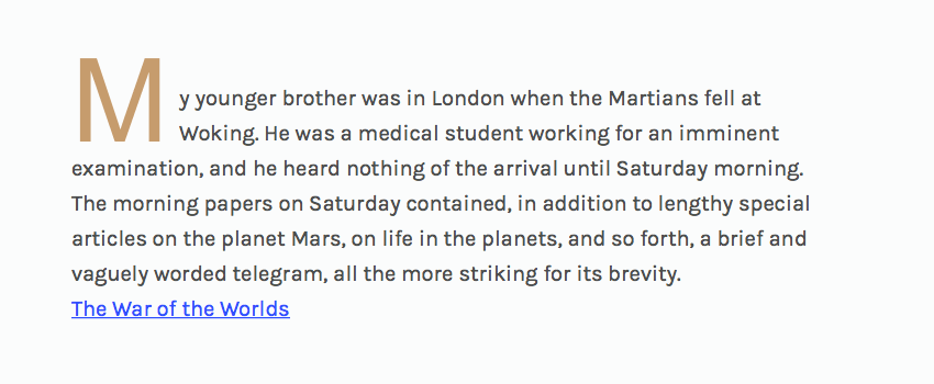
Here we’ve declared that the letter is three lines deep, but sinks just two.
This is known as a “sunken initial”, rather than a true “drop cap”. Again, here’s a screenshot if you’re not seeing the desired result:
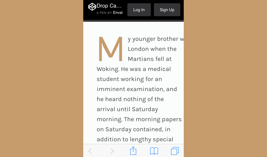
Going Responsive
Big drop caps can look fantastic, but on a narrow viewport you should consider drop caps to be a part of your responsive typography. You’ll likely have smaller body copy on small screens, so consider using a proportionate drop cap too.
/* set base paragraph styles */
p {
    font-size: 1em;
}

/* set base drop cap styles */
p::first-letter {
    initial-letter: 2;

    color: #c69c6d;
    margin: 1em .2em 0 0;
}

/* mobile first media query */
@media only screen and (min-width: 800px) {

    /* set paragraph styles for larger screens */
    p {
        font-size: 1.25em;
    }

    /* set drop cap styles for larger screens */
    p::first-letter {
        initial-letter: 3 2;
        margin: 1em .5em 0 0;
    }

}

Fallback
If you’re looking at these demos in an unsupported browser, you might wonder how best to avoid the absurd-looking result:
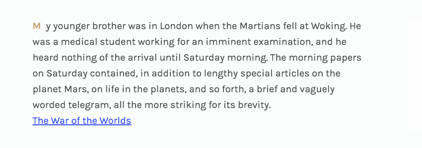
We’re getting all the styling except the stuff which makes the letter actually behave like a drop cap. Using CSS feature queries you can apply your styles selectively. Wrap your drop cap styles in a @supports condition like this:
@supports (initial-letter: 1) or (-webkit-initial-letter: 1) {

 /* your initial-letter styles here */

}
If initial-letter is supported, the styles will be applied–if not, they won’t.
Note: not even CSS feature queries have universal support, so take this with a pinch of salt. Modernizr would be a safer bet.
Taking things further, you may even want to apply the dropcap.js JavaScript polyfill by Adobe, but we won’t be covering that here; Dudley Storey does a great job of that over on his blog.
Conclusion
It’s very early days, but initial-letter shows great promise. Keep an eye out for further properties such as initial-letter-align, which will help with non-roman alphabets, and initial-letter-wrap which will allow more tightly-fitting surrounding text.
The demos used here are very functional, but imagine the doors to decorative typography this could open up! In principle we’ll be free to use many familiar properties on the initial letter, including:
- All familiar font properties
- Color and opacity
- Text-shadow and other text decoration
- Transform properties
- and how about some
background-clipaction?
For updates on its progress your best bet is to follow @jensimmons (she’s all over this stuff).