Let’s get the basic stuff out of the way first. Whitespace isn’t simply a block of space in your design that has to be white. Instead, think of it more like structural “empty” space, where no extra elements, embellishments or other parts to your design are placed.

Essentially, whitespace is “unused” space, though I think that can be a bad term for it. Although whitespace may look unused, it does actually serve a very useful purpose in your designs and, in fact, works very hard. Whitespace is valuable to any design, allowing your design to breathe and offering greater balance to your designs.
After all, what defines the presence of a block, if not the whitespace around it?!
Micro & Macro Whitespace
If you want to drill down even further, we can define other types of whitespace: micro and macro.
Micro Whitespace
Micro whitespace is what you’d expect – all of the tiny, little parts of your design that are devoid of any elements. This can be the little bits of space between each letter in a word, or between each line of words.
Macro Whitespace
Macro whitespace refers to the larger bits of space you’ll find in your design – between main blocks of content, elements or modules. For example, you might find blocks of macro whitespace between a header and your next block of content, or between one chunk of text to another.
Why Should We Care About Whitespace?
Imagine you’re browsing a website and, everywhere you look, you’re unsure if you’ve found what it was you were looking for. That, and it’s also hard to read; the text is cramped, it’s too close to the next block of text and there’s no sensible divider (or even just enough space) to differentiate between the blocks. It’s annoying, isn’t it?

In all likelihood, the users of the websites you design will feel the same way. If anything, they’ll be less patient than you are; we understand that it takes time, talent and a lot of knowledge to create a good website, but most users don’t care and will often just expect a good website, a good experience, and be frustrated when they don’t receive that.
When you’re looking at any composition trick or layout option, whitespace is one of those things that should always be at the forefront of your mind. Allowing all of the main elements in our site chance to breathe gives a better balance to a website, also allowing us to place more trust in our hierarchy to direct our users where we want them to go, leading them on their journey through using the website.
Advantages of Whitespace
We should know by now that having more whitespace in our designs gives every different item on the page more breathing room. This creates balance, as it means we can lend more weight to the elements that we want to focus on.

In-keeping with our hierarchy, whitespace can also help guide our users around the website properly and as we intend them to. With more space around our elements, we can also hope to speed up interactions between our user and the website. This means that our users should be able to find what they are looking for as quickly as possible, only helping to improve their experience on your website.
How to Use Whitespace in Your Designs
Understanding that whitespace is good for your designs is one thing, but you need to know how to put it into practice.
KISS (Keep It Simple, Stupid)
I always wish I could call that bit “KIS”, as I hate calling people stupid! However, it’s true; keep everything simple. Often, there’s no need to complicate your design by stuffing bits of information in every nook and cranny. What you want to do instead is use all of your other compositional techniques (whitespace, colour, size, typography, etc) to draw attention to the areas in your design that need that extra bit of focus.
Keeping your design simple doesn’t only help to make your life as a designer and a developer easier, but it makes things easier for your users too. Keep things simple by stripping out absolutely anything that isn’t necessary or important, or that the user doesn’t need to know.
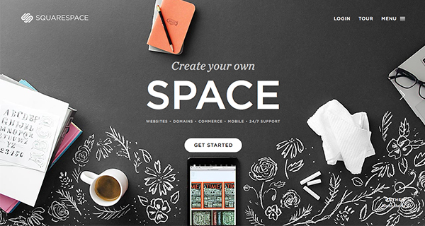
This doesn’t mean that you end up with a silly amount of completely empty space, where no parts of your design seem to have any relationship with each other. Instead, use the space that you have cleverly, and improve the usability of your design through spacing that is consistent and ensures that your design is clear and easy to understand and follow.


Up Next…
Having introduced the fundamentals of composition, and talked a little about whitespace, our next section will take things further by looking into building consistency and relationships into our designs.
