There is a lot to learn as a web developer. For starters, the syntax of HTML, CSS and JavaScript, and how these fundamental web languages work together.
However, on top of that you need to learn how to code well: how to use the web technologies like a professional, to create efficient, maintainable, and scalable apps and web sites.
In this post, I’ll share 30 tips for best practices when you’re coding you webpages or web apps.
Top 10 HTML Best Practices
1. Always Declare DOCTYPE
The DOCTYPE is one of the first few parameters a browser looks for. By definition, it tells the browser, the version of the HTML document.If any other markup language is used, the DOCTYPE would tell about it. Hence, the browser uses the DOCTYPE to understand how the entire document needs to interpreted.
So, what would happen if you don’t have DOCTYPE in your HTML code? The browser will function in Quirk state. It will consider the HTML code as a piece written in the late 90s. As a result, bugs in older browsers will start to imitate. Of course, the browser will do its best to parse the HTML document. However, not all elements in your code will be displayed accurately.
The Quirk Mode is a method used by certain browsers for maintaining backward compatibility. It helps in opening webpages that are written in older standards. In Standard Modes, the code needs to comply with W3C and IETF standards.
With the launch of HTML5 everything became much simpler. You need to add the following line, before the <html> tag.
<!DOCTYPE html>
2. Only One H1 Tag for a Page
Have you been to Twitter lately? if you pay close attention, you’d realise that the H1 Tag is used as a logo, instead of a title. This is not uncommon. However, if you are building a single page application, or a blog, you should save the H1 tag for the title. H1 should be used to describe your page. When you include multiple H1 tags in a single page, the overall search engine scores will be affected. The W3C Specification advises developers to use only a single H1 tag per page.
3. Images Need the alt Attribute
It is easy to forget to use the alt attribute within image tags. However, the alt attribute plays a crucial role in validation and accessibility. By definition. the alt tag gives an alternate text for the image in your page. If the image does not get loaded, the alt text will be shown. Search engine scores will be affected, if you don’t use the alt tag in your images. As a result, your page will secure a lower rank. Not only that, but your page will be less accessible to those with screen readers.
<!-- BAD APPROACH -->
<IMG SRC="http://code.tutsplus.com/cornImage.jpg" />

<!-- GOOD APPROACH -->
<img src="http://code.tutsplus.com/cornImage.jpg" alt="A corn field I visited." />
4. Validate your HTML
Validating HTML will help in picking wrongly written code, and defects. There are a couple of validators available on the web to help. W3C supplies one of most widely used HTML validators.
5. Use Semantic Elements
HTML semantic elements are used to create webpages with structure. When you assemble a webpage, it would be ideal to use semantic elements, instead of organizing everything into <div>s. For example, avoid the use of <div> to build headers and footers. Instead, make use of the semantic elements <header> and <footer> instead. The <header> semantic element helps in showing the starting of a webpage. On the other hand, the <footer> is a spot for showing navigation links and copyright content.
<!-- BAD APPROACH -->
<div id="header">
<a href="home.html">Home</a>
</div>

<div id="footer">
<a href="copyright.html">Home</a>
</div>

<!-- GOOD APPROACH -->
<header>
<a href="home.html">Home</a>
</header>

<footer>
<a href="copyright.html">Home</a>
</footer>
Other semantic tags include <article> and <nav>.
6. Always use Descriptive Meta Tags
Meta tags consist of two attributes: the descriptive meta attribute and keyword meta attribute. This tag is used by search engines to understand page content and connect searchers with content they are looking for. Search engine spiders get lot of meaningful information about the webpage from meta tags.
The descriptive meta attribute is used to summarise the contents and purpose of the webpage. It has to be concise and relevant. Never spam the descriptive meta attribute with repeated phrases. Modern search engines are smart enough to identify this trick.
<meta name="description" content="30 best practices for web development" />
The keyword meta attribute is a collection of keywords that best describe the page. It can be used to categorise the webpage.
<meta name="keywords" content="code, html, web development" />
7. Close All Your Tags
HTML is a very forgiving language. Browsers are capable of rendering pages even when there are syntax errors. However these errors—for example not closing your tags—can make your browser run in Quirks mode. That means your content might not render the way you expect.
Unclosed tags are bad coding practice. According to the W3C specification, all tags must be closed.
<!-- BAD APPROACH -->
<li>Some text here.
<li>Some new text here.
<li>You get the idea.

<!-- GOOD APPROACH -->
<ul>
  <li>Some text here. </li>
  <li>Some new text here. </li>
  <li>You get the idea. </li>
</ul>
8. Separate IE Fixes
It is important to build a webpage that works on all browsers. But, one of the trickiest browsers to develop for is Internet Explorer. If you are having issues with IE, then you need to build modular code with adequate comments.
For example, in the below piece of code, only the .css file has to be modified to adapt to the IE version.
<!-- IE 7 Fixes -->
<!--[if IE 7]> <link rel="stylesheet" href="css/ie-7.css" media="all"> <![endif]-->
<!-- IE 6 Fixes -->
<!--[if IE 6]> <link rel="stylesheet" href="css/ie-6.css" media="all"> <script type="text/javascript" src="http://code.tutsplus.com/js/hello-min.js"></script> <script type="text/javascript"> hello.fix('#logo'); </script> <![endif]-->
Mixing IE compatibility fixes with the rest of your code is asking for trouble. Your code will be harder to maintain and understand.
9. Avoid Too Many Comments
This isn’t advice you’ll hear too often in development!
Unlike other languages, HTML is self-explanatory. If you use the right semantic elements, and naming conventions, you don’t need to add too many comments. In case you are forced to enter many comments, you should revisit your code.
10. Lowercase Markup and Indentation
Finally, in HTML you should stick to lowercase characters. Here, we are not dealing with code standardisation. Instead, our primary focus is code readability, which translates to better maintainability and readibility. In addition to lowercase markup, the code has to be well-indented.
<!--BAD APPROACH-->
<DIV>
<IMG SRC="http://code.tutsplus.com/./home.jpg" alt="home"/>
<A HREF="#" TITLE="ABOUT">about</A>
<P>30 Best HTML Practice!</P>
</DIV>

<!--GOOD APPROACH-->
<div id="home">
   <img src="http://code.tutsplus.com/./home.jpg" alt="home" />
   <a href="#" title="About">About</a>
   <p>30 Best HTML Practice!</p>
</div>
Top 10 CSS Best Practices
1. Avoid Importing Many Stylesheets
Heard of critical rendering path? The moment a response is sent from the server to the browser, the browser starts to paint the page. It always has the DOM to build. But, if your code is loaded with many imported CSS files, the overall time required to build the page increases. This is because the browser builds a CSSOM (CSS Object Model) for the CSS in your HTML page. Until the CSSOM of the page is constructed, the browser will not render the page. This is why CSS is considered as a render blocking resource.
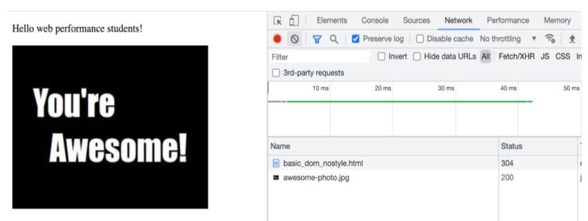
Here is a simple example to demonstrate the effect of imported CSS in a simple piece of HTML code, which displays some text and an image. As you can see, the entire page took only around 40ms to be displayed. Even with an image, the time taken for the page to be displayed was less. This is because images are not treated as critical resources, when it comes to making the first paint. Remember, the critical rendering path is all about HTML, CSS and JavaScript. Even though we must try and get the images displayed as quickly as possible, they are not going to block the initial rendering.


Now, let’s add CSS to the piece of code.


As you can see, an extra request is being fired. Even though the time taken for the HTML file to load is less, the overall time for processing and displaying the page has increased nearly tenfold. Plain HTML doesn’t involve much fetching and parsing. But, with a CSS file, first the HTML has to be fetched, then the CSS file has to be fetched, then the CSSOM (as given above) has to be constructed. Both the HTML DOM and the CSS CSSOM have to be built. This is definitely a time consuming process.
2. Avoid Inline Styles
This is a golden rule for all developers. Try to avoid the use of inline styles, as much as possible. It can be extremely tempting to introduce inline styles now and then. But though it appears harmless, it is a poor separation of concerns and will be seen as an error in your coding practice.
/* BAD APPROACH */
<p style="color: red;">I'm going to make this text red so that it really stands out and makes people take notice! </p>

/* GOOD APPROACH */
#someElement > p {
  color: red;
}
3. Use Inline CSS for Critical Elements
We just read that inline styles have to be avoided. Now, let us understand when Inline CSS is actually essential. Always place CSS required by the browser to complete the first paint on the top. This tells the browser what it needs for rendering the page quickly. So, inlining critical CSS helps the browser complete DOM and CSSOM rendering as quickly as possible.
Critical CSS is defined as the minimum collection of styling required by the page, when a user first lands on it.
4. CSS Preprocessors
CSS Preprocessors are built with many utilities and tools for modularising, avoiding repetition and organising CSS. Three commonly used CSS preprocessors would be LESS, SASS and Stylus. The best thing about these CSS preprocessors is that a new way of styling is not introduced. Instead, you get basic CSS with more features, and more expressive syntax.
5. Stick to a CSS Methodology
Choosing the right CSS methodology for your project will help with maintenance and scaling. There are three CSS methodologies I can recommend: BEM, ITCSS and OOCSS.
BEM is also known as Block, Element, Modifier methodology.
- block represents a standalone entity or component with it’s own meaning
- element is not a standalone component, but a sub-entity of the block
- modifier is used to represent flags, states and appearance of the elements
.block { }
.block--element { }
.block--modifier { }
ITCSS is inverted triangle CSS where files are organised based on specificities. As you go deeper in the triangle, you will become more specific.
OOCSS is Object-Oriented CSS where you separate the view and the structure.
/* Instead of  */
.container {
    width: 50px;
    height: 50px;
    padding: 5px;
    border: 2px solid #FFF;
    box-shadow: 1px 2px 5px #FFF;
    border-radius: 2px;
}

/* Do */
.container {
    width: 50px;
    height: 50px;
    padding: 5px;
}

.border_style {
    border: 2px solid #FFF;
    box-shadow: 1px 2px 5px #FFF;
    border-radius: 2px;
}
6. Use media
If your page has to load on both web, and mobile you should make use of media queries. Also, it would be wise to begin with mobile-first CSS. This is widely known as progressive enhancement.
/* Mobile-first media query, for media above 600px*/
@media (min-width: 600px) {
    /* your CSS rules */
}

/* Non mobile-first media query, for smaller screens */
@media (max-width: 600px) {
    /* your CSS rules */
}
7. Compress CSS
Compressing CSS gets rid of whitespaces, and even comments. This reduces the overall size of bundles. And, reduces the time taken for the browser to complete its first paint. There are a couple of interesting tools for compressing CSS. Here are three to begin with:
8. Avoid !important
Have you heard about CSS specificity? If you are forced to use !important, there is a serious issue with your CSS order or hierarchy. You could be playing around with inline styles. Or, you could have become extremely specific with the selectors. Or, you might be overriding styles from a 3rd party library. If that is the case, you should learn more about CSS specificity, and even try to get rid of 3rd party libraries to begin with.
Specificity is a technique used by browsers to identify the right CSS property for an element. The final outcome depends on the rules created in the code for the selectors.
9. Beware of Heavy CSS Properties
Modern browsers are definitely fast. However, if your website is complicated, even the town’s fastest browser will take some time. Widely used expensive CSS properties are: filter, border-radius, and box-shadow. In fact, width and height are relatively expensive if you perform animations, and constantly change these values. Why? Every time you change these values, the browser needs to recalculate the layout and repaint. Every nested child in the view will be affected by these recalculations. This is why you should be careful when you use these expensive properties.
10. Use Shorthands
Last but certainly not least, make use of shorthands. Commonly used properties like border, padding, margin and background have shorthand properties. Using shorthand will let you style HTML markup in a more concise manner.
By definition, a CSS shorthand is a collection of CSS properties. You will be able to set a update the value of multiple related properties in a single line, simultaneously.
Top 10 JavaScript Best Practices
1. Position of the script Tag
Most of the time, developers place their scripts at the end of the entire document. Technically, the script tag has to be present in the head. A primary reason why it is placed at the bottom, is to delay download and execution. The browser always reads and interprets a document line by line. When it sees a script in the head, the DOM will not be rendered until the script is fetched and parsed. This could be a long delay for large JavaScript files. Hence, moving to the bottom makes sense. But, there are better ways of loading the script:
Preloading
This is used when the file is important and rendering should wait until the file is loaded. The browser will download the resource and execution will happen the moment the resource is available.
<link rel="preload" href="http://code.tutsplus.com/main.js" as="script">
Deferred Loading
When you use defer, the JavaScript resource will be downloaded while the HTML rendering happens. However, the will not happen as soon as the script is downloaded. Instead, it waits for the HTML file to be completely rendered.
<script src="http://code.tutsplus.com/main.js" defer></script>
Async Loading
When you use async, you will be allowing the browser to do something else, while a JavaScript resource gets sdownloaded
<script src="http://code.tutsplus.com/main.js" async></script>
2. No Inline Scripts
Inline scripts will make your code look bad. But, this is not the real problem. The problem is that inline scripting will increase the overall size of your HTML code. Try it out, inline your JavaScript. You will see the size of the code increases. Also inline scripts can never be cached. This way, your webpage will lose the whole concept of caching. When external scripts are cached, loading it for the second time becomes faster. By adding inline scripts, you can never leverage this feature found in most modern browsers.
So, keep your CSS in a dedicated CSS file and your JavaScript in a dedicated script file.
3. Minify the Script
When you publish your website, you need to minify your script to reduce the overall file size. If you look at any npm package, you will come across two versions. One is the complete sourcecode. The other version ends with .min.js—the minified version. This version will not have any comments, semicolons or even whitespace. All functions and variable names will be replaced with shorter ones. Here is a simple example, to help you understand minified JavaScript.
//What you Write
function displayPost(name){
    console.log("You are reading " +name);
}
displayPost("30 HTML Best Practices");

//What happens in minification
function displayPost(n){console.log("You are reading"+n)}displayPost("30 HTML Best Practices");
4. Avoid Browser Whims
Do you have the habit of writing for a specific browser? If yes, this practice needs to change. Writing code for a specific browser will definitely backfire one day. The code will soon become obsolete, and difficult to maintain. Going around the web, you will come across many scripts that stop working with newer browser releases. The effort and time invested in building a page for certain browsers will become void. So develop pages to web standards and test them across browsers. Never rely on a single platform.
5. A Plan B for JavaScript
A lot of users have turned JavaScript off in their browsers. For example, do you know that the NoScript Firefox Extension has 31 million downloads at time of writing? In addition to intentional disabling, many users are unable to load JavaScript due to external circumstances. These users have no control over factors like company-enforceed proxy servers, poor internet access and even overly-harsh firewalls. In such cases, you need to have a plan b.
Don’t forget to include a <noscript> section. In this section, give a message that the user will see, when JavaScript is not enabled.
<noscript>We are facing Script issues. Kindly enable JavaScript</noscript>
6. Think About Accessibility
Accessibility is never limited to CSS. There are a couple of cases where JavaScript can break accessibility. When you are designing a page, ensure that you use the right elements for the job. Also, content must be available to the user in the form of text. In a situation where you cannot control the markup, make use of WAI-ARIA to support the non-semantic JavaScript enabled widgets. And, enable the use of keyboard controls in your script. This will help non-mouse users.
WAI-ARIA is a technical specification which helps developers creates web pages that are highly accessible.
7. Unobtrusive Scripting
This is an interesting topic. Developers should always keep obtrusive scripting in mind. That means, the existing script should be enhanced with newer and better functionalities. However, the entire script should not be built from scratch. As confusing as it sounds, it is a wise coding practice to not reinvent the wheel. Basic functionalities of the page must function, with and without script. Great examples of obtrusive scripting would be:
- Build websites with client-side validation. Do you remember the point, where we stressed on constant validation of HTML? If a user is entering wrong data in the form, you must not wait for server responses. Instead, client-side validation would be adequate.
- Leverage the features of HTML5. This includes the use of custom controls like
<video>
8. Make Use of Browser Developer tools
This might be a no-brainer. But, sometimes we miss on the amazing features offered by the modern developer tools in our browsers. Whether it debugging a script, or a layout problem, browser developer tools can give lots of information. Also, debugging source code has become extremely simple and interesting with the newer Chromium based browsers.
9. Browser Supports
Browsers have evolved drastically in the past few years. But, that doesn’t mean you build solutions only for newer ones. New features in HTML, CSS and JavaScript might not be available across all browsers. Hence, you need to test compatibility, before using the framework’s newest release. For example, if you are planning to host a page that could be used by someone with an old browser, consider polyfills. Older browsers don’t support many new methods like Array.includes, Promise.allSettled and more. In any case, knowing which features are commonly available across modern browsers can be helpful. The Can I Use website is a great resource to help decide whether a feature is widely-enough available for use in your application.
10. Frameworks Come Last!
Last but certainly not the least, you need to master JavaScript concepts. There are many inspiring frameworks in the industry. But, all these frameworks would be meaningless without knowing JavaScript. Learning JavaScript will increase the chances of you using every framework to it’s best. So, don’t waste time on frameworks before learning to code in vanilla JavaScript and CSS!