Every good app developer constantly learns how to create the best apps avoiding the common pitfalls. How can you be up to date with the current methodologies and ensure that the app is bug free?
There are two ways to learn. One is from the experience of developing an app and the other from other developer’s mistakes. Obviously, the second way is much better. There are a few common mistakes that an app developer must know about in advance, and avoid them. Here are the ten mistakes that you need to avoid while designing an app.

1. Do not start without a flowmap
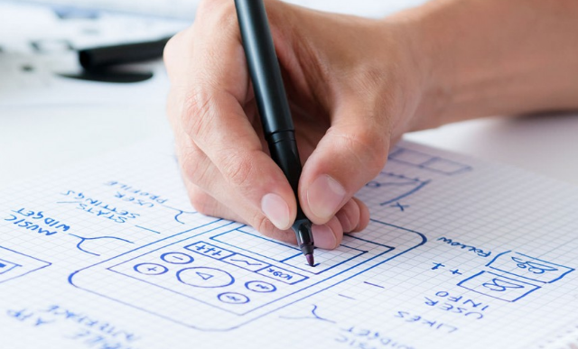
The idea alone is not enough to get started. You must have well thought out the flow to go with before you begin your designs and wireframes. Even with simple apps, you must consider flow map. Flow map ensures you have a direction for all your designing steps. It also gives you an idea how your navigational structure will look before you begin the design. Without flow map, you will have a design that will leave your users confused.
2. Do not underestimate the development budget
Every design goes through the development stage, where time is money. If the developer takes more time, it costs more money – businesses looking to develop apps will always want it to be cost effective. Any simple change in design may require the developer to spend hours to bring about that change. Hence, beware of over-defining the functionality of the design. To avoid this mistake always involve the developers into the decision-making process.
3. Do not design for low resolutions
Though most designers know it, it is still important to mention this point. Always create apps keeping in mind high quality resolution, retina displays, and pixel-dense screens. After this, you can scale down to the required resolution. Currently there several screen resolutions for designers to deal with. Hence, start with high resolution and then scale it down. Use vector graphics rather than using bitmaps or rasterized graphics.
4. Do not forget the hit area
Most users’ index fingers are about 1.6 cm to 2 cm wide. Take the width of a finger into account. For a designer, it is too easy to add several buttons and functionality to all kinds of features but users are always in a hurry do not want deal with multiple numbers of buttons. Crete buttons large enough and maintain enough space to make the easily accessible for users.
5. Do not use intro animation
Users are impatient; even few seconds of intro animation will irritate them. When users launch the app for the first time, the intro animation may be a good idea but launching it every time users access the app is a bad experience for the user. Even if you use one, make it subtle and quick. Moreover, make it appealing so that the user finds it to be worth extra few seconds. Avoid glitches and make at as smooth as possible.
6. Do not leave users waiting
Longer loading times can leave a bad impression to the user. They might think the app is malfunctioning. Use some animations or clear indicators of stages, which shows that the app is working. However, check with your developer first because it might be an extra work for the developer to track the process and indicate for users.
7. Do not copy-paste the styles for different operating systems
All OS has their own style and esthetics. OS developer may have already published their detailed Human Interface Guidelines. Hence, do not design an app that looks same on all apps. This may confuse and annoy users as they are habituated with the functionality of the native OS. Familiarize yourself with layout and navigation style of OS and design the app accordingly.
8. Do not over-stuff screens
While designing for high PPI screens, you may be tempted to fit more functionality or interfaces. Especially with 27-inch high-resolution display, the user may think the space is underused. The overstuffed app will be difficult to navigate. Again, it comes to the necessity of users that is to have quick navigation. Always tests your designs on actual devices, even if it is screen grab, it will give you a better idea.
9. Do not assume users will be using your app the way you think about it or use it
No matter how good the idea or the functionality of the app is, always test it in real conditions with real people before releasing it. An app development cycle will always involve some rigorous testing. Include designers, developers, and common users. Update the app with necessary changes based on the feedback of the test and then release it.
10. Do not forget about the fast growing gesture interface
A simple gesture can do the most straightforward of tasks that otherwise might take little navigation on the part of users. For instance, in iPhone, the user can swipe on a message to reveal delete button in the inbox. Now there are several gestures are popular in the market that users sensors of the phones. Try to create your own but do not complicate them.
With all the steps, it comes down considering every aspects and step in detail before you begin the design or development process of an app.
