What’s the one thing that designers, coders, and writers all seek in unison? Besides an easy to work with clients, of course.
It’s clarity.
When achieved, it makes quick work of even the most daunting task. If absent, even a mind-numbingly menial job can break a seasoned professional down to tears.
It’s always a lack of clarity that leads to mismatched expectations, missed deadlines, and huge changelogs.
But, just how is a UX designer supposed to gain clarity on a project when (s)he is designing something for an entire demographic rather than a person? Won’t different people have different expectations?
The answer as it turns out is quite simple. You turn the demographic into a person. Or rather, a persona.
The UX Persona and Its Place in the Digital World
Personas have been used in marketing and website design for some time now. They are essentially a fact-sheet of your ideal prospect/buyer/user.
A persona contains data that is averaged out over an entire user-segment. It documents what they like, what they don’t like, what their pain points are, their goals, skills, and attitudes.

And it is represented as a single person.
A UX persona, therefore, tells a UX designer who his/her target audience is.
Personas are indispensable tools for several reasons.
Firstly, they give the designer just one person to focus on. It’s far easier to design something for a single person than for a group of people.
Next, since personas are built using solid data, the designer won’t have to resort to guess work. Their decisions will have a far better chance of success.
A good UX persona will help a designer —
- Gain empathy and see the world from his/her audience’s perspective.
- Understand the user’s pain-points and desires on a deeper level.
- Refrain from self-referential design.
UX designers can borrow from sales literature here. What we’re talking about here is creating a strong value proposition.
A value proposition is a solution you are promising your customer. Just like a product must solve a problem, so too must a website design deliver an intended benefit.
How to Create a UX Persona
Creating a UX persona is an intricate process and you need a framework to work from. Fortunately, UX design already has sound user research methodologies that you can use here.
User behavior vis-a-vis UX can be broadly divided into two categories —
- Attitudinal studies: Insights gained through listening to a user’s subjective preferences and outrightly stated beliefs. Uses interviews, focus groups, and customer feedback.
- Behavioral studies: Insights gained thru objective analysis and observation. Uses lab tests, camera studies, A/B testing, clickstream analysis useability studies etc.
As a rule of thumb, attitudinal studies will try and answer the why and how of a problem, while behavioral studies go after the how many and how much.
Ultimately, a combination of both attitudinal and behavioral questions will be needed to gain a complete picture. Your questions can include —
- Who are my users?
- What common threads bind them together?
- Can I group the users into different groups? If yes, then will I need to create different designs for each group?
- What action will the user take?
- What is the objective of said action?
- What potential stumbling blocks might the user face?
- Are there any similar designs/UIs that match my intended goal? How can I outdo them?
- Why should the user care for my chosen design?
- Are there any brand guidelines and/or style guides?
Fee free to take out questions/add to this list as you see fit.
Data from the company’s database, surveys, inputs from marketing and sales teams, interviews, and even just plain old brainstorming can be used to create a UX persona.
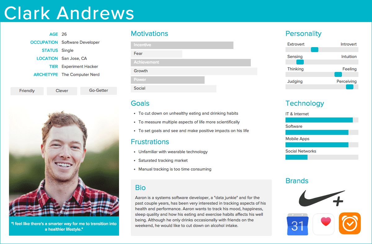
While personas can have any structure you think will help you get a good design, a typical persona consists of —
- Fictional name:
- Photo:
- Occupation:
- Company Name:
- Personal Information:
-
- Age:
- Country:
- Income:
- Marital status:
- Pain Points:
- Goals:
- Behavior Pattern:
- Personality:
Now that we have established what a UX persona is, let’s see how they play out in the real world!
UX Persona Example #1 – Cube Funder
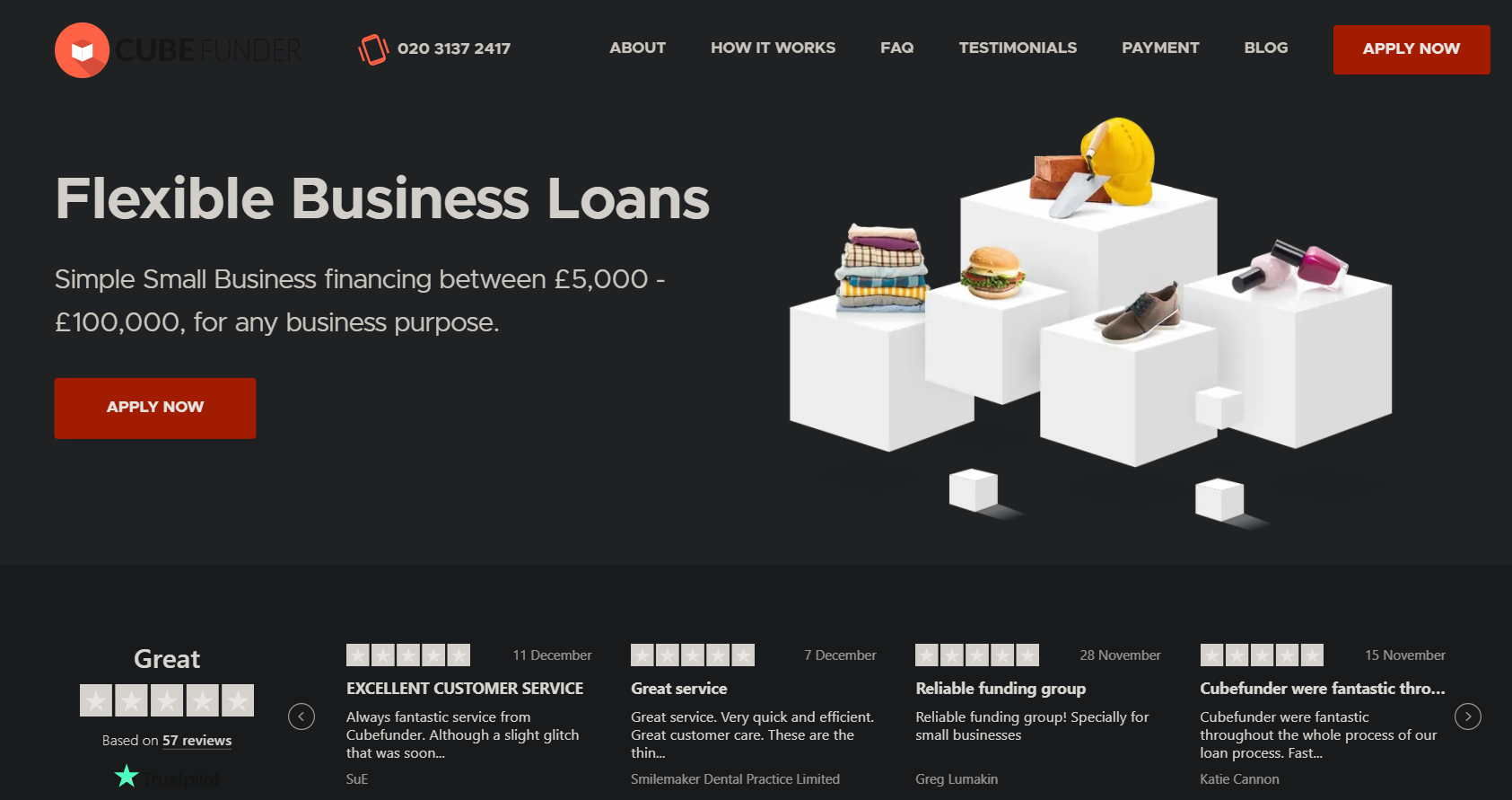
The website, CubeFunder provides simple business loans to entrepreneurs and established businesses alike.

What kind of persona might such a website use? Let’s start with the basics:
The service is clearly targeted at small business owners in need of help (the user).
Next question will be what drives the users to take action? Business owners are generally driven by their company’s relative position in the market.
They will be interested in a loan if they are looking to expand their business, or are in need of capital to make it past a rough patch.
In either case, a small business loan as provided by Cubefunder will be a short term solution. So, they cannot be bothered with a tedious and long application process.
A possible persona, in this case, might look like —
- Fictional name: Bob Graystone
- Occupation: Owner/MD
- Company Name: Vertical Horizon Construction Inc,.
- Personal Information:
- Age: 56 years old
- Country: England
- Income: £175,000 per year.
- Marital status: Married with two kids
- Pain Points: Vertical Horizon is plagued with inefficiency and lack of productivity. The company’s balance sheet is on a knife’s edge as a result. Lack of proper communication between team and subcontractors means costly delays.
- Goals: Keep the original team intact. Upgrade project management and communication skills and tools.
- Behavior Pattern: Bob spends most of his day between his phone and his spreadsheets. If he’s not negotiating with a client, he is managing his team. Despite being tech-savvy, he simply doesn’t have the time to look into modern cloud-based productivity tools.
- Personality: Bob’s a fast learner, very quick-witted, and enterprising. His team describes him as reincarnated T.E. Lawrence whom Bob loves to quote every chance he gets.
A close look at the page reveals that it will help Bob out just fine. The testimonials which are right over the fold will instill confidence, while the Apply Now button can help him get started straight away.
If he does wish to learn more, then all possible questions he can have are answered below the fold. Cubefunder’s application process, features, types of business applications their loan is ideal for are all, and eligibility criteria are all given on the home page alone.
If you have a product or service that’s more complex and demands customer support, you may consider adding a chat widget throughout your website like Spruce does.
UX Persona Example #2 – Preply
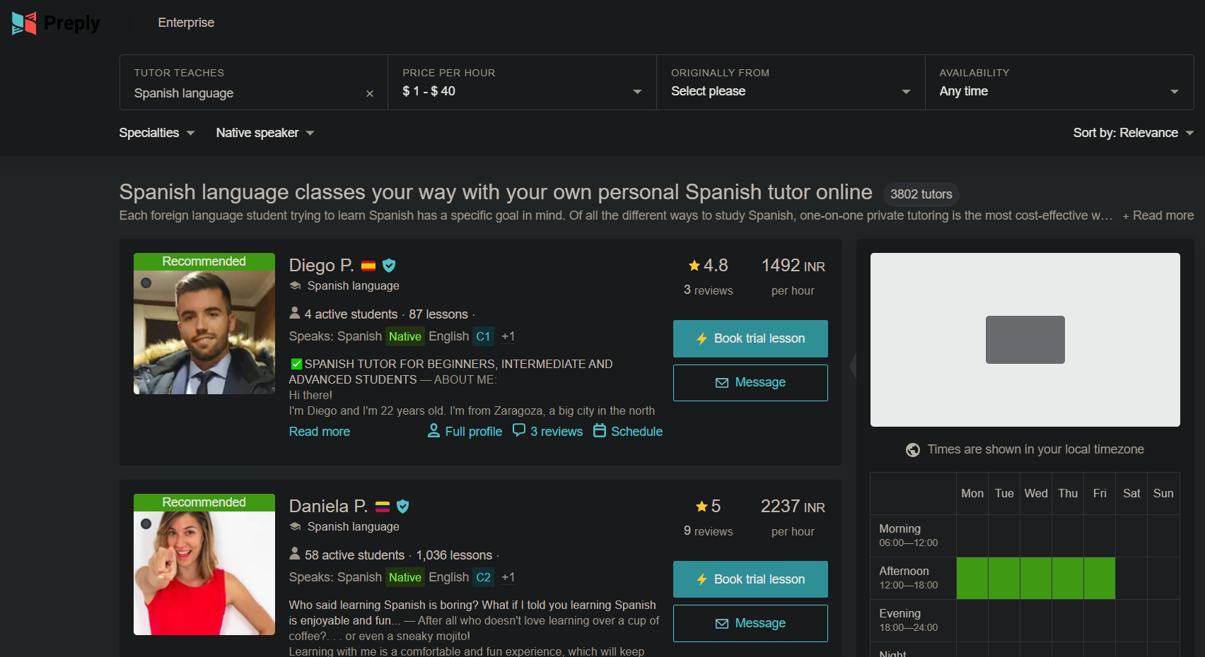
Preply provides an online one-on-one tutoring platform for virtually every subject. However, the website targets two demographic groups — students and tutors. For the sake of this example, let’s take a look at what their student persona might look like.

If we take a look at their online Spanish tutor page, we see multiple profiles, the number of students and lessons a teacher has, their native language, price per hour, and proficiency.
The same format follows all the profiles throughout the site. A possible student persona that can work here will look like —
- Fictional name: Grace Miller
- Occupation: Marketing Coordinator
- Company Name: The Cloudy Bookstore
- Personal Information:
-
- Age: 26 years old
- Country: Canada
- Income: CAD 56,000 per year.
- Marital status: Single
- Pain Points: The Cloudy Bookstore decided to include books in a wide range of languages recently. So, Grace has to help her team create marketing content in different languages quickly.
- Goals: Gain functional knowledge of a new language in as little time as possible.
- Behavior Pattern: Grace is always looking for ways to upgrade her skills and spends a lot of time researching solutions. She is her team’s innovation provider and loves to bounce new ideas.
- Personality: Grace is a self-described dog person. A bit impatient and quite optimistic about the future, she has a knack for becoming the voice of reason in any situation.
Preply’s page for finding tutors is clearly designed for someone like Grace. It gets straight to the point and tells exactly what someone in Grace’s position will like to know. The trial session will be particularly interesting since it will allow Grace to quickly test different tutors.
Conclusion
As useful as personas are, it’s best to remember their utility is limited by your willingness to implement the insights they provide.
As Gen Eisenhower said, plans are useless, but planning is indispensable. No matter how confident you are in your UX personas, it’s always a good idea to treat them as a perpetual work in progress.