Today mobile applications are playing an essential role in helping businesses in catering a large customer base. Having a visually stunning mobile app isn’t good enough. For a truly successful mobile application, a user-friendly interface must be in mind.
Implementing best practices for mobile design is key to getting your app in stores and used frequently.![]()
What is Mobile App UX and Why it Matters?
Mobile app UX design refers to the visual elements of an app including layout, visual design, text, brand, sound, and interaction that together make up an interface.

UX design is concerned with usability and in determining the success or failure of an app. Therefore, when designing for mobile, designers must consider user-centric designs.
This article explores some important design tips that will improve the usability of mobile apps.
Tips to Design Great UX for Mobile Apps
1. Easy App Navigation
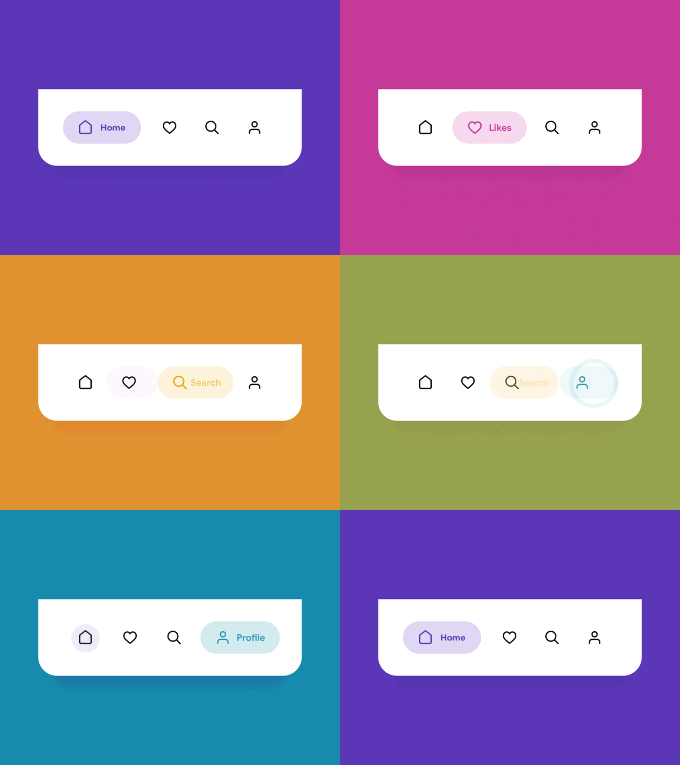
Navigation is the skeleton of the app, helping the overall content and information; therefore, the mobile app navigation must be user-friendly and intuitive.
Designers must clearly label every button as per their functionality. They should avoid using jargons that users can’t comprehend.
Easy navigation highlights new features and lets the users land on their desired page. Here are some exciting tips:
- Follow the same navigation pattern across the app
- use the tab bar for iOS and Navigation Drawer for Android.
2. Add Visuals And Keep Your View Consistent
Visuals with a great color scheme will stimulate users’ interest while using the app. Designers must add striking visual elements to keep users engaged rather than using heavy text app designs that users find intricate.
Using various colors, templates and images might affect your app’s view. Try to maintain the specific flow. Use same font style and background throughout the app. A similar look will enhance the user experience.
For better user experience, designers must maintain proper flow for virtual interface including buttons, typefaces, and labels.
Keep the app interface consistent with similar features and never copy elements of UI from different platforms.
Encourage native elements for a better view. Additionally, follow the rules of the platforms to create optimal quality app design.
3. Cut the Clutter
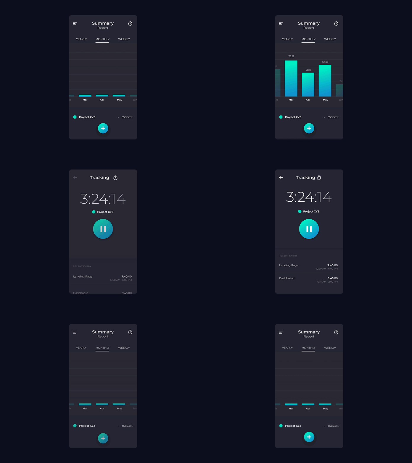
Cutting out clutter is essential for designing mobile app designs. Clutter can easily degrade a good design.
Avoid excessive buttons, text, and images will keep the design simple and clear.
Here are some ways to remove clutter:
- Keep headlines and text concise and clear
- Keep content to a minimum (add what users need to know).
- Do not complicate screen with unnecessary button, images, and icons.
4. Minimize User Effort Required for Tasks

Carefully watch your design elements that require user’s effort. For example, it’s better to reuse previously entered data rather than asking the user to type again. The designer must design mobile apps that offload the user’s task.
In case, a function requires specific actions from the user’s side then it’s better to divide that task into sub-task. A good example is a step-by-step checkout flow in an e-commerce app.
Splitting a task into sub-task will reduce complexity and offers a great user experience.
5. Add Familiar Screens
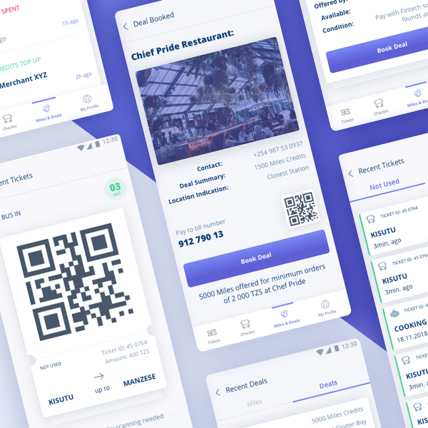
Familiar screens are frequently used in many applications. These screens save user’s time and effort otherwise spent on getting familiar with different screens.
Some good examples of familiar screens are Getting started, What’s new and Search results. Such screens allow users to interact quickly without any learning struggle.
6. Maintain User Readability

As compared to desktops, mobile screens are smaller. Therefore, fitting in a lot of information is challenging for a user-friendly mobile interface.
Add only essential keywords and phrases that users can read easily even when the internet connection is interrupted. An upright prioritization of your content will make your user’s experience incredibly good.
7. Add a Responsive Back Icon
When it comes to user experience, minor details are crucial. Don’t forget to add a responsive back icon.
A user might want to go back to check previous pages. Hence, a responsive back icon allows the user to navigate back quickly. Adding responsive back icon will make the process smooth for the end-users.
8. Place Action Button Wisely
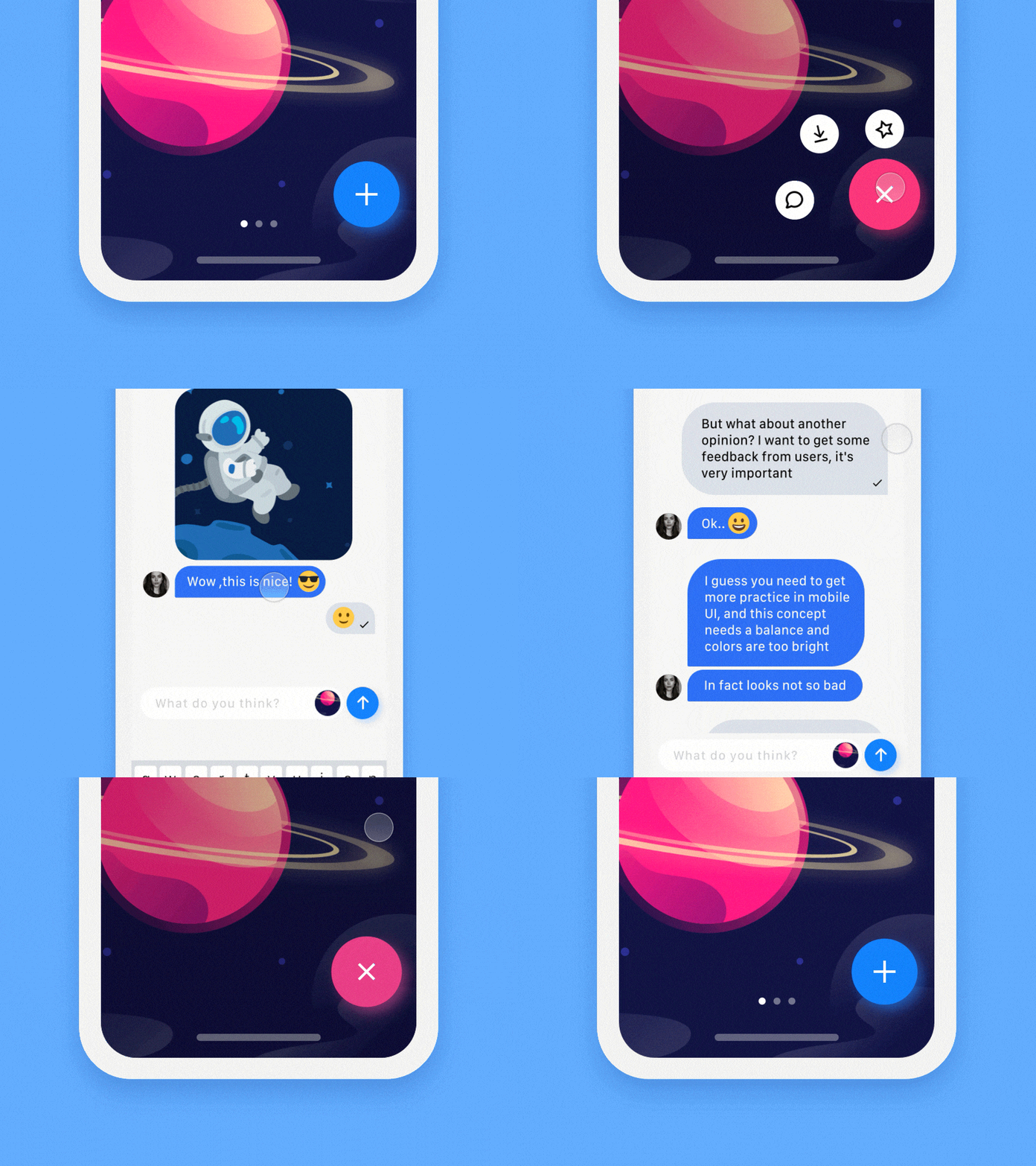
An action button is known as call-to-action (CTA). The CTA button must be designed in a way to show specific action. Designers must place CTAs on visible screen areas.
designers must highlight CTA buttons with bold and attractive colors. For example: use green color for buttons like add to cart. Use Red color for Delete or Cancel.
9. Keep an Eye on the Trends
Tech world is continuously changing with advancements everywhere. Designers always need to look at new trends to find out new ways of looking great with improved designs.
Keeping up with the latest trends will assist app designers to execute fresh ideas and create a simple yet interactive user interface.
Hope you enjoyed these tips about creating great UX mobile design. Always consider users’ convenience and preferences when designing the app.
Ensure that your app’s features and functionality enables a pleasant user experience.
