Am I a kind of ‘zombie designer’ then? Yep, those two holes in my trousers were probably for something.
But how did I get here?
I couldn’t say that I remember a specific moment… maybe it’s like Italy, my home country, in which everything gets a little worse every day, very very slowly, in a way that you never fully realise it.
I need to find some clues.
I’m at home. I check my desk first. There are some books here (yeah, those bricks of paper we used in the past). “Designing Web Usability” by Jakob Nielsen is the first one to grab my attention. I read a couple of lines, page 34:
“There are essentially two basic approaches to design: the artistic ideal of expressing yourself and the engineering ideal of solving a problem for a customer. This book is firmly on the side of engineering.”
– Jakob Nielsen, “Designing Web Usability”, 1999.
“Sure, god bless engineers, art sucks.”
Someone rings the bell.
Jakob Nielsen’s words are still echoing in my head while I get to the door. It’s my friend Ale, he called by to show me his new car. I’m not really into cars but he studied car design so…I’ll hear the story. Ale tells me his car is exactly like another one from a different brand but he got a better deal. It was built — for a lot of good reasons — on the same stamping line as countless other models.
We grab a coffee together, we chat for five minutes, and then he leaves. He was there long enough to draw a car with very big wheels on a napkin.
I worked with cars as well, I want to be honest with you. I was working at Stanford as a car park attendant some years ago when I helped this guy, who I later discovered to be a design celebrity called Chris something, to find his car in the car park.
He had rented a car, a silver one and he was in a rush to the airport. Unfortunately, half of the cars in the car park were silver like his and they all looked the same. After some struggle we finally found it. Ready to go, he looked at me one last time, shouting “How did we get here?”.
Shocked, I didn’t know what to reply. I later discovered the video of the speech he had just given in Stanford.
We wind up in a world that is totally silver. We wind up a world of identicalness. How did we get there?
– Chris Bangle, “Designing Difference in a World of Sameness”, November 26, 2012, Stanford University.
Identicalness, that was his point… How did we get there?
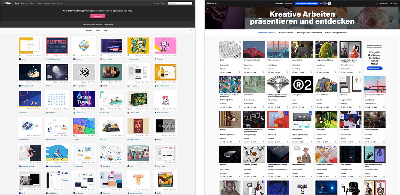
I go back to my desk and I check my dribbble. Oh no, that’s actually Behance. Maybe. Yeah yeah I look harder and the logo is actually different, it must be Behance.

Ooops.
“Web design today seems to be driven by technical and ideological constraints rather than creativity and ideas. Every page consists of containers in containers in containers; sometimes text, sometimes images. Nothing is truly designed, it’s simply assumed.”
– Boris Müller, “Why do all websites look the same?”
“Design is central in the digital push but something is amiss. Relentless uniformity in today’s design.
Why do all websites look so similar?
Why does everyone use the same icons?
Why the obsession with Donut Charts?
Brand come in a few templates only and all “alternative” brands are alike.”
– Olof Schybergson, “Design Rule of 3”, text from presentation, Awwwards Conference NYC 2016.
It looks like we have a problem.
I want to take a break, this is all quite heavy. I keep asking myself “How did we get there?” as if I were Chris Bangle.
I’m nervous and hungry, I feel the need to eat some meat (OMG it’s the zombie thing), I go to the kitchen and I see my tacky “Mondrian” table mat, still there from last night. The kitchen is quite a mess. There is a “Caravaggio” one there as well, even tackier, that I bought because one of his biographers wrote he had used one of his paintings as a tablecloth for years. Now I can do the same… Kind of.
Close to each other the table mats look really weird. Of course, I obsessively apply the “How did we get there?” thing here as well. I mean, how did we get from Caravaggio to Mondrian?
Art should have stopped there.
How can you dare to paint any better than Michelangelo Merisi from Caravaggio?
“There was a time when this is all there was to art. If you want to be a painter, it doesn’t get any better than Vermeer, do you want to be a sculptor, it doesn’t get any better than Lacoon right? And what happened? This happened, the avan-guardist.”
– Chris Bangle, “Designing Difference in a World of Sameness”, November 26, 2012, Stanford University.
What if, what if the solution, the resurrection button from our zombieness was purely artistic? 100% nonsense isn’t it? We are all, as Jakob Nielsen said, “firmly from the side of engineering”…. right?
I notice the new ashtray I got for my birthday, interestingly I don’t smoke but someone must have thought “that’s design shit by an Italian designer, he will like it for sure.” True, I LOVE it.
It’s an ashtray by Bruno Munari. One the greatest designers of all time, he wrote a book called “Design as Art”. I found a photocopied version of it in the bin outside (the zombie thing, again, I should remember to stay away from the bins). There are spare pages around, some lines are highlighted:
“The artist has to regain the modesty he had when art was just a trade, and instead of despising the very public he is trying to interest he must discover its needs and make contact with it again. This is the reason why the traditional artist is being transformed into the designer…”
– Bruno Munari, “Design as Art”, p.13, first published by Editori Laterza, 1966.
Munari was right, of course, but what if, after some decades, that lesson was learnt too well? Do the lovely bunch of (often) introverted design-doers and thinkers that I am part of, with their artistic backgrounds and some exhibitions on their CV, have that modesty?
What’s the relationship between the needs of putting yourself, your art, your taste and your craft in to the equation, and the modern ‘design systems’ worker? Should we build a ‘Design Systems Workers’ Union first?
What if we have actually become too modest and too scared?
We might not have been very sincere…with ourselves.
