
A website mockup is also known as a wireframe. Oxford defines a wireframe as “an image or set of images which displays the functional elements of a website or page, typically used for planning a site’s structure and functionality.”
For UX designer Chris Newnham, a wireframe is “a crucial phase when designing a website, app, platform, landing page, or emails” (although for emails and newsletters, there are products that offer different layouts depending on purpose).
It might be tempting to skip this part of the process but it is not advisable. The wireframe is the blueprint of your product. It will dictate the kind of experience people will have with your website, for example. It will also help you decide on your UI (user interface).
At Spyre Studios, we have a heart for the self-starter. So in case you are not ready to shell out cash on a wireframe tool just yet — but don’t want to use pen and pencil to sketch your wireframe (save the trees!) here are some free options:
Read: Black and White Patterns for Web Design
Screenshot from Framebox
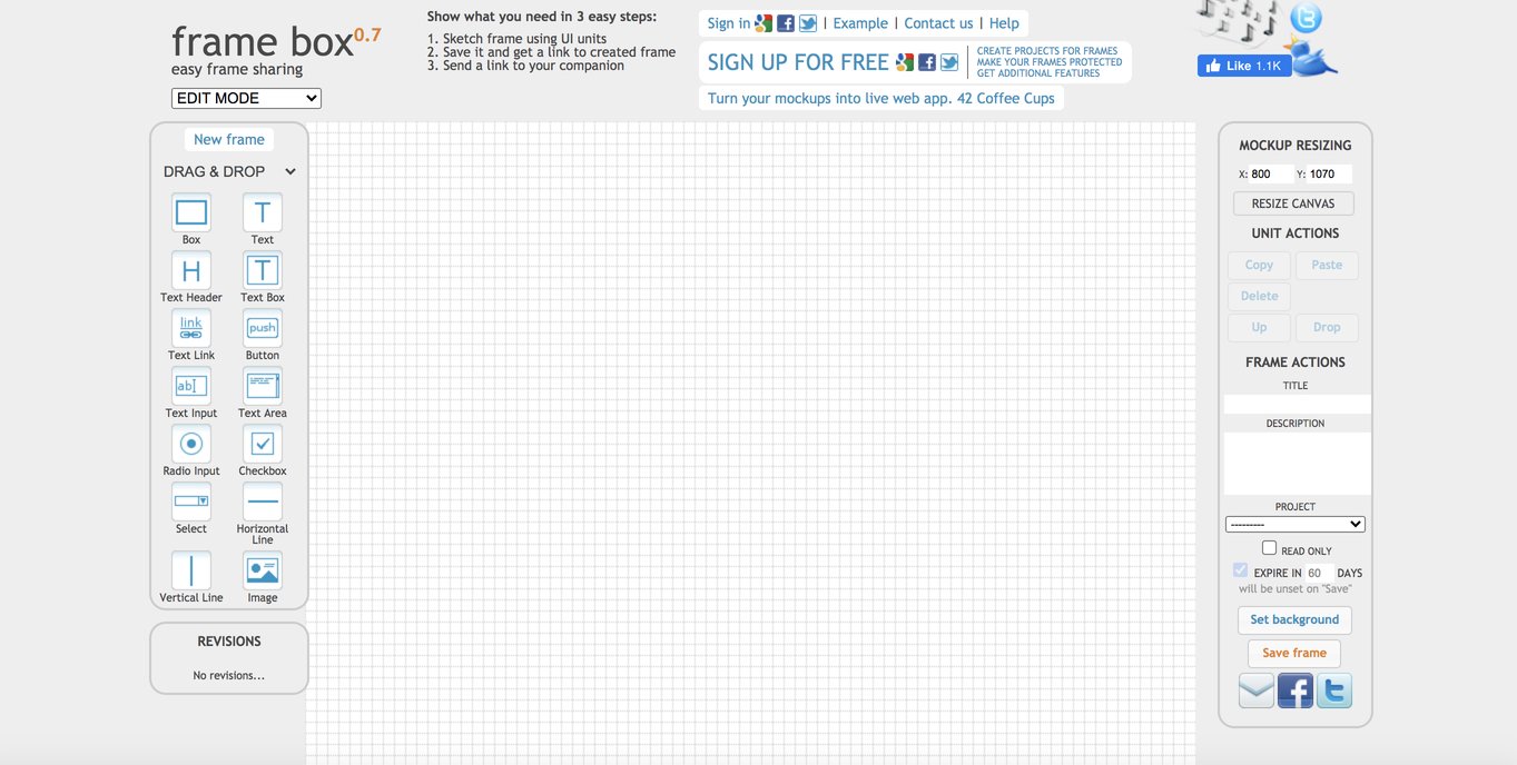
Framebox is the simplest and most basic of all options you will find in this list. It is perfect for students, UX newbies, or anyone looking to hone their UX skills.
You go straight to the design “board” the moment you go to their website. Using it is as easy as 1-2-3 (literally!).
Step 1:
Sketch using the UI elements on the left side of the screen. Drag and drop.
Step 2:
Once done, save your sketch. They will generate a link to your sketch.
Step 3:
Share your sketch by sending out the link. Done!
The downside to Framebox is that it may be too basic in the long run. As we said, it’s good for starters and for practice. The more experienced UX designers will probably go for other (paid) options.
Screenshot from Gliffy
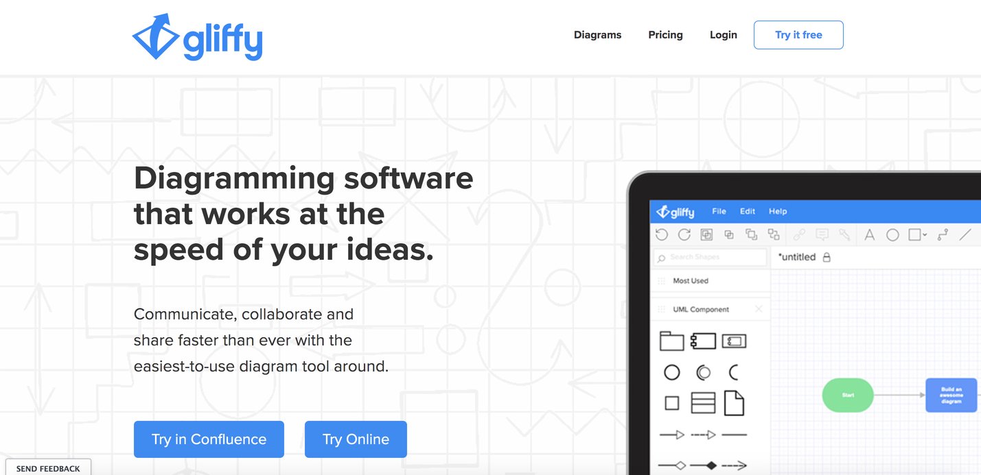
Gliffy is a visualization tool that boasts of a drag-and-drop feature that makes it fast and easy to use. Files can be shared with anyone via URL or embedding. In the era of remote work, several people can collaborate on one project at the same time. You can backtrack to the revision history. You can import and edit previous diagrams and export new ones.
In their website, Gliffy claims to have a “software for every need”:
a. Software Engineering
- UML diagrams
- AWS architecture
- Network diagrams
- Entity-relationship diagrams
b. Design
c. Business
- Flowcharts
- Venn diagrams
- Org charts
- Mind maps
- Business process modeling
- SWOT analysis
Gliffy is also integrated into some of the most widely-used teamwork and project management platforms such as Slack, Trello, GSuite, Jira, Confluence, and more.
Screenshot from Jumpchart
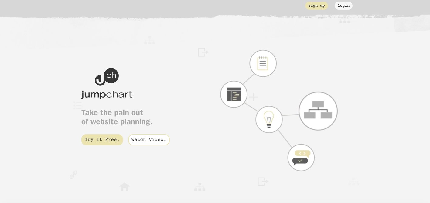
Jumpchart is geared towards website UX design and uses the term “sitemap” on their website. Their battle-cry is to “take the pain out of website planning.” They are targeted towards teams that run a website together, from project managers to developers to designers to copywriters; up to the final stakeholders: the client.
An interesting feature of Jumpchart is that their sitemap automatically builds itself as one adds pages then drags it towards a section it should fall under. Jumpchart makes the adjustments for you.
You can also use it easily on mobile. It can export to WordPress, Drupal, HTML, PDF, and CSV formats.
Screenshot from Mockflow
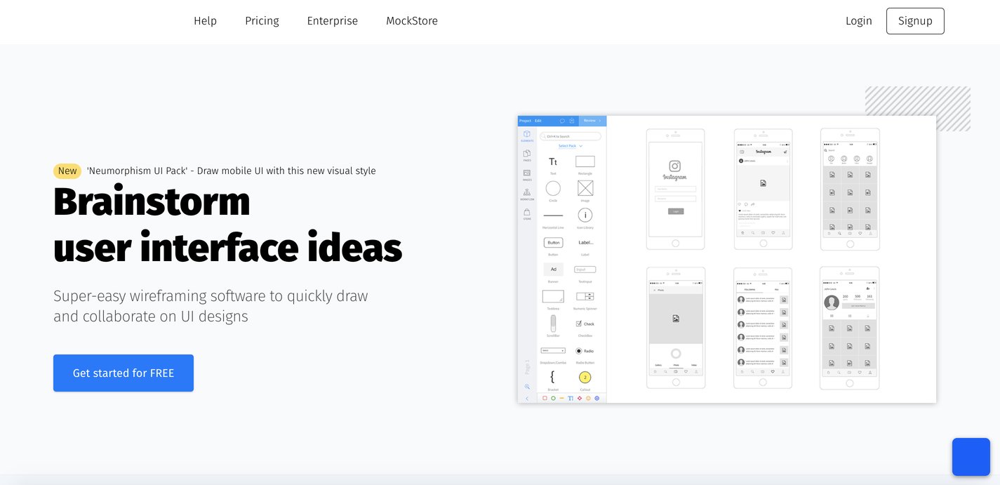
With Mockflow, the UX team can collaborate on one design from the get-go. They claim to have an “intuitive” editor that quickly brings ideas to life. They offer thousands of pre-built components to quickly put designs together (no need to sketch from scratch!). You can review or preview your design. You can also quickly revise.
Once your design is final, use their StyleGuides feature to document and draw out your brand’s UX design guidelines. This helps in documentation, training, and turnover for continuity of business.
Like Gliffy, Mockflow is also integrated into teamwork and project management platforms. It is also compatible with Windows and macOS.
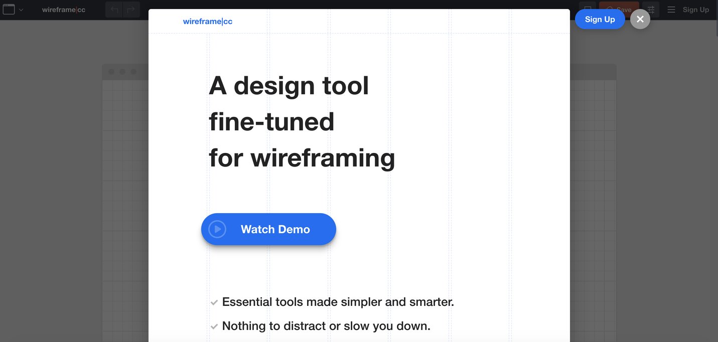
Screenshot from Wireframe
Wireframe is so straight to the point, it won’t even try to sell itself to you. That’s the beauty of this tool: it’s super simple. In one click from when you go to their website, you can begin designing. Once done, save your work.
Wireframe claims that other design tools are “overly complex” that one risks “getting too invested and unnecessary details and styles too early.” Yep, this tool is for the minimalist and simplistic thinker.
For example, they have a limited color palette so you can focus on what matters at this stage: the user experience, form, and function. Their own UI is sensitive to context. It knows what you need based on what you are designing. It will not clutter your screen.
Lastly, from the get-go, you can already design for any screen, whether for desktop/laptop, tablet, or mobile. Go from one format to another if you wish. Whatever makes the work simpler.
Read: Developing a WordPress Website 101
Now you are ready to create a mockup of your website — the first step to a successful blog, e-commerce business, or web designing business. Go for it! Go for gold!
Author: Kai Magsanoc
Kai Magsanoc is a lifestyle and celebrity journalist and erstwhile fashion stylist. She began her career as managing editor of glossies and contributor to broadsheets. Kai was the first Life & Style and Entertainment editor of Rappler and the last Lifestyle and Celebrity Editor of Yahoo Philippines. Kai is an animal rescue and adoption advocate, aspiring life coach and farmer.