The development of sales makes one thing obvious – consumers are becoming picky and negative towards uncreative companies. The ones to make the best deals are the always evolving ones, which seem to really understand what their customers want.
First of all, a company needs to develop an excellent product which can sell itself with minimal efforts. The best way to do it is to literally follow every phase of the selling procedure.

Image source: nastygal.com[3]
Core elements for successful sales
- Researching
- Asking
- Listening
- Teaching
- Good quality
- Closing a deal

Image source: afends.com[4]
Also, as the startup initiator or original employee who has something to sell, you need to familiarize with social advertising, AdWords, Facebook, or any type of retargeting and online promotion. It is very possible that sales leadership in the future will depend solemnly on these methods.
Rules for designing a website that sells
- Grab your customer’s attention: This is how your sales begin. Apply professional, breathtaking images
- Keep them motivated: Your customers have to be attentive all the time. And make your point clear.
- Make customers trust you: Successful online deals are based on confidence. Use your previous experience.
- Be ready and willing to answer all questions: Have in mind that buyers always have questions. Explain your visitors what they should do.
- Trust yourself: Can you really fulfill your promises and deliver the product your buyers expect? And if you face a situation where you fail to deliver the right product, promise to send the right one or even a better one.
Content can sell
There is no better selling tool than great-quality content. Content is the thing that sells, explains, and redirects prospects while we are not working.
However, it all depends on us. We are the ones to produce such content whose potential can sell our products. If we fail to display excellent content, we are risking making use of the full content sales experience.
Consider the needs of your visitors

Image source: bellroy.com[5]
The reason people decide to go for your product is that they like it. Take a moment to observe what they are putting in their basket and consider other things they could like.
Suggest them ideas that could sound better than the product they are viewing, and try to grab their attention. Cross-selling is an appreciated sales strategy and there are no drawbacks to apply it online.
Analyze the impact of your online sales process and improve usability

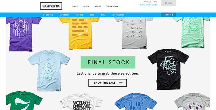
Image source: ugmonk.com[6]
The common feature of all contemporary ecommerce websites is their motivation to increase sales. The main criterion that makes certain e-com platforms better than their opponents is the degree of usability. Usability is in fact, fundamental for the success of trade.
Usability measures to which extent an item fits the purpose it was created with. In order to create a usable product, you need to understand what targeted customers need and to explore their mindsets.
Users will not tell you what they want. They will show it. Usability will take you all the way from purchase satisfaction to producing items which can fulfill their optimal desires. Therefore, make sure you are working efficiently.

Image source: fontshop.com[7]
For the purpose, you need landing pages that work. Online shoppers ought to be given a fabulous impression from the very first moment they ‘land’ on your site. UI influence must not be neglected, as users often rely only on the information you are giving them. A converting landing page seems welcoming and normal, and contains all of the essential information concerning your business and your products.
Tips for easy and efficient online payment

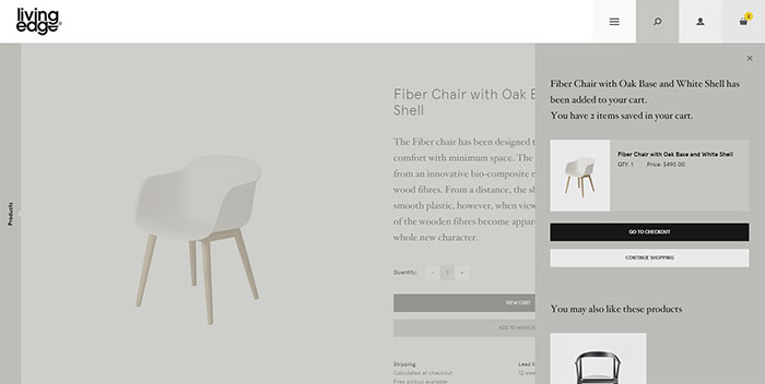
Image source: livingedge.com.au[8]
Creating a landing page which is functional depends on the introduction of efficient and simplified payment methods. Without such, you are not very likely to make numerous sales.
This is exactly why great checkout pages matter. It is the closing step in online shopping where customers insert credit card data and they make the final decision of sharing hard-earned income with you.
It is your checkout corner where ordinary visitors turn into loyal customers.
Simplified payment – How to do it?
Avoid single payment methods
The most recommended option is to offer various card type options and to enable direct transfers from all banks. Still, this depends on the type of business and the target audience.
Make payment possible even without registration
Asking people to register and to reveal personal data is confusing and intrusive. In fact, most of your new visitors will avoid conversion because of the sign-up requirement.
Simplify your design
Have in mind that you have to keep your design simple and consistent. Don’t experiment too much with colors, typefaces or decorations on the checkout page (or the website in general) and ensure people will remember and recognize your brand.
Avoid redirecting people
Yes, it is very easy to use PayPal or other payment services which redirect users from your page to a different checkout corner.
The checkout page of those platforms are something you cannot control, and the difference between your and their design will make people feel as if they were depriving from your services and giving the money to someone else.
Besides, you don’t want people to purchase your products without even remembering the name of your online shop.
Ask for nothing more, but essential information. Keep the list of required data short and generalized.
Point out that privacy and security are well guaranteed on your website
State the precaution/security measures you offer. After all, people need to be sure you’re protecting their data and there is no risk attached to their purchases.
Online shopping is the future of business

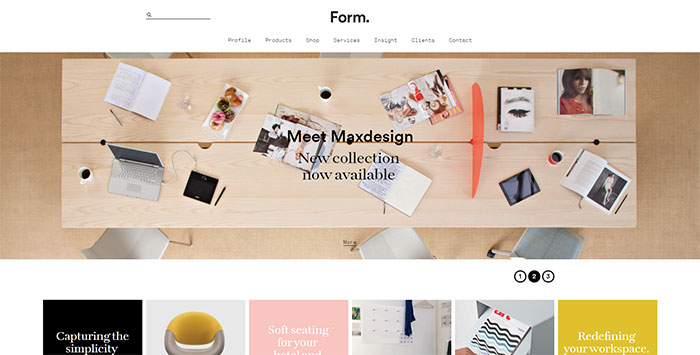
Image source: by-form.net[9]
Internet pushed its way to the basis of every industry and it became an essential element of modern commerce and trade. The web has a special role in every part of the process: exchange of information, orders, deliveries, and payments. Traditional sales may still be the most frequent ones, but the growing tendency of online shopping shows this trend is not going to last.
The constant growth and increasing diversity of online-offered products make it difficult to estimate in which direction ecommerce is moving.
The final thing that designers and online retailers need to consider is the 24/7 online presence of their customers and the need to stay ‘on the scene’ for as long as possible.
