The New Be Pre-Built Installer
The old Be prebuilt-website installer got the job done, but it wasn’t entirely free of issues. Installing a website was easy, but the actions you had to take before doing the install were not all that user friendly. Quite simply, neither the UI nor the UX were the best.
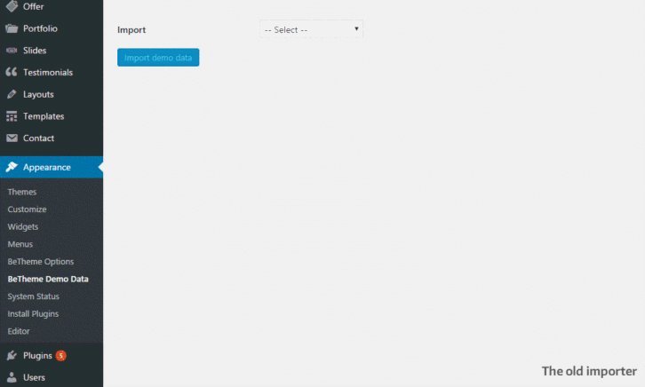
The old Be pre-built website installer lacked some important features.
- Searching for a pre-built website was manual and cumbersome; and you had to move back and forth from the presentation page to the admin area to zero in on the website you wanted.
- The old website installer didn’t tell you ahead of time which plugins you might need for a given pre-built website; or which ones were already installed.
- Insofar as importing a pre-built website was concerned, it was an all-or-nothing affair.
Muffin Group fixed all of that before releasing their new pre-built website installer.
Muffin Groups new Be pre-built website installer.
The new installer works like a charm.
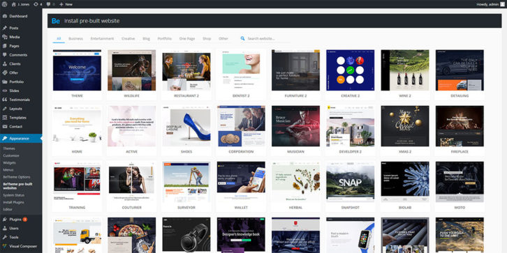
- Now you can view thumbnails of all 250+ prebuilt websites in the admin area. No more scrolling, or checking back and forth. To preview or select a pre-built website, just click on its thumbnail depiction.
- The new filtering feature allows to search by category from the admin area. Filtering by category lets you quickly zero in on candidate pre-built websites, so you can preview one or more before making a final choice. This will be a great help as the number of pre-built website continues to increase.
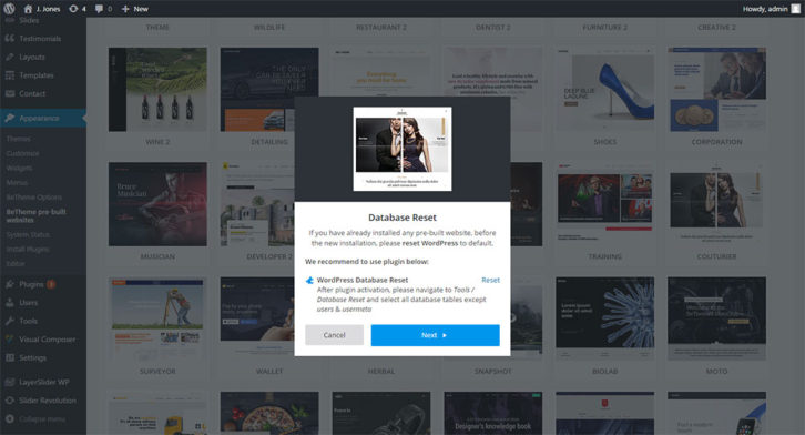
- The new installer tells you which plugins you’ll need for the pre-built website you’re about to install; so it will perform exactly as in the preview. It will also tell you which plugins are already installed, and give you the opportunity to install any which are not – a real time saver.
See which plugins a pre-built website requires to perform as anticipated.
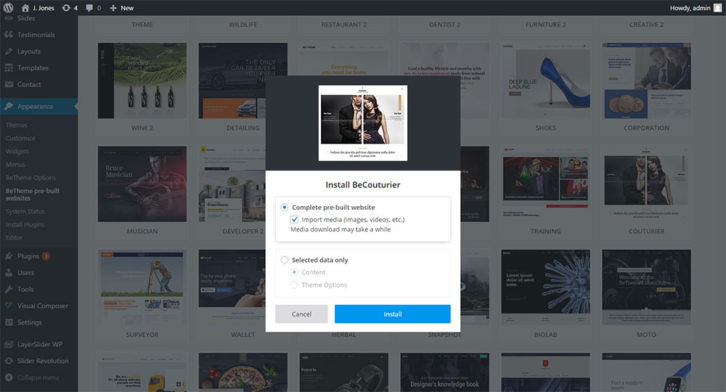
- You also have the advantage of being able to import only what you need from a pre-built website; whether it is the content, the default pages, page options, or all the above.
Install what you need, and only what you need
Check out this video to see it in action:
Check out Be’s Latest Pre-Built Websites
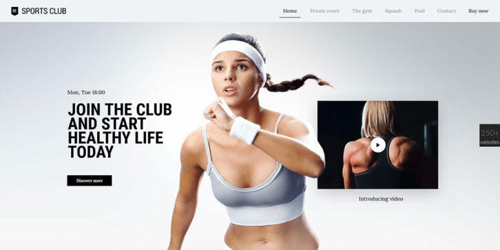
Just about any gym would want their website to feature a modern design like the one featured in this Be Sports Club pre-built website. The neat fade-in animations you’ll see when first entering the site are especially engaging. They are followed up on following pages by special parallax effects.
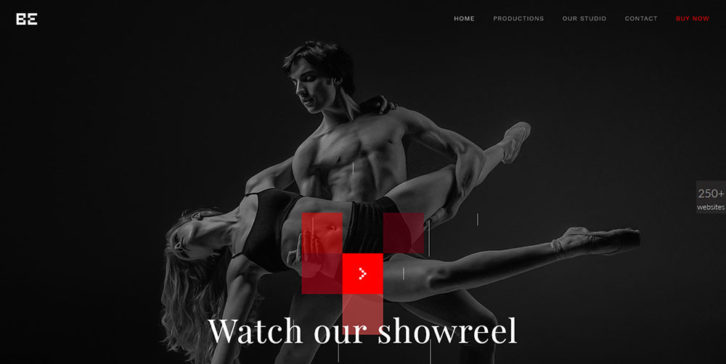
Be Productions relies on a smooth parallax scroll effect to help deliver its message. This is an idea pre-built website to build upon when creating a site for a motion graphics studio, or an advertising agency. The dark background serves to emphasize the brand’s colors and message.
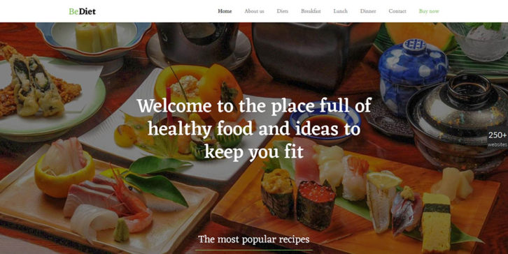
There’s no better way to showcase great food than through large, high-quality images; images that nearly look good enough to eat. Muffin Group designed this website to help your clients present their culinary talents in beautiful and delightful ways. Be Diet also features several compelling, yet subtle, special effects.
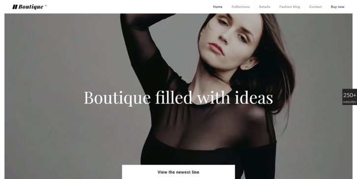
If you think it’s about time you tried using a background video in a website’s home page, Be Boutique shows you the way. Using video to help present your message can be very effective, without being gaudy or flashy. The challenge is to choose the right video; incorporating it is the easy part.
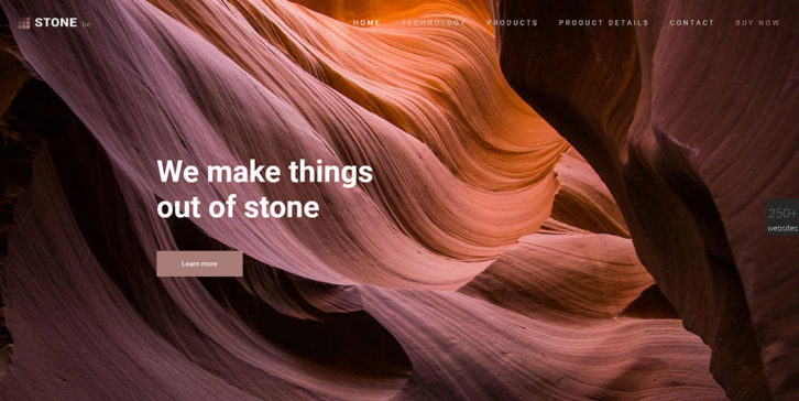
With a pre-built website like Be Stone in your designer’s tool kit, you should never have to worry about creating a dull, uninspiring, or flat-out bad looking website again. Neat animations contribute to a final product that features the look and feel you want.
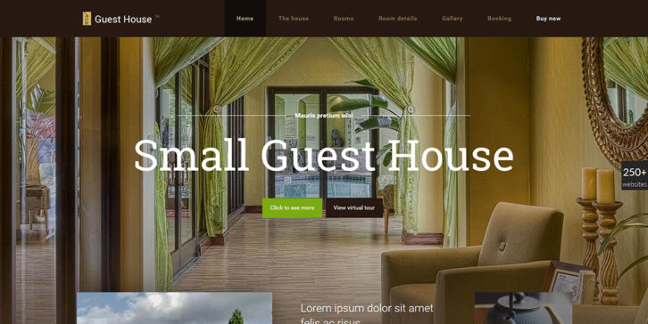
This Be Guest House pre-built website will be a great help in presenting a guest house or cabin you want to rent or sell. It’s also a good starting point for a hotel’s website, or for a realtor offering condominium sales or rentals.
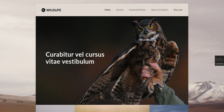
Be Wildlife is a good example of why there will always be a place for fixed layouts. This pre-built website could be destined for a wildlife photographer’s studio, but it has many other potential uses as well. Notable features include a slider effect, reinforced by a parallax effect as you scroll down.
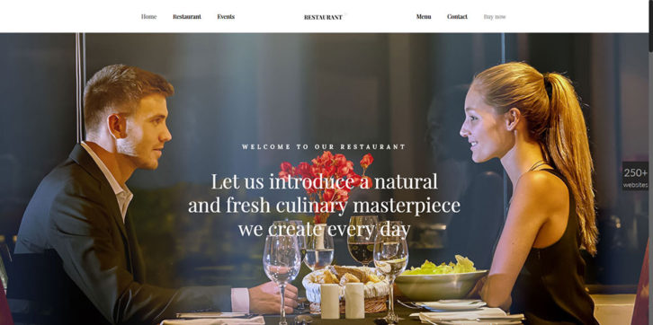
This dashing restaurant design practically compels a visitor to pick up the phone and make a reservation. A nice slider effect, together with its overlaid design elements, gives Be Restaurant a dynamic look; one that you are unlikely to find in any other restaurant’s website.
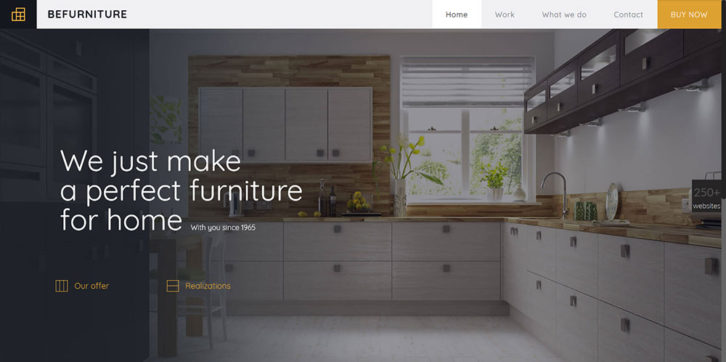
If you have a client that sells furniture, this is a great looking design to work with. Be Furniture utilizes an attractive slider effect and large images to showcase your client’s products, and by using a hip, modern, and uncluttered design approach.
Be Theme’s Key Features
- The abundance of features that make Be so popular, include its 250+ pre-built websites, that address nearly every website niche you can think of.
- The Muffin Builder and Options Panel lets you customize a pre-built website as you see fit, without any need for coding.
- When you decide to build a page from scratch, Be’s Layout Configurator makes doing so a piece of cake. Add some added spice and variety to your products, instead of having all your pages look like they came from the same mold.
- Add important details and useful functionality to your website without coding by using Be’s 200+ Shortcodes.
- Advanced Typography Options permit you to use Google fonts, or upload your own.
- Incorporate special effects that everyone loves, including a smooth Parallax Effect and Video Background. Be’s special effects make creating awesome-looking pages easy.
- Once you take ownership of a Be license, Lifetime Updates, including future monthly releases of new pre-built websites are yours for free.
Support
When you purchase a Be Theme license, you can expect solid support. In addition to the top-notch support team, a selection of video tutorials will help you along the way. When you join up with Be, you’ll become the proud owner of a Themeforest top seller, and a product that has sold over 62,000 licenses.
Find out more about Be Theme here.
1 Comment
