Motion is not so simple – it might sound easy to add some ‘movement’ to your sketches, but how successfully could you replicate feelings and reactions? The truth is that designing interface animations could take a while before you upgrade from the basic animated patterns to highly technical interactions which could build the dynamic aspect of your brand’s identity.
Designing interface animations is not a new trend-they were introduced on the web long ago, mostly thorough standard operating systems and native apps. The same as other interface tools, animations are facing a new challenge: they need to support the improvement of technology and to transform into mobile UI animations.
Good looking or bad looking, an animation should always be functional
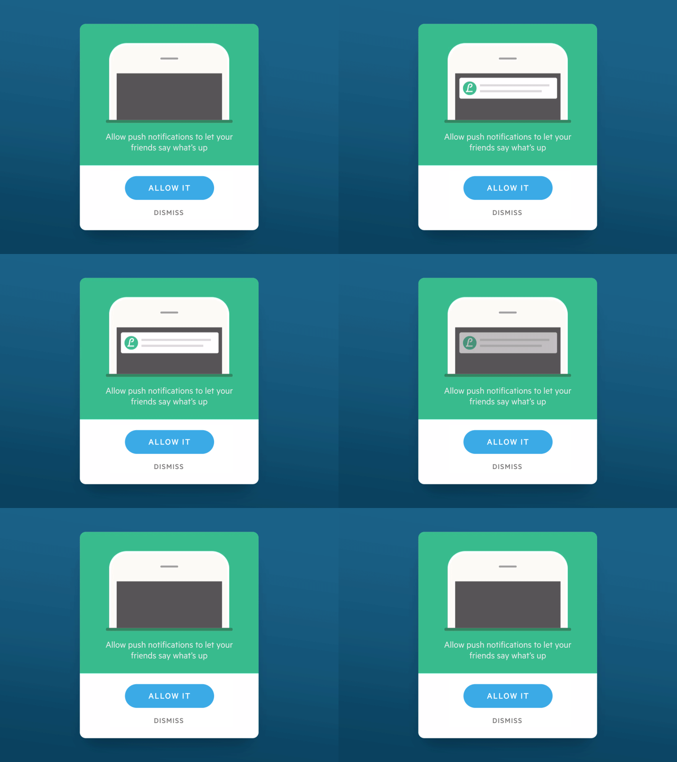
Image source: Markus Dahlbom[3]
The best way to describe a functional animation is to imagine such, which is hardly noticeable during the interface process, but it can be triggered without any complication.
Functionality means to respond to a certain purpose, ideally very precise and logical. A functional application needs a clear aim; and it has to match both your concept and style; and the message you’re trying to convey to your users.
The crucial feature, however, is purpose. A valid and clear purpose justifies the presence of the animation, which would otherwise seem like an unnecessary detail. Not able to find a purpose? Reconsider the idea of including that animation!

Image source: Derek Torsani[4]
Animations, as good as they are, are not applied to substitute static presentations of content. Static elements are still very important, especially in terms of signaling change or transitions from one page to another. The rationale is that they usually include detailed and important information, which can be neglected on a playful animation.
An important thing to consider is the way in which you present animations to your users-bear in mind they are not expecting the visual change and they will most likely step away to understand what is going on with their interface.
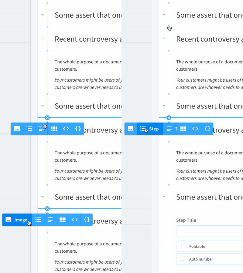
Image source: Ethan Leon[5]
Fast and unclear animations are hard to track. The state changes rapidly and leaves almost no time for users to understand the change in their screens’ state. Above all, if you fail to convey a clear purpose, you might scare them away and ‘kill’ whatever relation they thought they had with your website.
The best thing you could do is to prepare your user for the upcoming change-work hand by hand with their expectations and provide action which is exiting to them. As an animation designer, you have the advantage of novice affection, unlike classical and static websites whose interface can only be understood with experience. As long as the encounter is pleasant and engaging, people will not mind not knowing anything about it.
How to design interface animations
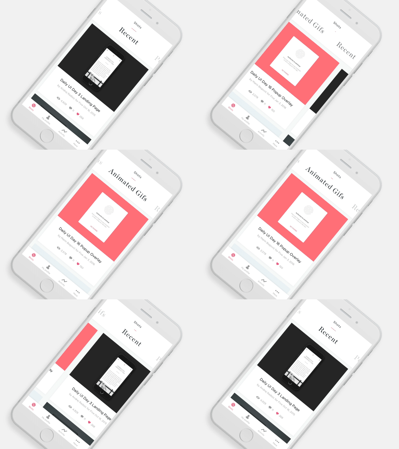
Image source: Andrej Radisic[6]
Animations have multiple usages: they orientate behavior, provide feedback, enhance relationships, and produce effects. If designed skillfully, motion can serve many purposes and add a stylish ‘breeze’ to the website/application.
Quality animations serve to transmit information in a stylish and restrained manner. Being able to determine how and when to restrain motion is the skill of great designers, which keeps ads and awkward distractions away and keeps users focused on essential information.
Long story short, designing interface animation is an essential task in the future of web and UX designers.
The basic principles you should have in mind
Everything rotates around time and space
Animation timing refers to the time necessary for one action to be performed.
Interface animation doesn’t require users to replicate real life, but to focus on the particularity and ‘personality’ of each item on the website or on the app. Yes-timing is the essence of communication!

Image source: Derek Torsani[7]
Space represents the easing property that we apply to the timing of an animation. Easing measures speed modification for the entire duration of one animation. Thanks to space we can express moods and individualism.
A proper combination of time and space performs the ‘talking role’ of an animation.
Attach an explanatory animation
A modest additional animation which complements the main one can be a real attraction grabber. It can add cheerfulness and interest to the actions. Therefore, the combination of the two seems like a real-life character which waves or whistles while walking.
Gaining speed
The same as people and objects, animations need time to pick up speed before they achieve their maximum. Stopping should also take time in order to look realistic.
Proper closure
There are two established and interrelated concepts which you could use when closing (stopping) motion: following through; and action overlapping. Both of them could enable you to overshoot slowly the final destination and to settle back in place without unnecessary delays.
Skillful drawing
Obviously, drawing the perfect animation is a big responsibility which requires creativity and talent. Animations are not simple sketches, but realistic three-dimensional expressions of feelings and moods. It is not really important what type of tools you’re using, but rather whether the final product is functional in a live environment.
Speed ‘polishing’
Low speed levels are highly recommendable while designing an animation. The reason is that we need to monitor its performance and make further decisions based on it.
Experienced designers, however, know that an animation will take significantly less time to be read by users. It is because our brain adjusts to the motion expectation and works very quickly to understand it. Therefore, don’t be surprised by the need to hasten your animations.
Animations are the main ‘communicators’-they transmit ideas and describe actions in a clear and succinct way, much better than text or images would do.
More than anything else, animations are informative tools

Image source: Marin Begović[8]
Animations were not invented to help users ‘kill’ time-they were actually introduced to provide information and to ease interaction.
Even the simplest among animations (suddenly dropping menus; or bouncing images appearing out of the blue) are fun and they upgrade every aspect of users’ interaction. As practice shows, the most successful animations are those which are simple, natural, and which don’t overwhelm users.
The future of interface animations
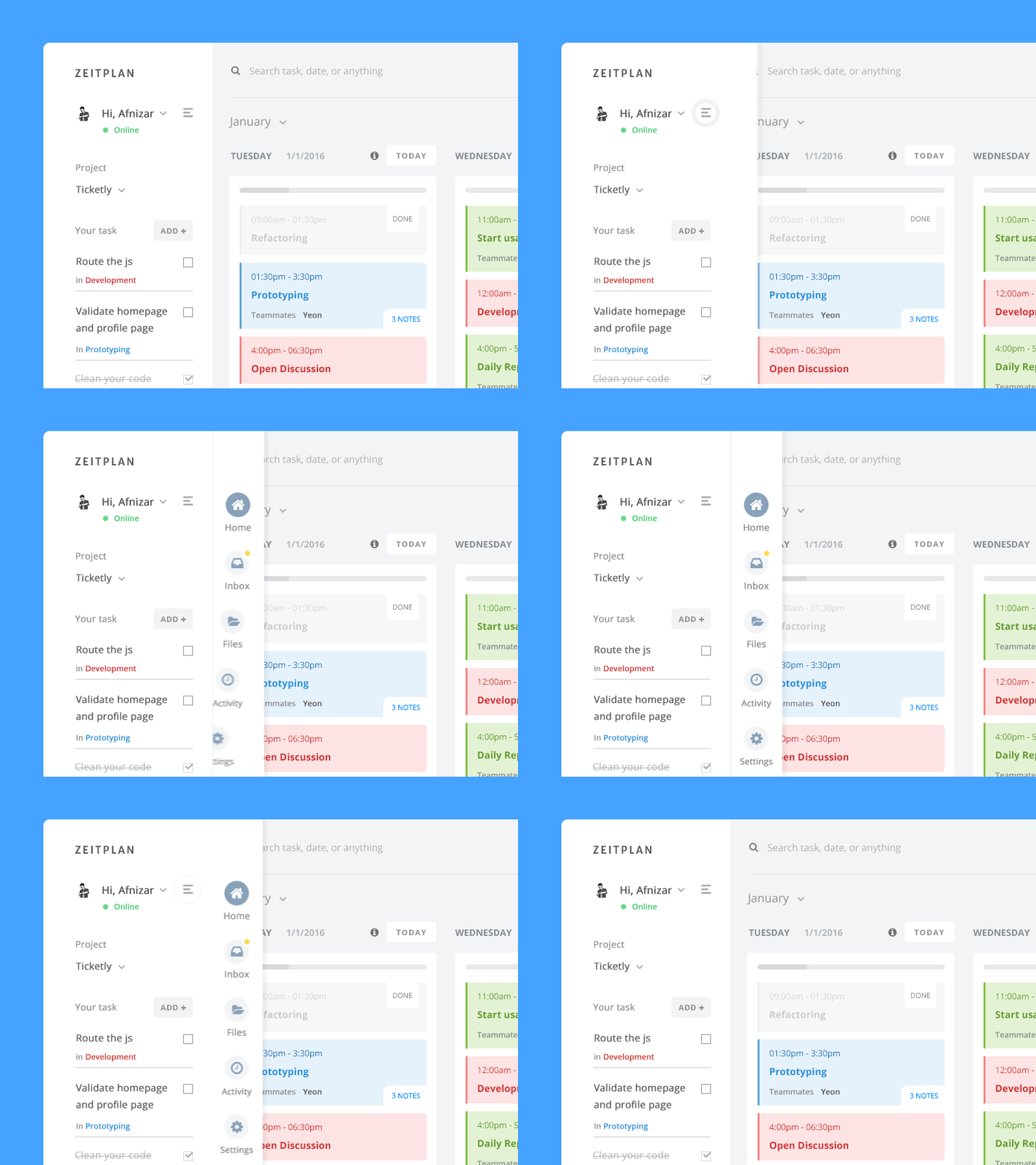
Image source: Afnizar Nur Ghifari[9]
2015 was definitely an animation year-it revealed a rising trend in the usage of creative motion and it enabled browsers to be faster and to comply with modern technology. It was exactly this benefit that inspired designers to employ creativity and to professionalize in the production of excellent animations.
If you ask us, interaction without motion is not possible. Let’s check this through the perspective of users: They close the tab, and it goes away; they make a mistake, and instant feedback messages appear on the screen.
We could mention hundreds of similar examples, but the point is to understand that thanks to these animations, users perceive a website or the app as something human, and responsive. The more natural an animation seems, the more advanced its design becomes.
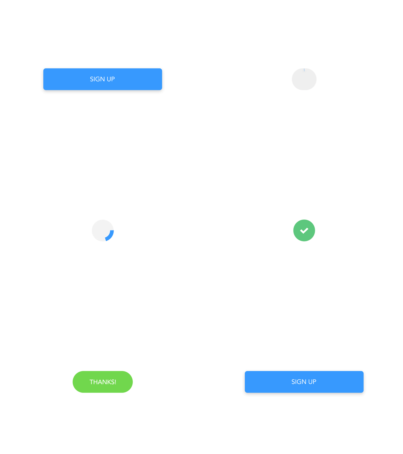
Image source: Pixel Junglist[10]
