In this tutorial I will walk you through the design process of a simple and conversion-oriented app landing page. We’ll use the Tuts+ Android app for the demo, emphasizing its features and benefits, and employing calls to action throughout.
Essentials of High Conversion
When designing landing pages there are some things you need to get right to enjoy high conversion rates.
According to growth hacker Neil Patel, in order to have a competition-crushing landing page you need:
- A killer headline
- Persuasive subheadlines
- Pictures
- Explanation
- Value proposition or benefits
- Logical flow
- Trustworthy testimonials
- Powerful call to action
We’re going to implement all of the above elements to make our landing page as effective as possible.
AIDA Model
I highly recommend you take a look at Employing AIDA Principles in Web Design by Shaun Cronin. AIDA stands for Attention, Interest, Desire and Action; and these principles can be applied to different situations which involve selling products or services.
Research shows that people don’t mind scrolling, so once you’ve created initial interest at the top of the page you shouldn’t worry about making your landing page longer. This is necessary to tell a great story and add persuasive elements.
A/B Testing
Effective landing pages cannot simply be designed once and perform well. You have to keep testing with various combinations of copy, colors, call to action and other elements to achieve the best results.
For more information on this check out A Web Designer’s Introduction to A/B Testingby Siddharth Deswan.
Tutorial Assets
In order to follow along you will need some (freely available) assets:
- Photos from Unsplash
- PT Sans font from Font Squirrel
- User icon from Iconfinder
- Marker icon from Iconfinder
- Clock icon from Iconfinder
- Samsung Galaxy S5 Mockup by Martin Adamko
Get the Document Ready
Step 1
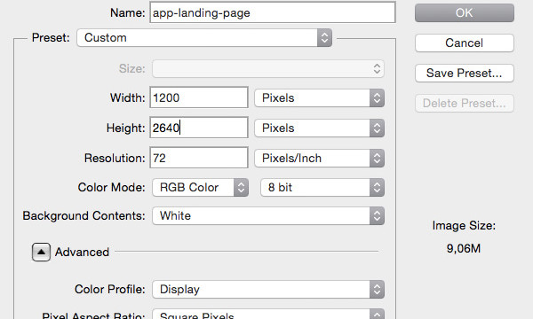
Begin by creating a new Photoshop document (File > New…) using the settings shown below. You’re free to use a canvas of whatever dimensions you prefer.
Step 2
Let’s set some guides so our layout has enough space and looks balanced. Setting some guidelines will ensure neatness and will help to define our website’s width for the purposes of this design. Go to View > New Guide… and set some guidelines. I usually choose 1000px as a starting point and add some guidelines from the corners so it has space to breathe.
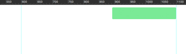
Note: Guidelines used for this tutorial: vertical at 100px, 600px and 1100px.
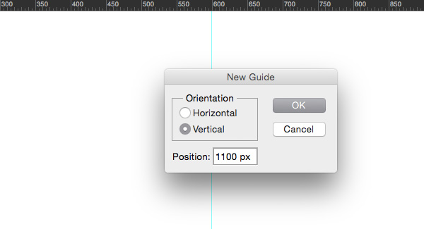
Tip: You could also use the GuideGuide Photoshop plugin to make this process even quicker.
Designing the Header Area
The header or area “above the fold” plays a very important role in engaging with users and ensuring that visitors stay on the website.
Our app landing page’s main function is to convince visitors to download the app. For that reason we’ll focus on the benefits of trying out the app and make it easy to download.vvv
Step 1
Let’s first create a group called “Header” by clicking Layer > New > Group… or hitting the little icon at the bottom of the layers panel. After that grab a Horizontal Type Tool (T), choose PT Sans (Bold) 18px size font, set color to black #000000and enter the name of your app to serve as a logo, place it on the top left corner right next to the first vertical guideline. Give it some space above so it doesn’t look cramped.
Step 2
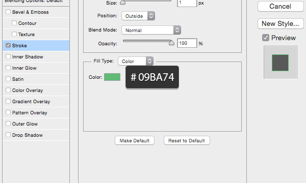
Let’s create a call to action button that we’re going to reuse throughout our design to make sure that visitors take action. Create a new group called “CTA btn” and pick the Rounded Rectangle Tool (U), set Radius to 2px, change the foreground color to lime green #17e594 and draw a 206x38px sized rectangle shape.
Now click the right mouse button on the layer, select Blending Options… and check the Stroke option. After that apply a darker green #09ba74.
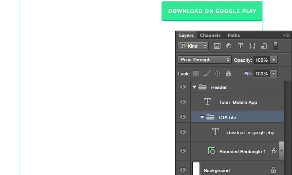
Pick the Horizontal Type Tool (T) again and enter the copy for our button. I’ve usedPT Sans (Bold) 12px and the color white #FFFFFF.
Step 3
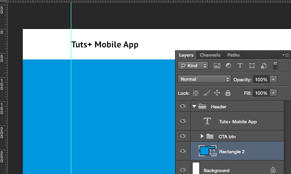
Now pick the Rectangle Tool (T) and draw a 1200x600px (any color) rectangle shape and place it right below our minimal top navigation. I’ve left a 25px gap between the logo and the shape as I did for the logo above so it’s consistent.
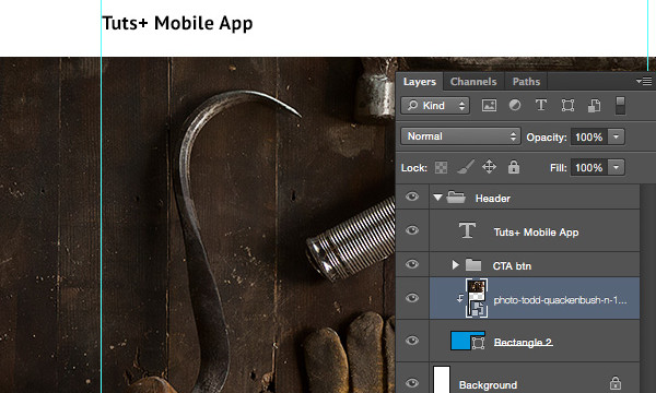
Now grab a Toolkit photo from Unsplash and place it above the rectangle shape layer. After that hold down the Alt key and mouse over the image layer until you see a little arrow pointing down, then release the mouse to create a Clipping Mask so the image is only visible in the area of the rectangle.
Hit CMD+T to resize the photo, making sure you hold down the Shift key so you resize it proportionally.
Step 4
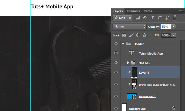
Let’s add a filter layer of gray so we make our background ready for copy and the app screenshot.
Change the foreground color to dark gray #222325 and create a new layer, then place it above the photo layer and once again create a Clipping Mask. After that hitAlt+Backspace to fill the layer with gray. Finally, reduce the layer’s Opacity to 80%.
Step 5
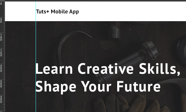
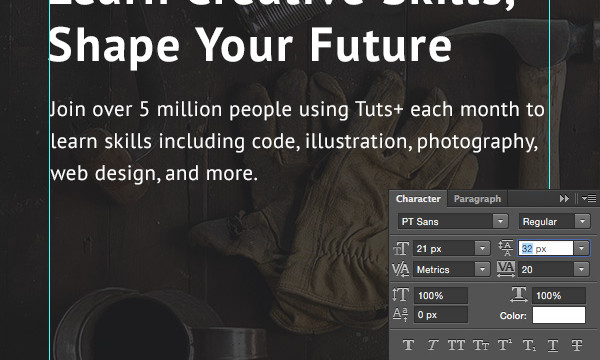
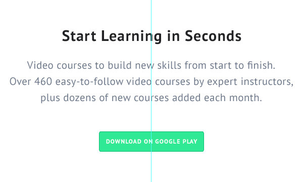
Grab the Horizontal Type Tool (T) again, change the color to white #FFFFFF and using PT Sans (Bold) 48px size enter the main message. Make sure you give it a lot of space above.
Step 6
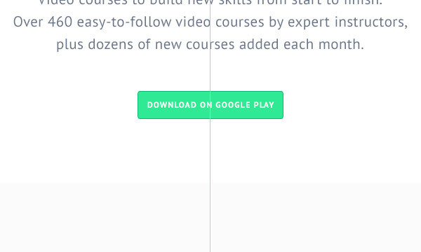
Now reduce the font size to 21px, select Normal font weight, enter a more descriptive message and place it below the main message. To make lines look balanced and easy to read increase the line height to at least 30px. Place the description below the main headline, in my case I moved 40px down.
Step 7
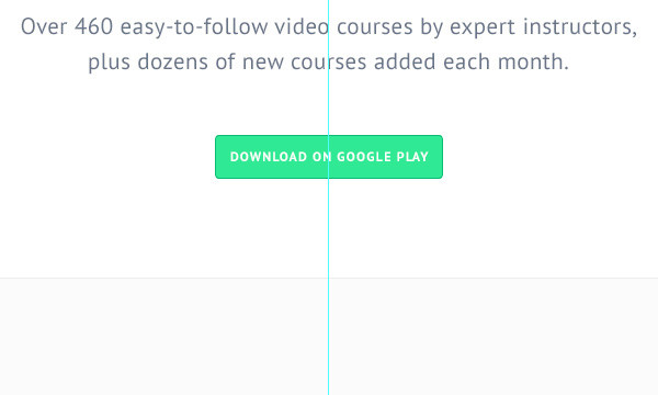
Let’s repeat our call to action (CTA) button so it’s clear for the visitor what to do next after reading the copy. Find the “CTA btn” group and duplicate it by hitting CMD+J, after that place it below the secondary message.

Step 8
We’re done with the copy and main call to action, so let’s put an actual app preview to show how the app looks before people decide to download it.
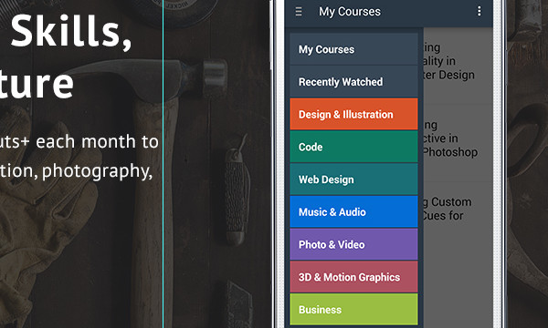
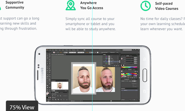
Download the free Samsung Galaxy S5 mockup by Martin Adamko and place it into your document. After that, hold down the CMD key, click on all the layers that belong to that mockup and right-click to choose Convert to Smart Object. Use CMD+T to resize it and move to the right from our main copy and description.
After that, place your app screen on the smartphone mockup by hitting on the smart object layer and saving it. I’ve used a screenshot of a new Tuts+ Courses Android app.

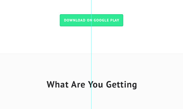
Designing the Benefits Area
We’re done with the header. Minimize the group and create another one called “Benefits”.
Step 1
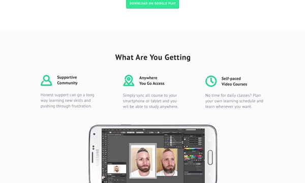
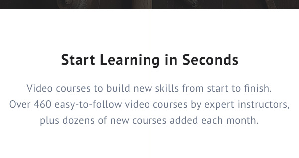
After that, pick the Horizontal Type Tool (T) again, change the color to the same dark gray #222325 we used for the filter (make your design consistent and cohesive instead of bringing more colors) and using PT Sans (Bold) 30px enter a strong statement and place it below the header area, leaving plenty of space above it.
Step 2
Now we have a chance to convince our visitors why our app is worth downloading. Think of benefits over features so people can visualize themselves using it. Change the color to a subtle gray blue #6a7588 and enter a couple of lines explaining why people should use your app. I’ve gone for PT Sans (Regular) 21px with the line height set to 32px, the same setting as used for the secondary message in the header area.
Pay attention to the spacing between text blocks, leave enough space to give that light feeling to your design.
Step 3
Once again, let’s repeat the call to action (CTA) button so visitors who weren’t convinced earlier can take action right after reading your benefits copy. Duplicate the “CTA btn” group by hitting CMD+J and place it below the benefits copy. Move it into the “Benefits” group to make your document more organized.
Designing the Features Area
We’re done with the benefits area, so minimize the group and create a new one called “Features”. Here we will highlight some of the app features so visitors who want to know more and are already interested can find out more about the app.
Step 1
Change the foreground color to light gray #fbfbfb, we’ll use a different background color for the Features section to separate it from the rest. After that pick the Rectangle Tool (U) and draw a 1200x700px sized shape that will serve as a background. Make sure to give the section space above.
Step 2
To set apart the Features area even more let’s put 1px horizontal lines between the backgrounds. Pick the Line Tool (U), set the Weight to 1px and change the color to a darker gray #eeeeee.
Tip: hold down Shift key to draw a perfectly horizontal line.
Step 3
Open up the “Benefits” group and find the headline layer, hit CMD+J to duplicate it and move into the “Features” group. Edit it to fit your needs and place it inside the previously created gray background.
Step 4
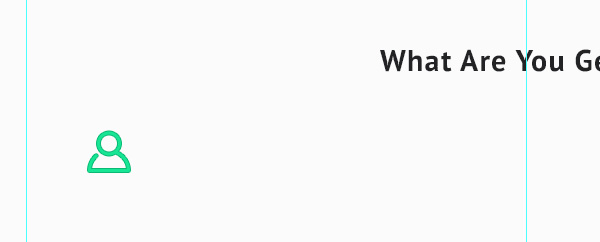
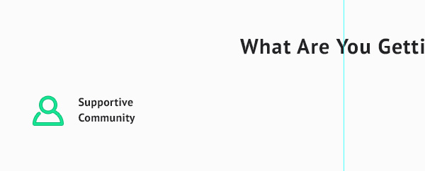
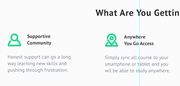
We’ll create three blocks of features with an icon, headline and a short description. Create a new group and call it “Feature 1” or something more descriptive. Head over to Iconfinder and download a 48×48 px user icon. Click the right mouse button on its layer name and apply the following options.
You may notice that we’re actually mimicking the button style so everything is consistent.
Step 5
Once again, duplicate the headline layer, place it inside the “Feature 1” group and using the Horizontal Type Tool (T) reduce its font size to 16px and line-height to22px.
Step 6
Using the same Horizontal Type Tool (T) write down three short lines explaining your feature. Make sure to change the type color to the previously used gray blue#6a7588. Place below the icon and headline.

Step 7
Now minimize the group and duplicate it twice by hitting CMD+J. After that customize the duplicated groups to fit your app. For this tutorial I’ve used marker andclock icons from Iconfinder. Make sure to leave enough space between the blocks so it looks balanced
Step 8
The more you show how the actual product looks the better, we’ll use a different perspective of our smartphone mockup. I’ve flipped the previously used Samsung Galaxy S5 mockup and replaced its screenshot found on Google Play. Right-click on the mockup layer at the top and select New Smart Object via Copy to create an independent copy.
To customize the smartphone mockup, click twice on the layer thumbnail and place your app screen there
Designing the Testimonials Area
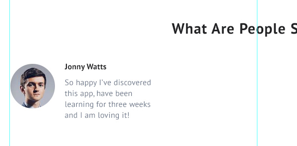
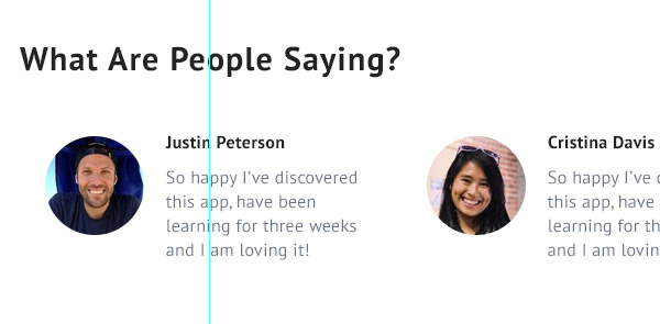
We’ll add some social credibility for our app by showing some testimonials from app users.
Step 1
Minimize all the groups and create a new one called “Testimonials”. Enter a section headline as we did before and place it below the “Features” group background leaving a consistent amount of space.

Step 2
Now open up the “Features” group, duplicate one of them and move it inside the “Testimonials” group. We’ll reuse the group for our testimonials. Edit the copy, changing the headline to a person’s name and description to the testimonial copy.
Remove the icon and, using the Ellipse Tool (U), draw a circle shape. After that place the person’s profile photo above the circle shape layer and create a Clipping Mask. I’ve used a face from User Inter Faces.
Step 3
Finally, duplicate the freshly made testimonial group and customize it with different names, testimonials and profile photos.
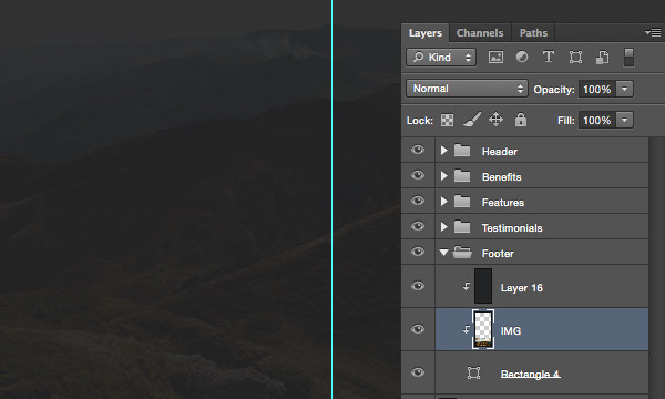
Designing the Footer Area
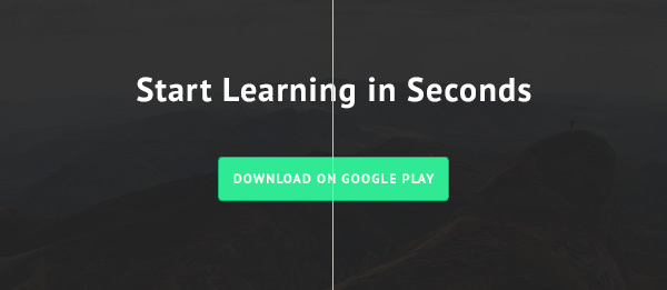
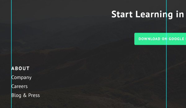
Minimise the “Testimonials” group and create another one called “Footer”. We’ll put a final call to action (CTA) button here and some links to inner website pages as most people scroll down to look for the site’s architecture.
Step 1
Head over to the “Header” group and, holding down the Shift key, choose the rectangle shape and gray filter layers. After that hit CMD+J to duplicate them and move them into your new “Footer” group. Then place a photo of your choice between the rectangle shape and gray filter layers creating a Clipping Mask
Add another headline encouraging people to take action and download your app. Make it white #FFFFFF so it’s highly visible on the darker background. After that, duplicate the call to action (CTA) button and place it below the headline.
Step 3
Pick Horizontal Type Tool (T) again and enter some links of your website. I’ve used white #FFFFFF PT Sans (Regular) 16px and a line-height of 29px.
Step 4
Duplicate your text layer and customize it to fit your app. After that, place a copyright line at the very bottom of your footer leaving plenty of space above and below it.

Congratulations!
That’s it! We’re done with the theme design, now review your document layers, delete the unnecessary ones and hand it over to your developer, or, even better, code it yourself!