Luxury brands are all about projecting the right image. It’s a combination of taste and style that makes the brand appealing to people. Designing a website that successful captures the luxurious sense of a brand is a fine art, and one that must be practiced. Here are some tips on how to design a luxury product website.
Modern Design
Capturing a high-class aesthetic is crucial for a luxury product website. While it might be hard to put your finger on exactly what makes a design that feels luxurious, modern design is always a crucial part of the equation. Outdated styles are immediately obvious.
While your design should be conservative, it should still be reasonably on trend. We shouldn’t see skeuomorphic buttons on your home page, for example. It’s one thing to have “old-fashioned” elements in your design, like serif typefaces, but it’s quite another to have small pictures or frames on your website.
In web design, we’re knee-deep in a wave of minimal, flat design. Your luxury website should reflect that trend. It should also be responsive and generally well-designed. An old-looking luxury website is death on a stick. Luxury is all about appearance and exclusivity. If your website doesn’t project those ideas, it’s not going to be effective.
Large, High-Quality Images
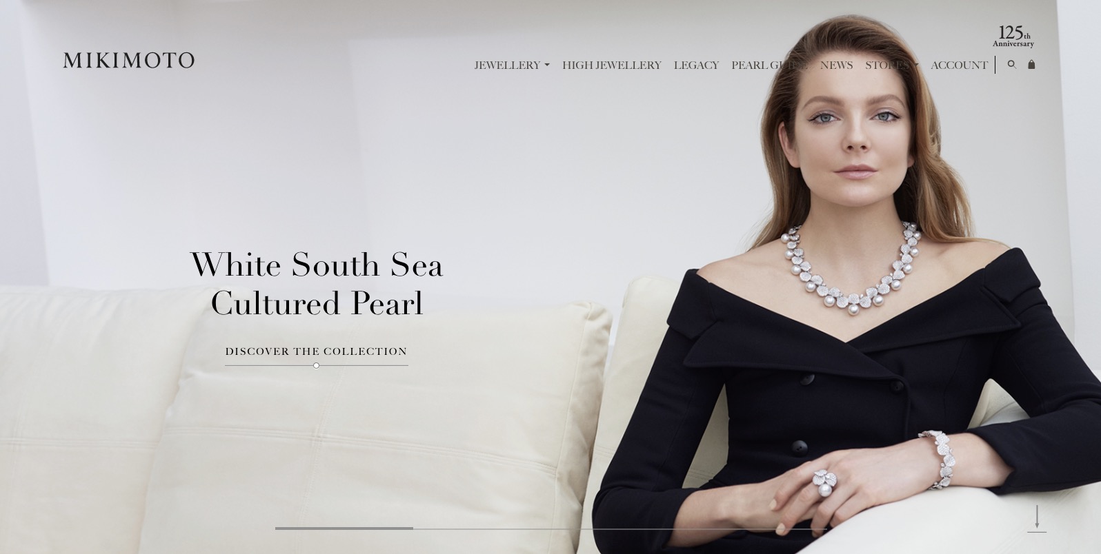
Mikimoto’s design is centered around lush yet conservative photography.
Luxury product sales require high-quality product photography. Whether you’re selling yachts, cars, jewelry or makeup, you need absolutely excellent photography. This means it must be technically sound and artistically appealing. Stylistically, it should be conservation. you don’t need to follow the latest Instagram trends. But you cannot make mistakes in your photography. Remember, luxury is all about image.
Don’t use stock photography if you can avoid it. Inauthentic-looking images will be an immediate credibility killer, and you won’t get the conversions your client wants. If the client doesn’t have their own imagery yet, suggest that they work with a professional photographer to capture images that convey the essence of their brand. Photography is the core of the luxury brand experience online. Without excellent photography, your website won’t be effective.
Don’t make the mistake of using small images, either. The current web trend is all about large statement images. High-end fashion brand The Row makes this error in their own design: with a huge amount of real estate to work with, the site limits itself to a comparatively tiny image. This is very much a Web 1.0 design, and it doesn’t reflect well on the quality of the brand.

Don’t float a tiny image inside a giant white box. Image from The Row.
Excellent Typography
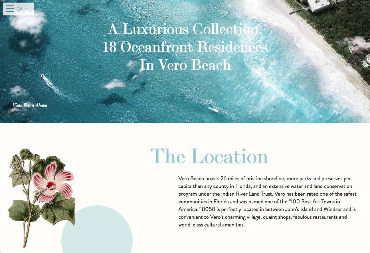
A strong typographic layout, as seen on Vero Beach, will grab the reader’s attention that convey information effectively.
Typography should be central to your luxury product website. Use readable, modern typography. Avoid ultra-trendy designs, but pick typography that feels fresh and modern. Lean into headline fonts, and consider both classy sans serif faces as well as serif choices.
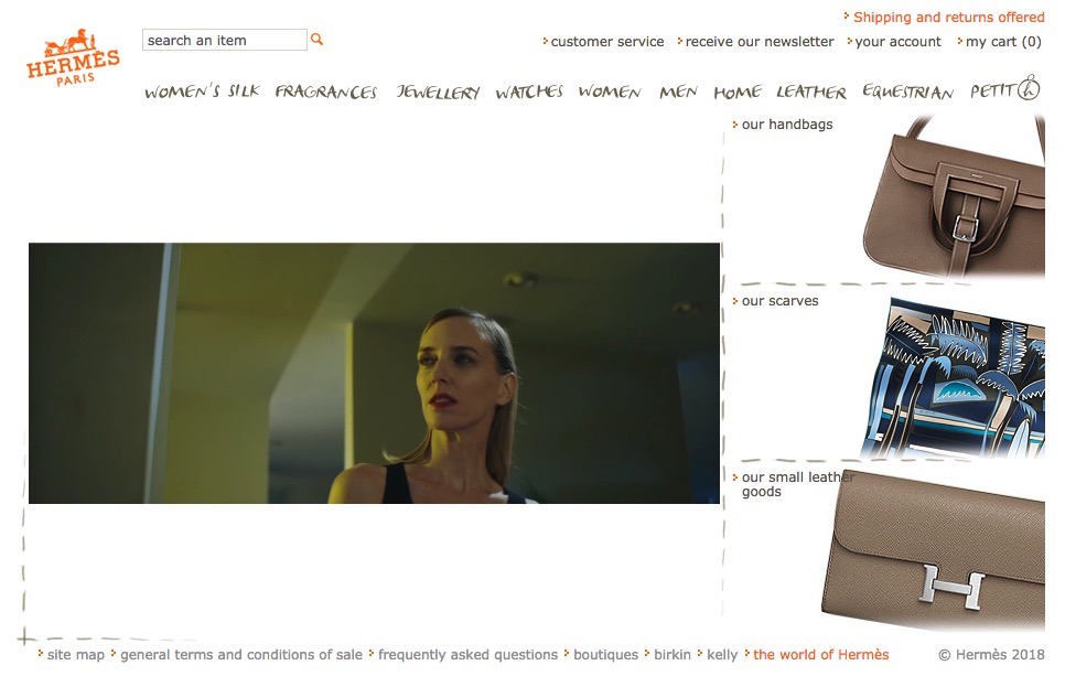
While Hermés’ US website is well-designed, the Hermés UK site suffers from old-fashioned design and illegible typography.
On the home page, display only a small amount of text at any one time. Paragraphs of text should be saved for product detail pages and about pages. Even then, be direct, and make sure your design is extremely legible.
Extreme Legibility

This Aston Martin page is clearly intended to convey detail about a modern of vehicle. Clearly named sub-categories let me jump around quickly, and a subtle down arrow tells me to scroll to continue. Arresting imagery doesn’t hurt either.
Luxury is associated with ease and comfort. The more accessible your design is, the easier it will be for users to interact with the site. And luxury brands shouldn’t be difficult for their customers: everything should be taken care of for them. Remember the halo effect: a positive experience with your website will encourage users to develop positive feelings about the brand.
Make sure your site has a comfortable, natural flow, with a clear direction and purpose that guides the user through a pleasant experience. The jewelry blog, Beyond4Cs, is an example which utilizes a clear menu system to help users navigate towards key content.
Avoid anything that interrupts or degrades the experience, like pop-over boxes or auto-playing music. Sometimes, less is more. In the words of luxury smartphone manufacturer Apple, your site should “just work.”
Monochrome Color Scheme
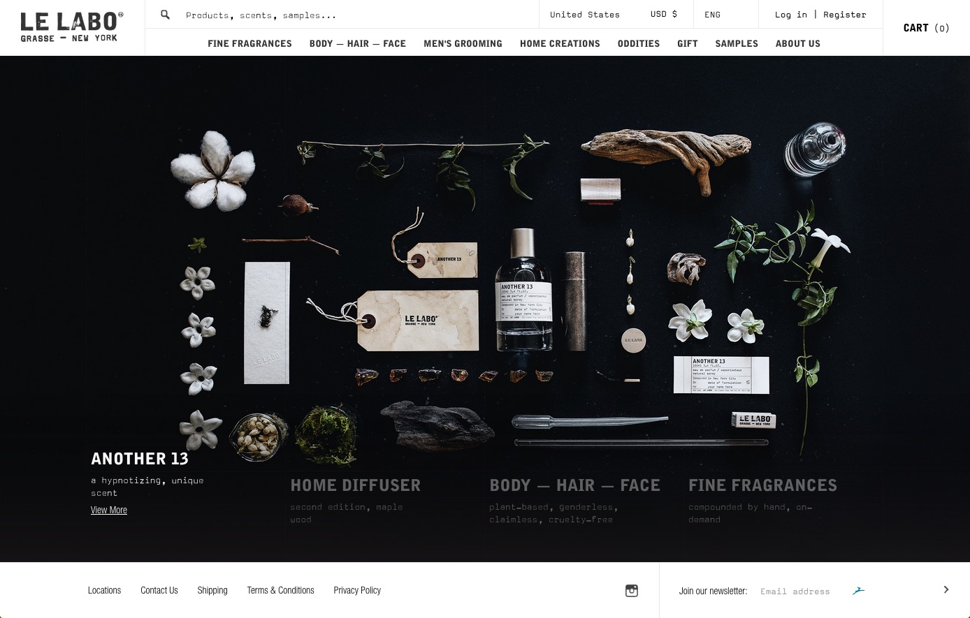
Match your color scheme across photography and typography for a unified look, like Le Labo.
Focus on a monochrome design. Luxury brands tend to go either all white or mostly black. There’s good reason for this. We associate darker colors with sophistication, class and style. Gold and black or black and white are both a classic combination, especially when paired with a modern serif font.
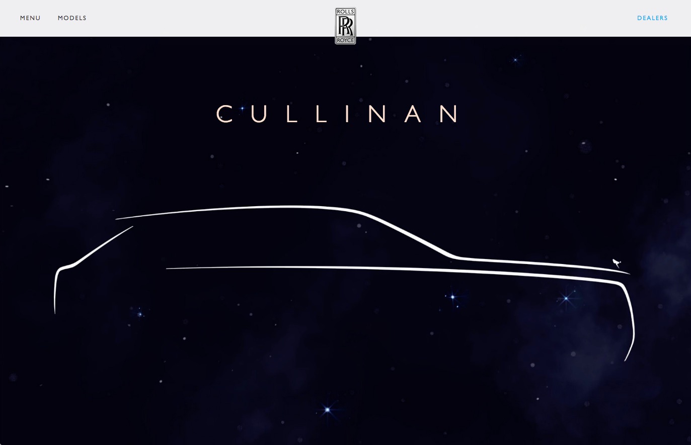
Rolls-Royce grabs the viewer’s attention with a black-and-white design that’s carried throughout the site’s imagery.
However, any cool, monochrome color scheme might serve you well. You can take a look at Adobe Color to build a color scheme based on the palette that best suits your client’s brand.
Subtle Ecommerce Elements
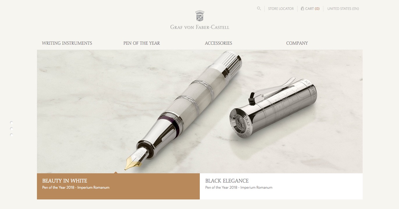
Faber-Castell uses subtle ecommerce elements to avoid feeling cheap or commercial.
If your customers are shopping big ticket items, they should get a high-end experience before they plunk down their cash. Don’t pad the site with the “traditional” ecommerce tools like a clunky toolbar and a featured product carousel. Keep it restrained, with just the essentials. Display only one product at a time, with large, clear images that grab the viewer’s attention.
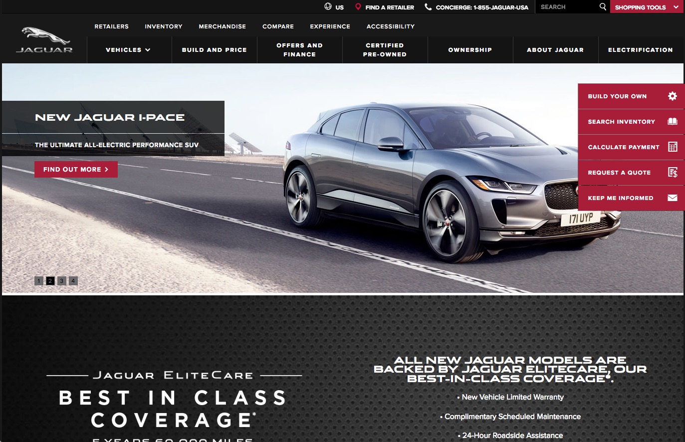
Jaguar, on the other hand, uses the standard car website tool palette, creating a cluttered and common feel.
If your site is cluttered with links, sale text and buttons, the user experience will suffer. We want to encourage a sense of pleasure and splendor in our viewers, maybe even a subtle amazement or awe at the quality of our products and the beauty of our photography. Wow the viewer, don’t block the experience with overlays.
Conclusion
When you design a luxury product website, you must ensure that you’re create an impressive, attractive experience for the visitor. Put that above all else, and you’ll find your way.
You might also like the following posts:
