No matter if you are focusing your branding efforts on your website, marketing, or business cards… it’s all a reflection on the business and brand you create.
Did you know that 64% of consumers make a purchase after they view a branded social video? Think about that for a moment. If you create a video that follows your brand guidelines, 64% of viewers will buy your stuff after seeing it.
Did you also know that color alone can increase brand recognition by 80%? That means consumers will recognize your products 80% more often if you simply use the same colors on those products.
That’s what your brand identity is all about: creating a clear, consistent message for your audience. That means in your videos. It means in your blog posts. It means in your color choices, taglines, and emails.
But there’s a secret that experts use to convert your brand identity into a consistent message. It’s called a brand guide. When you’re ready to discover what it is and how it works, read on.

What is a Brand Guide Exactly?
Imagine for a moment that you’re a screenwriter. You imagine the most incredible, audacious storyline of all time. You only need a few great actors to act it out, and it’ll be the best selling movie of all time.
You round up the financing. You pin down the best actors, directors, and film crew of all time. You even figure out who your audience is and where you’ll be playing the movies.
There’s just one thing you forgot.
The script.
You’ve got to put that fabulous storyline into writing so every person working for you will understand your intentions. In this example, your storyline is your brand identity, and your script is your brand guide.
Brand guides (aka style guides) are the documented guidelines that outline your company’s identity. These guides have two equally important halves. Your visual style and your content style. With these pieces, anybody can understand and replicate your brand.

Visual Style and Content Style
The styles we’re talking about help your content creators and graphic designers create any elements in your particular style. Here are some examples:
Color Palette
These colors will be used throughout your company’s advertising and marketing strategies.
Stick to less than colors (not including black, white, or grey). Make sure to include RGB and CMYK color codes, as one is for digital mediums and one is for print.
Logo Design
Include colors, size restrictions, and optional backgrounds. Make sure your logo is a vector graphic. They can be sized up or down without causing pixelation. Unlike JPGs, vector graphics will also support transparency.
Typography
This includes the various typefaces, styles, colors, and sizes of your textual elements.
Graphics/Images
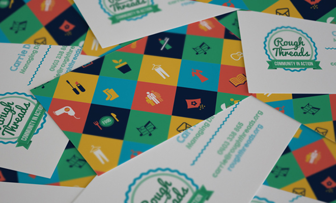
Yes, graphics can be just as important as logos. Make sure you’re consistent, and each piece represents your unique style. You can use these free business card template ideas to get a better idea of what we mean.
Imagine how the images on each might be incorporated on a company’s website, videos, and brochures.
Tone
This one conveys the overall tone your company represents. Is it playful? Serious? Friendly? What impression do you want to leave your audience with?
Slogan/Tagline
Your slogan should be consistent throughout your campaigns. Your tagline should remain the same within a campaign, though it may change from one campaign to another.
Message
This one is huge! It’s less about the words you use, and more about what those words convey to your customers. Here are a few examples of company branding. Can you pick out each of the graphics and content styles that we spoke of in this section?

Even Ugly Cards Get Attention Too!
Remember the song, “The Ugly Duckling”? Of course you do!
The moral of this story, is that “Ugly” things get a lot of love and attention too. For example, just look at DrudgReport, Craigslist, and Google. Their main pages are all super basic and pretty plain in comparison to the rest of the internet, but they still generate millions of dollars and have huge followings.
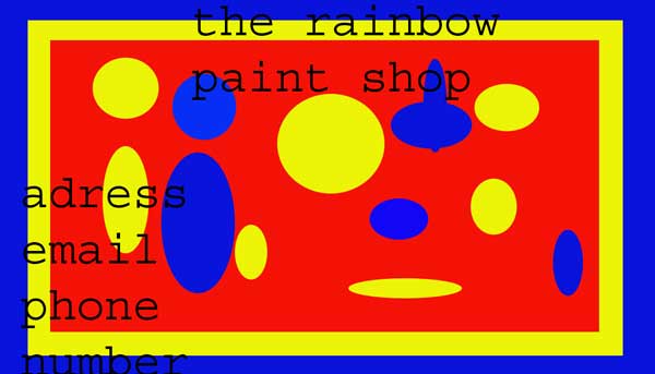
The same can be said of business cards as well. Don’t feel like you need to fall into the mix by have the same old white and basic business card.
Take a look at any of these ugly business cards and you will see exactly what we mean.

If you really want to mix things up and make a lasting first impression, throw in a set of these in with your next business conference or event.
What’s Next?
Now that you know the importance of the brand guide, how do you create your own? If you’ve already created your brand identity, it’s simple. You create a printable guide which properly details each element given above, based on that identity.
Did you find this information worthwhile? If so, browse the library full of other fantastic design articles.
So long and good luck!
Author: Zac Johnson
Zac Johnson is an entrepreneur with 20 years of experience in the world of online marketing and branding. Follow his journey at Blogging.org and ZacJohnson.com.