

With clever use of CSS properties, it is in fact possible to draw very complex shapes. All the shapes below were drawn with CSS alone. It might be that CSS isn’t the best way to render shapes in the browser window, but it’s very fast and included for “free” on all modern browsers. Learn how to draw with CSS below.
Draw with CSS: Border-Radius
Setting the border-radius of an object can round off the corners. When used with more dramatic values, it can draw circular and elliptical shapes.
Circle
If we want to start a simple circle, we could use something like the following:
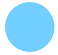
#circle {
  background: lightskyblue;
  width: 100px;
  height: 100px;
  border-radius: 100%
}
Ellipse/Oval
We can use the same properties to draw a simple ellipse.
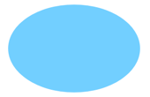
#ellipse {
  background: lightskyblue;
  width: 150px;
  height: 100px;
  border-radius: 100%
}
Because the height and width of the object are different, the circle is slightly cockeyed. This produces an ellipse, which is really nothing more than a drunk circle, if you think about it.
Cylinder
Using this principle, we can fake a cylinder too:
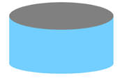
#cylinder {
  background: lightskyblue;
  width: 150px;
  height: 100px;
  border-radius: 100% / 30%;
}
#cylinder:after {
  content:"";
  position: absolute;
  background: grey;
  border: 0 solid transparent;
  border-radius: 100%;
  z-index: 500;
  width: 150px;
  height: 40px;
  top:  6px;
}
And if we add in another pseudo-element, we can give our cylinder a little shine:
#cylinder:after {
  content:"";
  width: 150px;
  height: 100px;
  border: 0 solid transparent;
  background-image: linear-gradient(to right, rgba(255,255,255,0) 0%, rgba(255,255,255,0.36) 50%, rgba(255,255,255,0) 100%);
  position: absolute;
  top: 10px;
  left: 20px;
  z-index: 400;
}
Visit the Codepen with this shape.
The linear gradient sits on top of the blue but below the grey. It’s also barely opaque, so it only creates a minor effect. This creates the illusion of depth, making our two-dimensional cylinder appear slightly more three-dimensional.
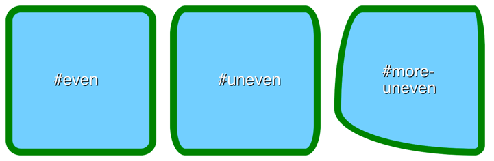
Uneven Border Radius and Slash Notation
This cylinder in both its forms relies on an important property: uneven border-radius and slash notation. If we set two values with a slash, like 100% / 50%, those values individually sets the horizontal border radius separately from the vertical border radius, and in that order. This creates unequal or uneven border curves. You can learn more about uneven border-radius syntax from MDN.
Here’s an example:
body {
  font: 24px Helvetica, sans-serif;
  color: #fcfcfc;
  text-shadow: 1px 1px 0px #000;
}
.shape {
  height: 200px;
  width: 200px;
  background: lightskyblue;
  border: 10px solid green;
  margin: 10px;
  display: block;
  float: left;
}
#even {
  border-radius: 10%;
}
#uneven {
  border-radius: 10% / 20%;
}
#more-uneven {
  border-top-left-radius: 60px 100%; /* no slash on individual radius properties, mix-and-match with pixel and percent measures */
  border-top-right-radius: 10% 40%; /* border will sometimes reflow to fit curve*/
  border-bottom-left-radius: 300px 100px; /* radius measurements larger than the shape itself can be declared */
  border-bottom-right-radius: 10%; /* you can mix and match with regular radius statements */
}
#center {
  width: 80px;
  margin-left: auto;
  margin-right: auto;
  position: relative;
  top: 50%;
  transform: translateY(-50%);
}
View the Codepen for these shapes here.
For a deep explanation of how border-radius works in a variety of cases, check out Lea Verou’s incredibly deep talk, “The Humble Border-Radius.”
Drawing With Border Widths
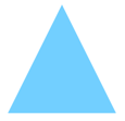
Non-curved shapes can be created with careful manipulation of borders. Most of these examples with use an object with 0 height and 0 width, so we’re really drawing with just the borders here.
#shape {
  width: 0;
  height: 0;
  border-left: 50px solid transparent;
  border-right: 50px solid transparent;
  border-bottom: 100px solid lightskyblue;
}
The CSS above will draw and equilateral triangle in light sky blue, my personal favorite of the named CSS colors. It works because of the way borders are divided.
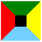
If we were instead to draw a shape like the following, we’d see a more intelligible shape:
#triangle {
  background: black;
  width: 40px;
  height: 40px;
  border-top: 50px solid green;
  border-left: 50px solid red;
  border-right: 50px solid yellow;
  border-bottom: 50px solid lightskyblue;
}
See how the differently colored borders are separated from one another at 45-degree angles? That’s what allows us to create a triangle. We are taking advantage of the spec to draw.
By manipulating which borders are which, we can change the direction of the triangle.
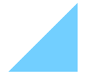
#right-triangle {
  width:0;
  height:0;
  border-left:100px solid transparent;
  border-bottom: 100px solid lightskyblue;
}
We can draw a massive variety of shapes using this trick, including some really complex ones. Take this five-pointed star by Kit MacAllister and found on CSS Tricks.

#star-five {
     margin: 50px 0;
     position: relative;
     display: block;
     color: red;
     width: 0px;
     height: 0px;
     border-right: 100px solid transparent;
     border-bottom: 70px solid lightskyblue;
     border-left: 100px solid transparent;
     transform: rotate(35deg);
 }

 #star-five:before {
     border-bottom: 80px solid lightskyblue;
     border-left: 30px solid transparent;
     border-right: 30px solid transparent;
     position: absolute;
     height: 0;
     width: 0;
     top: -45px;
     left: -65px;
     display: block;
     content: '';
     transform: rotate(-35deg);
 }

 #star-five:after {
     position: absolute;
     display: block;
     color: red;
     top: 3px;
     left: -105px;
     width: 0px;
     height: 0px;
     border-right: 100px solid transparent;
     border-bottom: 70px solid lightskyblue;
     border-left: 100px solid transparent;
     transform: rotate(-70deg);
     content: '';
 }
Visit the Codepen with this shape.
The big trick with this shape (or combination of shapes) is the use of the transform: rotate property. This works like it sounds, and spins the element around its central point. Positive degree values rotate the shape clockwise. Negative degree values rotate the shape counter-clockwise.
In shapes with zero height and width, the object is rotated about the point that would be the center of the shape if it had dimensions. This means that, with uneven border values, rotations may appear to happen about a position slightly outside the element, which is normal but confusing until you see it.
Conclusion:
Drawing with CSS is an under-utilized use of style sheets. Developers tend to reach immediately for images, SVGs, or even JavaScript. But there’s no reason to bring more than is necessary into your code. Sure, drawing a five-pointed star with CSS isn’t exactly easy or maybe even sensible. But for basic buttons, you can style shapes far more dramatically than you might realize. Try it out on your next project and see what you think.
You might also like the following posts:
Adding Vectors and SVG Images into Website Layouts
What is Z-Index and How Does It Work?
Using CSS Pseudo-elements and Pseudo-classes like ::before and ::after