If you are reading this article, you most likely have worked with a tech company or startup. You’ve noticed that this niche has its own rules. And you probably had to answer some hard questions. What’s the audience’s main treat? What’s the suited design style for tech clients? Do web design trends matter in this domain?
We gathered some answers to those questions that will help you in the future. We’ve also analyzed ten tech related pre-built websites. Using them will save you valuable time.
When Designing for Tech Companies, Following Current Trends is Essential
The educated Internet user will quickly decide if your website is hot or not. Trends are not only a matter of fashion, but using them transmits a message of freshness and coolness. Here are some of the most important trends that you should follow when designing for tech companies:
– Use Flat Icons – Drop the shadows, skip the gradients, and avoid the clever special effects. In other words, go “all Apple”. It’s the best way to engage your tech client’s clients – simple is best.
When working on a tech-related website, it’s all about fine touches.
– Use Bold Colors. You may have your favorite color schemes, but be prepared to let them go. Bold colors are hot for these types of websites. Look for color combinations that are fresh, dynamic, but not too noisy.
– Work on Your Own Data Visualization. Using data-driven elements needs to be your goal. Tech clients feel a need to communicate various types of data on their website. With data driven elements you can work on your own visualization schemes and not those that involve working with other software.
– Typography. in-browser fonts that are built for all screens, to be precise. Needless to say, an expressive, typography font should be delivered to all types of screens.
Ten Cool Examples of Pre-built Websites Destined to Tech Companies & Startups
Pre-built websites are powerful website-building tools. At the same time, they are almost ridiculously easy to work with. They are simple to install (one click). And they require no coding skills (an experienced coding team has already done that for you).
They also are responsive and retina ready. They offer modern features (some include parallax effects and video backgrounds). And with the highly popular Be Theme, you have 220+ of them to select from.
The Ten Cool Examples
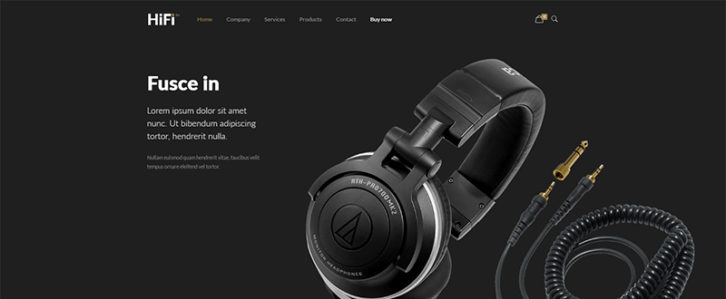
A stylish layout focusing on big, beautiful images. A down-to-earth e-commerce approach. This is a winning recipe for a tech-oriented website. There’s a section on the homepage to present new products, plus a product page devoted to features and benefits.
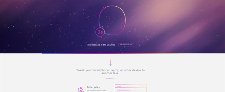
This is a very clean and modern-looking pre-built website. Its focus is on communicating an app’s features and benefits. This one page, landing page-structured, pre-built website features relevant sections. A news area, a newsletter subscription form and a section reserved for updates.
Providing a nice experience is definitely the case here. There’s plenty of white space, and a clear product presentation highlighted by a subtle parallax effect. The sections? A short description is followed by a series of areas dedicated to information relevant to the product and the app’s community. And and a section for a video presentation.
This pre-built, professionally oriented website features an eye candy hero image. The elements are positioned to focus on the headline. The visual approach used is definitely corporate, but with a friendly twist. Its icons convey a relaxed perspective. The layout directs the user to clearly presented sections: benefits, features, and pricing plans.
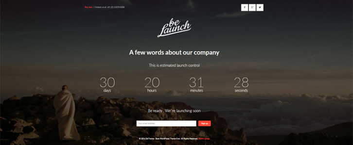
You will find this special-purpose pre-built website especially useful. The counter, as demonstrated here, could be used to count down to a product release. In its entirety, you can customize this pre-built website can to fit a large number of purposes.
This one page pre-built website is destined to an e-book (in this case a design e-book; but it could be any type of e-book). Notice how the Be team has made excellent use of a bold color trend in their use of a dynamic combination of purple and green.
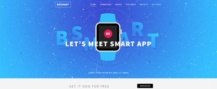
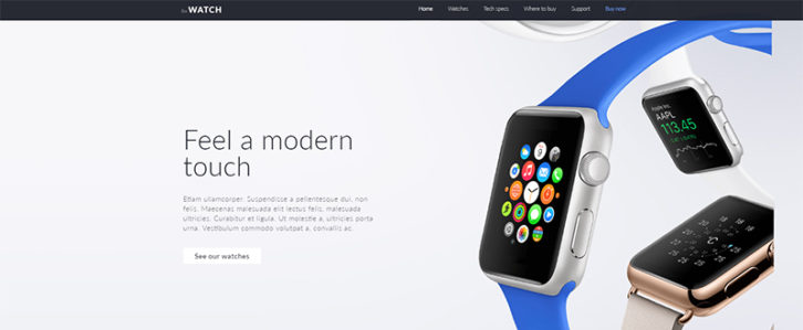
This pre-built website is an ideal choice if your client has a smartwatch shop. Or any other tech-related product line for that matter. Since these pre-built websites are easily customized, they represent only a starting point. A current e-commerce trend is a focus on big beautiful pictures, along with a generous use of white space, and you see that in this example.
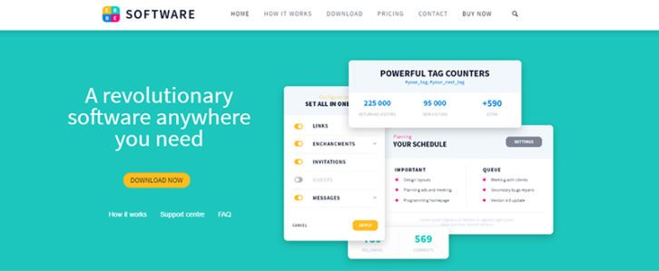
The first thing users will notice is the dynamic, yet relaxing effect of the color scheme used. A classical header is used on the homepage, which also contains a testimonial area and relevant information on the product. This is a suited design for a client dealing in software products.
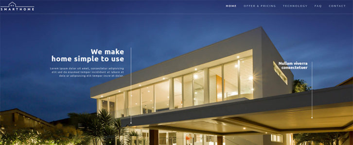
The hero image demonstrates how technology could transform a home. The use of cool icons and other subtle effects, a clever selection of graphical elements. This all adds up to a highly engaging pre-built website.
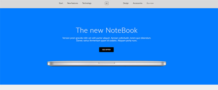
This pre-built website is perfect for a notebook site. It applies to other eye candy tech products as well. The impressive minimalist hero image is followed by a flat icon area emphasizing the products features. The coherency throughout the design offers a definite sense of equilibrium.
Be Theme – The Perfect Starting Point for a Tech Company’s Website
These pre-built websites have many features embedded in them. One click install, no need for coding, and a cool visual builder.
Besides, the latest web design principles and trends are incorporated. You will have everything you need to deliver a kickass tech website.
Curious about how to install one and get started?
Just view this:
Be Theme, with its more than 46,000 web design users, is a top 5 seller on ThemeForest. Join the community, and it will become a favorite of yours as well.
0 Comments
