 From some very tough competition, these are the 50 sites we liked the best this year. Each one has been chosen either because it took a unique approach, or because it was central to a design trend that was a big hit in 2019. There’s a lot of fullscreen video, a lot of illustration, and the emergence of a post-Brutalist maximalism trend that’s set to keep running into 2020 and beyond. Is your favorite included in the list?
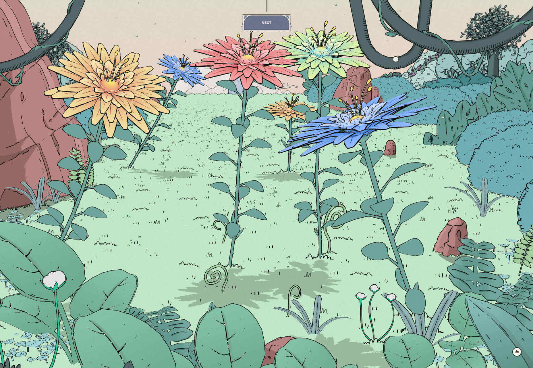
Nomadic Tribe
Illustration has been one of the biggest trends of 2019, and it is used to great effect in Nomadic Tribe, an interactive, animated short story, created to celebrate the end of 2018 and the start of 2019. Very little has surpassed it all year.
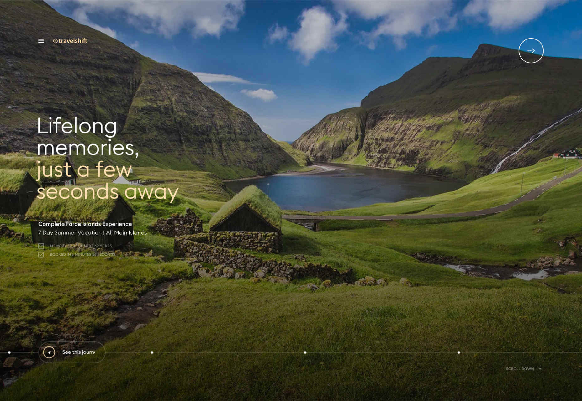
Travelshift
It’s never easy to reinvent navigation while maintaining great usability. Travelshift does an exceptional job of combining a simple navigation interaction, with beautiful animated transitions, to create one of the sites of the year.
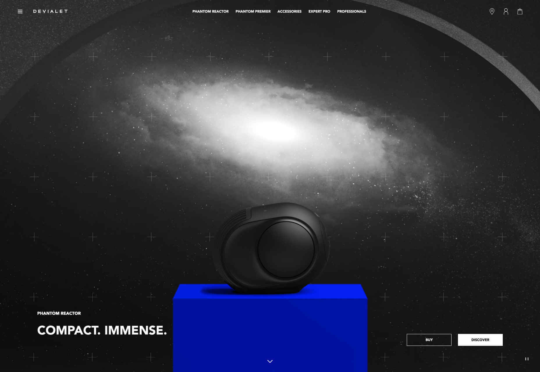
Devialet
Sound on the web is one of the least-liked technologies, with most people browsing with their sound off, and those that do enable it using tinny notebook speakers. So the designers of Devialet’s site had to present depth, range, and power in a visual way.
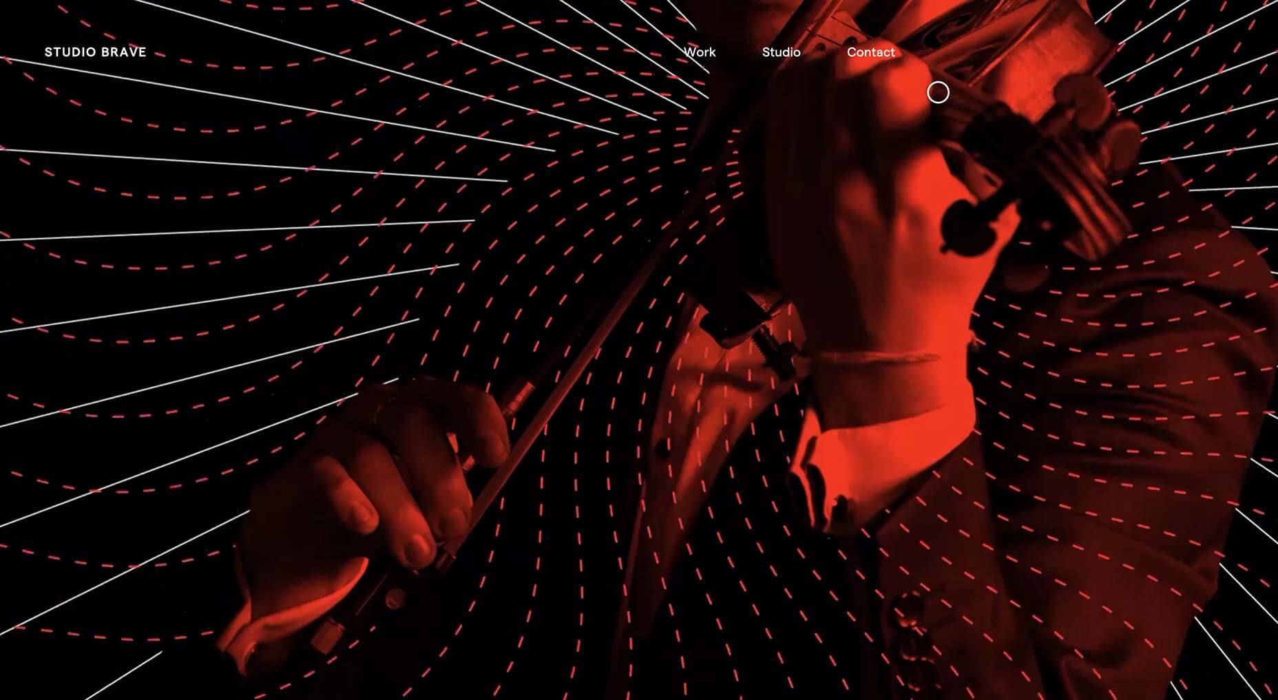
Studio Brave
More full screen video, this time from Studio Brave who wowed us in 2019 with some exceptional visuals to sell us on their portfolio. We even like the custom cursor, which is normally a huge no-no.
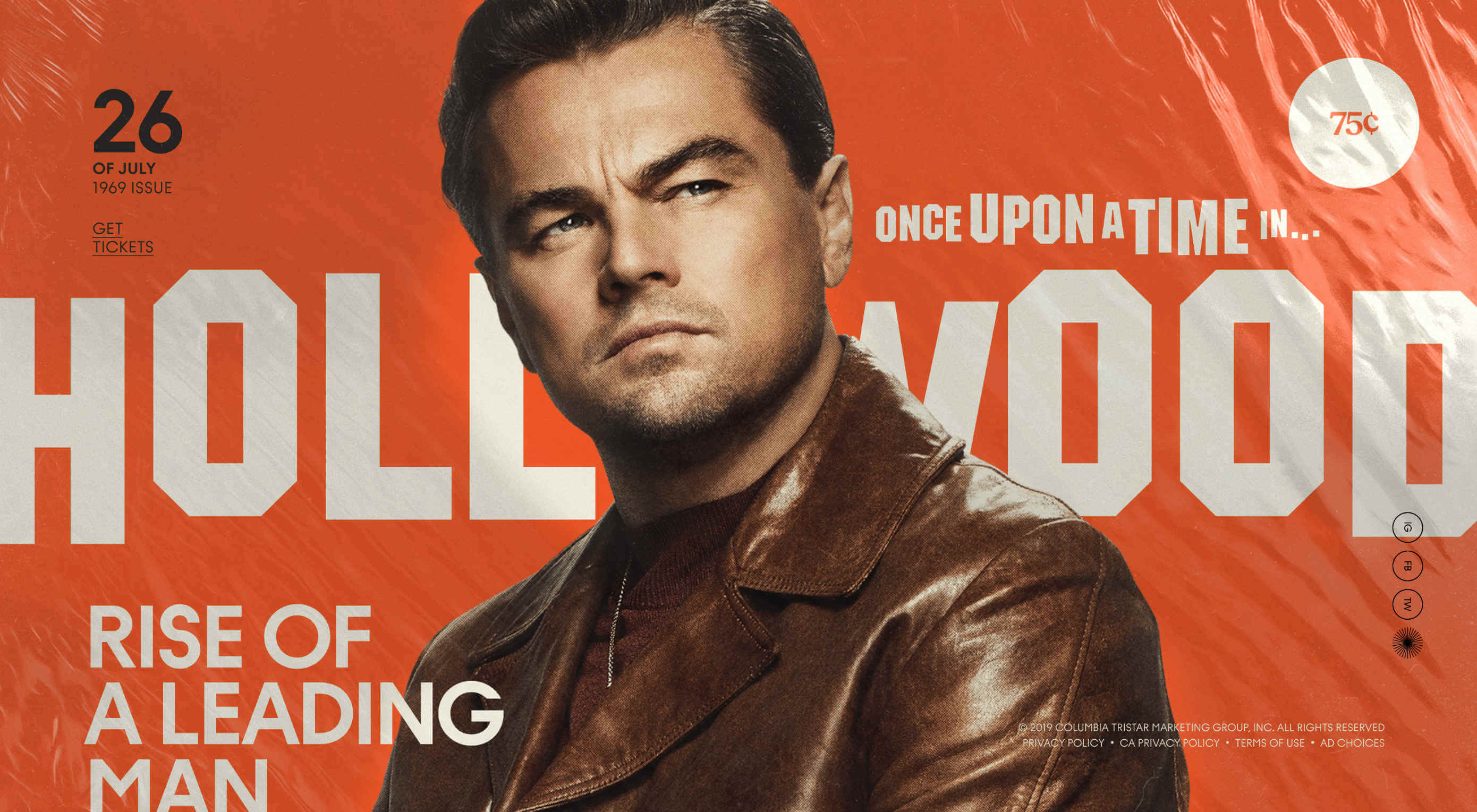
Once Upon a Time in Hollywood
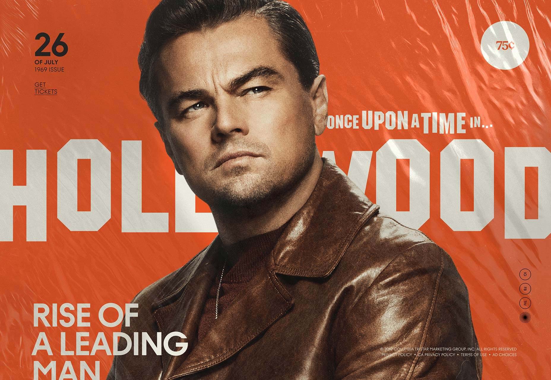
One of the biggest films of the year is designed to hark back to the culture of 50 years earlier, and its awesome promo site transports you to the time of Woodstock and the moon landing.
Hachem
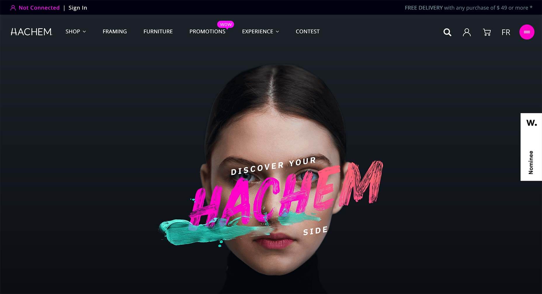
2019 is the year that we abandoned minimalist grey and adopted bright, rich colors. The trend is all the more obvious when combined with dark mode. One of the best examples this year was the art supply store Hackem.
Near Miss Memorials
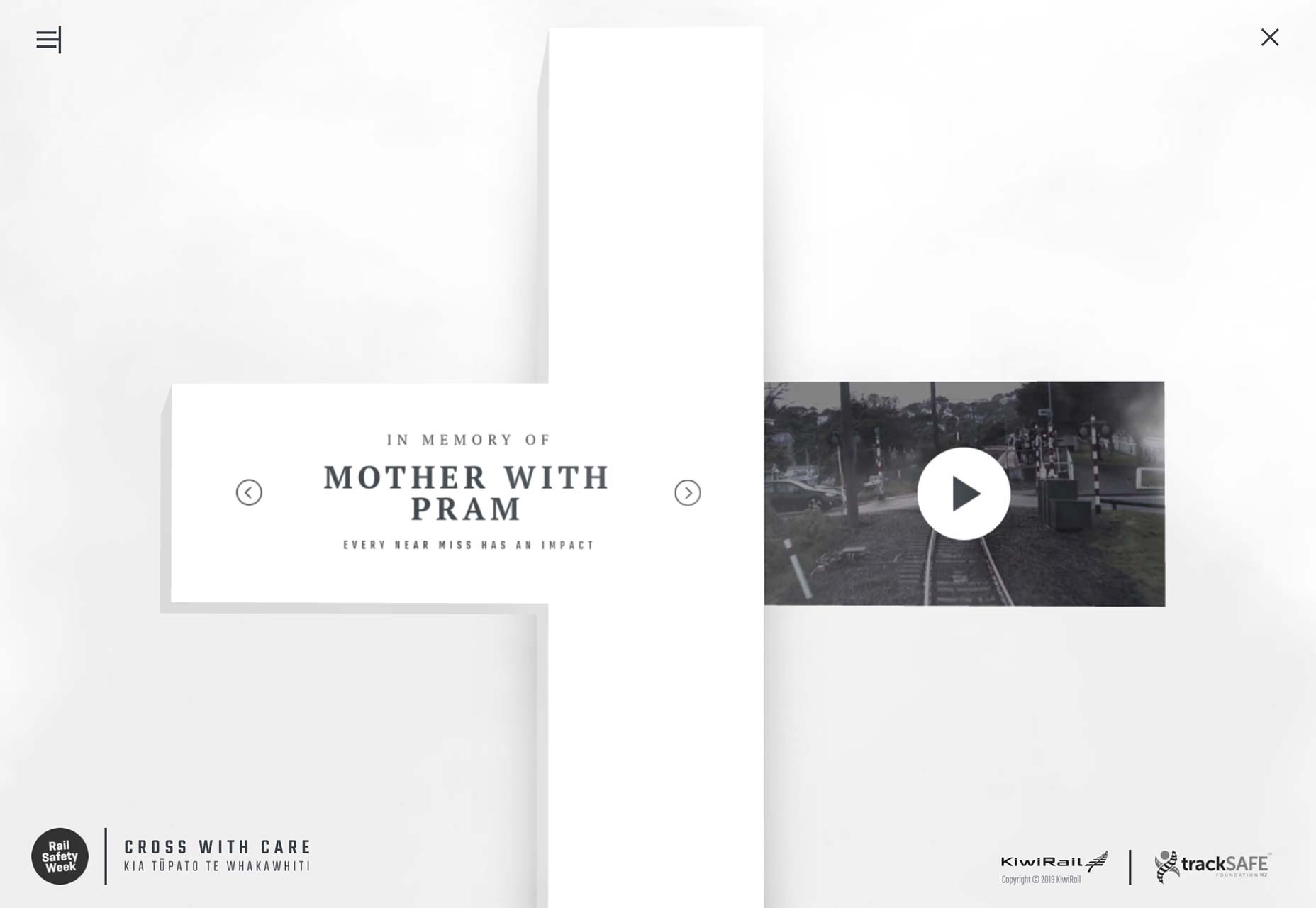
Not all sites abandoned minimalism in 2019. Near Miss Memorials is a public safety campaign site from New Zealand that adopts a suitably sombre mood.
Flatiron Collective
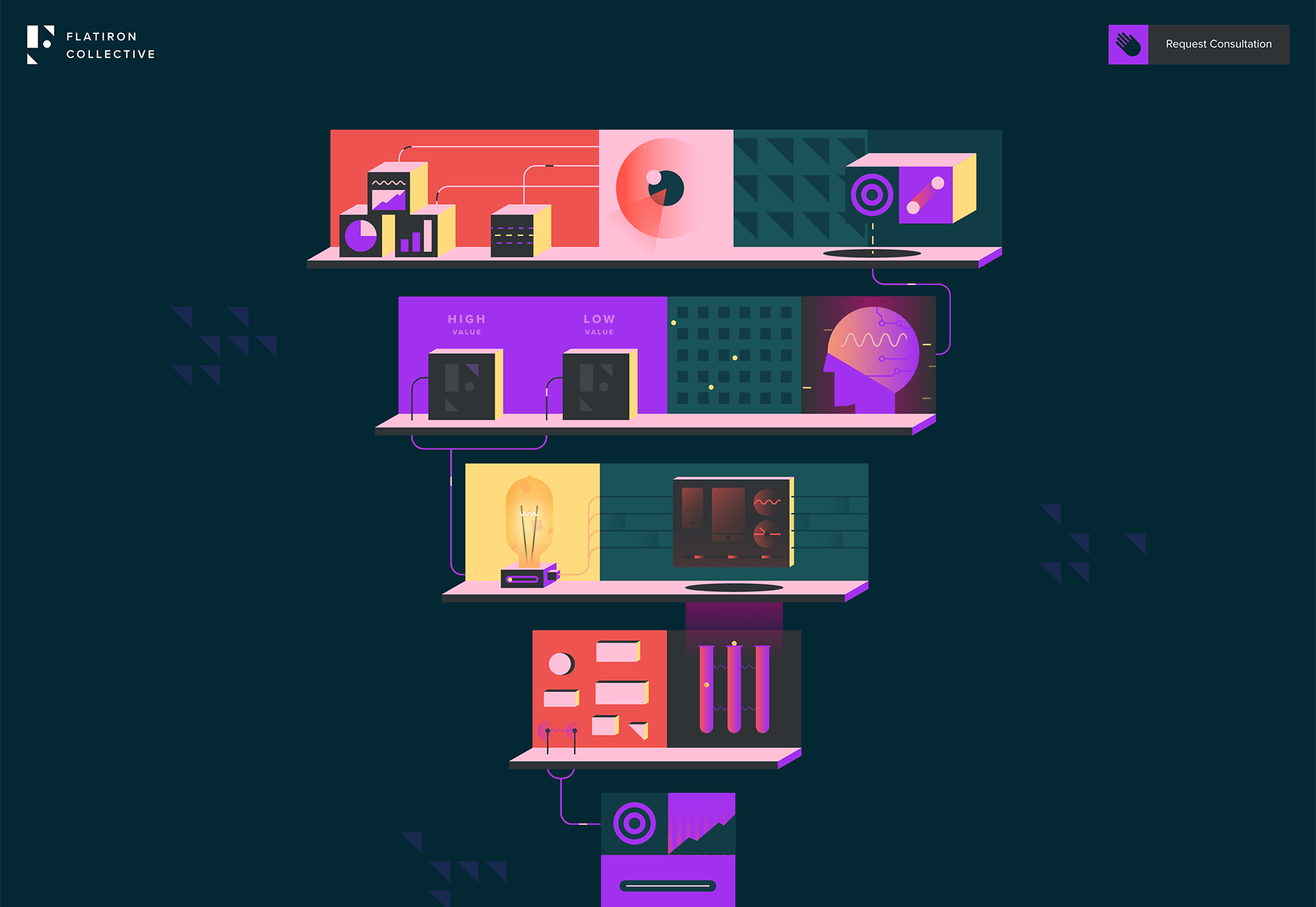
As well as tons of video, we also saw a lot of vector animation in 2019. A great example is the Flatiron Collective site that uses animated illustrations to pitch services to business.
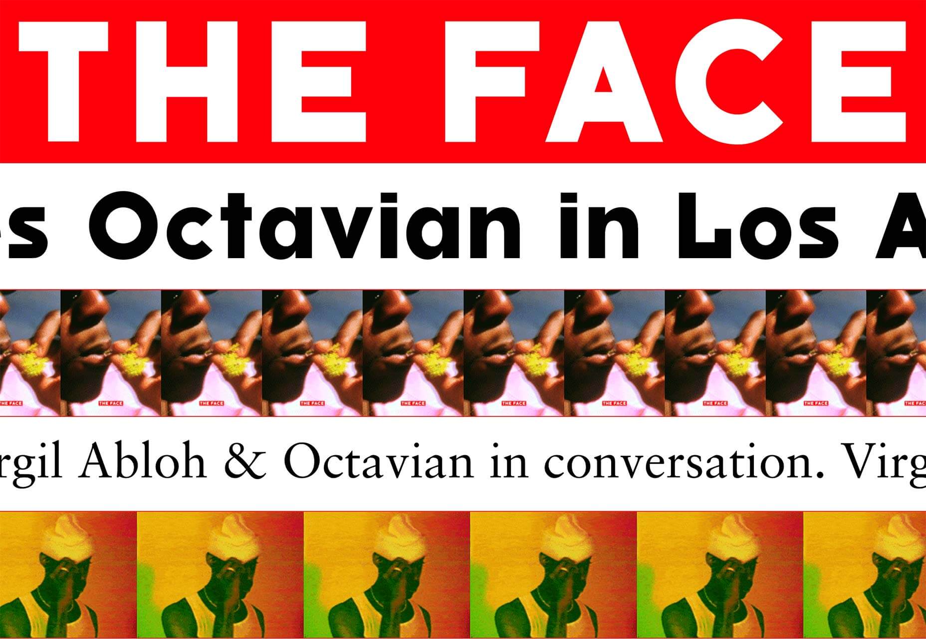
The Face
80s style bible The Face returned from publishing oblivion in 2019, with an online blog and plans for a print magazine. Its innovative approach to filling the page with repeat (not scaleable) images, is inspired.
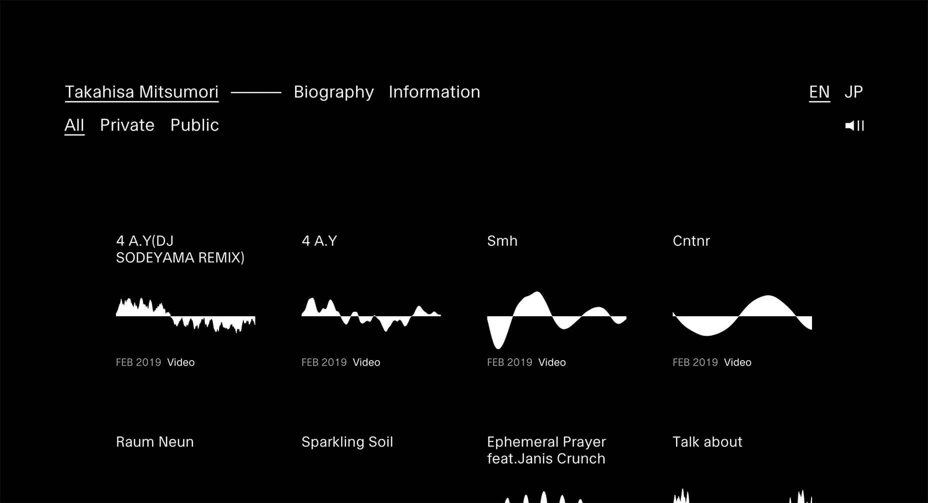
Takahisa Mitsumori
Berlin-based Japanese musician Takahisa Mitsumori released a site in 2019 that follows absolutely no trends, and presents a very minimal, almost Saville-esque set of visualizations of his work.
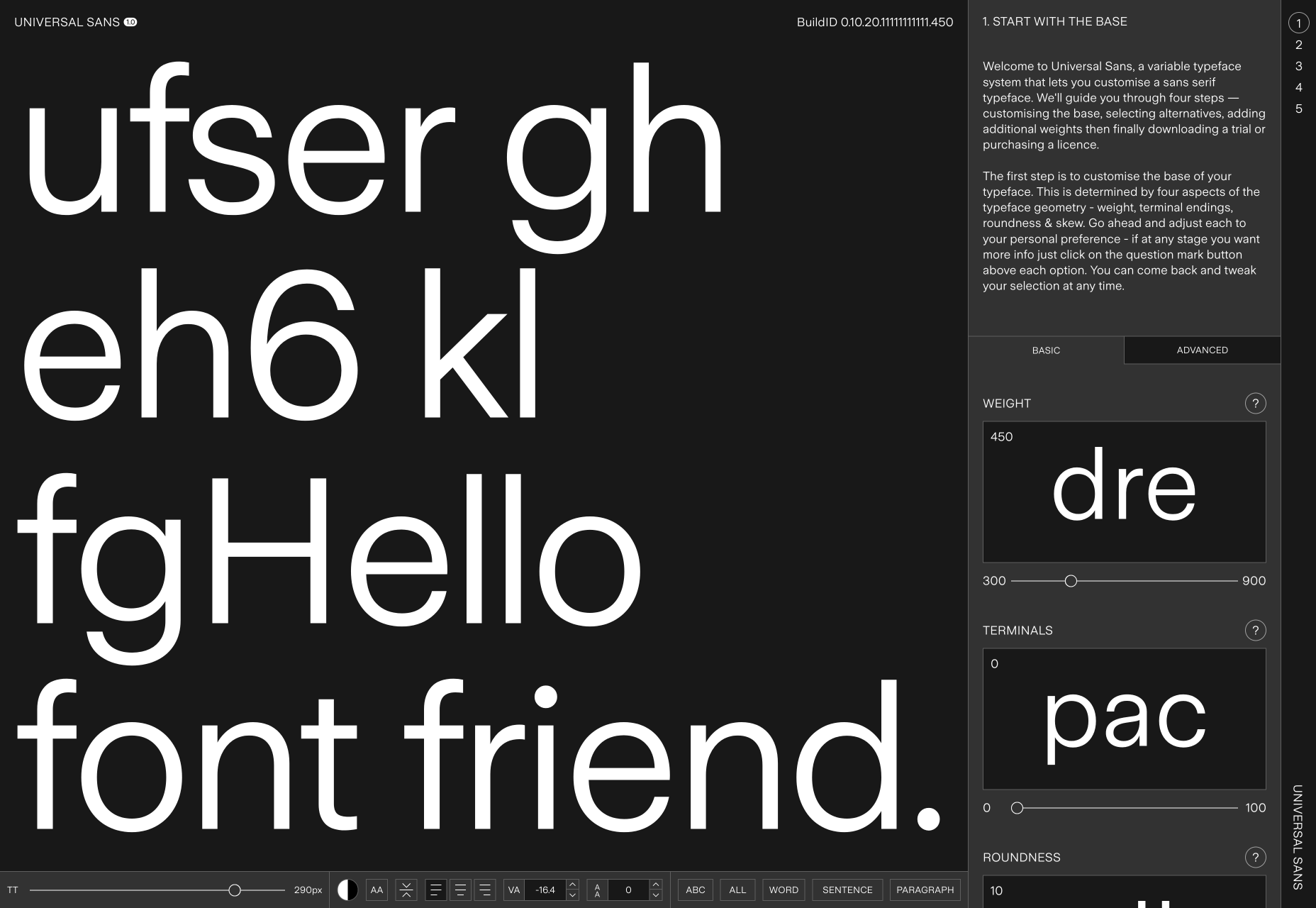
Universal Sans
Variable fonts were big news in 2019 and the awesome site for Universal Sans allows you to use the technology to adapt the font for your own purposes.
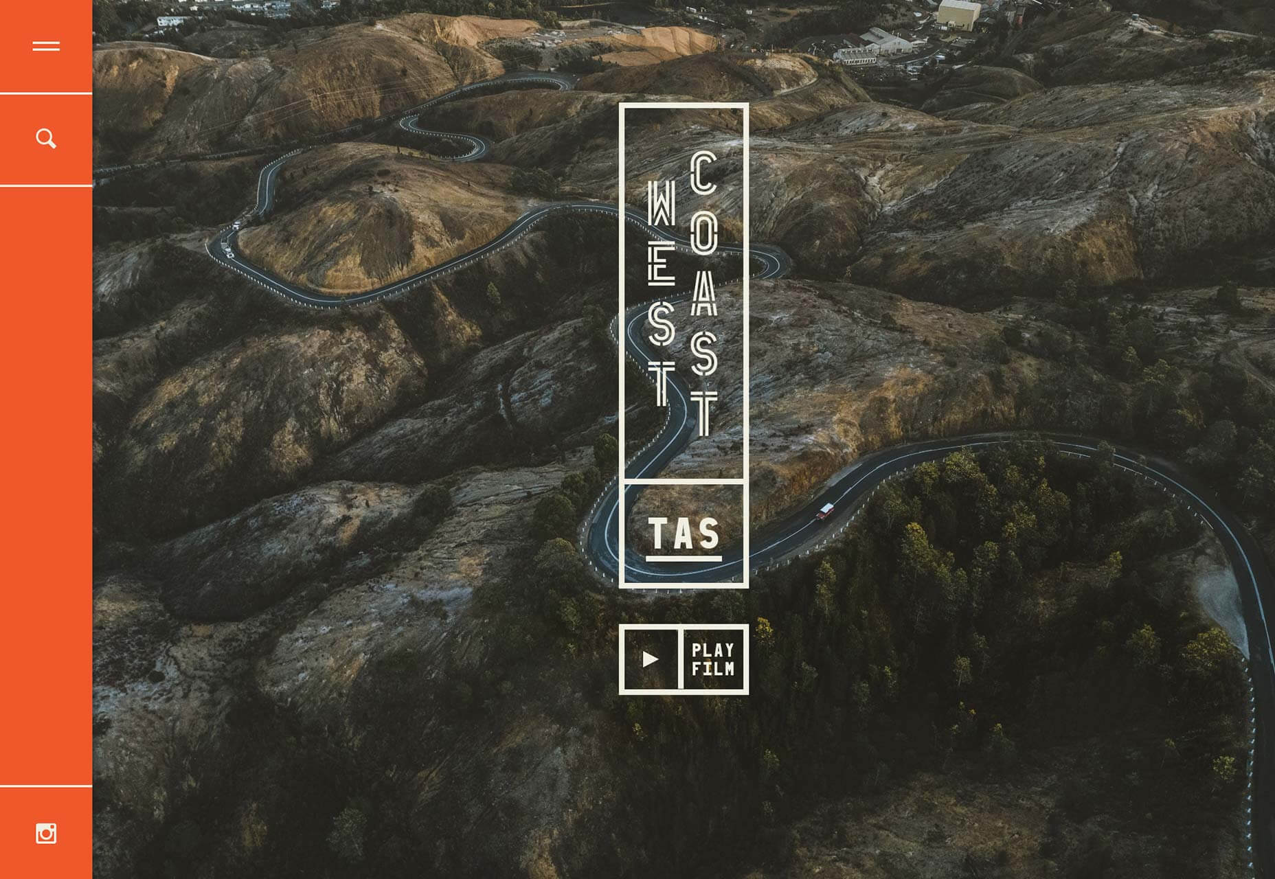
West Coast Tasmania
We loved this exceptional site for tourism in Western Tasmania. The colors and illustrations are great, and the photography is so inspiring it makes me want to book a trip right now.
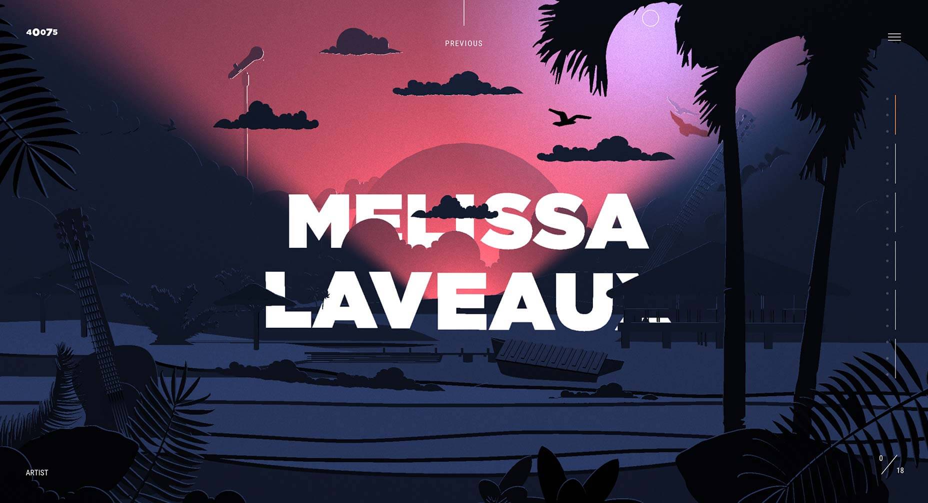
40075
2019 was a year of diverse musical influences. 40075 is an interactive experience designed to help you discover exciting new music by artists from Songhoy Blues to Gily Yalo.
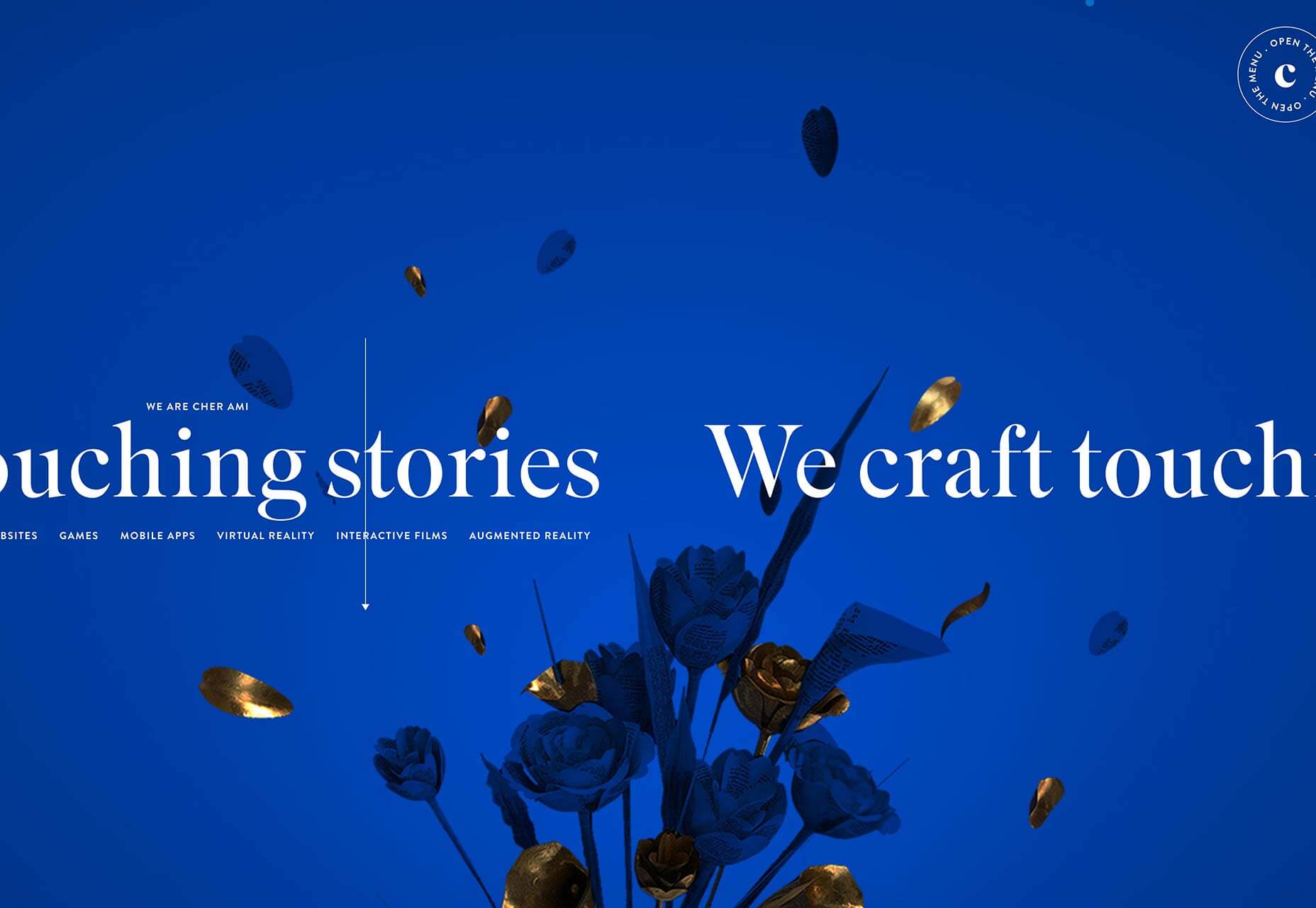
Cher Ami
One of the most vibrant sites of 2019 is Cher Ami. Packed with little details that make it stand out, like the angle of the fly-out menu, and dramatic transitions.
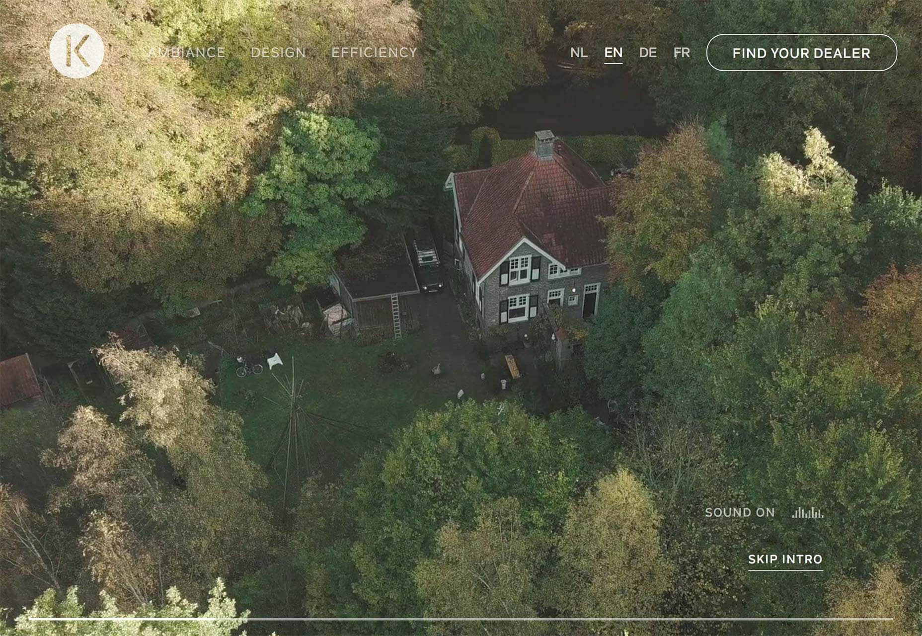
Kalfire W53/50R
We loved full-screen video in 2019, and the Kalfire W53/50R site has it in spades. Click through to the design page for more video. High-end production values like these are essential when selling luxury products.
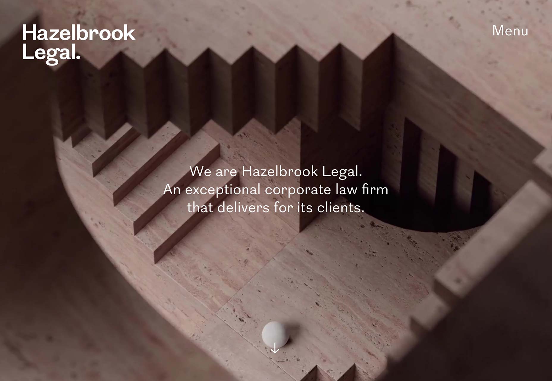
Hazelbrook Legal
As is to prove that the full screen video trend isn’t restricted to fashion labels and travel sites, Hazelbrook Legal uses a video of a marble ball navigating an Escher-style maze; a metaphor for the legal firm’s role.
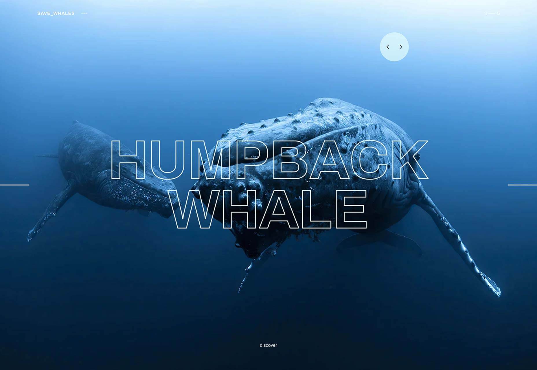
Save Whales
There’s no ignoring the deterioration of the natural world any longer. As we enter a new decade expect to see more inspiring sites like Save Whales, campaigning to protect ecosystems.
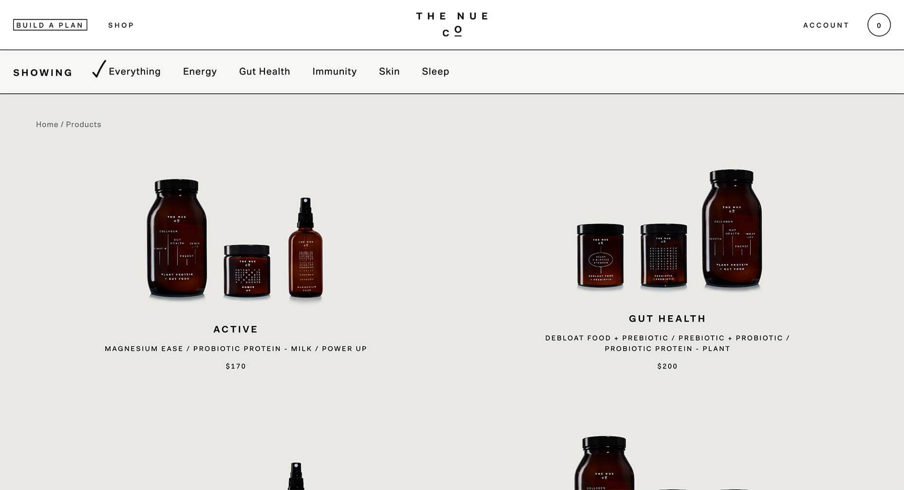
The Nue Co.
With so much color on the web this year, it’s startling when you encounter a black and white, high-contrast approach. The Nue Co. uses a little subtle color in its product images, but the whole site is mostly black and white, and all the more impactful for it.
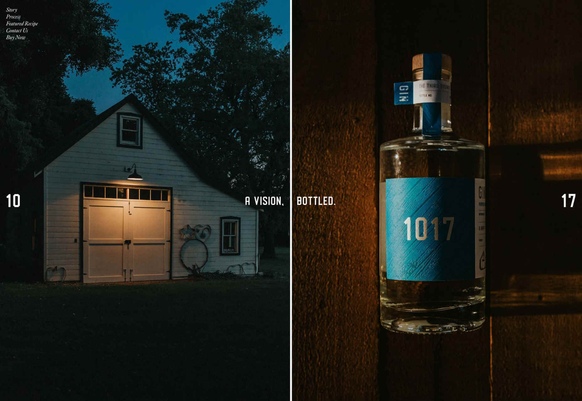
1017 Gin
1017 Gin’s site is a high-class mix of glossy magazine layout, and coffee-table book. The one-pager is understated, with just a nod to trends with undersized images. The way the page splits when you click ‘buy’, is lovely, because it’s unexpected.
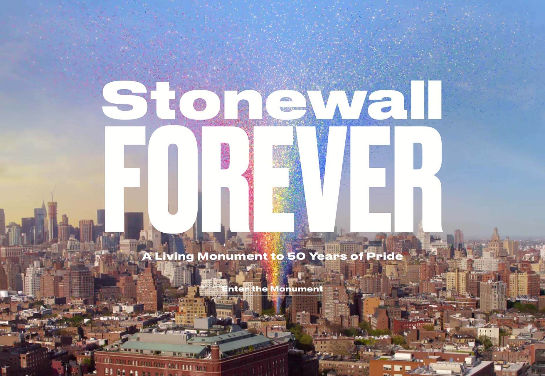
Stonewall Forever
2019 marked 50 years of Pride. Stonewall Forever describes itself as a living monument to the movement. The generated rainbow features stories from the early days of the LGBTQ rights movement.
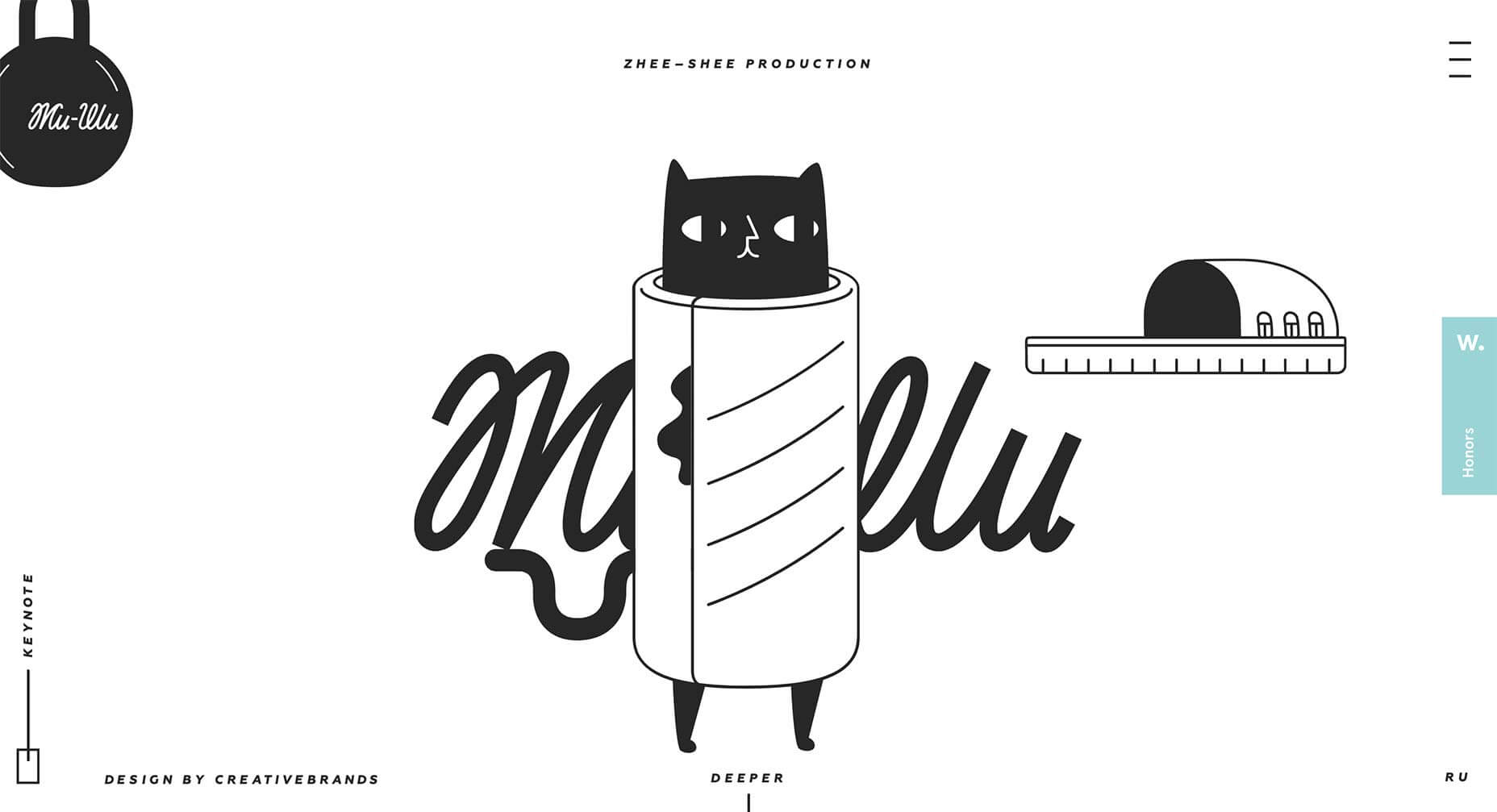
Zhee-Shee Production
More illustration from 2019, this time from Zhee-Shee Production. Many illustrators followed a similar style, derived from 2018’s trends, but these witty illustrations forge their own path.
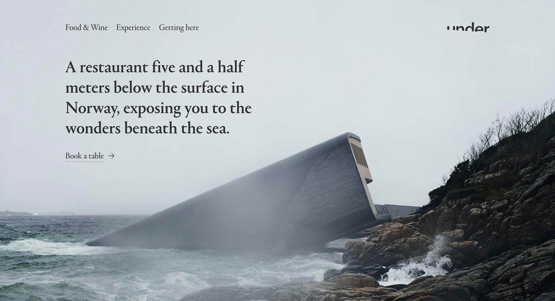
Under
Early on in 2019 we saw this site for the incredible Under restaurant in Norway. We love the Scandinavian aesthetic, proving that simplicity can sell luxury, and the logotype is inspired.
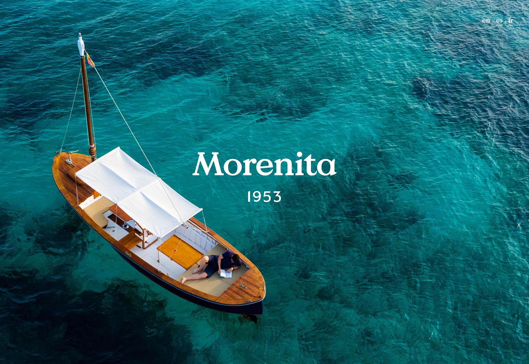
Morenita
As the Northern hemisphere shivers towards the end of 2019, this site for boat hire in the Balearics is an enticing prospect for Summer 2020.
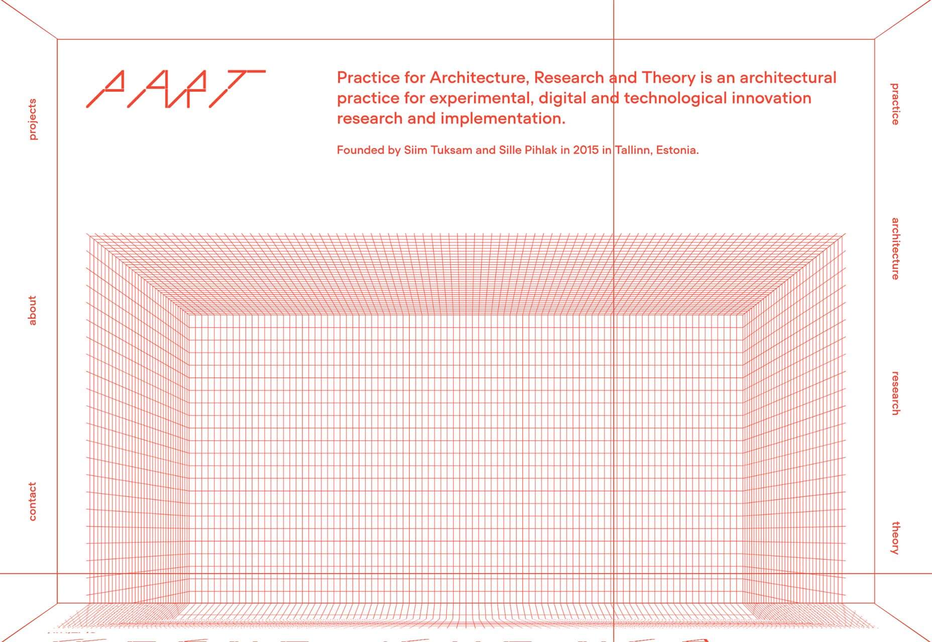
Part Architects
Mid-way through 2019, a new trend started to take hold; Brutalism. It’s a harsh, monotone, functional approach that is often deliberately ugly. Part Architects uses it to full effect.
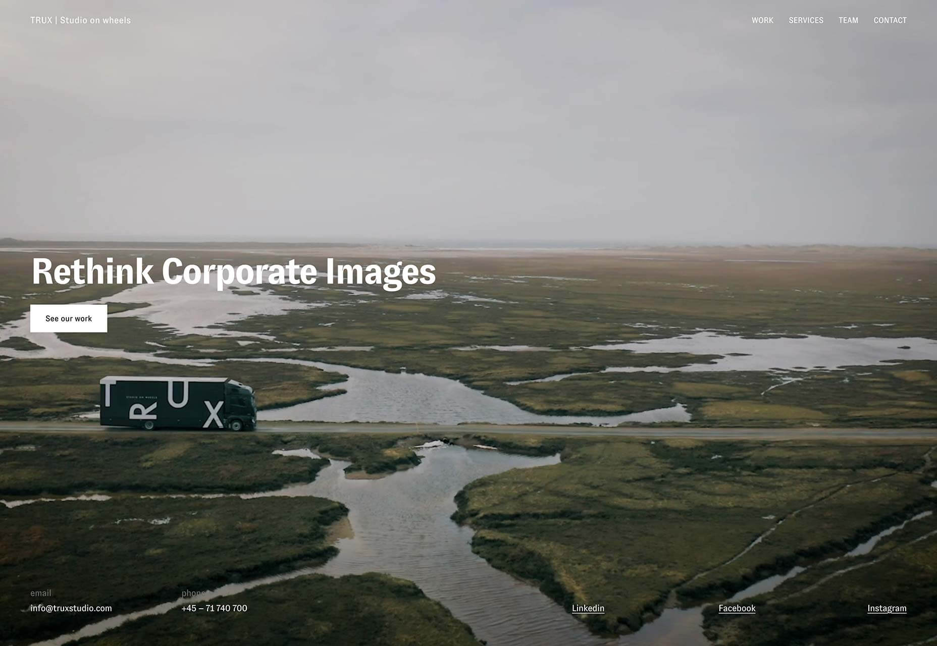
Trux Studio
More full screen video, this time being used to explain the innovative business of Denmark’s Trux Studio. Of course, it doesn’t hurt when you’re filming in such a beautiful landscape.
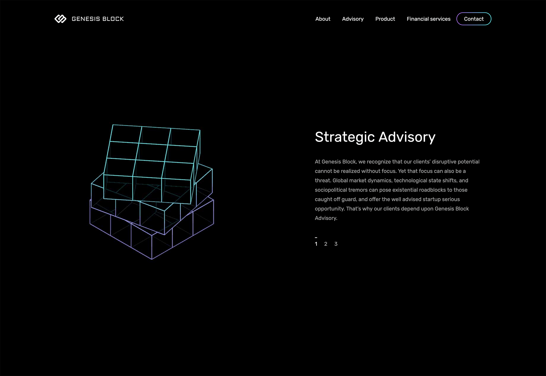
Genesis Block
2019 saw a wide range of business-to-business sites adopt a more design-led approach to their marketing. One such site is Genesis Block, a fintech site that uses line art, dark mode, and gradients.
The Frontier Within
The best websites are not just well designed, they blend information with experience to inform and inspire. The Frontier Within is one such site that illustrates the respiratory, circulatory, and nervous system to create a portrait of the human body.
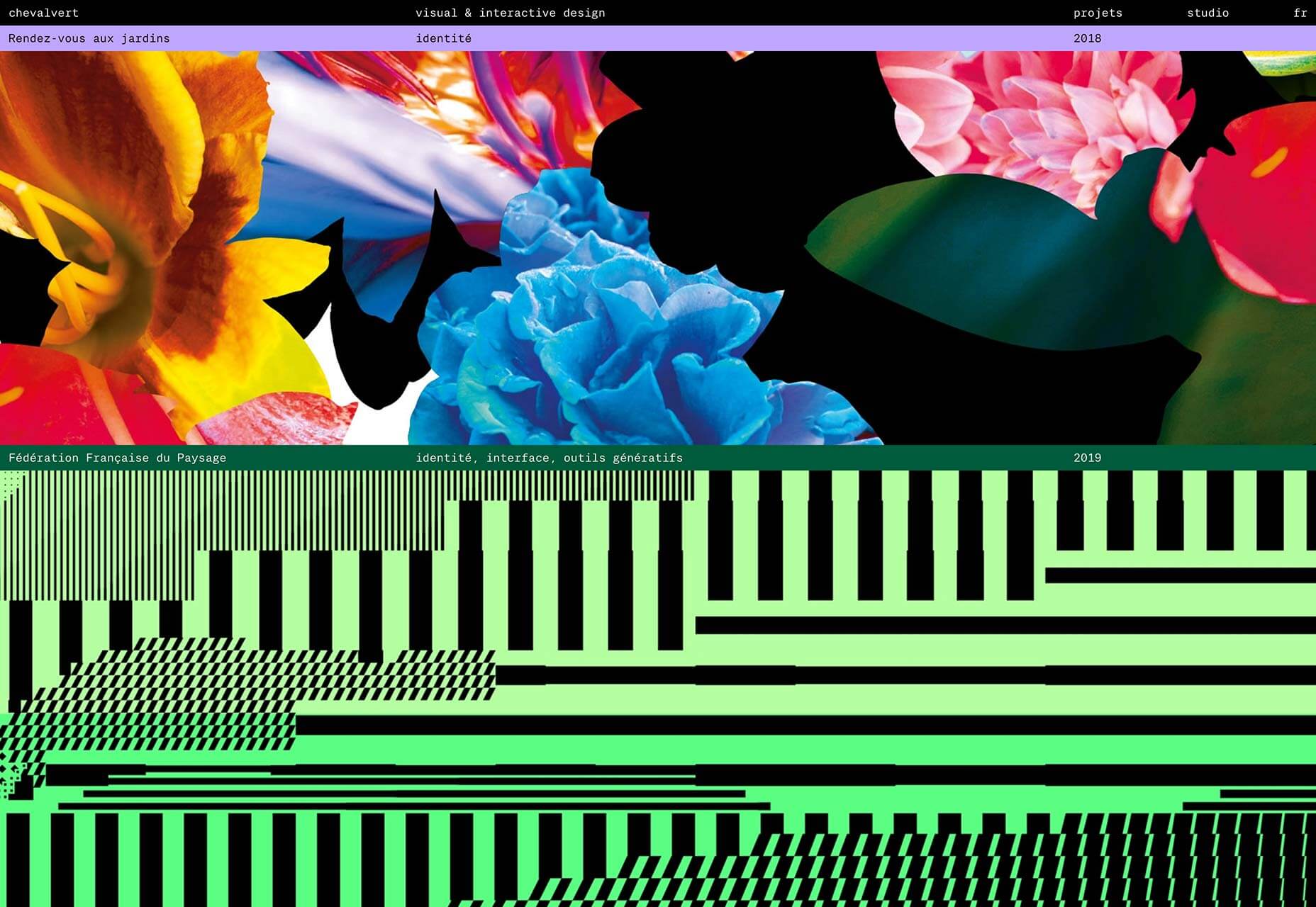
Chevalvert
Out of 2019’s Brutalist trend emerged a new trend, with more legs. Maximalism carried us through from July onwards and looks like continuing into 2020. Chevalvert’s site is a prime example.
Gyro
Another big trend in 2019 was over-sized typography. One of the best examples is Gyro, featuring an oversized logo that explodes and rotates when you cursor over it.
Marble
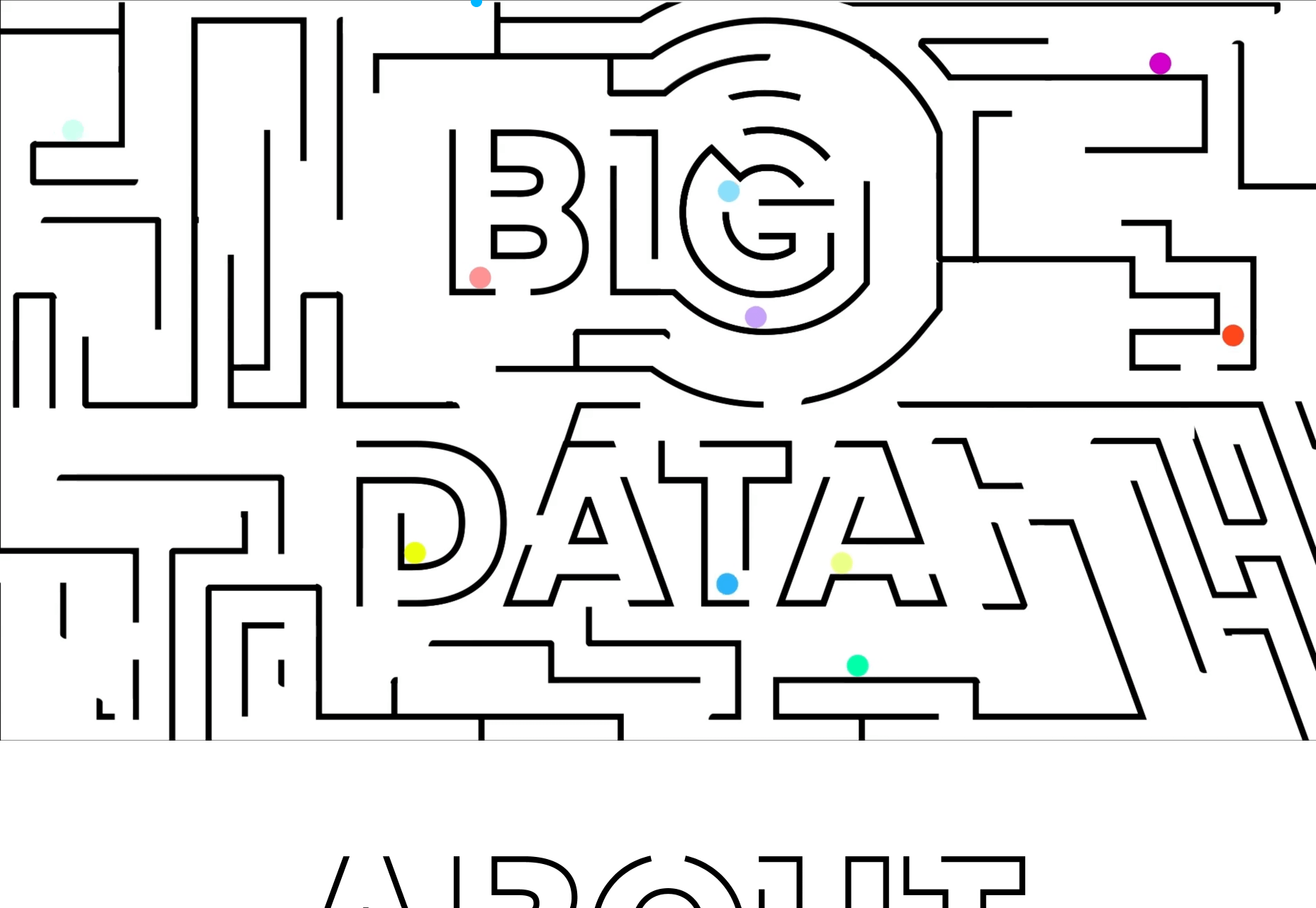
Marble tackles problems facing children around the world. Its delightful site features maze-like, over-sized text.
Oban Whisky
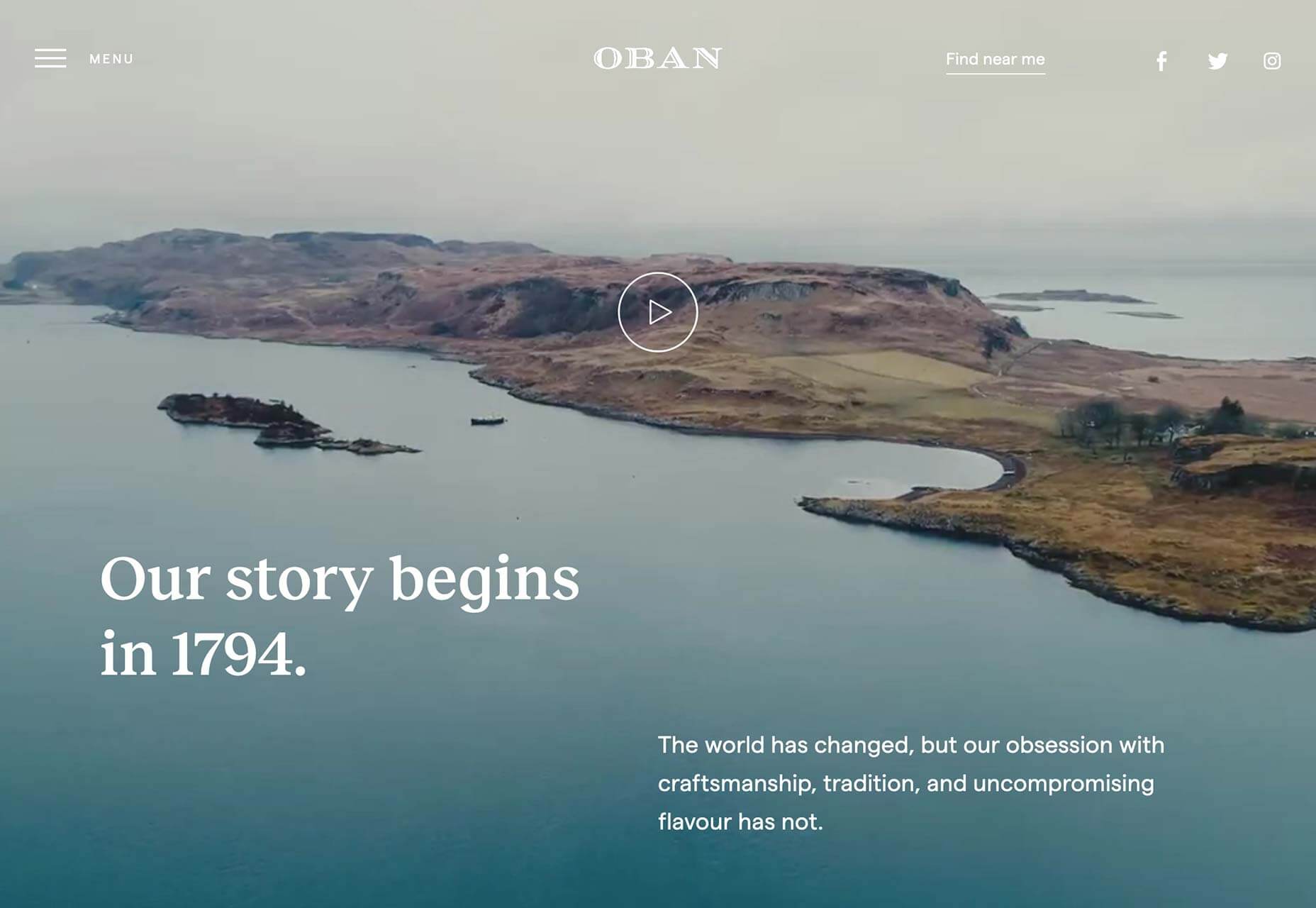
Another fullscreen video site, this time for Oban Whisky, a distillery in Western Scotland. The site combines beautiful video with modern typography to focus on heritage and brand values.
Bruegel: Once in a Lifetime
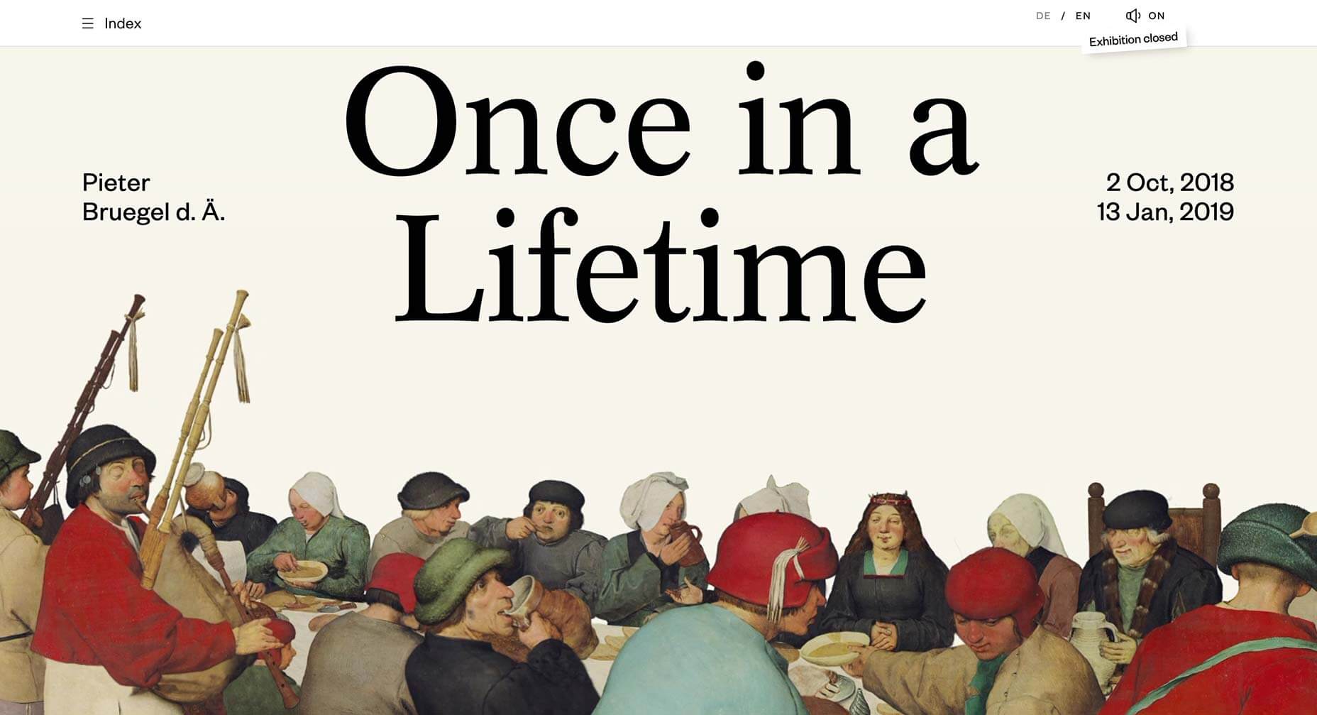
Animation was popular in 2019, but this site takes it a step further. It’s a site for an exhibition of work by the Flemish master Pieter Bruegel the Elder, in which his paintings are animated.
Bruno Simon
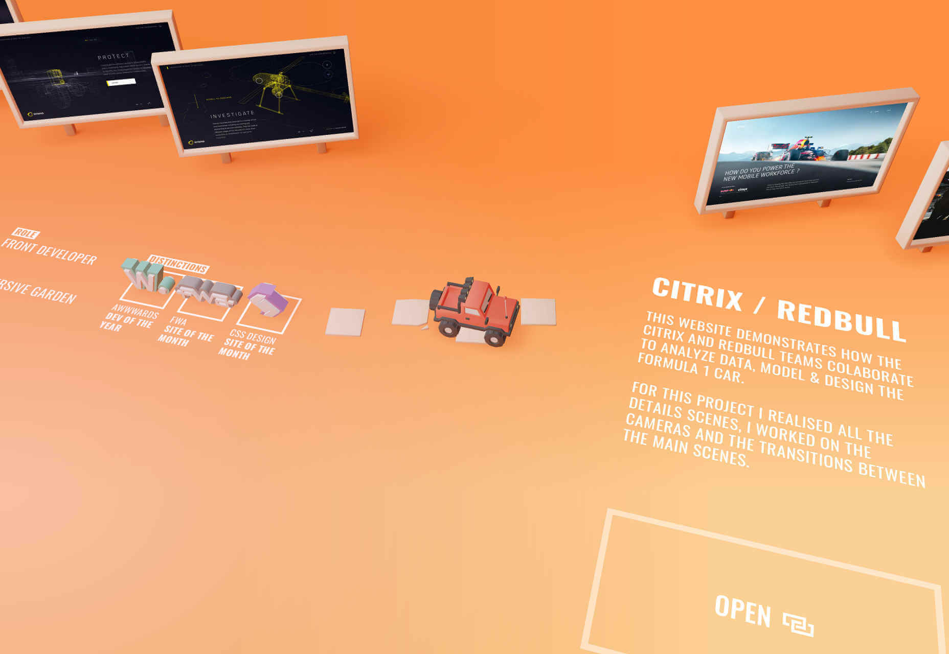
One of the most popular portfolio sites of the year was Bruno Simon’s. It features a miniature RC truck that you drive through a 3D landscape to explore his portfolio.
Daly
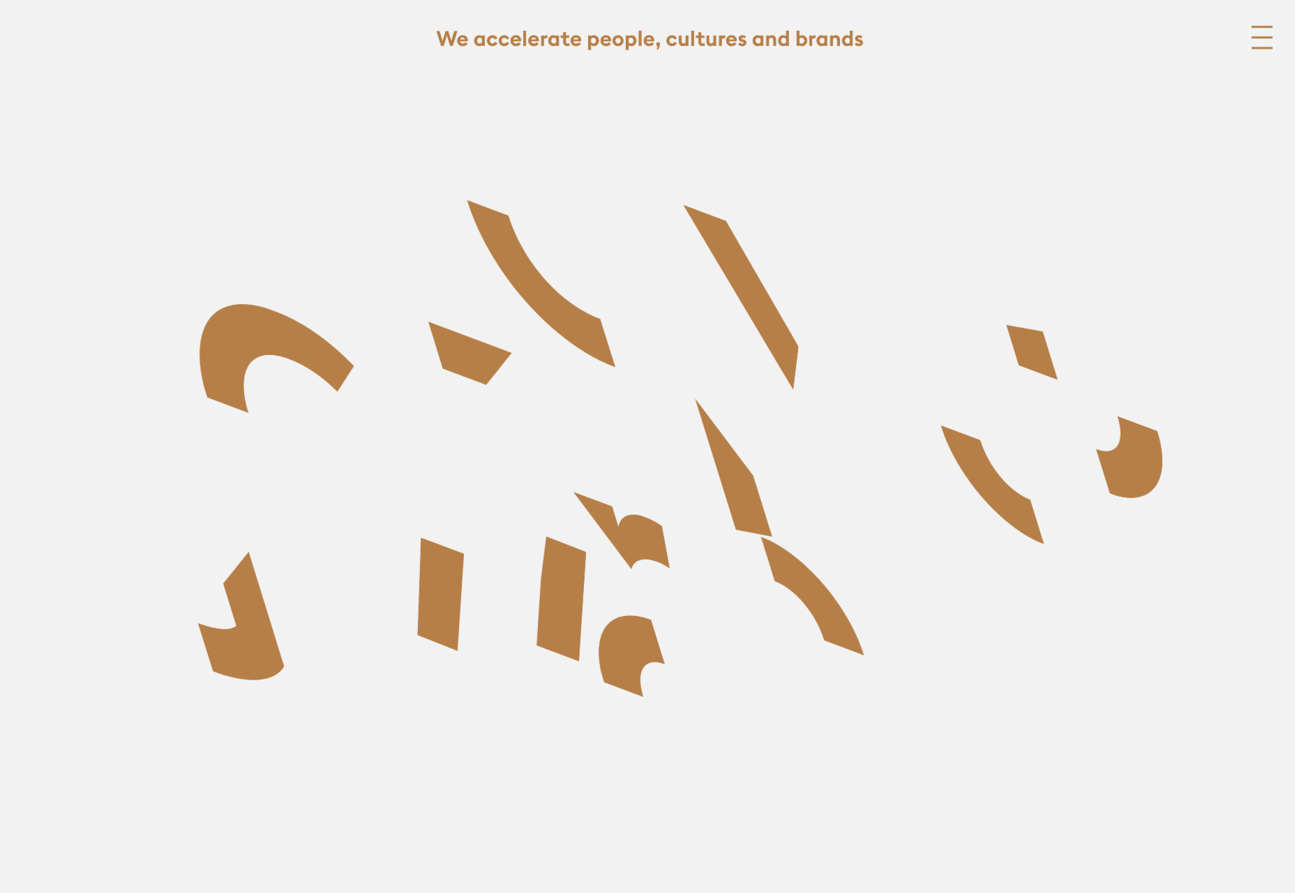
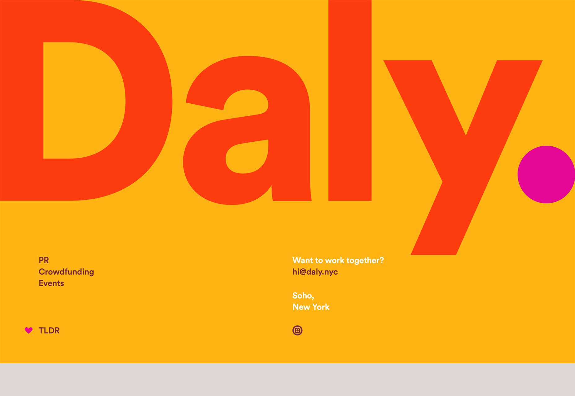
Daly is a very successful PR agency that launched a bold, colorful site in 2019. The highlighted period in the logotype is far from original, but I do love the way it follows the viewport as you scroll.
Gucci Marmont
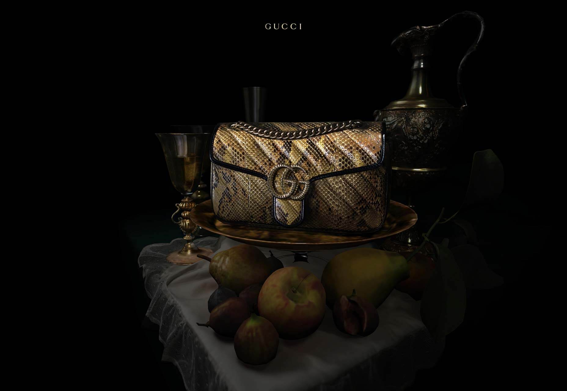
3D has featured extensively in sites throughout 2019, and one of the most interesting examples was Gucci’s Marmont collection site, which mimicked 17th-century art in exhibition format.
Bon Iver Visualizer
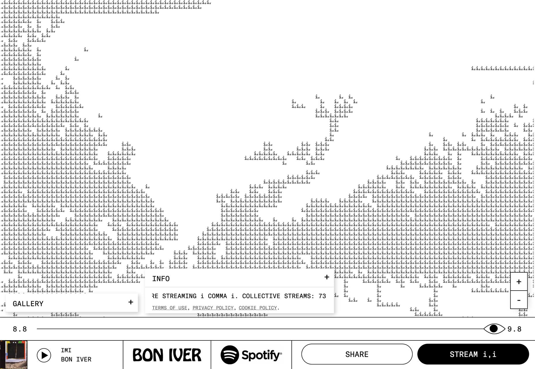
Data visualizations are growing increasingly sophisticated as computers get more and more powerful. This site, built with Spotify data, shows all the people currently streaming Bon Iver’s music.
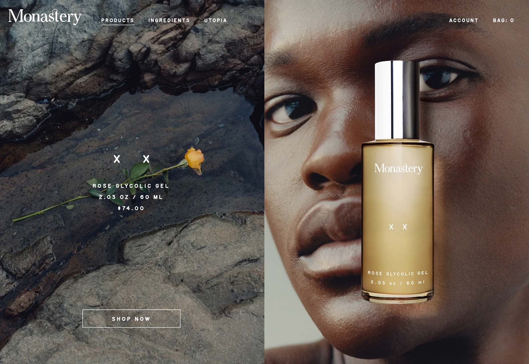
Monastery
As web designers get to grips with broad problems, they’re free to focus on small details, like the subtle blur added to Monestery’s transition fades, creating a luxury brand experience.
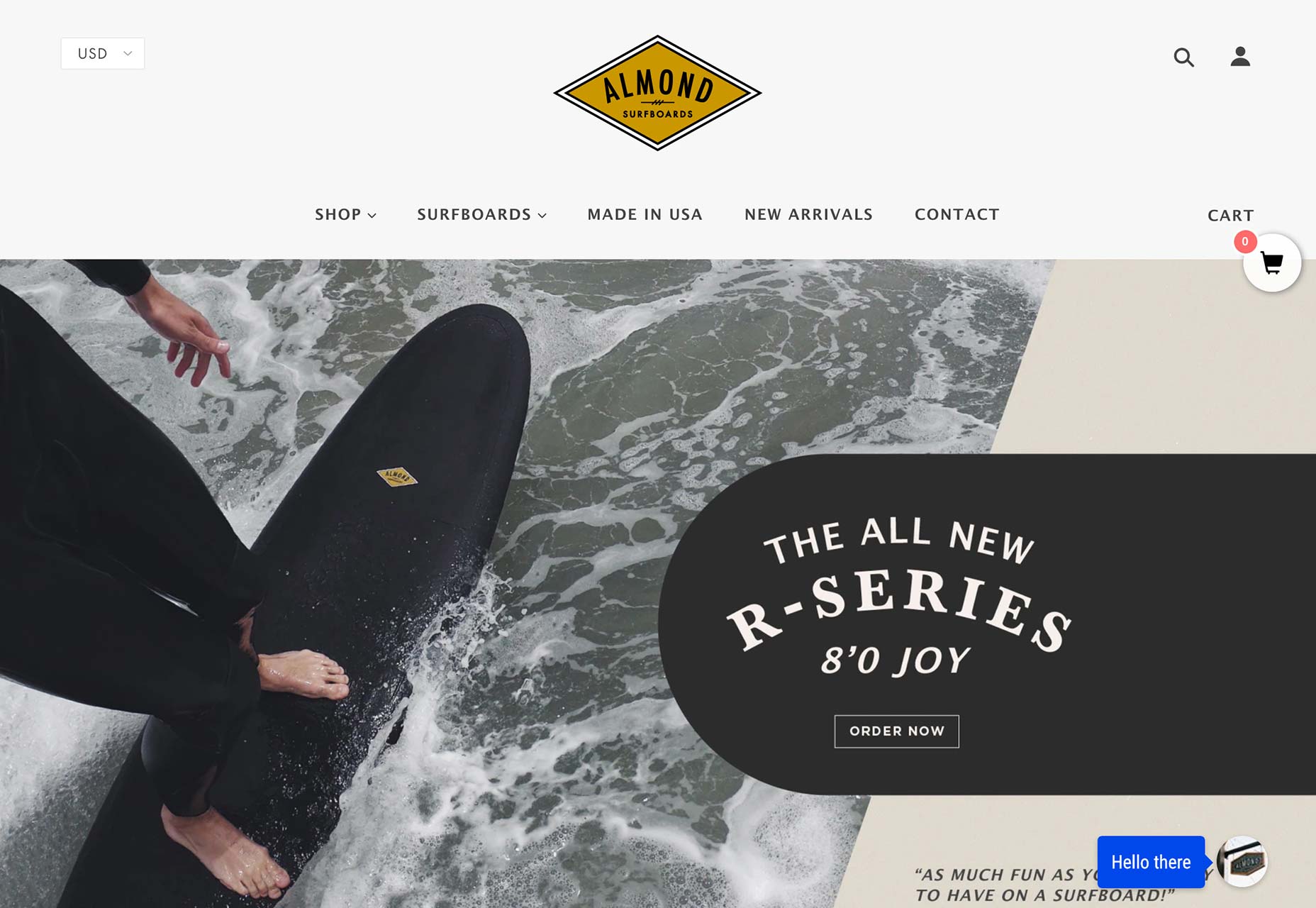
Almond Surfboards
The retro look is still in, in 2019. It will still be with us well into the 2020s. People love nostalgia it seems and Almond Surfboards does a great job of adding old-school credibility to its high-tech boards.
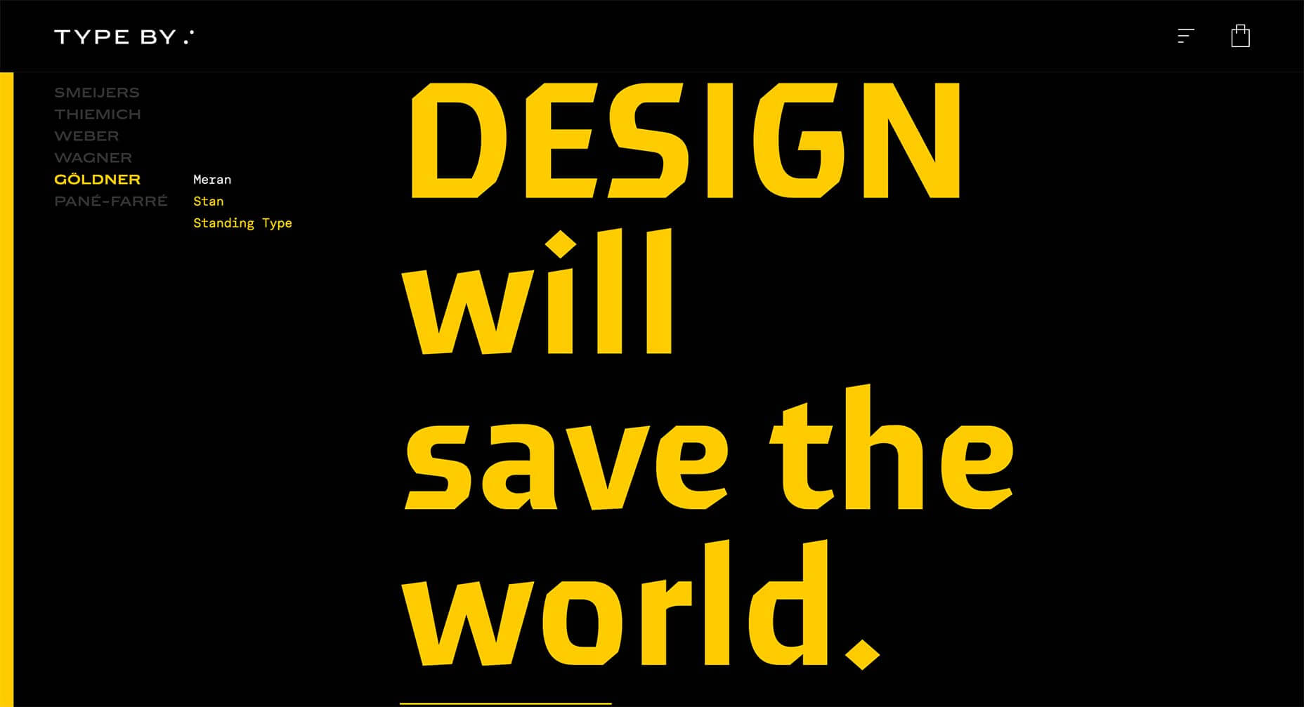
Type By
Type By is a new type foundry, that launched in 2019, so as you’d expect its site is text-only. We haven’t seen enough of this in 2019, but when done this well it’s very compelling.
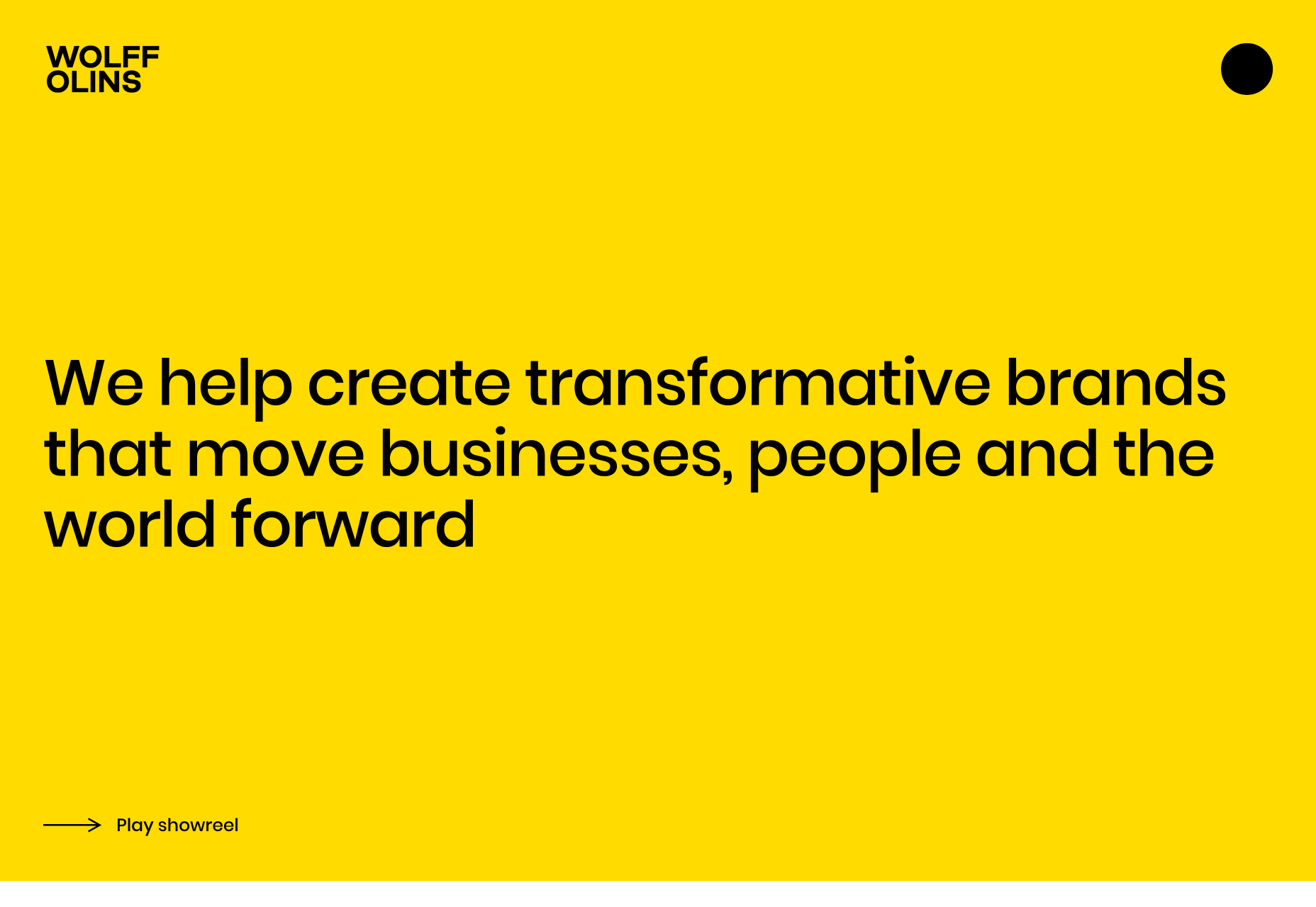
Wolff Olins
Wolff Olins is a globally reknowned agency whose engagingly simple site charmed us this year. The post-Brutalist approach adopted by a large agency suggests it’s a trend with staying power.
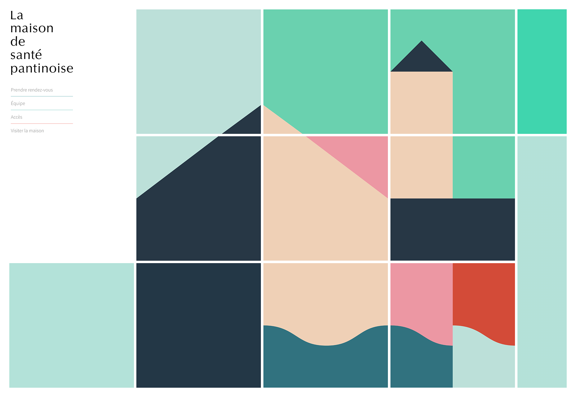
La Maison de Santé Pantinoise
Web design in 2019 wasn’t all about trends. Design is about creating something appropriate, and this site for a Parisian MD office is calming, and reassuring. The block animation sensitively illustrates the conditions that are covered.
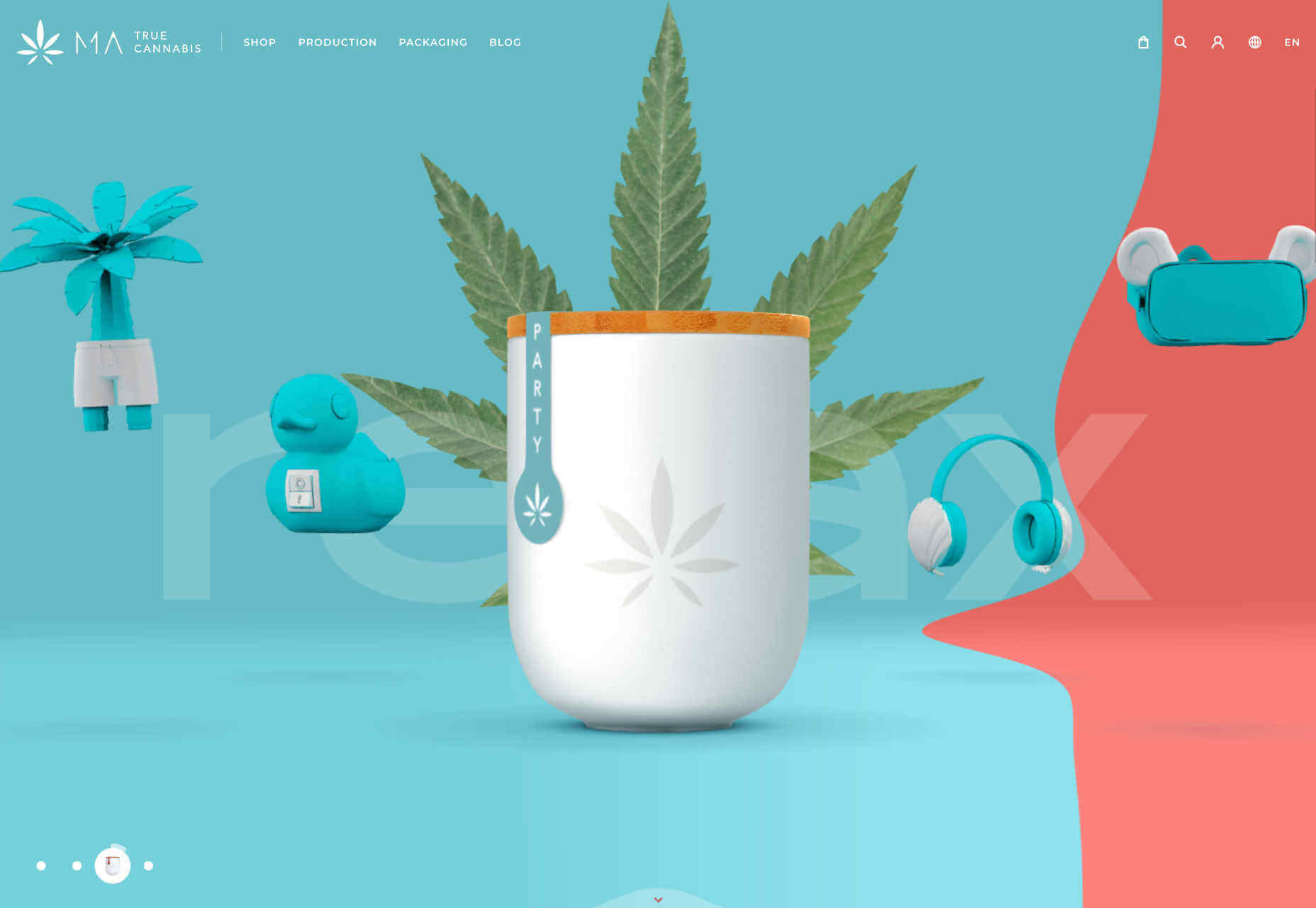
MA True Cannabis
Cannabis is increasingly acceptable in many countries, and its marketing is becoming increasingly sophisticated as a result. MA True Cannabis uses four ‘worlds’ to highlight some of the benefits of this naturally occurring, popular herb.
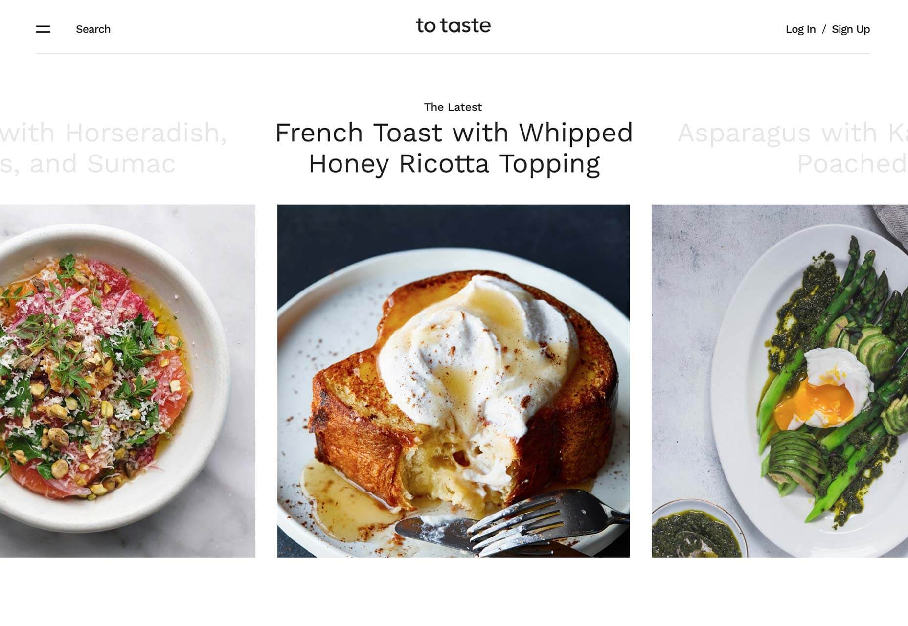
To Taste
To Taste was one of our very favorite recipe sites this year. It’s very easy to browse, and the mouth-watering photography is a clear guide to what your concoction was supposed to turn out like.
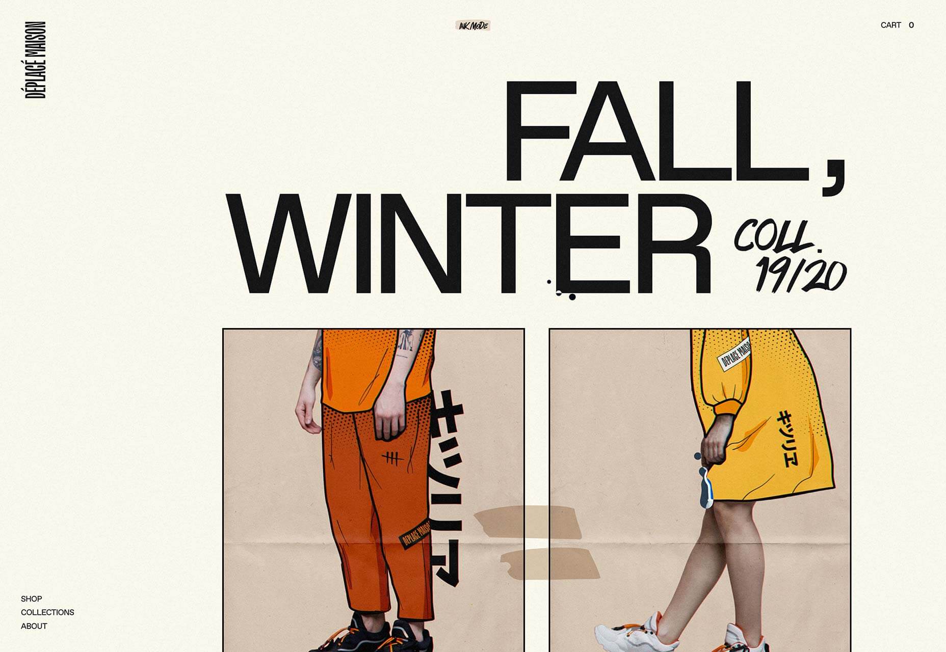
Déplacé Maison
Déplacé Maison’s art direction evokes graphic novels. It’s an original aesthetic that is reinforced with lettering-style typography, for a completely bespoke look.
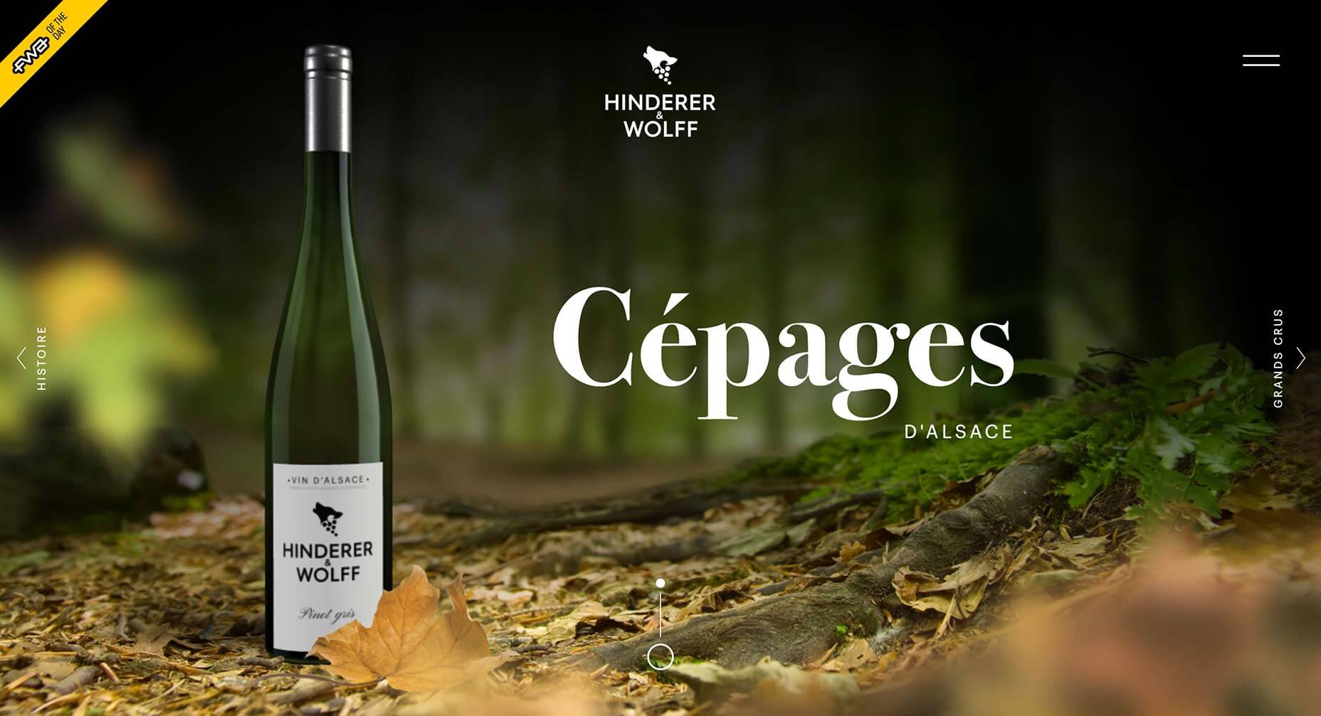
Hinderer & Wolff
There were dozens of elegant and sophisticated sites released for wine brands this year. One of our favorites is Hinderer & Wolff, because it’s a joy to explore.
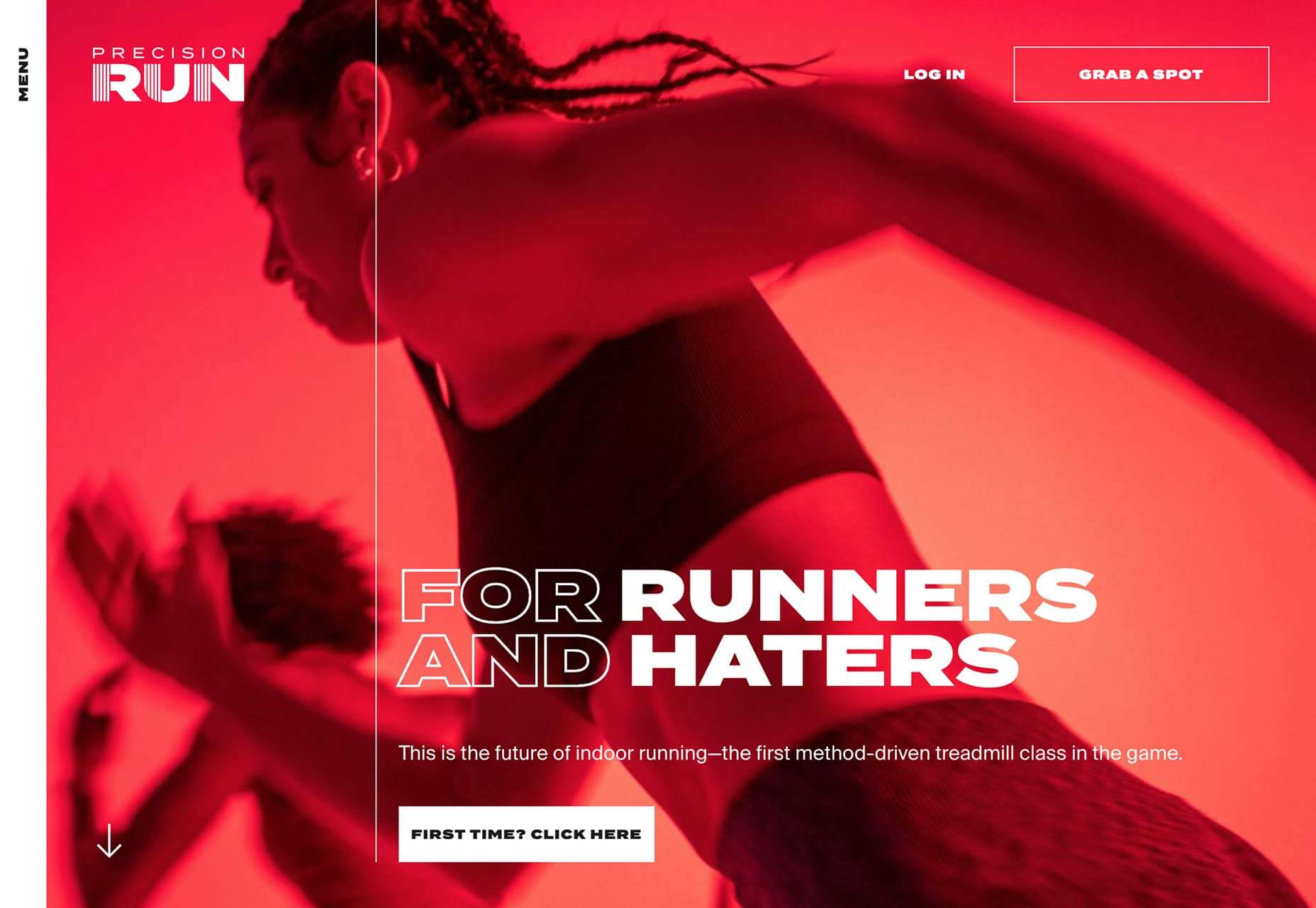
Precision Run
Outside of web design, one of the big trends in tech for 2019 was connected, indoor exercise. Precision Run is one of the leading pack, and its site is suitably high-energy.
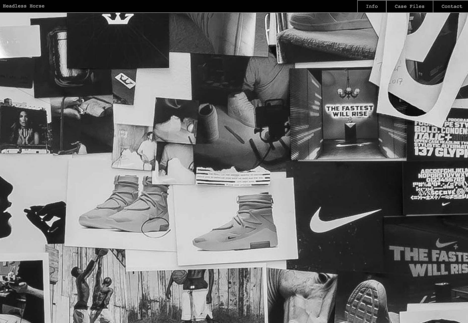
Headless Horse
With dozens of ways to browse a portfolio, it’s great to see that agencies are still finding new and exciting ways to present their work. Headless Horse’s approach is effective because their client list is so familiar.
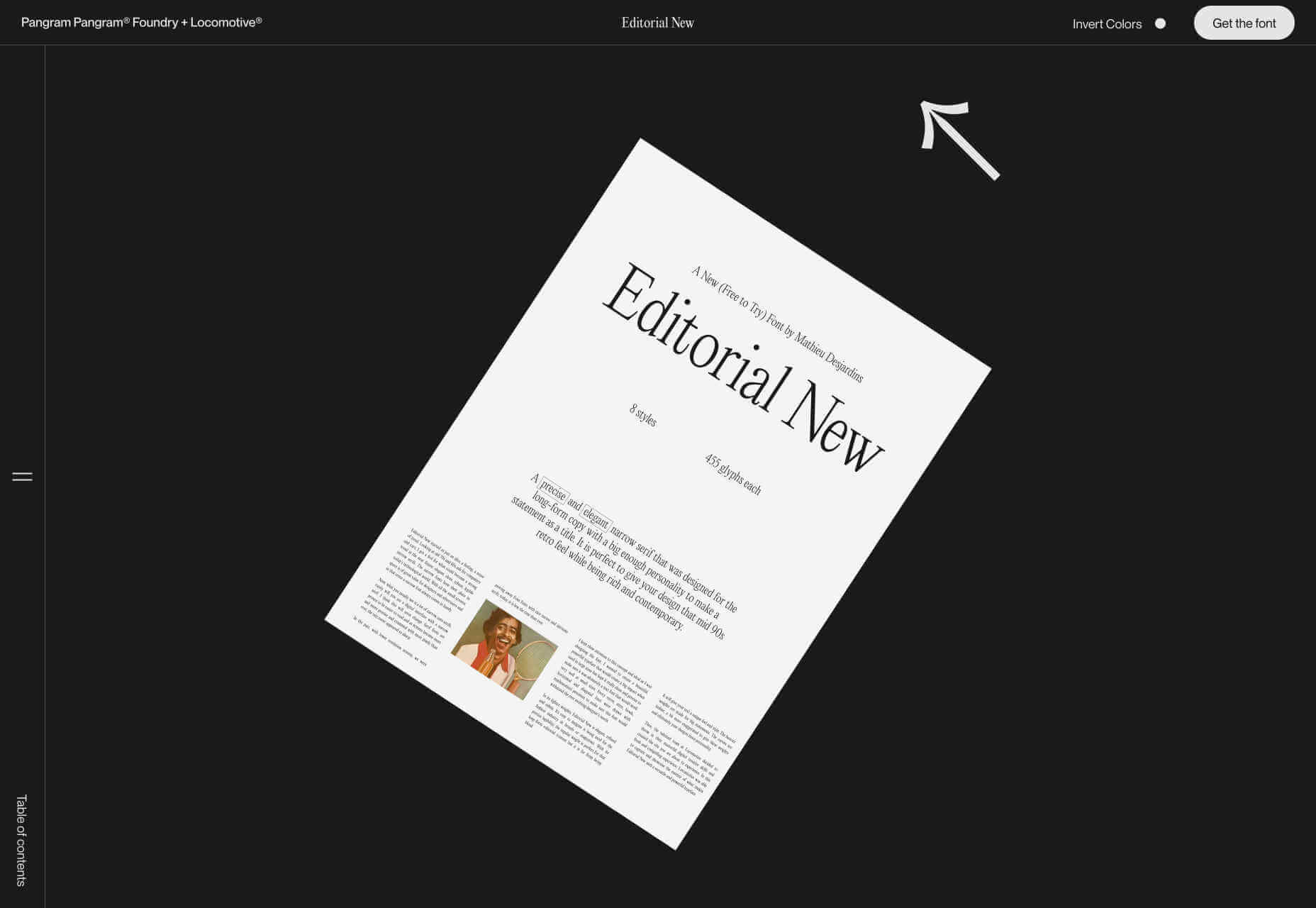
Editorial New
There’s been an increasing tendency among type designers to release entire websites to promote a single typeface. Joining this trend is Editorial New, a body text-appropriate typeface with a site that’s a joy to scroll through.
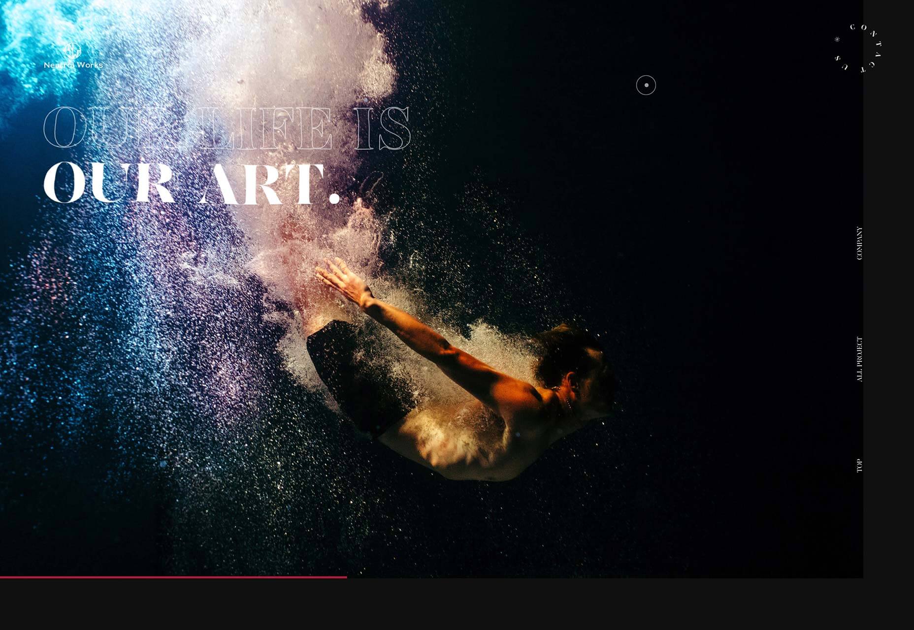
Neutral Works
One of the biggest design trends among developers in 2019 was liquid-style transitions. One of the best examples is Japan-based Neutral Works’ portfolio.
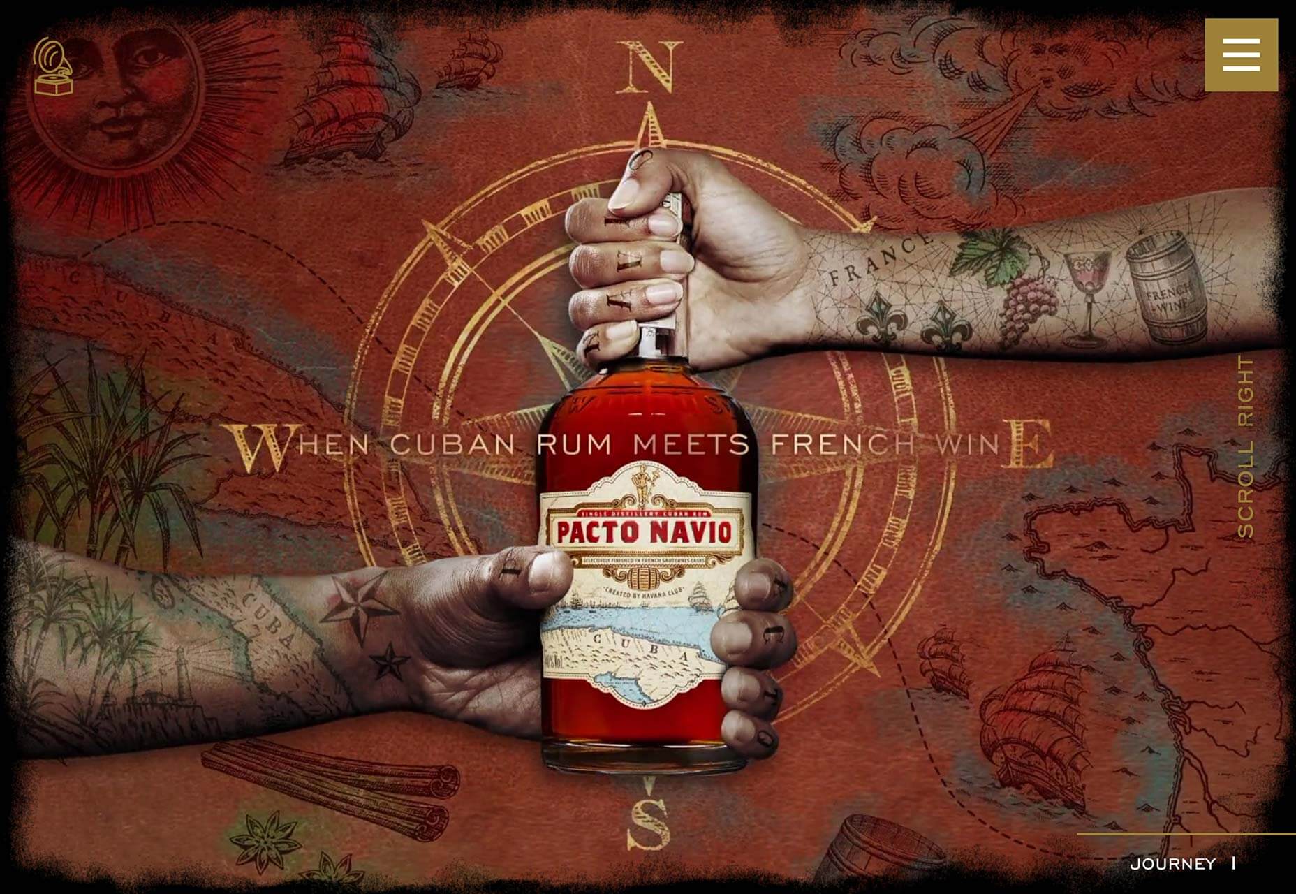
Pacto Navio
This beautifully art directed site is for Pacto Navio, a Cuban rum distilled near Havana. The brand illustrations give it a distinctly Caribbean flavor, and sell the brand perfectly.
p img {display:inline-block; margin-right:10px;}
.alignleft {float:left;}
p.showcase {clear:both;}
body#browserfriendly p, body#podcast p, div#emailbody p{margin:0;}
