
 This month’s collection contains a combination of big and bold, and clean and minimal. Although basic minimalism is still trendy, with lots of white space and greyscale type, we are seeing it softened with color. This is implemented differently, ranging from hints of off-whites in images to gentle pastels as section backgrounds.
Playing around with type and using typefaces with a few characteristic quirks is another way minimalism is being tempered without negating the overall effect. Plus, we’ve got some strong examples of type rules being deliberately broken to good effect. Enjoy!
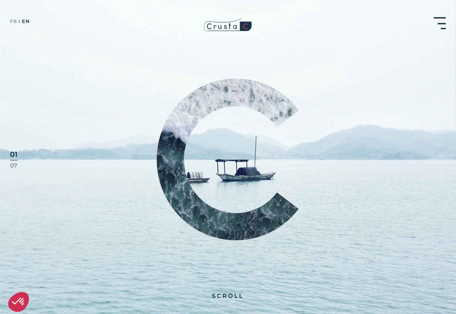
Crusta C
The new website for seafood company Crusta C makes clever use of the company’s simple logo mark ‘C’ with a cutout video effect.
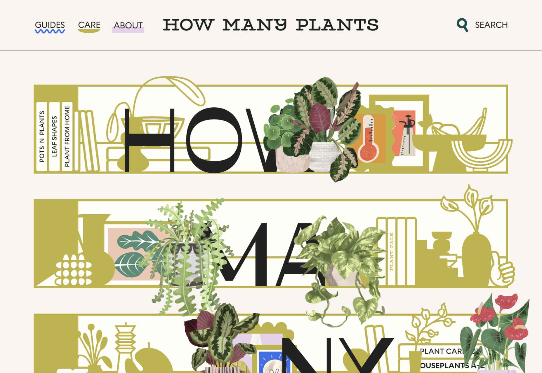
How Many Plants
How Many Plants is a guide to house plants and how to look after them. A good combination of illustration and space gives a friendly but efficient feel.
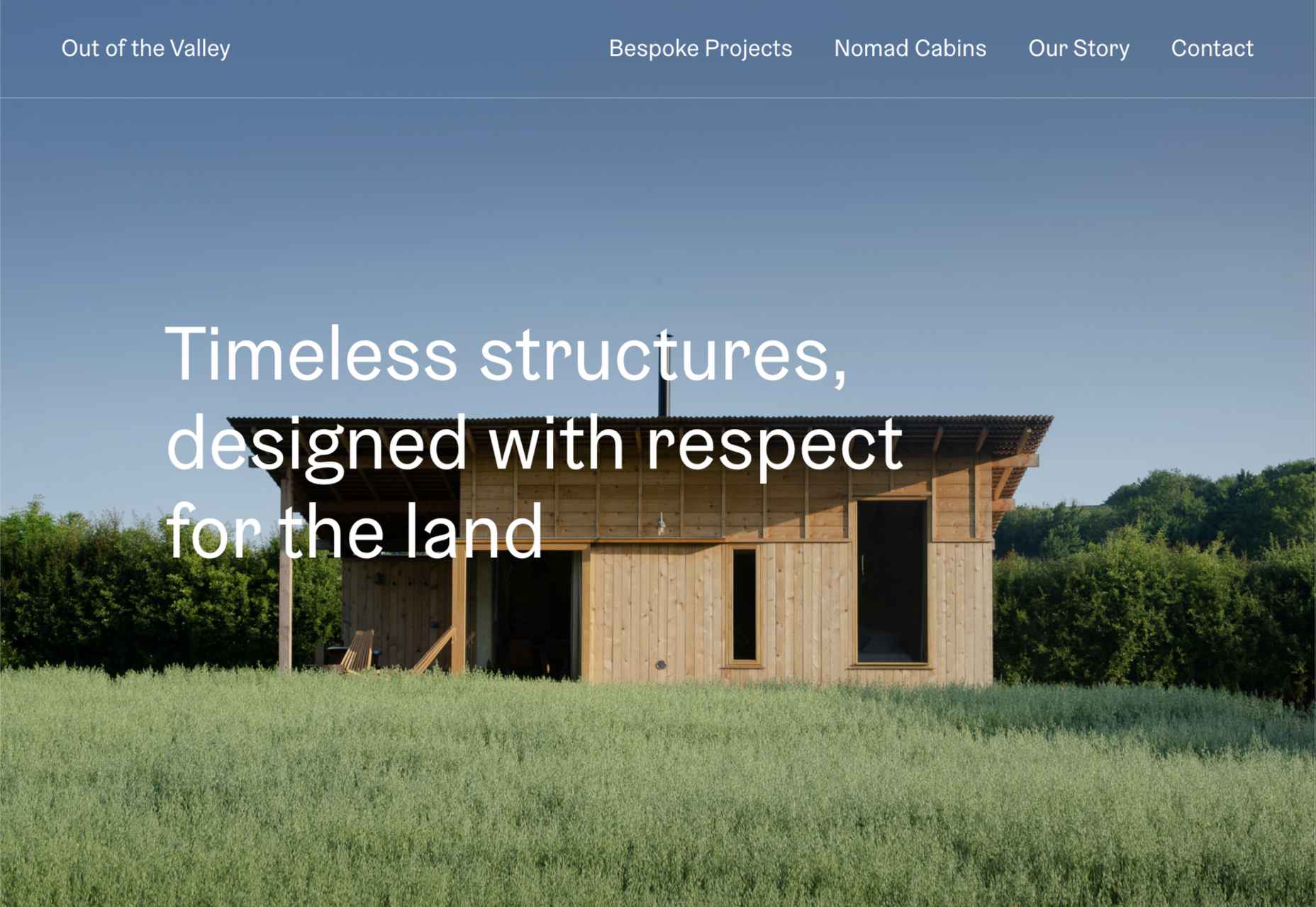
Out of the Valley
Out of the Valley, make bespoke and prefabricated cabins focusing on natural materials and traditional craft. The subtle changes in background color add warmth to the minimal layout.
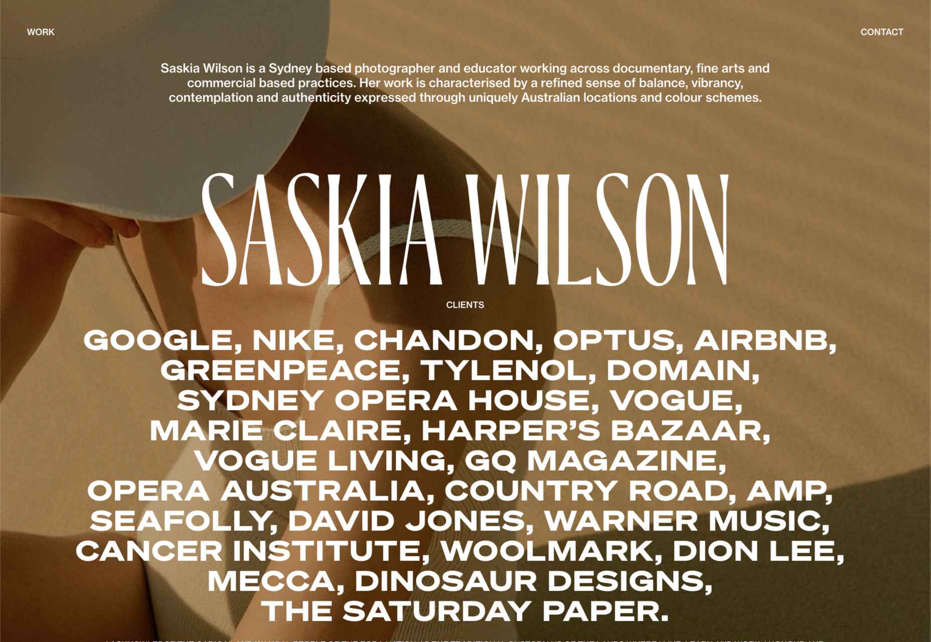
Saskia Wilson
Portfolio site for photographer Saskia Wilson. This is absolute simplicity, with a clear grid and nice, bold type to bare minimum text.
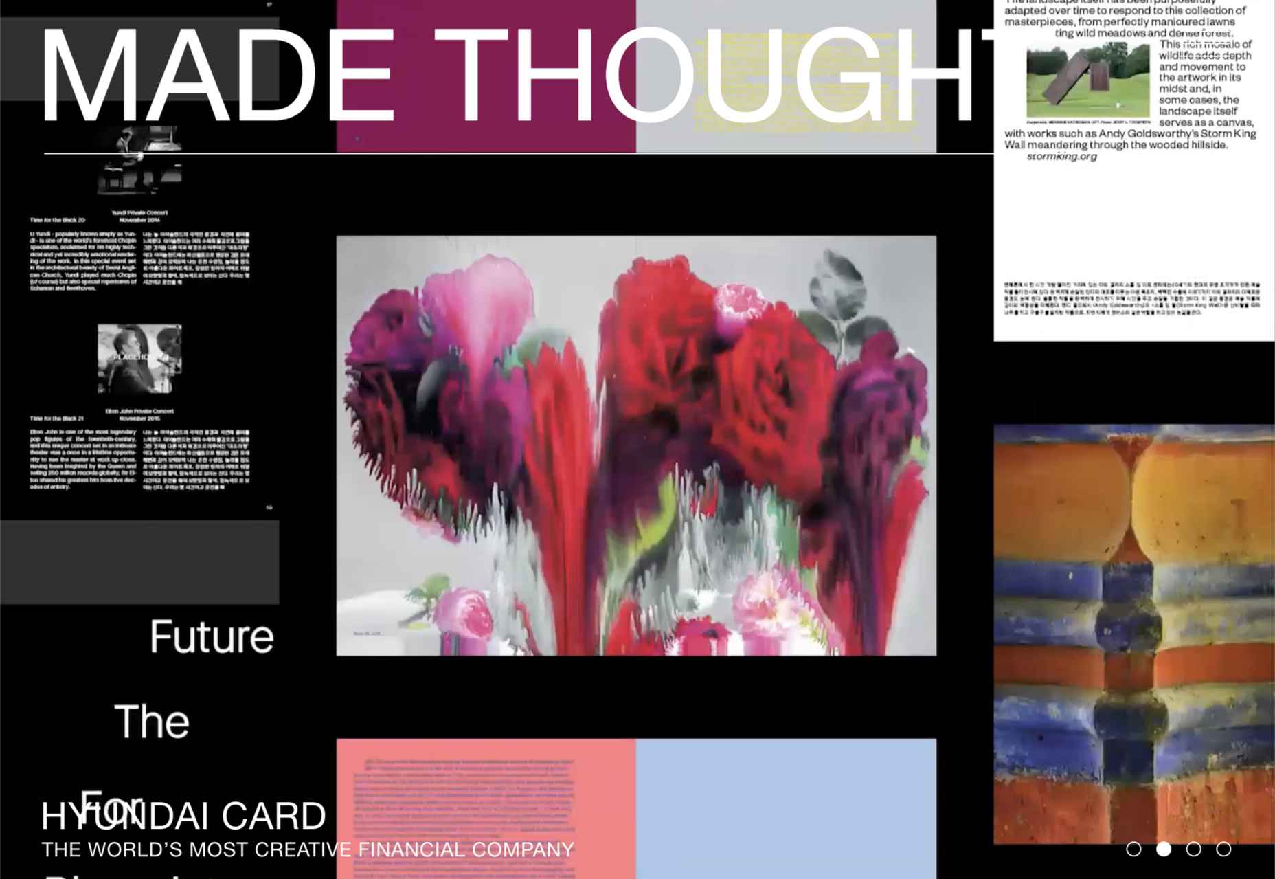
Made Thought
Design studio Made Thought has some pretty prestigious clients; for a designer, it doesn’t get more prestigious than creating a new brand identity for MoMA. Their bold aesthetic and approach explain their success.
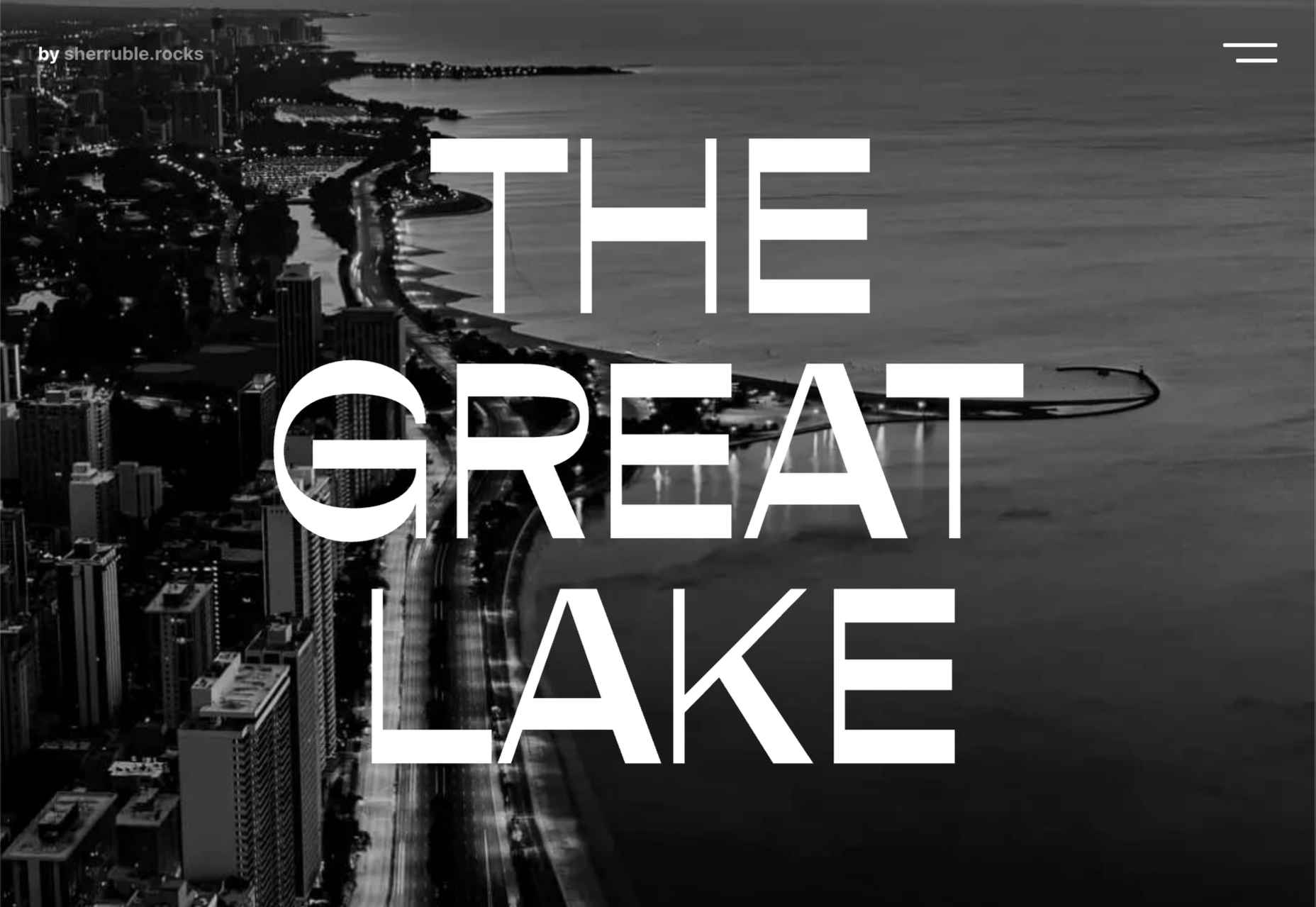
The Great Lake
For-fun sites like The Great Lake are a great way for web creatives to show their skills. This one from designer and front-end developer Anna Sherruble is visually appealing and has some informative content.
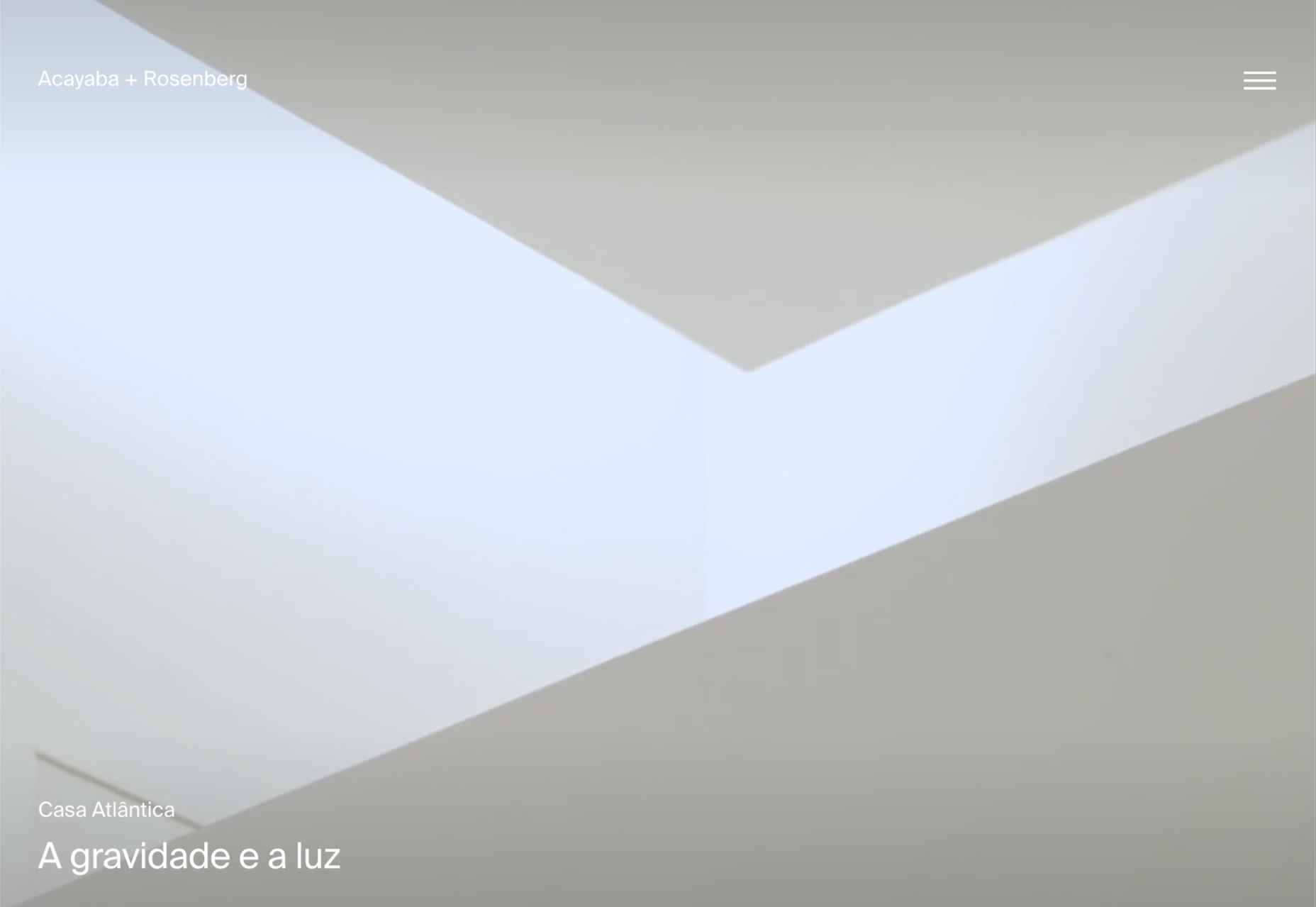
Acayaba + Rosenberg
Architects Acayaba + Rosenberg use carefully curated photography and subtle scrolling animation to pull the user in and create a pleasing browsing experience.
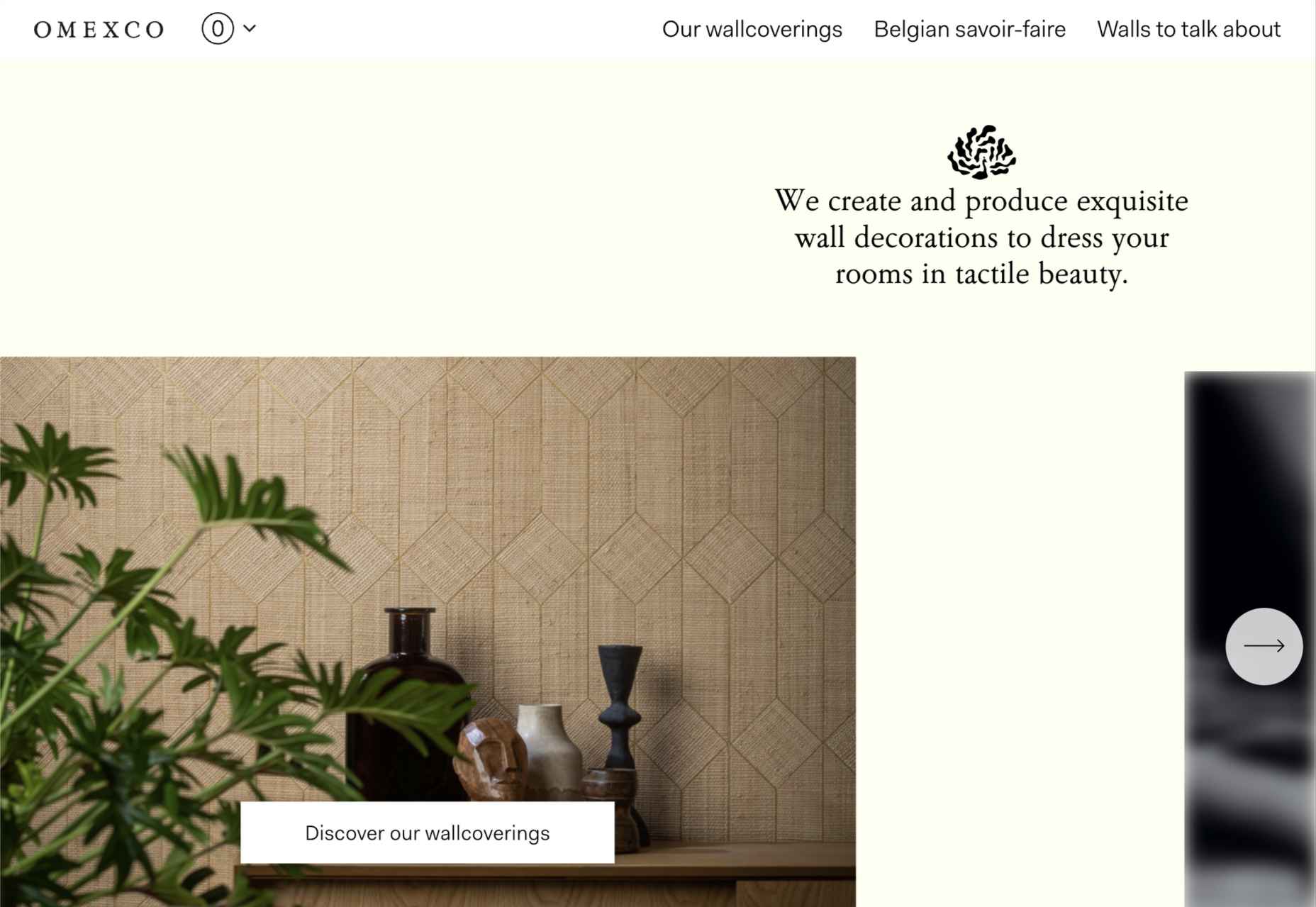
Omexco
Soft colors and a well-ordered grid recreate the feel of a mood board that prevents this site for Omexco from appearing cluttered and overly busy while showcasing multiple products.
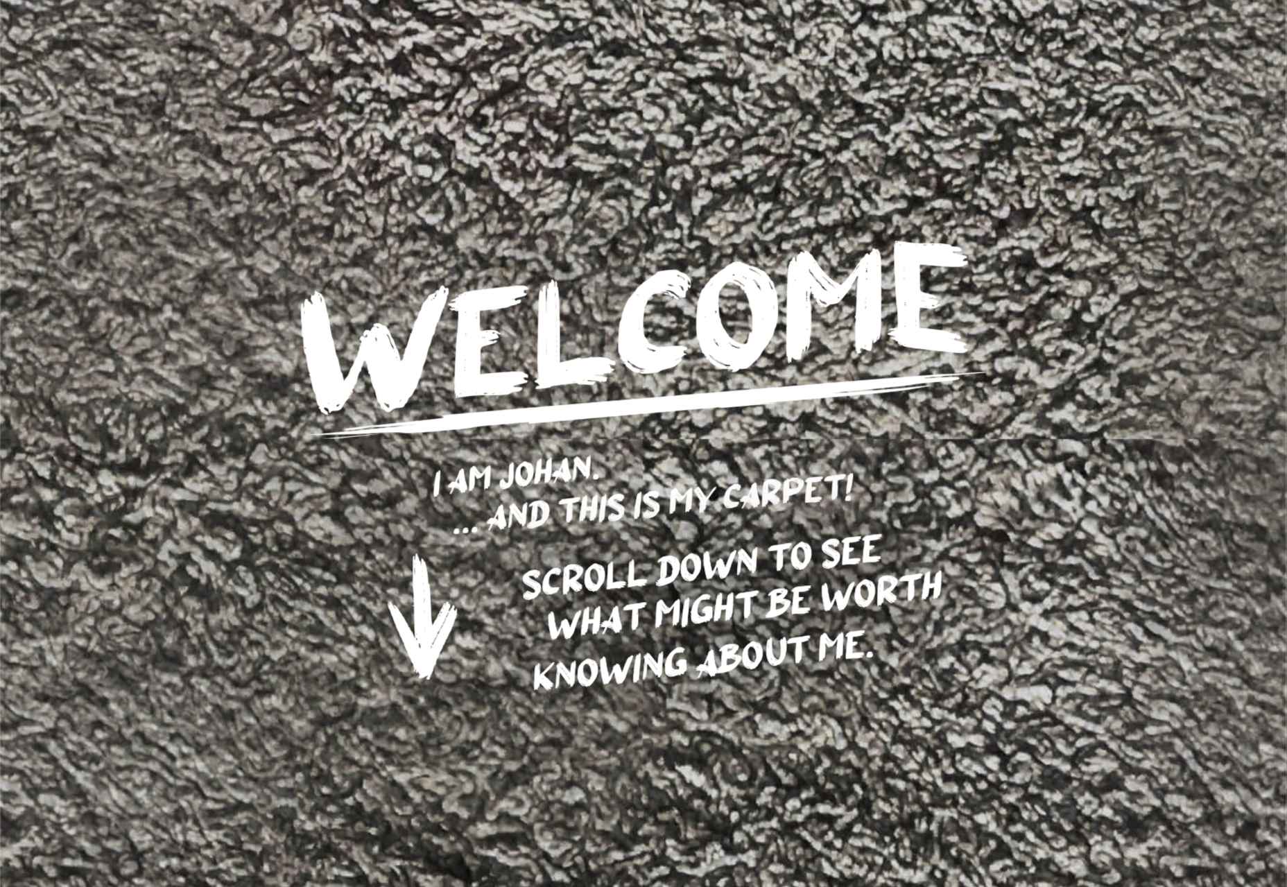
Johan Belin
For his own site, digital creator Johan Belin has opted to show off his skills by creating this single-page site instead of simply showing work. This can be a risky tactic, but it works here.
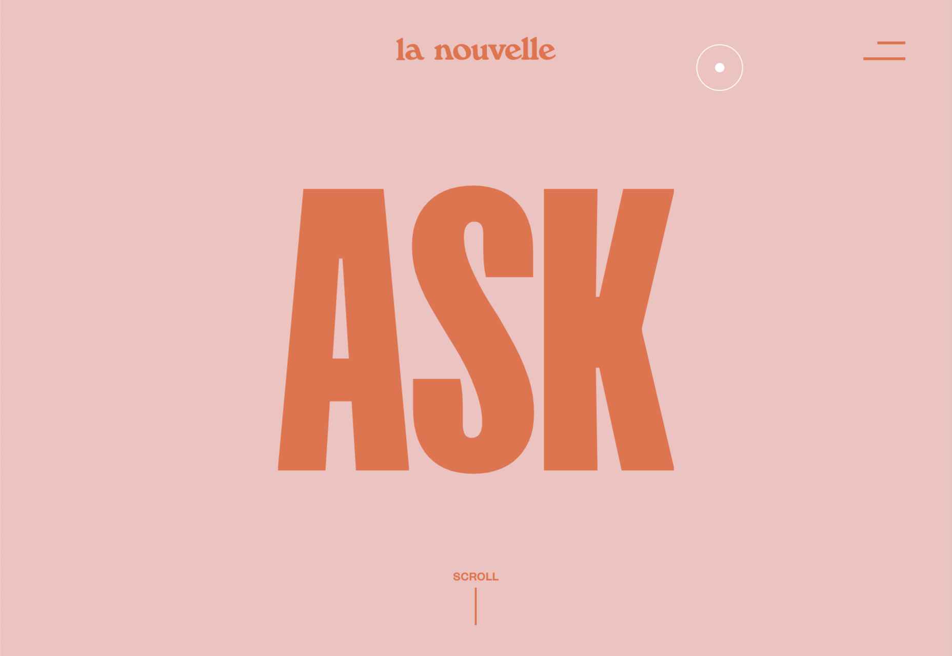
La Nouvelle
A combination of contrasting and complementary color combinations creates freshness in this site for digital agency La Nouvelle.
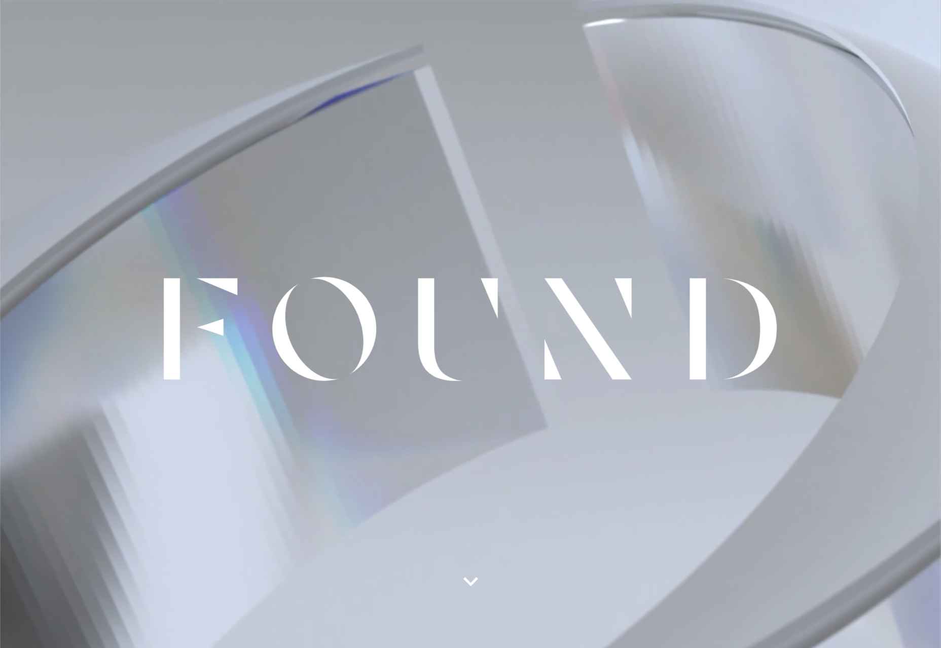
Found
Found Studio’s website uses a very basic grid layout to allow the work to stand out; varying the typeface, weight, and style within sections of text creates individuality.
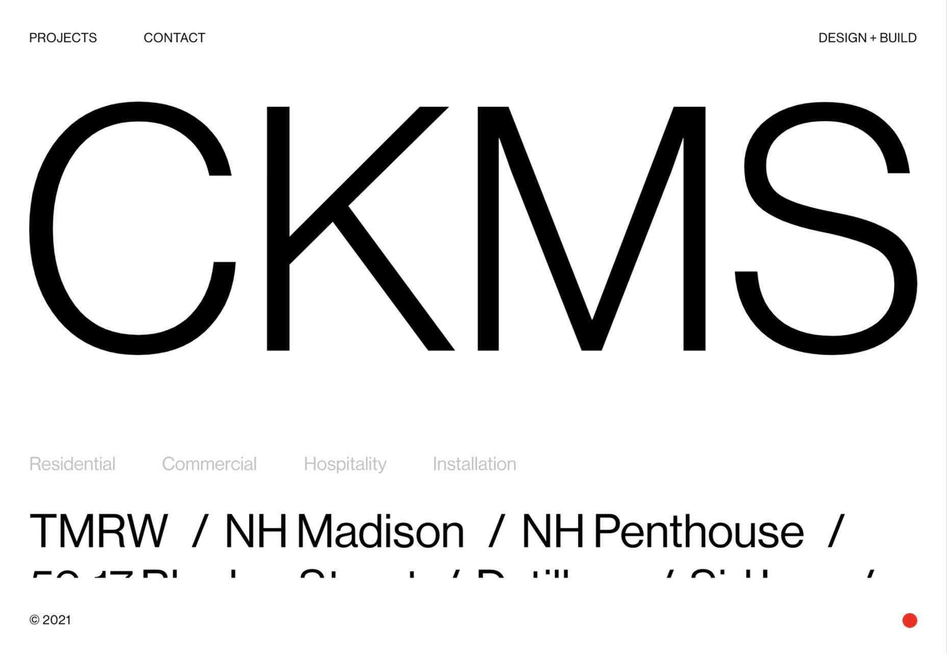
CKMS
CKMS is a design and build company. Their site is minimal but with a few nice little touches, like the background color change button in the bottom right corner.
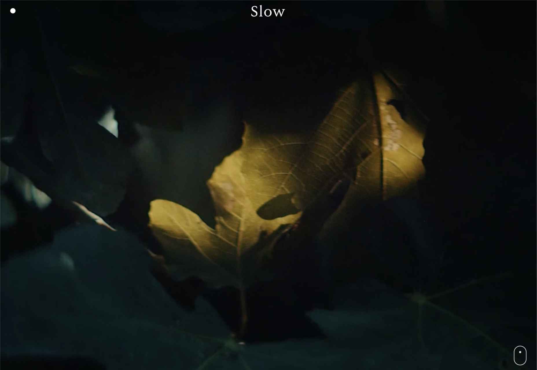
Slow
Slow is a collective of people–largely artists, designers, artisans–aiming to implement and live by the slow movement principles. The design of their site reflects these aims, creating a sense of calm and deliberation.
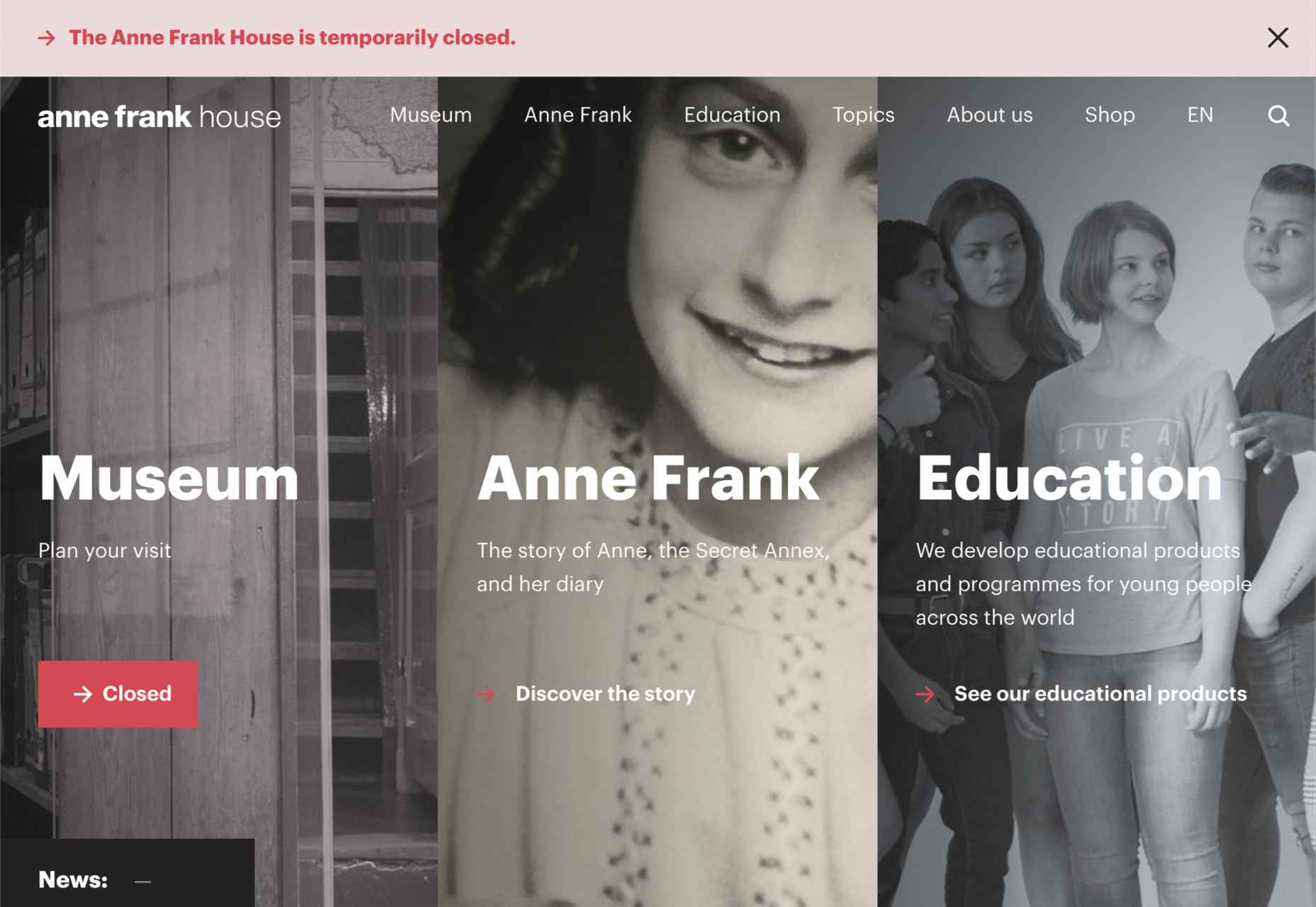
Anne Frank House
Practical information for visiting the Anne Frank House and museum is combined with historical information and educational resources in this thoughtfully structured and visually engaging site.
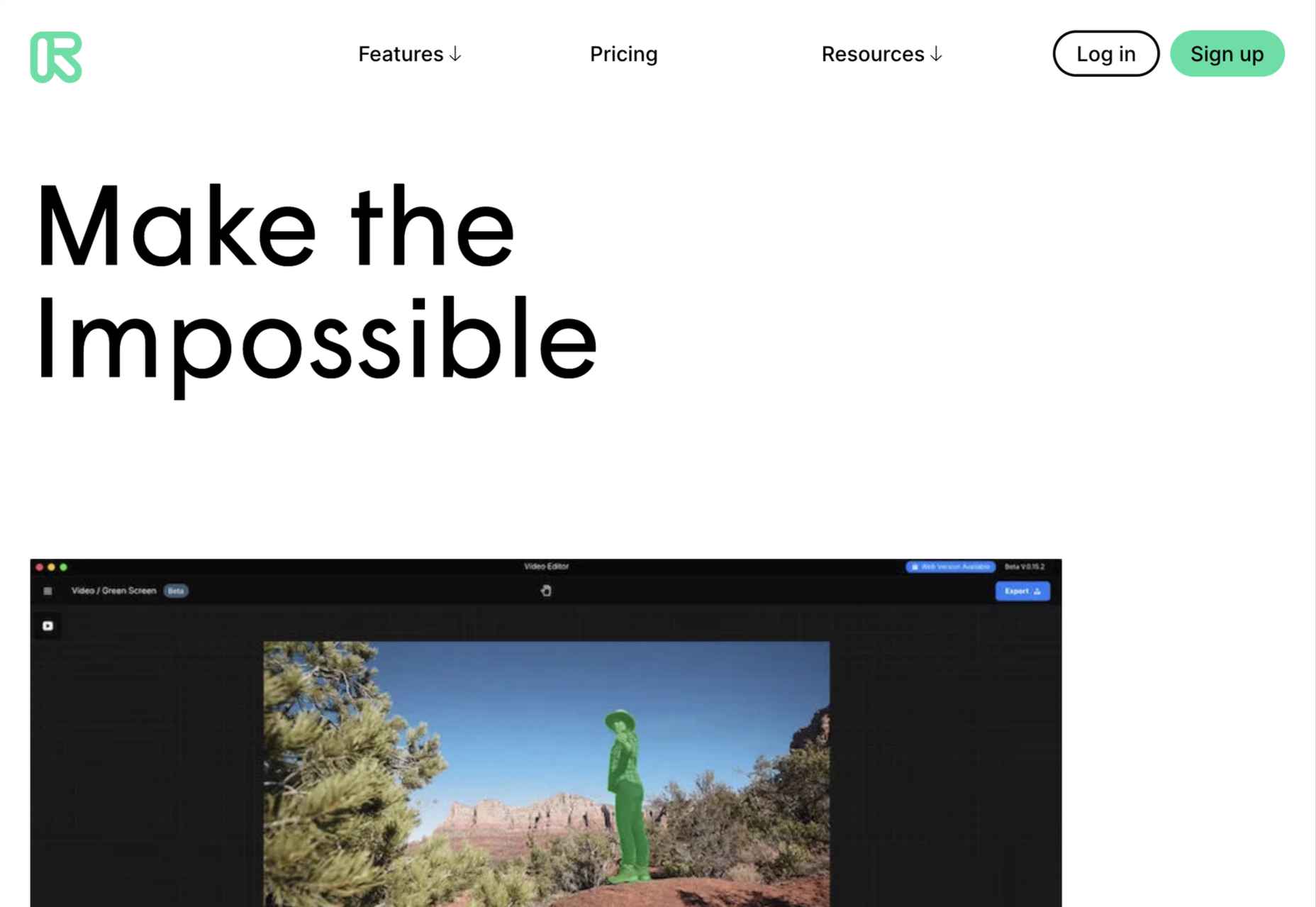
Runway
Runway is a platform for publishing open-source, pre-trained machine learning models, as well as for training your own models aimed at artists and filmmakers. If this site aims to make the user want to try Runway, it succeeds.
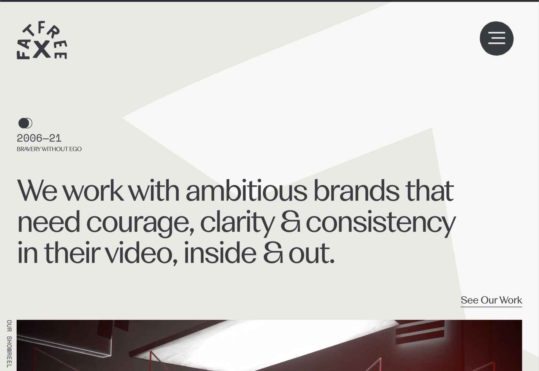
Fat Free
Fat Free video branding agency add warmth to their minimal site with soft color and occasional illustration.
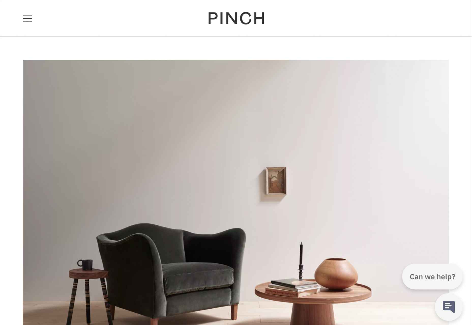
Pinch
The furniture and other interior products produced by Pinch Design aim for a quiet, elegant aesthetic, and their website reflects that with pale grey and generous spacing.
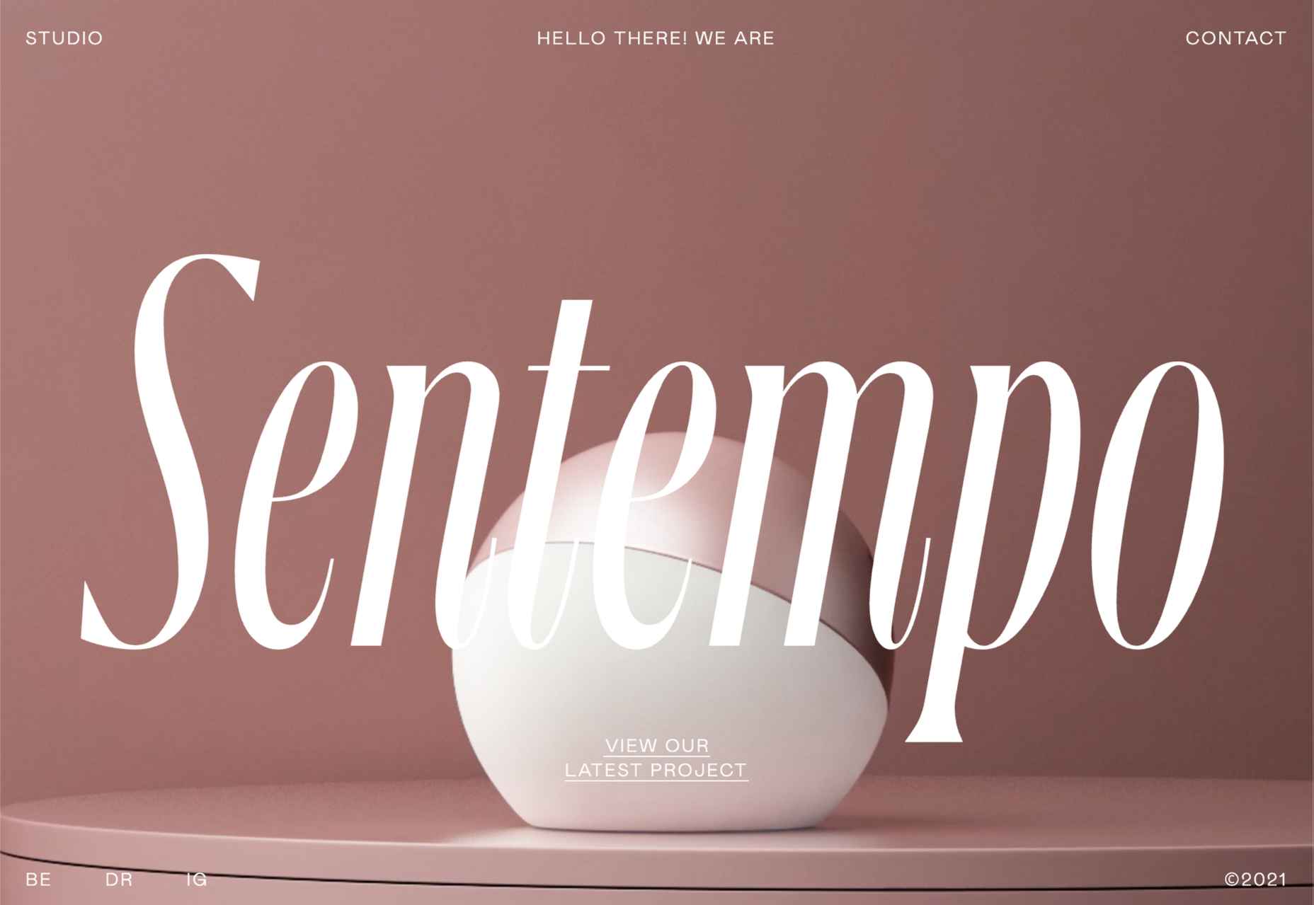
Sentempo
Digital studio Sentempo manages to achieve glossy without being overdone. The star dividers are a nice detail.
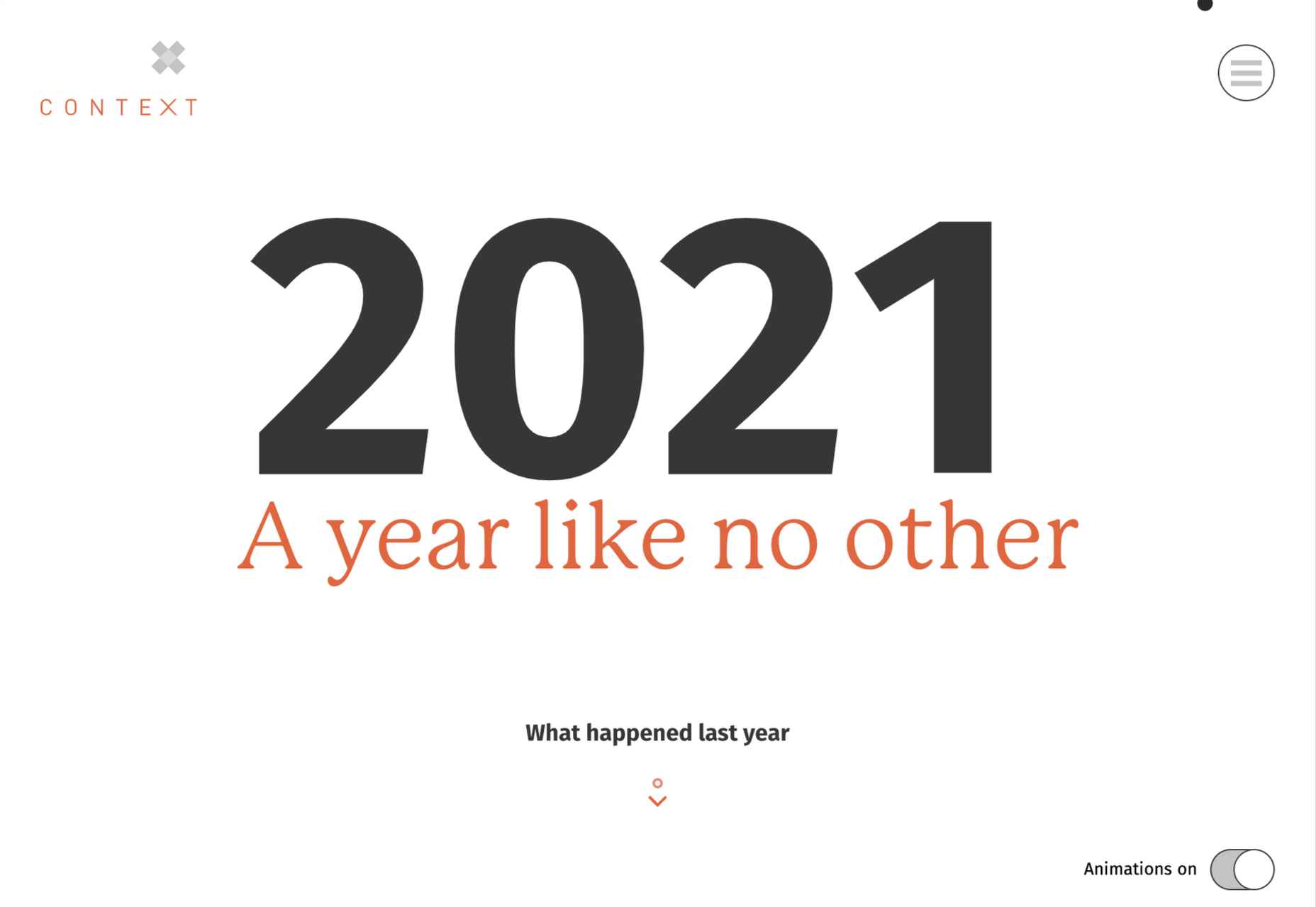
One Year
Many companies, including creative agencies, have come up with ‘what we did/achieved in the last year’ microsites. This one from Context Creative succeeds as a good advert for them.
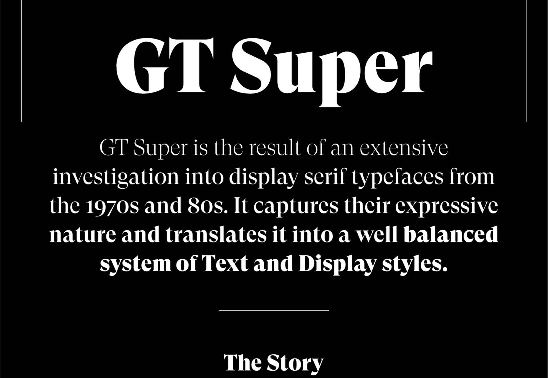
GT Super
This single-page intro to GT Super font has a certain drama in keeping with the font itself and allows you to play around with the size, weight, and style of the font in most sections of the text.
p img {display:inline-block; margin-right:10px;}
.alignleft {float:left;}
p.showcase {clear:both;}
body#browserfriendly p, body#podcast p, div#emailbody p{margin:0;}
The post 20 Best New Websites, April 2021 first appeared on Webdesigner Depot.
![]()