Creating a good print design can be quite a challenge. Even if you’re an experienced web designer who creates all kinds of responsive design and is familiar with all CSS tricks, working on a print project might be quite difficult because print production and web design require you to use different skills and pay attention to different aspects of work. The situation gets even more difficult because, when dealing with web pages, you can fix any mistake easily and quickly. In contrast, when working on printed materials, fixing even a small mistake can be quite expensive.
When designing for print, you need to not only create a design that will look good on paper (which is a challenging task by itself) but also make sure to properly set up your project for print. You should also try to avoid many common mistakes that beginners are often not aware of. You should take into account a resolution, color profiles, sizing, choose the right applications, etc. While modern print design depends on many technological factors, it has also inherited a lot from older art forms, such as painting, printmaking, and photography.
In this article, we are going to consider the 10 crucial elements that make a good print design, as well as the main principles of design, in general, so that you will know how to use different elements of art properly.
Design vs. Art
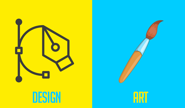
First of all, it’s important to focus on the purpose of design and its difference from art. Many people think of design as something that makes things visually appealing and therefore performs a purely decorative function. The truth is that design isn’t the same thing as art. Moreover, some designers insist that there is no direct connection between design and art. Although such an opinion is definitely debatable, art and design have different purposes and areas of application.
The main purpose of design is not to simply create a good look but to solve problems. Quite often, design is aimed to find an innovative solution, while making this solution good-looking is a secondary goal. It makes sense to define design as working with visual elements to perform real-world tasks. Design can not only solve problems but also have a strong influence on the way we perceive our reality, which makes it somewhat similar to art. Good design can evoke various feelings, delivering complex experiences. Besides, both design and art rely on some common elements.
The Key Elements of Art in Design
1. Dots
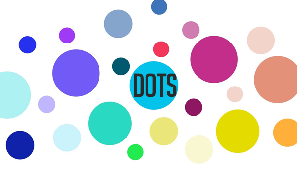
A dot, or point, is the simplest element of design, and it’s also the simplest unit in geometry. Geometry defines a point as a place where two coordinates meet. A point has no dimensions, no extension, no depth, width, or length, and its only property is its position. Nevertheless, dots are extremely important because they make up lines, shapes, and all the other complex elements. When working on print design, you can use dots for different purposes. For instance, they may serve as stopping or focal points of design compositions. They can also serve as focus elements to which you want to draw attention.
2. Lines
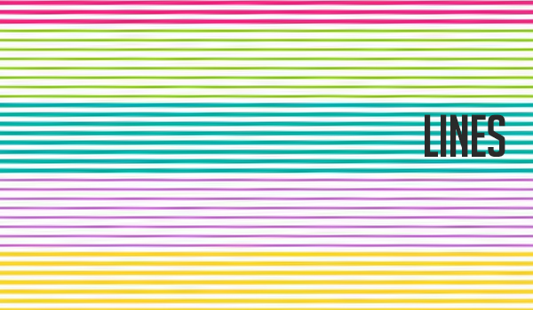
Lines are the most basic elements of any art, and the only simpler element is a dot. From the geometrical point of view, a line is a series of dots that make up a linear mark when moving. Lines serve as building blocks in all art forms. Even if you don’t see well-defined lines when looking at some picture or design, the final result is still based on the first draft created by the artist by using lines.
Most often, lines are used to create edges of an image, but they can also perform many other functions. For example, hatching is a common type of shading where lines with different density make up shades. Despite being the simplest element of design, lines are also very versatile: they might have different height, width, and direction.
You can also use a simple line to create the necessary psychological effect and to communicate a hidden emotional message. For example, spiky lines are associated with chaos and anxiety, while smooth curvy lines communicate a sense of comfort.
3. Shapes
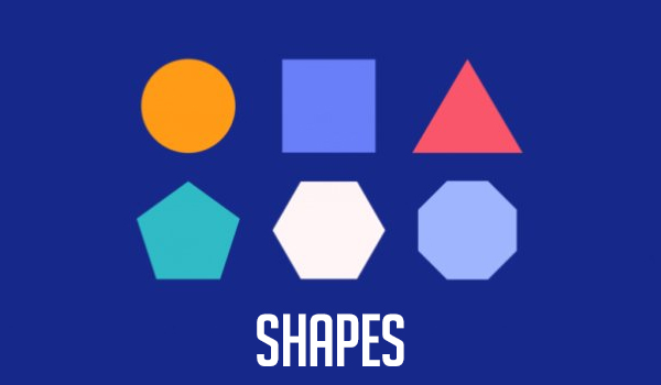
Lines and shapes always go together, and both these types of elements can evoke different emotions and meanings. Shapes can create a sense of movement, making viewers’ eyes move from one element of your design to another. The human brain is wired to find patterns in all visual information, and this is what makes shapes attractive for the human brain. Shapes are two-dimensional because they consist of multiple lines that create boundaries.
There are many types of shapes that you can use in different situations. Geometric shapes are usually based on various mathematical principles. They are precise and easy to recognize. For example, these are triangles, squares, hexagons, octagons, etc. Organic shapes are usually based on the elements that you can find in nature: leaves, branches, clouds, animals, etc. There are also countless abstract shapes that can be very useful when working on minimalistic designs.
4. Colors
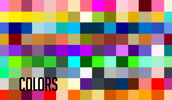
Colors are arguably the most emotionally charged elements of design because they have a lot to do with psychology. Besides, colors are one of the most important things when it comes to remembering brands. Every color communicates a certain hidden message: passion, joy, reliability, etc.
“You may have noticed that red is extremely popular in the fast-food industry, while healthcare companies often use blue,” notes Kira Suarez, graphic designer at Writing Judge. Red communicates hunger and passion, while blue will make your audience feel calm. Blue, purple, and green are considered cool colors so they are a great choice if you want to create a soft atmosphere.
The way you combine colors has a strong impact on the success of your design so you should always use colors that complement each other. For example, purple perfectly combines with yellow, while red looks great with green.
5. Forms
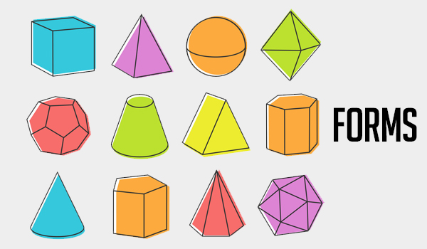
Forms are also called positive elements, in contrast to negative space that doesn’t contain any elements. Quite often, the terms “form” and “shape” are used interchangeably. However, shapes are two-dimensional, while forms can be either 2D or 3D. Forms also are heavily influenced by the use of space. You can change the way forms are perceived by using highlights, shadows, blur, etc.
6. Value
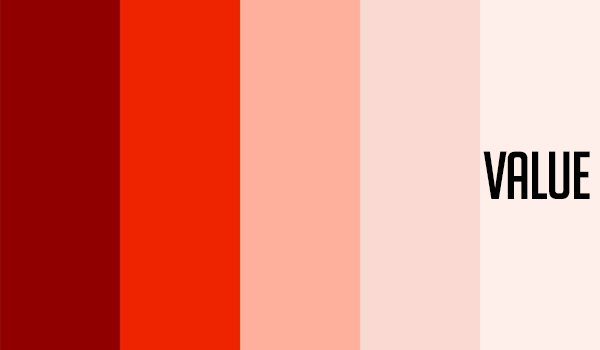
Value is a term that is usually used when talking about the lightness or darkness of a hue. Value is determined by how close or far a certain hue is from white or black. For example, bright colors like yellow and pink are closer to white so they have a higher value. Hues with a lower value are closer to black. The way you combine hues with different values determines how readable text and other elements of your design will be.
Value is very important for tone, light, and texture. You can adjust brightness and contrast by adjusting values between black and white. Changing the value of similar colors enables you to create various optical illusions, such as vibration or movement.
7. Proportion and size
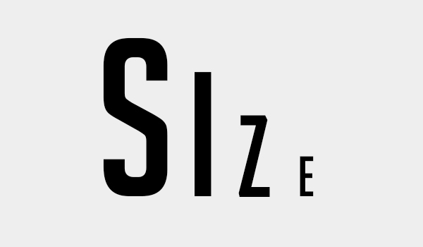
Another crucial element of the design is the relationship between different elements in terms of size. Scaling enables you to make different elements of your design appear close or far from a viewer. The closer an object, the bigger it is and vice versa. Proportion refers to different parts of the same object. For example, if you draw a face, you will make sure that eyes, nose, and mouth have the right proportions in relation to the size of the face, in general.
8. Space
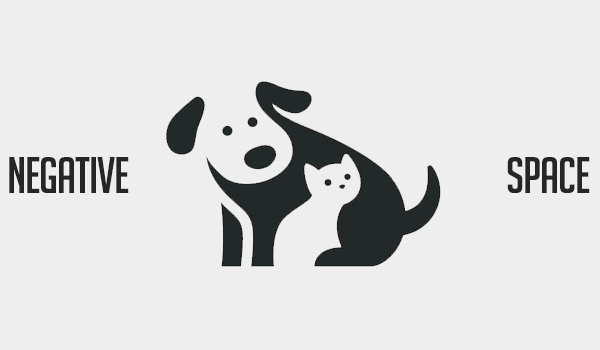
Negative, or empty space, is an important element of design by itself. Not only can you communicate a certain meaning by placing objects at some points of space, but you can also communicate it by showing an absence of any elements. When working on print design projects, considering negative space is extremely important because you may work with different materials that have their texture or even color. You can use the properties of materials and incorporate them in your design as negative space.
9. Textures
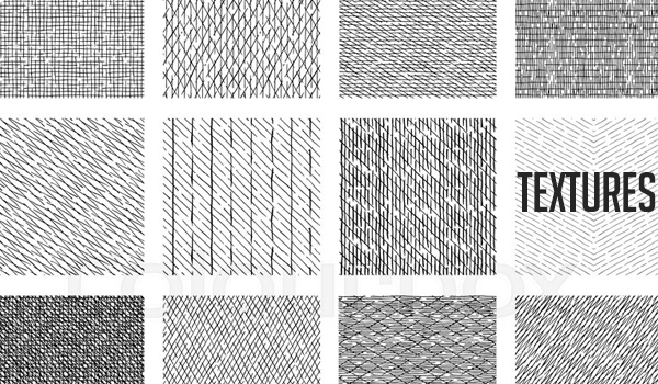
Most often, we mention textures when talking about 3D objects. However, textures can also be used to emulate 3D feelings in 2D design. For example, graphic designers often use paper-like or scratchy textures to make their designs look more natural or to create various visual effects. Oil paintings also have a texture created by strokes of the brush, and this is often used by artists to add depth to their work.
10. Symmetry
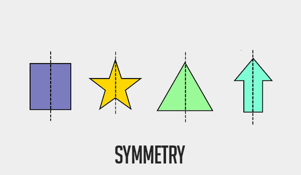
Simply put, symmetry is all about balance. You can observe symmetry if you divide an image in half and both sides will have the same shape. Symmetry is popular in design because people like symmetrical objects. The line of symmetry is one of the most common terms in the beauty industry because we perceive symmetrical objects as beautiful. Symmetry also enables you to create more complex shapes and forms while also keeping them easy to memorize.
At the same time, you should use symmetry in moderation. Symmetrical shapes are attractive because they are perfect, but humans like everything natural so combining symmetry with some “imperfections” (i.e. asymmetrical elements) is the best approach.
The Main Principles of Design
It’s not enough to know the key elements of design. To create a good design, you should also know how to combine these elements properly. All elements used in design have different functions and purposes so you should pay attention to the relationships between different elements to make sure that they serve the common objectives. Rhythm, repetition, contrast, balance, and other principles of design can help you harmonize different elements.
You should also keep in mind that you don’t necessarily need to use all the principles described below in one design. However, if you consider these principles and follow at least a few of them, you’ll be able to create a more coherent design.
– Unity
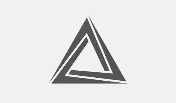
To create a successful end-product, you must ensure both visual and conceptual unity. Conceptual unity is crucial for wireframing, and this term refers to all interactions that lead users from point one point to another. Visual unity is all about the visual appearance of a design. To ensure visual unity, you must work with shapes, colors, sizes of elements, etc. For instance, elements of the same importance may have the same color, size, etc.
– Balance
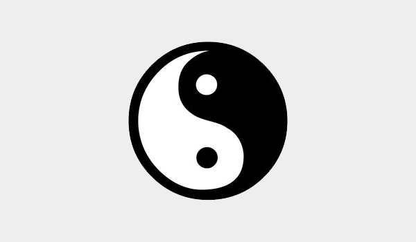
People like balance because it creates a feeling of satisfaction. Balance makes your composition feel more stable. There are many types of balance, including mosaic, symmetrical, asymmetrical, and radial balance. If you fail to make your design balanced, it can create a sense of discomfort for viewers or make them feel disoriented. An unbalanced design creates unnecessary friction between the product and user, damaging the whole interaction experience.
– Similarity and contrast
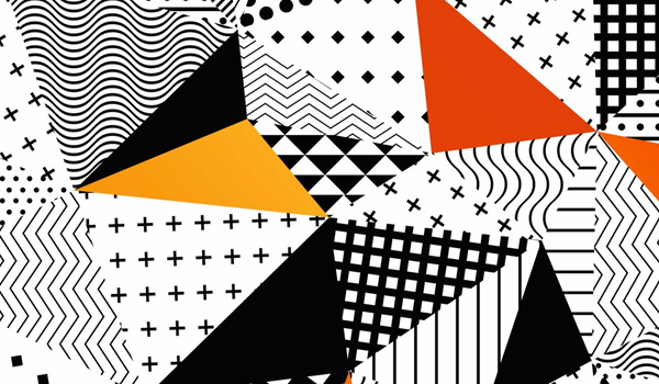
You can use similarities and contrasting elements to guide users’ attention. Similarities enable you to illustrate various relationships between elements in terms of both appearance and functionality. According to the Gestalt principles of design, people tend to group things based on their visual appearance so you can use visual similarities to indicate sequences of elements and group them logically.
You can also use contrast to make certain elements stand out. Our brains are wired to focus on things that are different from others in some way because we are interested in learning more about them. Whenever you see contrasting elements in a design, the chances are that these elements look like that for a reason. You can create contrast with colors by using different intensities, hues, and warmth. You can also combine smooth and rough textures, objects of different sizes, geometric and organic shapes.
– Emphasis and hierarchy
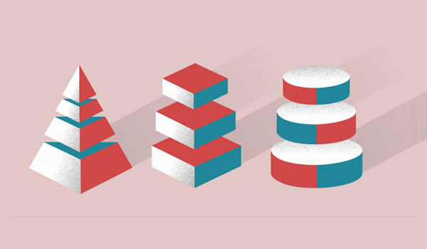
Hierarchy of elements helps designers make sure that users will perceive and process information in the right order. Creating hierarchy means structuring elements of a design in a logical and rational order so that the design will fulfill its purpose. Obviously, a clear hierarchy is crucial when designing apps and websites because it determines how easily users will be able to find each element.
You can achieve a clear hierarchy in different ways. For example, you can make some elements bigger so that they’ll be more noticeable. This way, users will quickly understand that these elements are more important than the smaller ones. You can also use different colors and shades. For example, brighter elements stand out from the paler ones and therefore are perceived as more important, as well.
However, you can also establish a hierarchy in less obvious ways. For example, you can use alignment. You can sort most elements in a certain order and make the most important elements stand out by keeping them misaligned. Elements of your design may also draw more attention if they’re surrounded by a lot of white, or negative space so they appear more isolated. Simply put, creating a hierarchy is all about making more important elements easier to notice.
However, you may also need to illustrate the relationships between different elements. In this case, you may use the same approaches, choosing similar colors, sizes, and shapes. You may also use similar features repeatedly. Repetition of common features helps show that elements are related, and it can also help visually explain how exactly these elements are related. Another effective approach is placing related elements closer to each other. All of these design solutions are effective because they can be interpreted intuitively.
– Variety
A variety of elements helps keep the user’s interest. Monotonous design can make it hard for users to stay focused. You can achieve variety through colors, shapes, and other elements of art. The main thing is to make sure that you don’t create variety simply for the sake of variety — it must have a clear purpose, reinforcing some elements, creating a better visual look, or adding meaning to the general concept of your design.
– Rhythm
The concept of rhythm in design refers to the spaces between elements and the visual composition. Visual rhythm can be regular, random, alternating, progressive, or flowing. Regular visual rhythms imply using the same spacing between different elements. Alternating rhythms are based on a repeated pattern, with no variation among specific elements, while random rhythms have no distinctive pattern at all.
Progressive rhythms change with every iteration. Flowing rhythms imply creating spacing that follows curves and bends. You can choose different types of rhythms to evoke different feelings. For example, progressive and flowing rhythms can help you build a sense of excitement, alternating rhythms help increase consistency, and regular rhythms may help you create reassurance.
Final Thoughts
Creating printed designs is a time-consuming and difficult task, but it has a lot in common with other forms of visual art. Everything from Picasso’s paintings to the print on your favorite t-shirt is based on simple elements like lines, colors, and shapes. However, you can use the same elements in different ways and build your designs based on different principles. We hope that our article will help you get inspired and focus on the right aspects of design when working on your projects.
