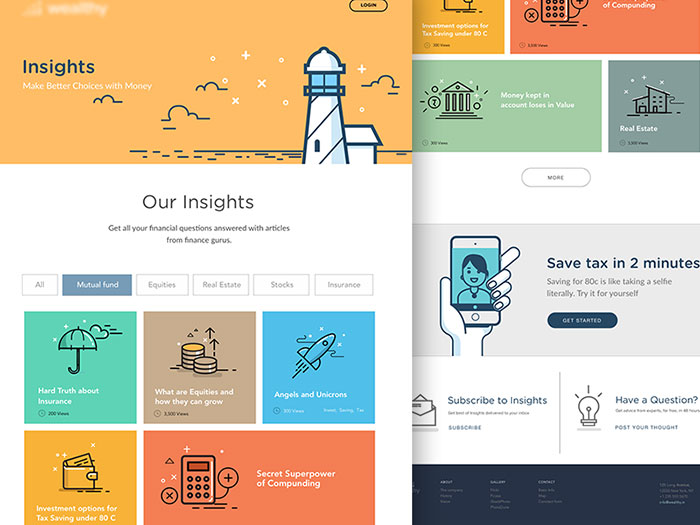
Color is the main tool you have in order to attract your audience’s attention towards that exact thing you want them to know. Using colors, you can inspire specific feelings and motivate specific actions. Long story short-the entire usability of your web design relies on color.
Color can support or modify the message you’re trying to convey. With pale colors and unreasonable combinations, your content or call for action (CTA) will be ignored regardless its quality. You may pretend to stay immune to this influence, but the truth is-nobody does. Even NASA cares enough to choose attractive palettes for its online tools!
The importance of color in web design

Image source: Ranganath Krishnamani
Color influences people in all possible manners: psychologically, physically, and socially. What people see on your design can actually make a difference to their health and their mood.
Every color has a specific meaning, so we should be really careful about the meaning we are trying to convey to our users. Therefore, using the colors you personally like is not the best solution for your design.
Color contrast in web design
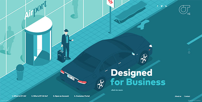
Image source: ot-24.co.uk
By definition, contrast represents the difference between visual properties that can distinguish an object from the background. In simplified terms, contrast is the set of differences between two or more objects.
When using color in web design, contrast is very important: It can contribute to the legibility of you textual content and to the way in which people perceive it. This is exactly why designers find it to be confusing and scary-it can either make or break the design! The biggest fear is that they would have to limit the color palette they are using and, of course, their creativity. Some of them even confuse color accessibility with the perception of semi-blind people, and they don’t care to apply it. Let’s make it clear from the beginning: Contrasts matter to every user!
The meaning of proper color contrast
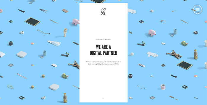
Image source: molamil.com
At a first glance, it seems like a reasonable color application on background and foreground objects. But what does reasonable mean? In fact, color contrast is associated with a rainbow of preferences – partially sighted users would require higher contrasts, but people with reading difficulties would appreciate subtle tones and differences.
Why is contrast so important?
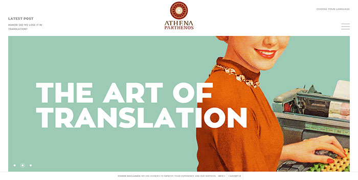
Image source: athena-parthenos.com
How otherwise would we distinguish one object form the other? Professionals who design websites with good color contrast know that there should be a significant difference between background and foreground textual objects. Contrast in textual terms is an entire accessibility theory, with universally accepted standards and measurement tools.
The perfect combination of colors and contrast
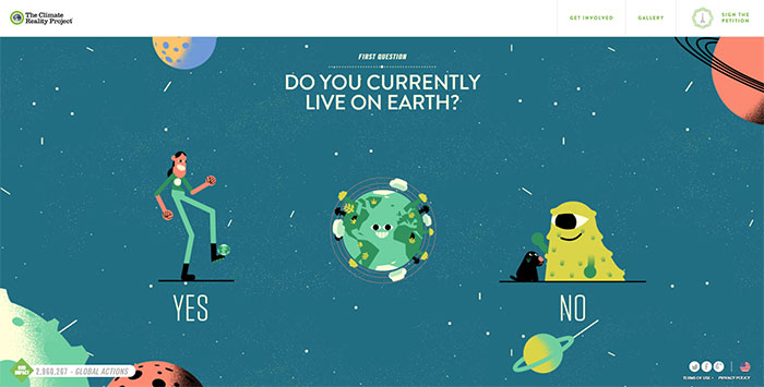
Image source: worldseasiestdecision.org
When working with colors, it is especially important to pay attention to contrast techniques. A designer, who knows how to apply contrast properly, is very likely to have a successful design.
Contrast decides which color is going to stand out from the crowd. When dealing with text, contrast can point out which parts are really important by making them more striking than the background. On the other hand, if you want readers to avoid certain information, use colors that will ‘melt’ the text with the background.
It means that proper contrast can help readers browse more effectively, with almost no effort to find the information that they need.
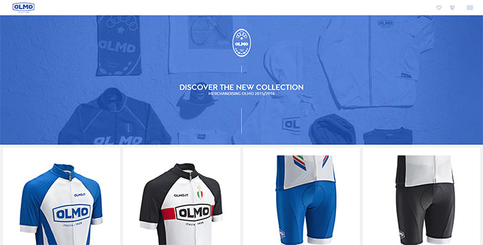
Image source: olmo.it
Decently-crafted pages look welcoming and fresh, because they decrease the effort of interacting with the screen. Users spare time and strength, as they can easily locate the successful competitors for attention on their screens.
With contrast, designers can either promote important information, or point out what they want to be seen. Between us, they use the tool to hide things that may not look perfect on a page.
So, contrast is important. Keep that in mind!
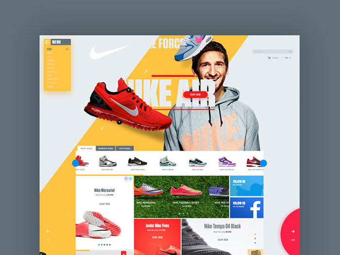
Image source: Vitali Zakharoff
If we have to be absolutely honest, we would say people are scanning rather than reading your content. They go through it quickly and they rely completely on the strategy you use to sort important information out.
Therefore, they will certainly pay attention to eye-catchy letters, shapes, and images that appear. Using strong contrast, you can push their way through the website and make important stuff easily noticeable. They will engage with the page easily (in the best case-with your company too!).
High Contrast Vs Low Contrast

Image source: Olly Sorsby
If trying to make an item stand out from the rest, the smartest decision is to use high contrast. Light colors on dark backgrounds, or the other way around-in both cases, people will be able to read it. It may not be your idea of the perfect design, but it is legible. Be careful, though-too many strong contrasts are confusing and they will not make your point so clear.
Still decided to go for low-contrast? Do it, but make sure the content is not that important. Your options are that it will either not be read at all, or it will be the first one to read (depending on your audience). What we can say for sure is that low contrasts are not attention-attractive.
The meaning of colors
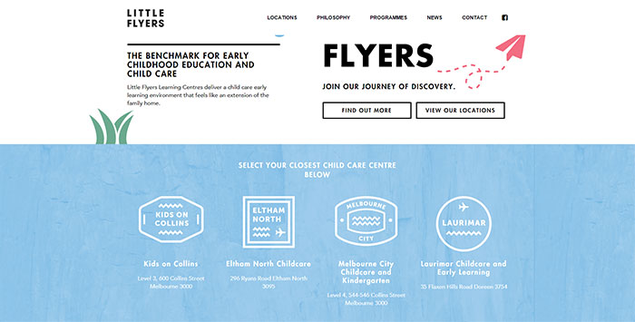
Image source: littleflyers.vic.edu.au
Before you start ‘contrasting’, you should make few smart color choices. The crucial thing to have in mind is the meaning of that color. Unfortunately, color meanings are not standardized and they often depend on traditions and preferences, but we can certainly provide few useful guidelines:
First step-decide on your target audience. Make a research and find out which colors they prefer and what meaning those colors have for them. We advise you to do this because colors have a strong cultural history behind them-what is the joyful shade of one region, may be the mourning tone of another.
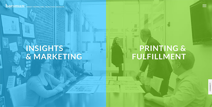
Image source: baesman.com
Warmer colors: yellow, orange and red. Don’t you immediately connect them with fire? True story-they radiate comfort and warmth. These are the colors for energetic, passionate or impulsive people; and the colors of happy and cozy feelings. They can ensure harmony in your design and they can make people feel welcomed.
Cooler colors: blue, violet and green. They remind us of water. Therefore, their meaning is mostly connected to reliability, professionalism and trust. In web design, they are a blade with two sides: they can make users trust you, or they can turn them off and cause sadness and monotony.
A summary on contrast’s importance

Image source: hoovermason.com
If you opt to believe color meanings are associated with time and trends, you should have in mind this is the ‘lively’ color season.
Color helps us transmit messages to people before they are even aware of our intentions. It is because some elements are painted to pop-out and to attract attention from the very beginning. For designers, color is the tool for visual communication which ought to be applied reasonably. Start in this way-Do you really want your users to see everything there is on the page? If not, what do you want them to see?
The second thing is contrast. You have to understand the difference between colors. You have to apply many of them, combined in different ways for some of your pages. Contrast is crucial for textual content-text simply has to step up from a dull background! However, we don’t recommend many contrasts on a single page, or extremely high contrasts which can create messy looks and impressions.
Remember that contrast is not just about dark and light tones. Some colors naturally contrast each other and they can take you straight to the top if you apply them properly.
Finally, round corners for sharp objects and dropping shadows on all items will not really improve your design. You need to stay creative and to think of more and more useful ways to covey the messages of your design. The best way is never to stop paying attention to details or observing your audience, so that you would know which their preferred ways for accepting information are.
