Studying the psychology of color is crucial for maximizing your site’s web design. Using the right colors can help put your customers in the frame of mind that compels them to take action. Color has the power to improve conversions by grabbing customers’ attention and triggering the right emotions for sales.
Colors often define the public’s perception about your brand and what you stand for. However, the ultimate question remains unanswered: Which color is right for my brand? What color should I choose for maximum impact?
It’s important to understand that the psychology of color plays a big role in persuasion. Keep in mind that persuasion is different from coercion, manipulation, or simply being pushy. Instead, it’s about bringing the change in attitude necessary to encourage customers to take action. In this case, the action would be a conversion or purchase.
Of course, an essential aspect of the psychology of color is value. If devoid of value, your products or services won’t sell regardless of the color scheme. For the psychology of color to work in your website’s favor, the content, design, loading speed, call for action, and other landing page factors must work in tandem.
Color and Conversions
There has been a proven scientific connection between the color of products and the urge to purchase. Every time you see a color, there’s a chain of reactions taking place within the hypothalamus in your brain. Hormones are released to your thyroid, thus triggering emotions that affect your behavior. In fact, 62% to 90% of purchasing decisions is based on colors! So, digging deeper into the psychology of color can significantly improve elusive conversions for your website.

Where Should I Use Colors?
The colors that you use might not be outright apparent sometimes, but they do make a difference. The key areas that you must be careful about are:
• Pop-ups
• Borders
• Headlines
• Background hues
• Primary web banners or hero graphics
• Buttons, especially call for action
The choice of colors in these prominent areas depends on the kind of audience that your website targets. Let’s discuss this further now.
Choosing the Color that Suits You Best
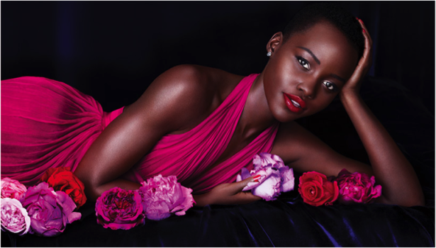
Each color generates different emotions that you can capitalize on. You simply have to know how colors can be put to good use. Take a look at L’Oreal’s successful brand image below. Notice how it uses different shades of pink on a purplish background. An image like this is inviting, especially for women. It gives a sense of beauty and fun combined with sophistication.
Here L’Oreal has found the colors to express precisely what their company and makeup products stand for. Just imagine any other color for the attire, flowers, or background. They would not give the same effect as the current one.
You’ve likely looked at the log-in page of Facebook and PayPal plenty of times. Ever wonder why both sport shades of blue? It’s not a mere coincidence. According to the psychology of color, blue inspires trustworthiness.
Contrast and Brightness
Brightness also plays a vital role in the success of your website. In general, it’s believed that women prefer soft colors while men prefer brighter colors. In the image by L’Oreal above, one can see that the colors are very soft. The same colors wouldn’t be smart for a website that deals with kids’ attire. Even though women mostly shop for their children, they still prefer bright colors. This is because kids are simply associated with vibrancy.
Contrast is another essential color factor that impacts the website’s readability. No one enjoys struggling to read what’s written on your call for action button or any other part of the website. Overlapping content with extremely bright or dull fonts is a strict NO. Imagine seeing a black “Buy Now” button on a light black background. It would likely go completely unnoticed.
Your website’s color scheme can impact accessibility and usability. If you create navigation tabs and dropdown menus using unnoticeable colors, it’s just as bad as not having them at all. Go through your website from the perspective of the user and you’ll know what we’re talking about. According to the psychology of color, orange, yellow, red, and blue would typically be the best bets.
Case Studies on the Psychology of Color
According to a study published on Moz, an online slot machine company simply changed the call to action button from green to yellow. This resulted in a whopping 187.4% rise in conversions! Trying different color schemes for your website is advised. You could use multivariate testing with several different colors. The colors with the maximum impact on your targeted audience will be the best options.

Here’s another study that proves the validity of the psychology of color. In academia, the color red is usually associated with error markings. Researchers at the University of Rochester put this to test through four different experiments. They found that use of the color red, such as wearing a red T-shirt, actually affects academic performance negatively.
10 Colors from the Internet Marketer’s Perception
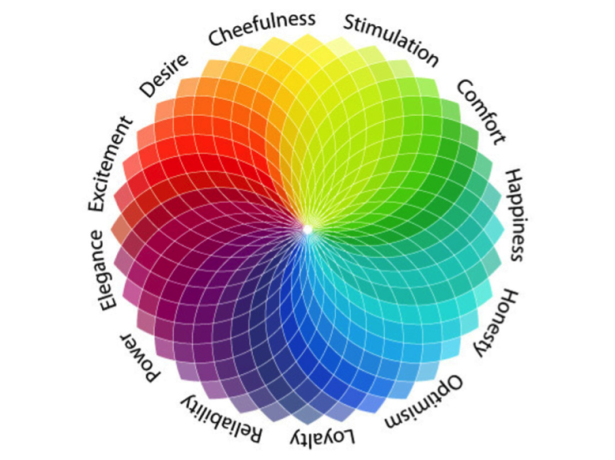
We’ve compiled the list below of colors and the emotions they inspire based on the psychology of color. When used in the right manner, these colors can go a long way in giving your website the right personality for improving conversion rates.
1. Pink: Let’s start with pink. If your target market is made up mainly of women, then pink is a good color for you. The color is known to raise emotions of fun and romance. Choose the hue of pink that suits your brand.
2. Blue: Blue signifies trustworthiness and provides an air of coolness. Any website that caters to online prescriptions, monetary transactions, or any other niche that demands reliability would be best served by this color.
3. Red: Nothing holds people’s attention like red. It’s considered the most effective color for call to actions. If you’re designing that “act now” button, red is your color.
4. Green: Green is the color of peace, tranquility, and nature. So if your website is about a great environmental cause or selling organic products, green should be the predominant background.
5. Yellow: In the marketing world, yellow is said to describe the healthy mind without worries or depressing thoughts. It’s best suited for online stores that sell products like kids’ apparel and toys. This color is also associated with caution.
6. Purple: Purple oozes elegance and sophistication. This color is ideal for a website that features niche, luxury products.
7. Orange: Orange can also signify sophistication, but at the same time be attention-grabbing. This color is suitable as a background for tech companies or websites that deal with gadgets.
8. Gold: As a metallic color, gold signifies power and prestige. It works well with other colors that signify elegance, such as green and purple.
9. Black: Black is versatile and goes well with any other color. It’s best used to bring about a contrast with the rest of the colors used in the website.
10. Brown: Brown is a nondescript color that enthuses relaxation and calm. This color is perfect for websites that deal with health and wellness.
The Final Word
Make use of the Adobe color wheel tool to see which colors match your brand. Experiment with how good each color looks. Remember the psychology of color to choose hues that persuade the best. Picking the right palette will surely help maximize your conversion rate.
Today’s globe is getting smaller and more diverse. Keep in mind that colors in cultures vary. What one culture considers positive might be considered negative by another. For instance, white is associated with death in China while the same color is worn by brides in Christian countries. Purple is considered feminine is most countries, but it’s also associated with death in Brazil. Therefore, you need to consider all aspects of your audience to zero down on a color combination that suits your prospective customers the best.
Have any questions or comments about the psychology of color? Please let us know in the comment section below.

