Using mobile apps and websites for banking, insurance, personal finance and investment in India can be deeply frustrating. These are essential services and companies providing these services must invest in the right kind of design expertise to provide superior digital product experiences to their customers. UX, or in this context, CX (Customer Experience) is critical enough to not only create core product differentiation but also, directly impact the company’s bottomline. Remember, good customer experience is good business. Gone are the days of unflinching customer loyalty — especially with the younger generation of internet users or Millennials, as we call them — who are digital natives. If their online experience of your product or service is sub-par, they will simply move on to the next best provider.
“When interfaces fail to live up to those unrealistic standards of simplicity, Millennials rarely blame themselves — unlike older users. Millennials are quick to criticize the interface, its organization, or its designers”
And that attitude is rubbing on to older folks like me! I recently moved my mutual fund investments from Scripbox to Goalwise simply because Goalwise — at least for me, provides a much easier, frictionless and pleasant app experience as compared to Scripbox. Don’t get me wrong, both platforms are equally good for their level and quality of service, expertise etc. Functionally, they are at par. The clincher for me was the overall user experience and the subtle joy of using a “modern” app that not only looked contemporary but also behaved fast, was frictionless and smooth, as I managed my monthly investment tasks.

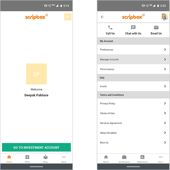
Scripbox — Apps should have a singular focus. Scripbox lands me on a blank page once you log in with nothing except the green button to go to the Investment Account. Erm, why not land me on the Investment Account as soon as I log in? Once you are on the Investment Account page, the overflow menu in the bottom right has a sundry list of options from Profile to…but wait, where’s Logout. I find that to be the most confusing thing — once you are inside Investment Account, and after you are done with whatever you were there to do, you want to log out. But you can’t find the Logout option. It took me a while to figure out that you have to go to Home to logout.

Goalwise — Clean, contemporary and fun design. Logging in, you land on your investment dashboard by default — clear focus. A single global navigation menu including My account as the first menu option, Logout as the last option and everything else in between. And this doesn’t change. Whether one should use hamburger menus is a topic for another post, the classic Hub and Spoke navigation works. Most importantly, super easy to set up a goal, start a SIP and get on with the task of putting something back for a rainy day!
