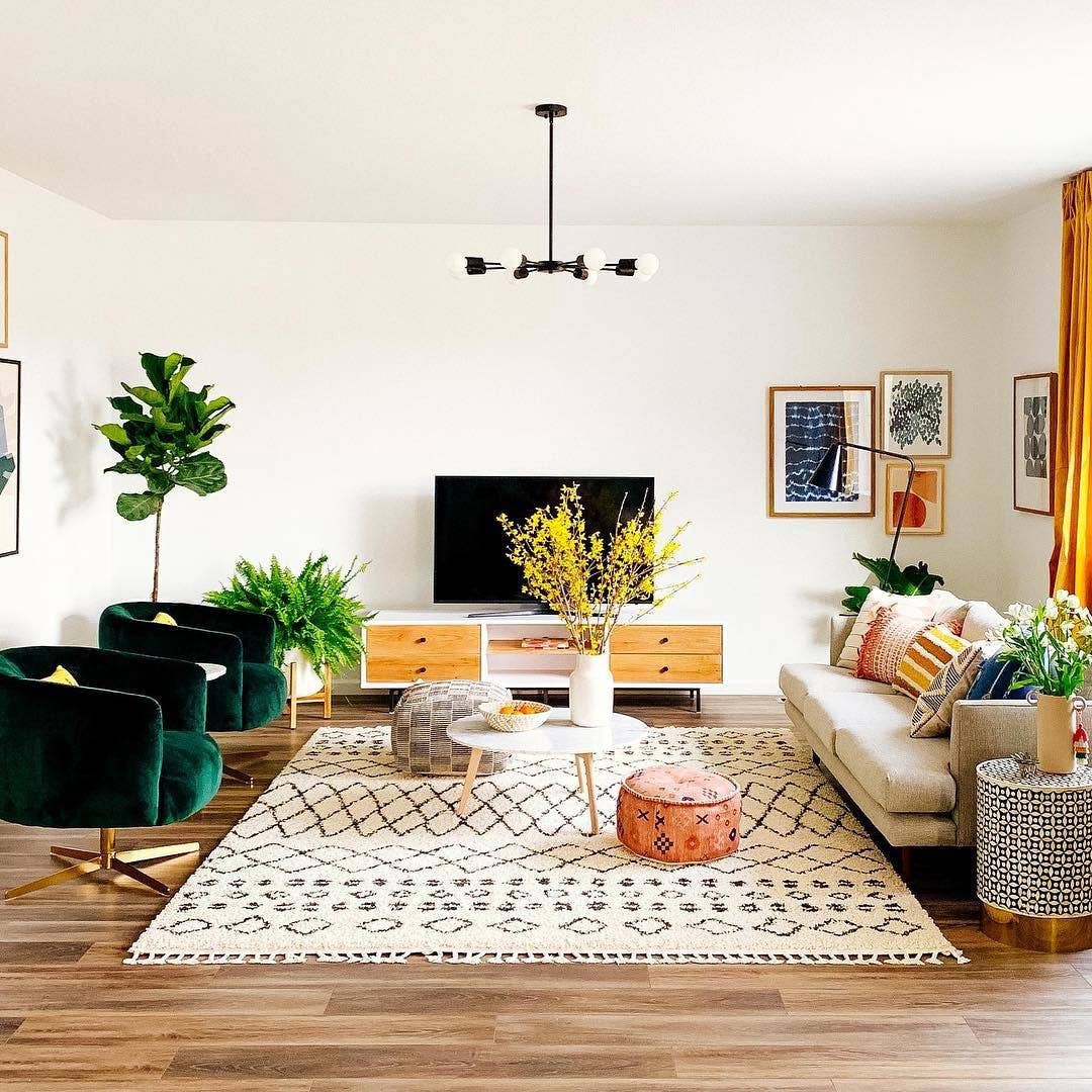
My husband and I bought a new bookshelf for our bedroom and were excited to set it up. After building it however, we faced a little dilemma. We began to feel it might look better in the living room instead given its color and size. Unable to decide, we thought we would run a quick experiment, put the bookshelf in both the places, compare and see where it looked and fit better, and decide accordingly.
But because this was such a heavy object, we were unable to move it around. Finally, we tried to visualize it in our minds and decided to place the bookshelf in the living room.
It looks amazing there but to this date I keep wondering, would it have looked better inside the bedroom?
And that’s when it occurred to me, that while there are apps to help design your space when it’s an empty layout with no furniture, there are no apps to help visualize your apartment if you want to rearrange your existing furniture.

Often you’ll find us rearranging our apartment to bring in some change and liven the space up especially in fall or autumn. And while it’s easy to experiment with lighter furniture, the problem begins with the heavier ones.
“Should we move this coffee table to the other side of the room?”
“It’s not looking good. Let’s put it back.”
“Will a 5′ x 5′ rug fit here? Get the measuring tape, let’s check again.”
“What about the TV? Should we move it to the corner?”
“You move it. I’m tired now.”
At the end of the day, I just want to know that if I wish to move my furniture somewhere else, will it fit and will it look better, without having to worry about measurements or physically moving it to make that decision. Also, I’m constantly scared one of us will sprain our backs with the back and forth!
Currently, the only way we can make that decision is:
I’d click a photo →hold the photo against the space where we want it →take a call. OR
take out the measuring tape →measure the furniture→measure the other space where I want it moved→do the math→take a call →push the furniture if we decide yes →push it back if we don’t like it→thank the lord if we do.
And so, instead of being a fun exercise, rearranging your space becomes frustrating and exhausting.

At the moment, most apps help visualizing your living space with furniture that hasn’t been bought yet, but nothing to rearrange the furniture that already exists in your home.
I downloaded and tried using some of the apps, and in my humble opinion they are better suited for interior designers. Simply because (and I asked around*):
- People don’t remember measurements. I don’t remember measurements. One of the apps that I actually liked got me to fill in measurements, and that drove me away. Users want the app to be able to scan and scale the area for them.
- Most of these apps make better sense to interior designers who know how to work with floor plans, layouts, AutoCad, 3D modeling, etc. The instructions are intimidating and have buzzwords that architects would appreciate and not necessarily a common user.
*three users.
How great would it be to have an app that would let you capture live data, and let you play around with it realtime.
Inspired by the model used by Amazon AR View which lets people visualize online products in their living space with their smartphone camera. However, their app only helps with products from their stored catalogue.


The features should mainly include:
- 360 degree view of the product
- disable zoom function to scale it accurately so you’re confident it will fit in the new spot

I did a usability testing with the paper prototype and the feedback was:
- there was no indication that the user could select an image from gallery in case the camera keeps crashing.
- an advanced feature that would be a great-to-have, is if you wanted to view multiple items at a location, you should be able to group them and move it around.
For sake of limiting this exercise to a one-day design sprint, I just added the gallery feature. The pink indicates the reiterated version.

Sharing quick visual screenshots of what I designed that I believe can solve this problem. Thank you Adobe XD for existing.


I do think this would benefit all kinds of users, where thinking is less and getting creative with your home is more. Now we just need someone to build this. What do you think!
