

When I started my UX career 3 & a half years back, I had always wanted to work on consumer UX extensively, because of the immediate references that we had around us in our day-to-day ecosystem. The current aspiration trend is also showing more UX designers wanting to work for consumer UX, compared to Enterprise UX. But, my experience & observations are that there will be more demand for UX designers in the Enterprise domain as its impacts are bigger & it is not in great shape now. But I am fortunate to work for Enterprise solutions early on in my career.
15 months of working for an Enterprise UX solution for a top Indian Jewellery brand, has taught and given me that sense of understanding complexities much better.
Disclaimer: These are some of my observations/learnings which I would like to share for UX designers, Product managers & Developers who are working or are aspiring to work on complex problems in the Enterprise space, especially for a Retail or Jewellery brand(but definitely not limited to Jewellery domain, as most of my first-hand learnings can apply for general Enterprise UX too)
I will take you through 3 key areas
- My learnings (with some examples from my project, obviously not the designs because of NDA, but definitely the insights & takeaways)
- Some myths about Enterprise UX (which I understood during the project)
- How to communicate an Enterprise UX project to an audience who does not understand or relate to a product or personas of your solution? (It can be recruiters or a new designer on the project or in a talk at your studio/org)
Let’s dive into the learnings then…
1. Go beyond Obvious problems
The first day of this project, was uncertain as I quickly got on to the existing legacy solution which had to be redesigned. But I deliberately did not want to spend much time on it, as it showed me obvious problems which I can see as a UX Designer. Then, a set of requirements were provided to us from the client, which was a mix of obvious, some thought-provoking, and some that needed more validation going ahead. Like, example ‘To achieve 30% efficiency’ was one of the many requirements. My immediate question bubbles were,
1. How did you reach that number??
2. Is efficiency the only problem to solve???
3. What do the users think about this?
Then the deep diving and exploratory workshops started and took 2 months to know the core problems rather than just scratching the surface.
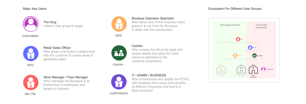
Also try to consider the whole ecosystem, following a system thinking mindset. For example (image below), this is the ecosystem of user groups for our solution, which helps the team to understand the major players and how each user group influences others.
Note: Deep-diving into complexities with patience and perseverance is the key here. This phase will be an uncertain & overwhelming ride and try to keep it that way deliberately till you have understood the whole ecosystem. Conduct workshops, contextual interviews, client meetings, etc to understand the bigger picture, keep aligning those insights and redefine the project’s actual scope. This will help you validate the Business goals and suggest a better open-ended scope for a greater impact.
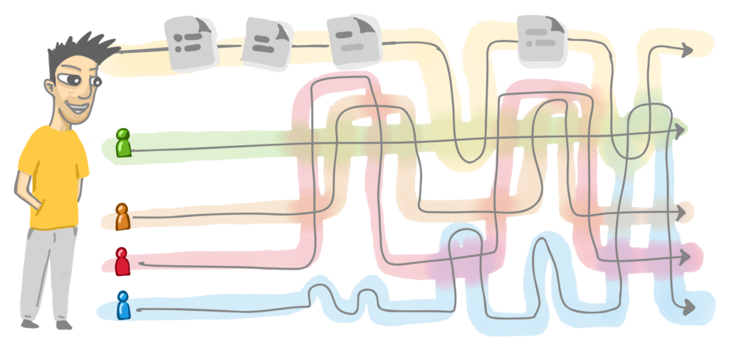
2. Study the user workflows (offline & online, both) in detail & observe the parallels, overlaps & interdependencies
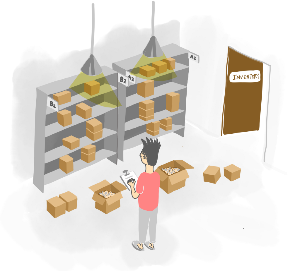
After considering all the user groups, then start observing how they function outside the system, and how they have developed some SOPs(Standard Operating Practices) for themselves, for example, an Inventory guy’s work is Data analyzing, Reviewing sessions, making Plan of actions & Documentation. This will help us get the existing workflows and their behavioral pattern as insights to consider going forward.
Remember you are designing a tool for their day-to-day usage. We need to consciously consider their work patterns starting from coming to boutique>planning for the month/day>doing their set number of tasks assigned>interactions with customers>their break times>segregating inventory & shelves>and so on
Understanding the sequence mental models was helpful, to get to know about the priority and frequency of the tasks. It is better to study each user group & its profiles simultaneously, as dots are much easy to connect in their flows. This will uncover bottlenecks or blockers in their day-to-day work lives. Definitely, things here are non-linear.
Enterprise solutions have a mammoth of user groups to consider, like in our case, Retail Sales Officer/Greeter (who interacts with the customer & shows products), Store Manager (Macro managing), Boutique Operation Specialist (takes care of the inventory flow & requirements), Cashier (self-explanatory), Karigar (service guy who works on any defects or minor customization orders, inside the boutique), and then the IT/Admin users(who orchestrate the software solution for employees), Factory users(who manufacture and ship products to stores) and other Business users.
I went ahead and understood their existing workflow, pain points & aspirations for each user group. Then understood the frequency, overlaps, and interdependencies with other users too.
Insights what I got: An greeter or an attendee inside the boutique does 50–60% of the tasks that a Cashier does, but all in an offline and verbal way. Also, customers can digitally prepare their own Cash memo, which is 40% of the Attender’s work & 70% of the Cashier’s work. Probable scenarios arose from these detailed overlap studies in process workflows.
I also went ahead to depict an emotional impact diagram of the staff & customers while navigating inside the boutique. This gave an understanding of where customers were spending more time & when the staff needed the tablets and docked systems were needed at more accessible spots.
3. Observe the existing interaction model & build muscle & flexibility into it for more accessibility
Are your users extensively used to touch or keyboard or mouse interactions? Understand the percentages of each interaction pattern. It will help you to design according to those interaction models for users without changing them drastically, directing your approach to more inclusivity.
If the shortcut interactions are already existing, try to study the existing pain points in the sequence & relatability of the shortcuts according to their work pattern. That does not mean you change it fully, but you can empower them to make it personalize for their own work pattern. A balance of both(definite & flexible ones) with a rationale is crucial here.
Insight from project: 60% of users used keyboard inputs to interact with the existing software. Our goal was to consider this as a major interaction of the desktop solutions & keep it adaptable. But, also we wanted to decrease the keyboards inputs as much as possible, to make the flow easy & not tedious (as repetition & frequency of tasks are more in such solutions). Adding a new interaction or feature is always easy for UX Designers, but removing & making it simple, by keeping the functions intact is a more complex task.
4. Consider different devices which can be leveraged
Modularity gives more flexibility. An omnichannel approach intelligently updates the masters and keeps all data synced and ready to use from anywhere and anytime the users want to, making the whole experience consistent.
From our research, we understood the solution overlaps with customers coming inside the boutique, like showing them the price-check, 3D customization of products & Catalog showcasing. So, the tablets which were already being used in the boutique were considered as the solution.
Insights: The tablets were 50% of the time not being used inside the boutiques. So we tried to leverage it in the proposed solution for the Greeters (to take care of the customer needs closely), and the Inventory folks (to take the Tablet to the Inventory and conduct the inwarding & outwarding verification of stock) predominantly
Have a pretty good business rationale behind it, if you want to propose different devices for enterprise solution ecosystems. Sometimes there might not be a need for a digital solution or integration. Please then do not try to force-fit digital interventions just so, we have expertise in it.
Note: Mobile experiences as a policy are not allowed due to business secrecy and the intention is for employees to not work from outside the boutique. The work is very contextual and it demands their presence inside the boutique.
5. Give them some time to adapt
For behavioral change to happen, it takes time & people try to be critical to change their existing pattern. In Enterprise applications, mostly till now, there are many solutions which users are using because of no choice. So in the time, people get used to a certain work pattern which might not be the most optimized & efficient way of work. That’s what bad Enterprise UX does to your mindset & productivity. It is high time to invest more in Enterprise UX, much more than Consumer UX. It is the need of the hour.
This is just in the case of a redesign, if you are designing or proposing a new solution then your reference of adaptation is their existing workflows, patterns, and digital solutions which they currently use extensively.
So, to take an example,
Existing : An Inventory guy, verifies the products which came from the factory by putting in all the data of the product in an excel format .csv file which is later uploaded to the existing software tool. These .csv files are used for review meetings & internal auditing by end of each week.
Proposed : So, I designed a flow where the scanner & weighing machine are integrated to verify at one go, and it updates in the system, without much manual intervention. BUT, I also kept a feature where you can upload your .csv file into the system and it converts the data to the front-end UI, letting the user take control & chose from
There might be scenarios where tablets & a system might not be available to the Inventory folk. How will he do then? He will do it as usual way & upload the .csv to automate & transfer the data into the system later.
So there might be different places where we add value and make it seamless, but also keep a workaround to the old pattern, because REMEMBER, the tool should not overpower people. It should be the other way round. Consider always their SOPs in your tool. If the change is happening, then always give the choice to the user.
6. Make sense of the Data dump
Lots of data were hidden in piles of excel sheets & archives which were not being used extensively by the boutique folks to predict & plan their next steps for the business.
A customizable dashboard was one of the solutions for each user specifically. Like the Inventory guy can see which products are high selling & low selling in his boutique and accordingly place the order to the factory.
The information is all there, you need to identify & make it purposeful & relevant to the users. And the whole dashboard can be customized according to the user’s work pattern and priority.
Take a quick look at the dashboard wireframe below for an Inventory guy from macro to the micro-level of information like
- All Products in boutique
- Products to Receive>take action
- Products to Issue>take action
- Defected productcts>take action
- Immediate road map
- Long term road map (like the North Star)
- Pro-active planning — Sales trend > Most selling/least selling > Request more
- Influencing factors — Festival trends
- Towards execution — Plan your dashboard, according to your preferred sequence
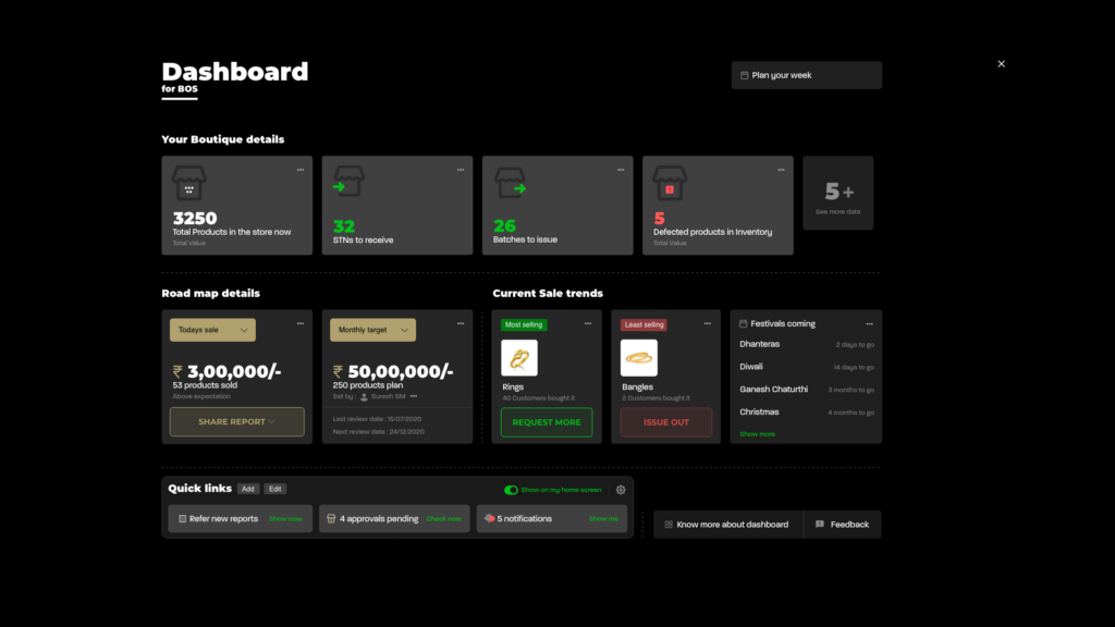
So make sense of data dump & always understand to give more power and flexibility to your users. It can act as a wiki for your whole solution.
7. Understand the whole approval flows
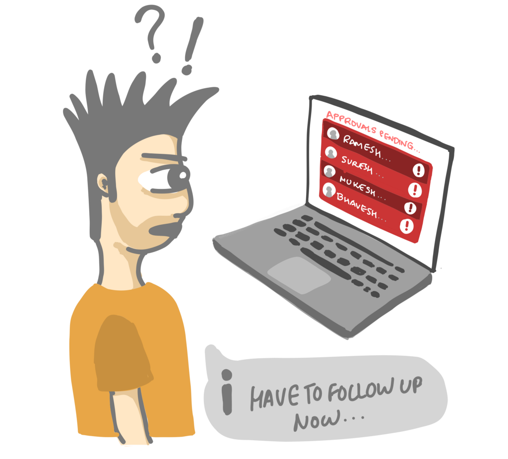
The interdependencies with other user groups for day-to-day workflows, might become daunting at most times. So we need to study what are the different types of approvals first and then work with the business team to discuss which ones to automate and which ones needed manual approval flows.
For example, the existing approvals & follow-ups happen on mails. So I designed an informative & actionable notifications module that is synced to your maid ID for regular updates which are crucial for users.
8. Finally, always consider the user’s environment
2 instances of how environment consideration helped us to make informed design decisions:
- One instance was, the Inventory guy spends his 50–60% of the time in Inventory sections that were not well lit up or does not have a full illuminated space. So, in the proposed solution, a tablet adapts screen lighting to the dark mode, which will not be more contrasting on the user’s eyes in dull lit spaces.
- Another instance was, the Solution is now on desktops & tablets, which are customer-facing. Initially, we proposed a solution where the Dashboard was kind of like the landing page for the staff. But to not reveal irrelevant & unnecessary data about the business to customers inside the boutique we had to have a simplified but not much revealing landing page for each user respectively.
Observe and spend some time, a day or two, with the users to understand better their environments to as much extent as possible. You never know, the crucial insights might just be there.
Myths to not consider
1. All things need to be upfront for users to access it
This is not at all true. Somewhere if you give choice to users they would love to start their day with a fresh canvas. Our insights were users felt more productive when we categorized and minimized the menu and landing page. We gave an option of quick links on the landing page, which they can define according to their choice. Surprisingly, from a 15 tabs format when we reduced it to 3 tabs relevantly for an Inventory guy, he added only 2 additional quick links as customization during testing(which we had kind of expected). Understand the information density & the cognitive load. You don’t want to create the same mistake of making your day-to-day usage screens overloaded with irrelevant unused features which might not be the optimized approach for Enterprise users.
2. There is not much scope for designers in Enterprise UX
For starters, the maximum scope in Enterprise UX is in Usability & Process Innovations. How well you can understand their complex workflows which they have been used to for many years, and then come up with creative ways to make it more efficient and empowering for them, is the most enjoying & ya, an uncertain ride to explore.
3. Enterprise UX is not as challenging as Consumer UX
Imagine if I don’t provide a good ambiance, healthy ingredients, preferred recipe, an organized kitchen space, and peace of mind to my MOM, then would she be able to cook us delicious food.
That’s how challenging it is, when you are giving the right tools for your intended users in Enterprise UX, they will, in turn, be empowered to help their customers, which is always a win-win scenario for the business. In Enterprise UX, a beautiful ripple effect of value created for many user groups that you never thought your design would affect
Believe me, the awareness & opportunities of UX is growing day by day in Enterprise, so don’t feel disheartened or skeptical with the existing perception which prevails for designers and scares them before even entering the project.
Give them the right weapons and they will help you win the war.
Why do designers feel skeptical and have second thoughts about entering into Enterprise UX?
- They think it does not touch millions of people and it’s not more impactful
- They feel the business & people using it, are adamant to change much in legacy enterprise solutions
- The work you can’t share with the world, as it is not consumer-facing
- It is difficult to communicate to an audience who cannot relate to your persona’s life
Well, let me help you with my way of how I create a relatable persona whenever I present my case study.
How to communicate your Enterprise UX story?
This was recent learning where I had to explain to my designer friend about the value we added to the employee’s life.
I used to face a problem while communicating Enterprise UX projects to recruiters, who could not directly relate to because of 2 reasons:
- No immediate & quick relatability (limited understanding of personas & their workflows)
- They had to understand the whole process based on their existing mental model or solely rely on the data that I am showing (which might not be the most comforting for them to just trust my data always)
So, I tried to create relatable personas and stories like for example, the Inventory guy I would start with comparing with a local shop owner or your mom. Let me explain how an Inventory guy can be related to your mom…
Imagine, how your mom manages her kitchen. How does she know the ingredients/items & their placements? How she segregates according to the ease of locating it? How she plans her next groceries order according to the likes/dislikes/demands of the family’s food requirements? How to dispose of waste? And the problems faced by her. I related the whole persona of the inventory guy with a mom, to let my audience empathize from start and then would take them through the exact persona & his life to explain the value addition.
Another example is the Retail Sales Officer, who can be related to a greeter or guide inside a museum or an Adidas showroom, or my uncle who has a small shop and takes the customer around to help them with their needs.
As shared by Ellen Lupton in the book ‘Design is Storytelling’, you need to build a narrative arc that consists of exposition, rising action, climax, resolution & conclusion. In this when you are laying the exposition & action phase, empathy needs to be communicated to your audience to have an impact when you share the resolution & the climax later on. Always think about how you can create that empathy & relatability when initially building a narrative.
Always empathise with your audience, and see if are they empathising & relating with your user, while presenting your Enterprise UX Case study
Thanks for taking out time to go through this. Would love to hear your insights from your Enterprise UX experience.
Also share it with folks, so it can help some fellow Enterprise UXer in his/her initial approach. To know more about the case study, please get in touch with me. Will be happy to discuss this over coffee ☕️
PS: All Illustrations are done by me. Hope you liked it.
Have a great day 😎

![]()
Enterprise UX insights & myths you should know was originally published in UX Collective on Medium, where people are continuing the conversation by highlighting and responding to this story.