Accessibility isn’t something that you can “add in at the end”. It’s not the icing on a cake, it’s the eggs that make the cake. Understanding what accessibility is, how you can create accessible digital experiences, and the fact that it impacts each of us in different ways, is an essential part of being a designer, developer, leader… an empathetic human being.
Better for people with impairments means better for everyone
In the UK, there are approximately 12.9 million people living with a permanent disability and 5.7million people living with a temporary disability. It’s important to note that 70% of those disabilities are invisible.
There are a few ways we can consider impairments, and with each consideration comes a complex set of needs someone may have when engaging with the world around them. Microsoft has developed a helpful inclusive design methodology that can be applied to view impairments in the following ways:


Learn more about Microsoft’s Inclusive Design
Permanent, temporary, and situational impairments can look very similar when applied to a digital user experience. This is important to remember because typically impairments are viewed through a narrow lens, minimizing the impact inaccessible digital solutions have on the vast majority of people.
Microsoft’s methodology gives digital solution-makers a critical tool to advocate for accessible design systems. When clients see that accessibility impacts every single one of their users, and ultimately their bottom line, there’s no ignoring that fact.
To make accessibility happen, start by clarifying what you mean
A lot of people use the word ‘accessibility’ but they often mean different things. It’s important for you and your organization to align on how you define accessibility in a way that makes sense for your product.
Here are some common attitudes towards accessibility:
- “It means that every single person finds using your website easy, regardless of any impairments they have.”
- “It’s about designing and building additional features.”
- “It would require a lot more time. It can be added later.”
- “It’s something that’s an exception, out of the ordinary.”
- “It would be a charitable thing to do but it’s not our priority.”
There are other ways to define what we could mean by “accessibility”. Here are a few examples:
Support built-in accessibility features
Operating Systems and web browsers already have all the accessibility features we need. Our role is not about adding accessibility features, it’s about making sure our websites work with accessibility features people already use.
Examples of in-built features include:
- Screen readers: An audio representation of the page plus enhanced keyboard controls.
- High contrast mode: The ability to see the interface with different, high contrast colors.
- Reduce motion: Request reduced animations if they trigger sickness.
- Voice control: Control your device with your voice.
- Braille support: Displays a large-text view of the item under the pointer.
- Pinch to zoom: Pinch a piece of content or map to see it bigger.
- Page zoom: Makes everything on a webpage bigger.
- Magnifier zoom: Magnify a part of the screen up to 5000%.
- Switch controls: Control your device with just 1 or 2 switches.
- Keyboard access: Navigate with ‘Tab’, ‘Space’, ‘Enter’, ‘Esc’ and the arrow keys.
- Focus indicators: See what element on screen will react to key pressed.
- Hover text: Displays a large-text view of the item under the pointer.
- Speak selected text: Select some text to have it read out to you.
- Speak pointed item: Put your mouse over any item to hear what it is.
- Form autocomplete: Have form input fields automatically or easily filled in.
Meet the Web Content Accessibility Guidelines (WCAG) level AA at a minimum
Use the Web Content Accessibility to avoid making mistakes.
Some useful guideline examples to follow include:
Don’t animate anything automatically for more than 5 seconds, unless people can stop it.

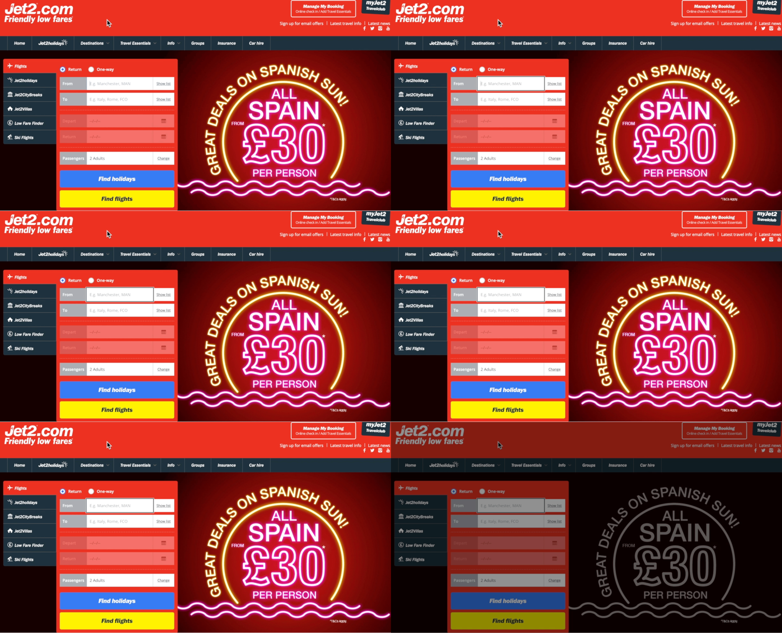
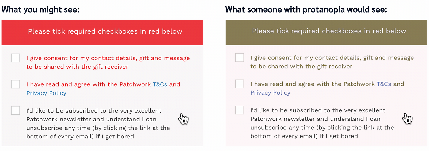
Don’t indicate errors using color alone.

Don’t hide the keyboard focus indicators for keyboard users.
You can use :focus-visible in CSS to remove focus indicators only for mouse and touchscreen users.

Using the Web Content Accessibility Guidelines alone is not enough
Most accessibility barriers might not affect you personally, so you might not realize they’re in your designs or code.
Here are some things you can do:
- Familiarize yourself with inclusive design considerations and best practices beyond WCAG.
- Design with people who experience and interact with user interfaces differently than you do, or at least seek out and act on their usability feedback.
- Use simple, familiar, inclusively-tested design patterns. Especially if you’re not doing inclusive usability testing yourself.
Consider the following example from Nicholas Steenhout:

How can we achieve creating accessible digital experiences?
It’s about improving our practices (design, coding, Quality Assurance). At first, this will take some time to learn but will lead to less time in the future, especially since fewer issues will need to be fixed or rebuilt.
Accessibility is not a separate feature. It can’t successfully be added at the end. Accessibility is a set of considerations that need to be baked in from the start. One way to achieve that is by designing and building an inclusive design system that can evolve over time.
Doing this is a key part of creating a quality service for millions of people, and that is our responsibility.
The concept of disability is evolving
In 1990, the World Health Organization (WHO) defined disability as:
“[Inability] […] to perform any activity in the manner […] considered normal for a human being, resulting from an impairment.”
We can take the above definition to mean; people are disabled by their impairments or differences. For example, “User X is having trouble accessing our website, that’s their problem.”
Since then, the WHO updated their definition in 2011 to the following:
“A complex phenomenon, reflecting the interaction between features of a person’s body, and features in society.”
In other words, people with impairments are not automatically disabled, it also depends on barriers in society. For example, “User X is having trouble accessing our website, that’s because we haven’t designed and built in an inclusive way.”
Accessibility barriers happen when the people making decisions are not affected
The good news is, once you start learning about accessibility you can’t unlearn it. So, get involved in the digital community to learn about how accessibility practices are evolving, and most importantly, connect with people who engage with the world in a different way to you.
This article was adapted from the presentation; “Understanding accessibility makes you a better developer / designer / leader” co-created by JF Hector-Labram and Magdalena Wielopolski for the 2021 TechExeter Digital Conference in the UK. Watch the original presentation on YouTube.