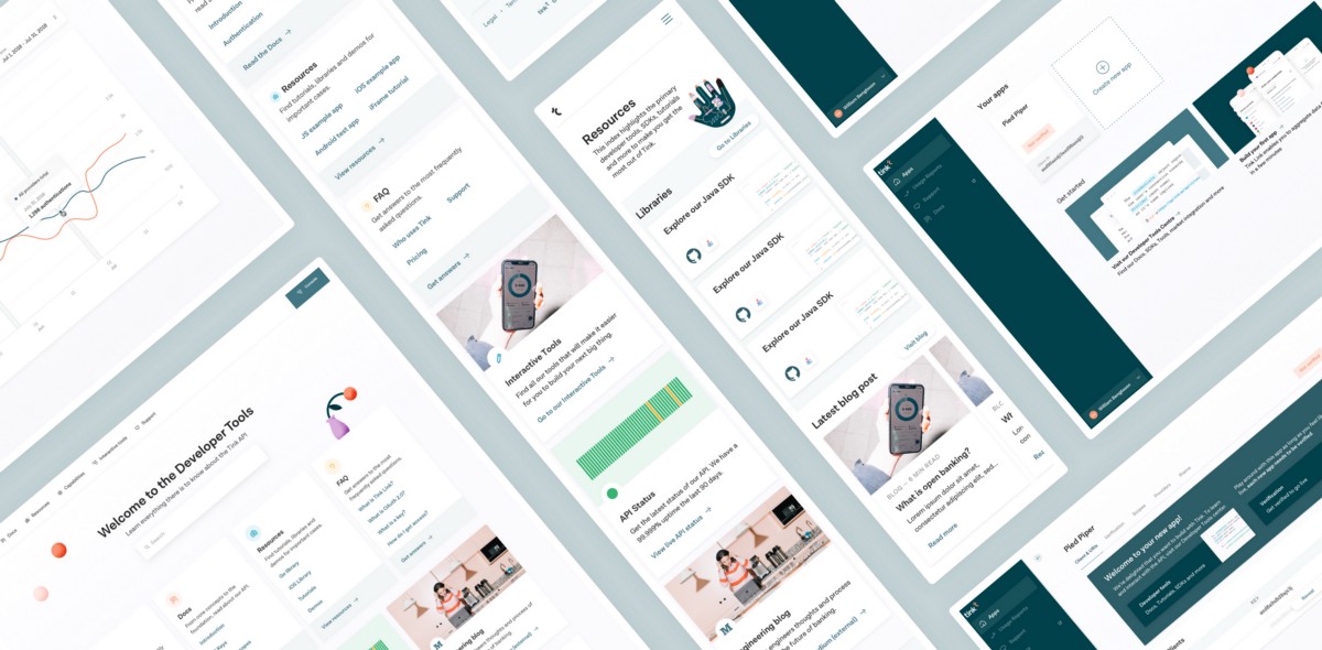
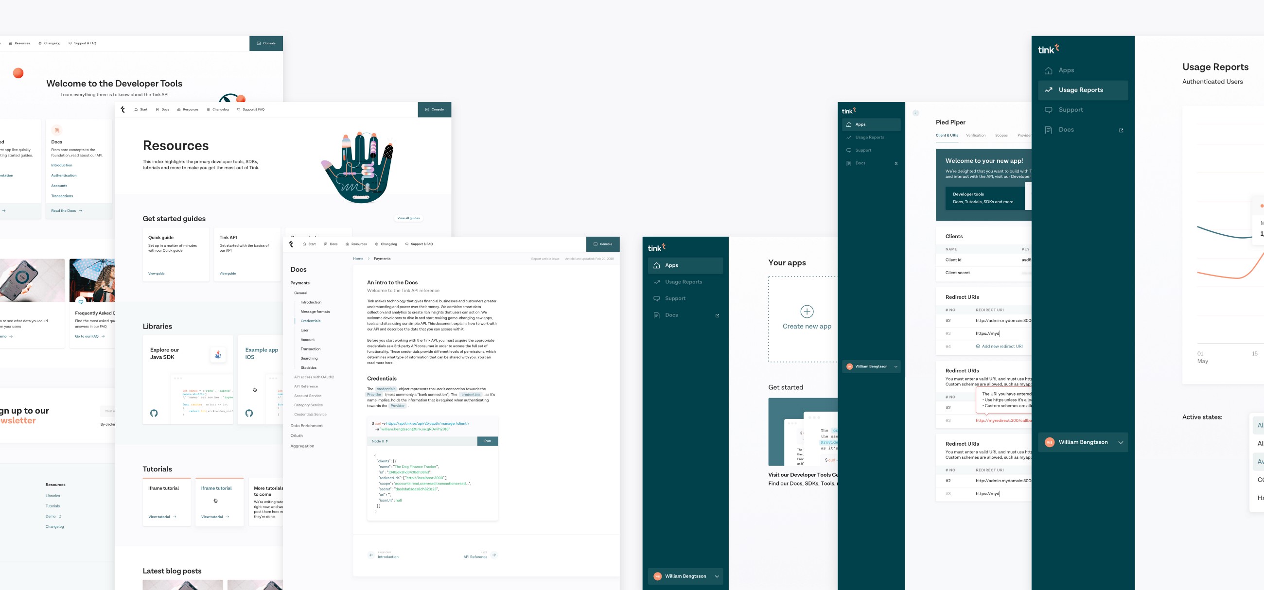
2. The Developer Portal
To make the most out of the API and the products (aggregation, payments, data enrichment and personal finance management), the developers will need resources and information. All of this is gathered in the Developer Portal. In detail, you’ll find:
2.1 Guides & Tutorials
The guides are there to help developers set up. Here you can read about what you can build, what data can be accessed and how our API work. Learn how to create an account, activate it and retrieve your API credentials. Developers can also read how they can connect to banks across Europe and easily access a wide range of financial data.
2.2 Documentation
In the API reference section, there’s an explanation how to work with our API and describes the data that you can access with it.
2.3 Resources
There’s a lot of resources to get started in just a few minutes. There’s a starter codebase for an iOS app, Javascript app and more. There’s also a live demo, where one can try the API in a test environment.
The building process
As mentioned in the intro, I’ve never built a developer portal before and have very limited experience of browsing and using a documentation section. I honestly didn’t know what a ‘client-secret’ was prior to this project, but that was the most essential keyword in this whole product. I wrote up a plan to try to define the process of finishing this project. The description of that went as following:
But when reality kicks in, time is short and it’s difficult to follow a strict guide to finalize it, the process changed a bit. Although the major flow went like described above, my process ended up looking like this:
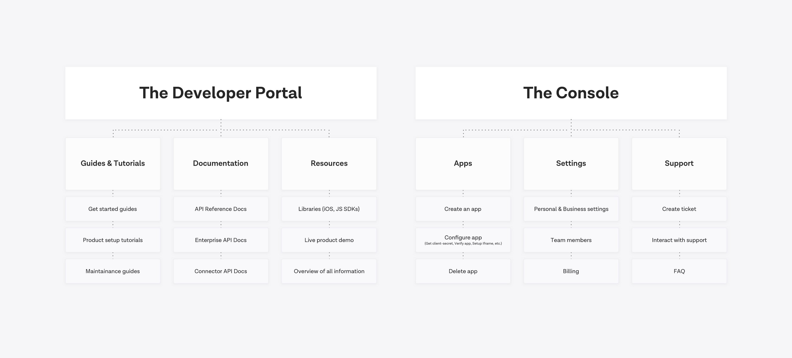
1. Try to define what needs to be done
I googled and read a lot of what a developer portal might be, and what it needs to provide. I also had to understand what our API did and how an API works from one side to the other. While I didn’t learn exactly everything, I learned the foundations of what it should be and scoped it down from there.
2. Interrupt our developers over and over again
Since there’s a lot of world-class developers at the office, I started to bug them with questions about what ‘client-secret’ was and what it wasn’t. That opened up 400 more questions which I had to bug them with.
3. Visit all the developer portals there are
I googled all the major tech-companies there are and visited all the documentation portals I could find. I tried to get an overview of how every portal was built, what it contained and how one would navigate through them.
4. Interrupt the developers (again)
When I had visited a lot of the developer portals out there, I knew which ones I preferred in terms of navigational structure and a bit more about what they contained. What I didn’t know was what developers themselves preferred, so i asked around in the office to hear which ones they preferred and why (sidenote: the Django documentation portal came up multiple times).
5. Build something
With the rather brief knowledge I had gathered, I decided to build something and upload to a Marvel prototype. I sent this to people around the office and waited for feedback. It was a bit early, but in hindsight I believe it was a good idea, since some things that I hadn’t added that needed to be there was brought up by people around the office.
5. The classic rapid building period
A period that always comes back when building a new web product is the rapid building period. Build something. Get feedback. Update. It went on like that for some time: update, read more, get feedback, update prototype, send out, read more, get feedback, update, etc — until it was finished.
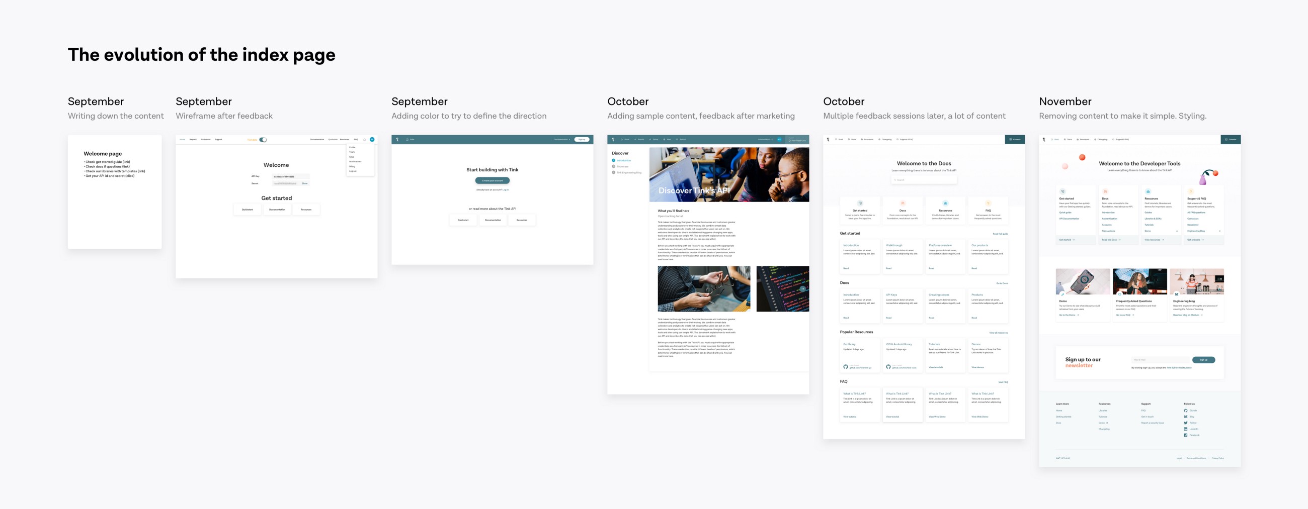
Here’s an example of the rapid building period: the homepage for the Developer portal:
Down to the details of the visuals
I wanted to build something that would last for a long time, so that when adding new sections or products, it would be easy to just put it in there without having to rethink the layout.
The menu structure was something I worked with a lot. I had to come back to it multiple times throughout the process due to new pages were added and changed the complexity of the menu. Here’s an overview of the evolution of the navigational structure:
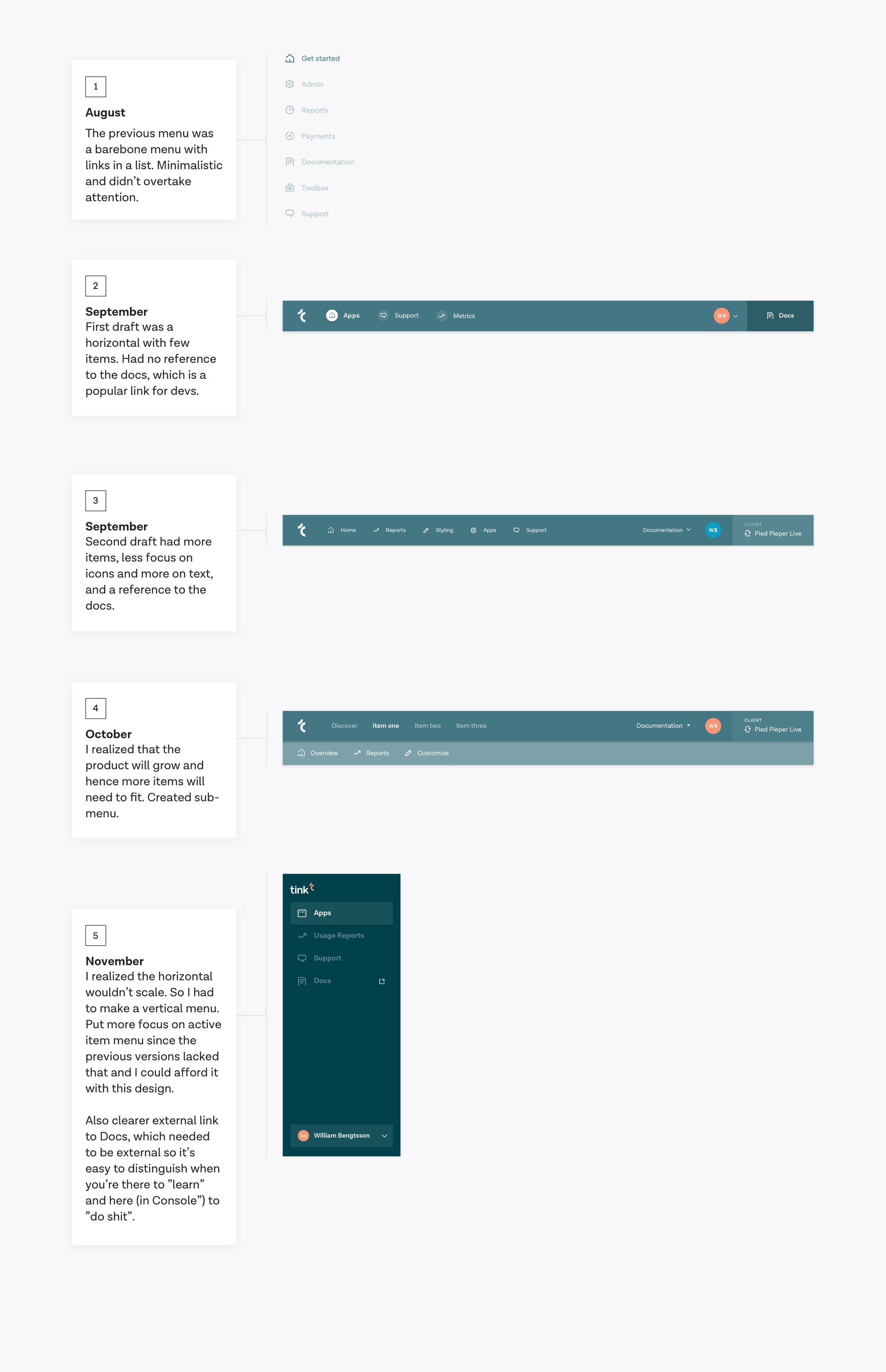
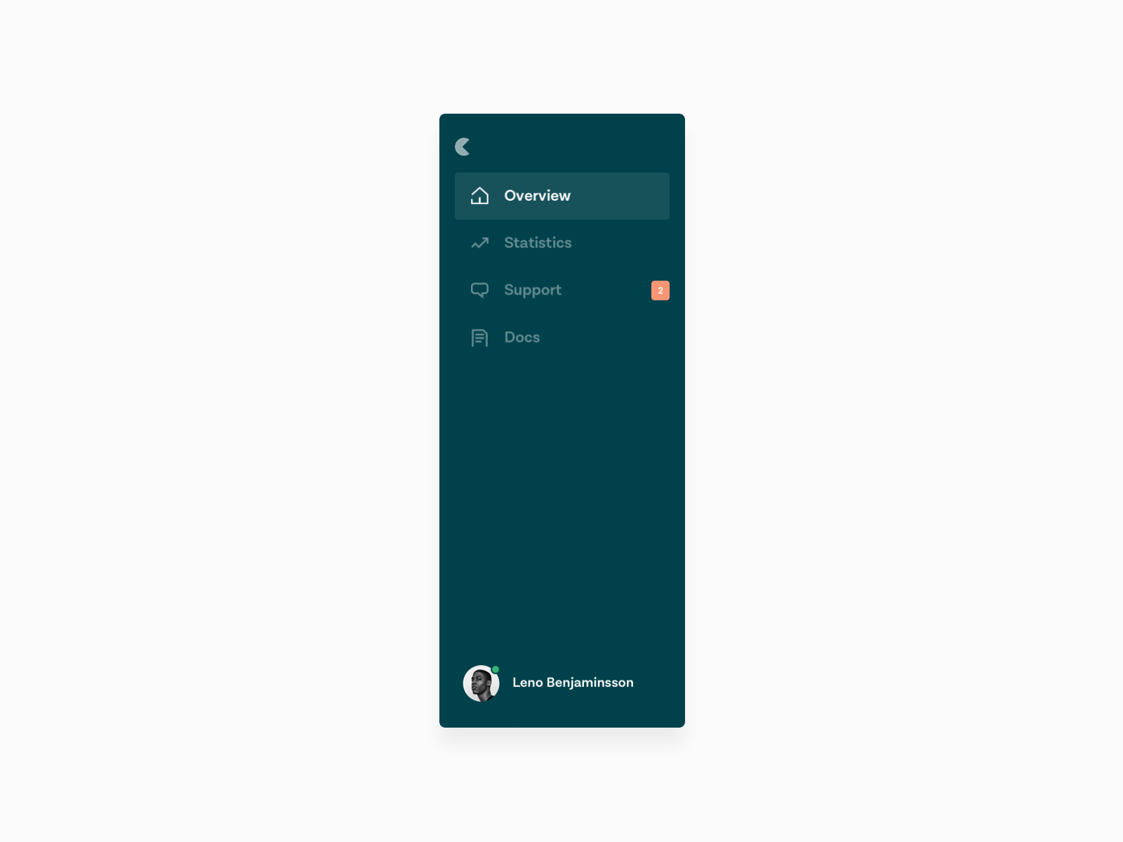
Hence, the navigational structure in the console ended up as a sidebar. It’s easy to just add new sections underneath, compared to a horizontal navigation where space is more limited.
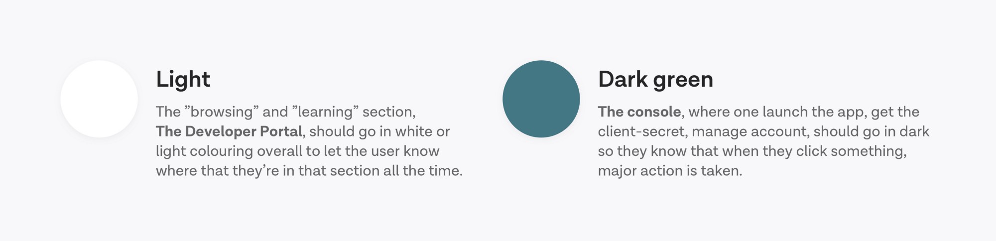
When it comes to the bigger picture of the design structure, I decided to use a darker color for the console, and a lighter overall color palette (whilst still keeping it coherent) in the documentation portal because it should be easy to distinguish one from the other for the developers. The console is about creating, the developer tools about learning/exploring.
The final product
For the final product, the menu became the major component that defined with color which section they are in, as seen below from the final product. All in all we created a lot of components and so many pages that contained all the content. We’re constantly working on the fine tuning of the site, such as adding a bit more color and illustrations to the pages and make it overall nicer.
Here are some things I learned while iterating on these products:
1. Make sections, not clusters
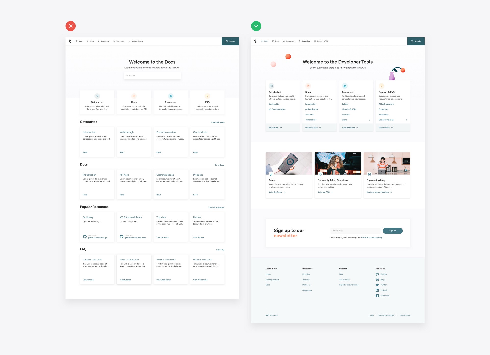
While iterating on the index/home page of the Developer portal, we started off with very little content to a lot of content. I tried to make as much as possible visible and accessible, but it actually just made it inaccessible because there was too much content. I divided the cluster to multiple sections, added a background color for each section, and included only the most vital links and instead of showing the rest, I included a “Show all” link that took you to a sub page where everything was listed.
2. Too much navigation will hurt the navigation experience
As mention, a problem that rose was navigation. In the Developer portal, there was a landing page with links to the different areas, sub landing pages for these areas, and then sub-sub pages for the sub areas. So for example, an article about “Credentials” would be down this abyss in the navigation:
Home > Docs > API Reference > Payments > General > Credentials.
How do you even navigate to that? And how do you know where you are in the whole environment when you are actually at that article?
So far, the solution is that the Docs are in the main navigation bar, a sub menu bar for the “API Reference” (alongside “Enterprise Docs”) and then a floating menu on the left with a line that indicates which article you’re at. I also added breadcrumbs so you would know where you are in the whole environment to make it easier to understand where you are at all times.
3. One screen for one task
This is something I’ve learned from building apps. An example: when you have a long flow like a questionnaire, with say 20 questions, it’s difficult and a bad user experience to list all of these questions in one page. You’d get exhausted after 6–7 questions. It’s better to have the select button at the same place on each screen and let the user easily click through the questionnaire while still holding the thumb at the same place throughout the whole flow. It will feel seamless and you’ll provide the user with page transitions rather than making them scroll, tap, tap, scroll, tap, tap, etc.
Same user experience was applied to the Console part, where there are a lot of actions that are needed to be done to complete the main task. I listed all of these sub tasks on separate pages with a tab navigation structure instead, so that the developer would only need to do one thing and focus fully on that task while on one page, and then go to another page to complete the second task.
4. Differentiate important actions from sub tasks
In the Console, you click a button and stuff happens; an app goes live, you remove users, etc. Important tasks. In the Developer portal, when you click something, you read and interact to learn for yourself. I needed to differentiate these with something while in the console, and I did it with colors and illustrations.
“Create an app” card is white with dotted borders. It’s clear that it’s an action. To differentiate, the “Explore the Docs” is a card with salmon color background and illustrations of a browser.
The current state of design
Thanks for reading
We are constantly updating and fixing these two products to make them even better. They’re live today.
This design, it’s UX and planning wouldn’t have been possible without the developers at Tink.
If you want to check out some other stories I’ve written, maybe my article about Creating a web design system from an app design system could be interesting, or perhaps my 8 Practical Design Learnings from Building Dashboards is, or even my story Insights from writing a newsletter for two years. Alone. For free. could be of interest.
Thanks for reading!
