Why should you care about them?

A design pattern is a document that describes a common solution to a recurring design problem. According to Tibor Kunert (2009), using design patterns allows designers to quickly find solutions to problems using proven designs, rather than starting from scratch each time. The idea behind using patterns in architectural design is to document proven designs for recurring problems, which can help to facilitate and speed up the process of finding design solutions. By utilizing design patterns, designers can work more efficiently, and build upon previous successes, resulting in better and more effective solutions to design problems.
Building good user interfaces (UI) is not a trivial task. Many developers lack the time and expertise for highly usable UI design. Budgets don’t normally include enough funds for UI designers or usability experts. Even when developers consciously focus on user interface design, the resulting applications can have usability, consistency, and interoperability problems.
“Welcome to Design Patterns. Someone has already solved your problems.” (Head First Design Patterns, FREEMAN et al., 2004).
The pattern-based design paradigm emerged in the 1970s when architect and mathematician Christopher Alexander (1977; 1979) published a set of descriptions about common problems in architecture and their solutions within specific contexts. Each pattern represents the record of a solution in a given context, imparting this experience to be reused in other contexts. This enables the design experience to be reused.
The concept of a pattern library in interaction design/human-computer interaction began to gain recognition in 1997, when Jennifer Tidwell presented her scientific article on the topic at the annual conference on human factors in computing systems (ACM/SIGCHI). Since then, pattern libraries have become a commonly used tool in the design process, enabling designers to document and reuse design solutions for common user interface challenges.
Patterns are optimal solutions to common problems (Granlund et al., 2001). As common problems are discussed within the professional community and resolved, common solutions spontaneously emerge. Finally, the best of these solutions stand out, self-identify, and refine themselves until they reach the status of a design pattern.
Patterns can also be defined or distinguished in two ways, Alla Kholmatova (2017) introduced through her book two models of patterns, which she called: functional and perceptual.
Functional patterns are “tangible building blocks of the interface,” they can be simple or can be combined to create more complex patterns. Their purpose is to trigger or encourage certain user behaviors (Kholmatova, 2017).

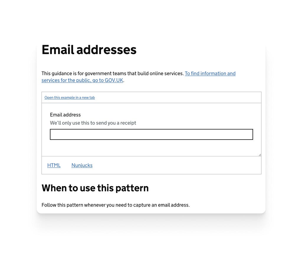
A Card is an example of a functional pattern. In this example above, the title tells us the name of the hotel, the supporting text tells us about the location or nearby places, the image provides a preview of the location where you will stay and its aesthetic appearance, the stars allow us to visualize the hotel classification, the price lets the user know the cost of accommodation, and the button serves for the action of booking the room. This “card” module itself allows the user to have an idea of what they are looking for. The purpose: to encourage people to easily book the room.
According to Alla Kholmatova (2017) articulating the purpose of design patterns early in the design process can help to avoid duplication and inconsistencies as the product grows. While Kholmatova does not explicitly define “perception patterns,” she provides examples of visual and interactive elements that can be considered part of a perceptual pattern. These elements include tone of voice, typography, color palette, layouts, illustrations, iconography styles, shapes, textures, spacing, images, interactions, and animations, as well as specific ways in which these elements are combined and used in a user interface. By identifying and documenting perceptual patterns, designers can create a more consistent and coherent visual language for their products.
https://medium.com/media/3aa7bfd31c64155bff7e42bb03994139/href
It’s through perception patterns that we can differentiate one brand from another or one product from another. Today, the way we interact with products is changing. Perception patterns can play a crucial role in distinguishing your product from your competitors. However, for perception patterns to be effective, they must be deeply ingrained in the brand and evolve with the product. When perception patterns are effective, they become a powerful way to differentiate your product. (Kholmatova, 2017)
https://medium.com/media/c60438f0f7f54b1be8711bcd0e4965a2/href
In the video above, it’s clear that Microsoft has established a unique visual identity that sets it apart from its competitors. By differentiating itself in this way, Microsoft helps its customers and users to easily recognize its brand and software, and creates a distinct image that is more likely to be remembered in the minds of consumers. This type of visual differentiation is an important aspect of brand recognition and can help to strengthen a company’s position in the marketplace.
Why Design patterns are important in Design/HCI?
To understand why patterns are important in Design/HCI, first of all, we need to understand why they are important for humans.
Patterns are important for humans because they help us to make sense of the world around us and to predict and understand the relationships between events and objects. Patterns allow us to recognize, categorize, and analyze information, making it easier to remember and recall. They also provide a structure for organizing and simplifying complex information, making it easier to process and understand. In addition, patterns can be aesthetically pleasing and can provide a sense of order and symmetry in our environment.
Human beings have a natural tendency to look for patterns, and our brains are wired to recognize and process them. The more standardized things are the better. (Nzongo, 2019).
Davide Bolchini (2000) conducted research identifying why patterns are so effective in transferring project experience (knowledge). In fact, his work covers the domain of communication and it is in this aspect that he highlights the power of patterns. Being a language easily understood by professionals in the same field, it more easily disseminates useful and summarized information.
The use of patterns in HCI (human-computer interaction) has certain advantages because it communicates good solutions to the design community through a common vocabulary, arising from the experiences of designers. However, we must be aware that patterns are not ready-made solutions, they don’t replace the creative process, and they don’t guarantee the quality of solutions.
Design patterns provide several benefits to user interface design and digital product teams, this includes:
Reusable solutions
Design patterns provide pre-tested, proven solutions to common design problems, allowing designers to save time and effort by reusing existing solutions rather than starting from scratch.
Improved quality
By using proven design patterns, designers can ensure that their work meets certain patterns of quality and usability, helping to eliminate mistakes and improve the user experience.
Better communication
Design patterns provide a common vocabulary and understanding between designers, user interface design patterns can also improve communication among developers and bridge the gap between software engineering (SE) and human-computer interaction (HCI).
Faster development
By using design patterns, designers can focus on the unique aspects of a project, rather than spending time on repetitive, common tasks.
Easier maintenance
Design patterns make it easier to maintain and update code, as patterns can be updated and improved without affecting the rest of the system.
Increased consistency
Design patterns promote consistency in design, making it easier to maintain a consistent look and feel throughout an application or website.
Knowledge transfer
They are permeated in the transfer of knowledge between people with different experience levels, making the knowledge circulate in the community, being shared, and the solution being reused in different contexts. This using the efficiency and persuasion of greek rhetoric to optimize the transfer of knowledge, saving time.
It's important to note that patterns transmit empirical knowledge, which differs from scientific knowledge, making them highly applicable. This feature helps reduce the time required for designing solutions since they are based on proven solutions. Patterns are the result of the advanced expertise of a designer or a team of designers, making them particularly useful for novices who are facing problems that veterans have already encountered and resolved.
Design patterns are different than components
In the context of design and development, a component refers to an individual element that is part of a larger system, such as a website or software application. These elements are often designed to work together in a cohesive manner, and when combined, they create a unified and consistent user experience. For example, a navigation menu, a search bar, and a footer are all examples of components that are typically used to build a website.
Although Atomic design is not my preferred methodology or framework, it provides a useful representation of the components that comprise the Instagram interface at a granular level.
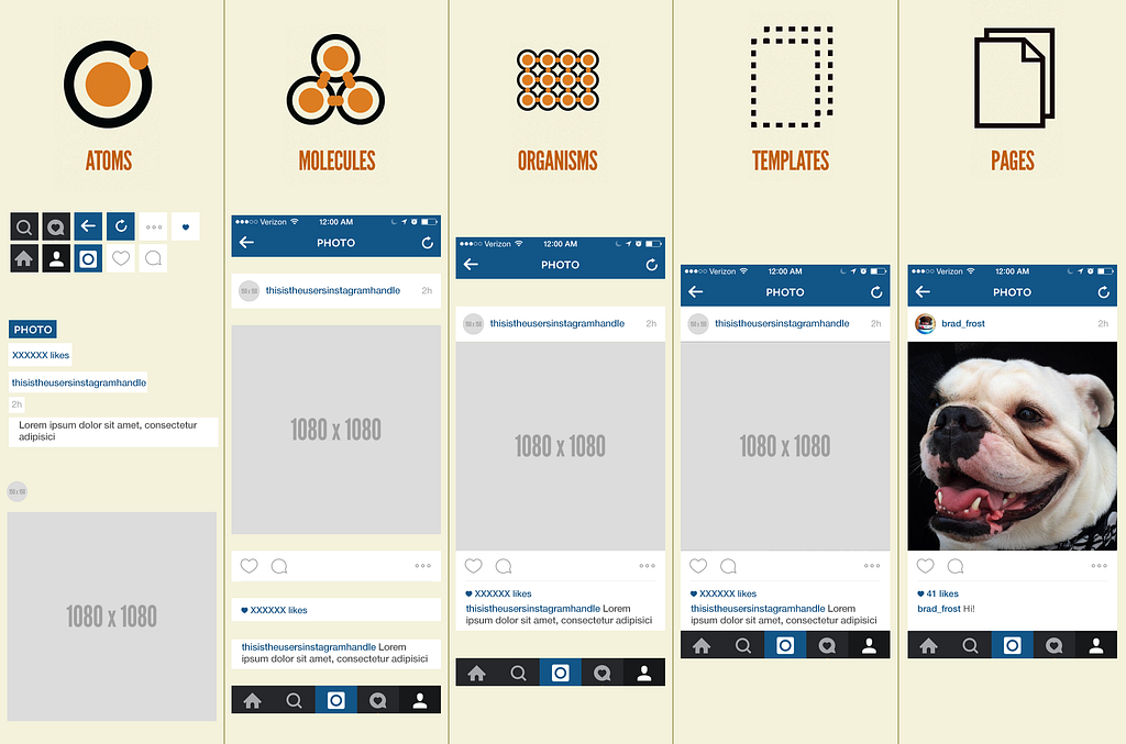
Component is the most solid term in the design systems concept. It originates in the field of software development and has the most unambiguous meaning. Several authors define a component from an implementation perspective, “as part of the reusable code, serving as building blocks for the application’s interface”. (Suarez, Anne, Sylor-Miller, Mounter and Stanfield, 2017).
In the design system, components can be generic elements such as links, buttons, combobox, checkbox, datepicker, Accordion or cards. It’s important to note that components are represented as pieces of code, components encapsulate an independent entity that is meaningful in itself. They can adapt and interact with each other, but semantically remain the same. From the user’s perspective, components are meaningful elements of a web application, for example buttons, form text fields, drop-down menus.
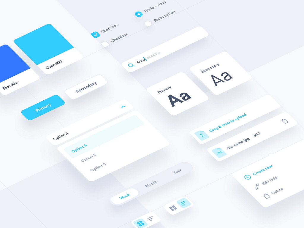
This figure below shows examples of various visual components of a design system or style guide.
Components are essential for reusing a design in multiple places and maintaining the same user experience and visual consistency. By breaking a design down into components, you increase the likelihood that individual elements will be reused again in other locations with little or no modification.
In contrast, patterns are not components, they are abstract, principled guidance applied as you design and build. Patterns describe how something should work under preferred conditions and suggest how to handle certain problems.
In a more academic view, Lafrenière and Granlund and Carr (2001) in the paper “A pattern-Supported Approach to the User Interface Design Process” argue that a pattern should be a “formalized description of a proven concept that expresses non-trivial solutions to a user interface design problem”.
In the Book Modular Web Design: Creating Reusable Components for User Experience Design and Documentation (2009) Nathan Curtis argue that “Patterns and components can be complementary and co-exist in design solutions, neither cancels out the other”. Additionally, patterns are the baselines of good design, not vague principles or strategies. They have been proven and therefore are not theories or speculations.
While the components are quite specific, self-explanatory and restricted to a single design system, most often they serve an already established design. Therefore, it is concluded that the use of patterns can considerably increase the level of instruction of the system, reduce possible usability errors and increase the ease of use for both newbies and more experienced users.
Design patterns are different than guidelines
In the design field, guidelines serve to guide design and designers, to prevent errors from occurring in design practices in daily life, but one must keep in mind that there is a big difference between guidelines and patterns.
Before using patterns, designers used guidelines. As Martijn van Welie (2001) assures us
“The purpose of guidelines is to capture design knowledge into small rules, which can then be used when constructing new user interfaces”— MartinJ Van Wellie
The two terms might share the same purpose, but not the same concept. Using patterns, designers share values and ideas so the pattern should ideally be related to their experience. In his PhD thesis “Task Based User Interface Design”, Welie explains that “On the one hand it is true that the design knowledge of a guideline could also be written down using a pattern template. On the other hand, the fact that a template is used to write down the guideline does not necessarily make it a pattern”.
For a guideline to become a true pattern, it is important that the proposed solution is a proven and tested solution for the declared problem, and that designers agree that it is a proven solution. In other words, a pattern should be widely accepted and adopted by the software development community and design community, and its effectiveness should be demonstrated through its successful use in multiple projects.
In certain senses, patterns represent good design pieces that are discovered empirically through formulation and collective validation process, while guidelines are usually natively defined by a closed group. Each pattern has a name, and a collection of patterns forms a vocabulary for designers. Guidelines are primarily presented without explanations or logic.
In his 2017 lecture, ‘‘The User Experience of Design Systems,’’ Rune Madsen emphasizes the importance of considering the user experience when developing design systems and highlights the need for a balance between consistency and flexibility. He also discusses how a lack of clarity in material design guidelines can lead to ambiguity in building a consistent interface.
It has been frequently reported that guidelines have various problems when used in practice. Dix, Mahemoff and Johnston (1998), in the article ‘‘Principles for a Usability-Oriented Pattern Language’’ they argue that guidelines are often too simplistic or abstract, can be difficult to interpret and select, can be conflicting, and generally have problems of authority regarding their validity. One of the reasons for these problems is that most guidelines suggest an absolute general validity, but in reality, their applicability depends on a specific context. This context is crucial in knowing which guidelines to use, why, and how they should be “translated” into the specific context.
In this context above, it is clear that for many design decisions, it is simply necessary to know the entire context of use including the tasks, users, environment, etc. Without knowledge, the design problem cannot be properly resolved. Guidelines have no built-in way of indicating the context to which they apply, and at best they are briefly mentioned.
The most worrying thing, however, is finding that the guidelines are often difficult to understand, what the problem is and why the guideline was defined that way.
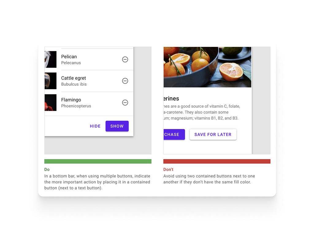
‘‘A pattern makes the context and problem explicit, and the solution is provided along with a rationale.” (Welie, 2001). It is no exaggeration to say that compared to guidelines, patterns contain more complex design knowledge, and many times several guidelines are integrated into one pattern. Guidelines usually exist in a positive and a negative form; “Do’s and Don’ts”.
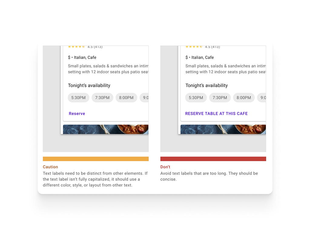
However, patterns however focus on ”do this” only and are hence constructive. Furthermore, solutions need to be very concrete and should not raise new questions surrounding the core of the solution.
According to Welie (2001, p.95) the big difference between patterns and guidelines “is that the patterns can be grouped and connected to form a pattern language. Each pattern can reference other patterns that solve sub-problems related to the same problem or solution. This way, design knowledge becomes semantically connected, and designers can more easily access knowledge related to a particular problem. With guidelines, this is not possible.”
Types of Interaction patterns
There are many patterns. Besides software engineering design patterns, in the field of human-computer interaction and interaction design, there are also various types of patterns.
Alain Abran et al (2007) proposed in the article “Patterns-Oriented Design Applied to Cross-Platform Web-based Interactive Systems", They introduced six types of patterns for web platforms, but we will only delve into the five that are important for our article.
The purpose of these patterns is to provide an integrated solution to the complex challenges of web design. The authors argue that using design patterns can improve the user experience, enhance the functionality of the system, and make it easier to maintain and evolve the system over time.
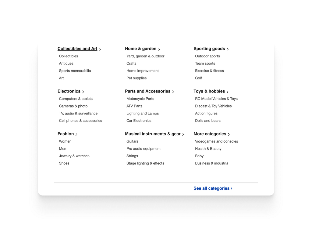
Information architecture design patterns
This category of patterns describes different conceptual models and architectures for organizing the underlying content across multiple pages, servers and computers. Such patterns provide solutions to questions such which information can be or should be presented on which device?
The following example demonstrates an information architecture pattern that adheres to the hierarchy navigation topology, which is structured like a family tree model and organizes information in a hierarchical manner with parent-child relationships represented as branches and nodes.
It is important to understand that this design pattern has its pros and cons, its application depends on several factors. According to Kathryn Whitenton (2013) “the deeper a hierarchy becomes, the more likely visitors are to become disoriented”.
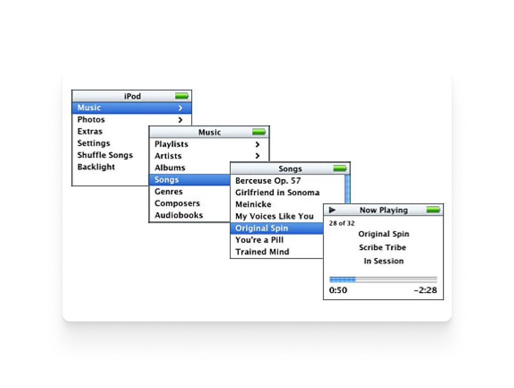
This pattern is used to organize information into a tree-like structure with categories and subcategories. Users can navigate through the hierarchy by clicking on links or expanding and collapsing sections.
User interface and page layout design patterns
These patterns provide solutions for how the contents or the related services are visually organized into working surfaces, the effective layout of multiple information spaces and the relationship between them. These patterns define the physical and logical layout suitable for specific Web pages such as home page, lists, tables, and forms.
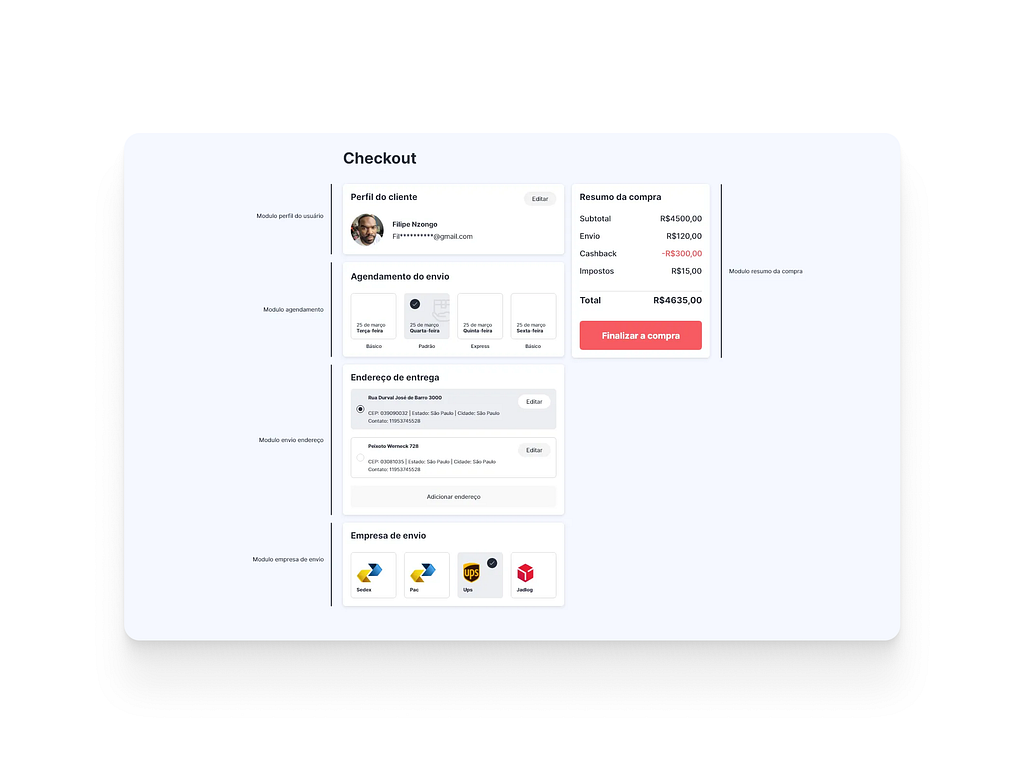
Card-based UI design has been a significant trend in interface design, with a history that dates back to the release of Windows 8 by Microsoft. This design concept made a comeback in 2014 with the launch of Google Material design. By using a card metaphor, information is presented in a concise and structured manner, allowing users to easily digest and interact with the content. The cards can also be arranged in a grid, making it easy to organize and navigate through large amounts of information. The popularity of card-based UI design demonstrates its effectiveness in providing an intuitive user experience.
The interface below follows the card based UI Layout concept.
If you want to delve deeper into this subject, I recommend the article “Designing Card-Based User Interfaces” by Nick Babich and Cards: UI-Component Definition by Page Laubheimer from Norman Nielsen Group.
We can also have a grid-based layout, many news sites that present a lot of content to users follow this layout pattern. Some examples you may consult: www.globo.com, www.nytimes.com, www.itsnicethat.com and many others.
You can deepen your studies by reading this article “Designing With Grid-Based Approach” written by Vitaly Friedman, where he presents techniques and practical examples to create this type of layout.
Another great advocate of Grid-Based Layout is Khoi Vinh, a famous American designer, author of the book Ordering Disorder: Grid Principles for Web Design. In his lecture grids are good, he tells us the history of grids, how to create grid layouts and use them in design.
⠀
Navigation design patterns.
These patterns implement proven techniques for navigating within and/or between a set of pages and chunks of information.
I present to you the Mega Menu, this type of navigation is very common on E-commerce sites, very useful for grouping a large amount of submenus and make it easier for users to navigate through the site.
This Navigation design pattern can also help to improve the SEO of a website, as they can provide a hierarchical structure that search engines can use to understand the content and organization of the site.
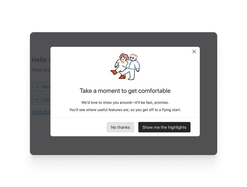
Interaction design patterns
Focus on the interaction mechanisms that can be used to achieve tasks and the visual effects they have on the scene, as such they relate primarily to graphical and rendering transforms.
Modal Windows this pattern is used to display important messages or to prompt users for input in a separate window that appears in the center of the screen as you can see in this image bellow.
Information visualization design patterns
These patterns suggest different visual representations and metaphors for grouping and displaying information in cognitively accessible chunks. They mainly define the form and content of the visualization i.e. the graphical scene, and as such relate primarily to data and mapping transforms.
Heatmaps is a information visualization pattern used in user interface design to visually represent data and user behavior. They are also particularly useful for displaying large amounts of data, as they can quickly and effectively convey patterns and trends that might be difficult to discern from raw data alone.
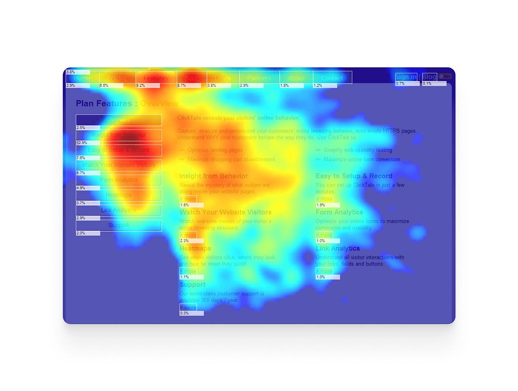
They exist other type of Information Visualization Design Patterns that you can explore and apply to your design, that can include: Bar charts, line charts, treemaps and many more.
Unfamiliar design patterns
Encountering unfamiliar elements in a user interface can be disorienting and trigger feelings of fear and uncertainty in the user. This is because unfamiliarity can make it difficult for users to predict how the interface will respond to their actions, which can lead to errors and mistakes.
As designers, we are often advised to create interfaces that are intuitive and familiar to users by using established design patterns and conventions, which can reduce the learning curve and increase usability. While this is a valuable approach, it is important to also explore new ideas and push beyond the obvious, in order to innovate and create interfaces that truly engage and delight users.
Recent years have seen the emergence of new design patterns that have made it popular among social media platforms. Many among them have even changed the way we interact on these platforms and even our information consumption habits.
A good example of an unfamiliar design pattern is the TikTok user interface. Renata Venturini argue in her the article “Disruptive design patterns — an uncharted territory” “TikTok has gained immense popularity by using a unique interface design pattern that restricts user choice. The app’s intuitive design keeps users focused on consuming short-format video content, potentially leading to over-consumption. To achieve this, TikTok has defied several conventional mobile app design principles, including undiscoverable swipe gestures, white text overlaid on video, small tappable areas, and a lack of hierarchy. Despite the learning curve, TikTok’s habit loop mentality ensures that users continue to use the app. Users often randomly swipe through the app to find what they want and may discover features by accident”.
Initially, TikTok’s interface was not designed as a pattern for social media interfaces. However, due to its immense success, it has become a popular design pattern.
TikTok’s success in attracting millions of users globally has resulted in its design pattern being adopted and emulated by other social media platforms. Designers are now incorporating the features and interface of TikTok to engage users by presenting short-format videos on their own platforms.
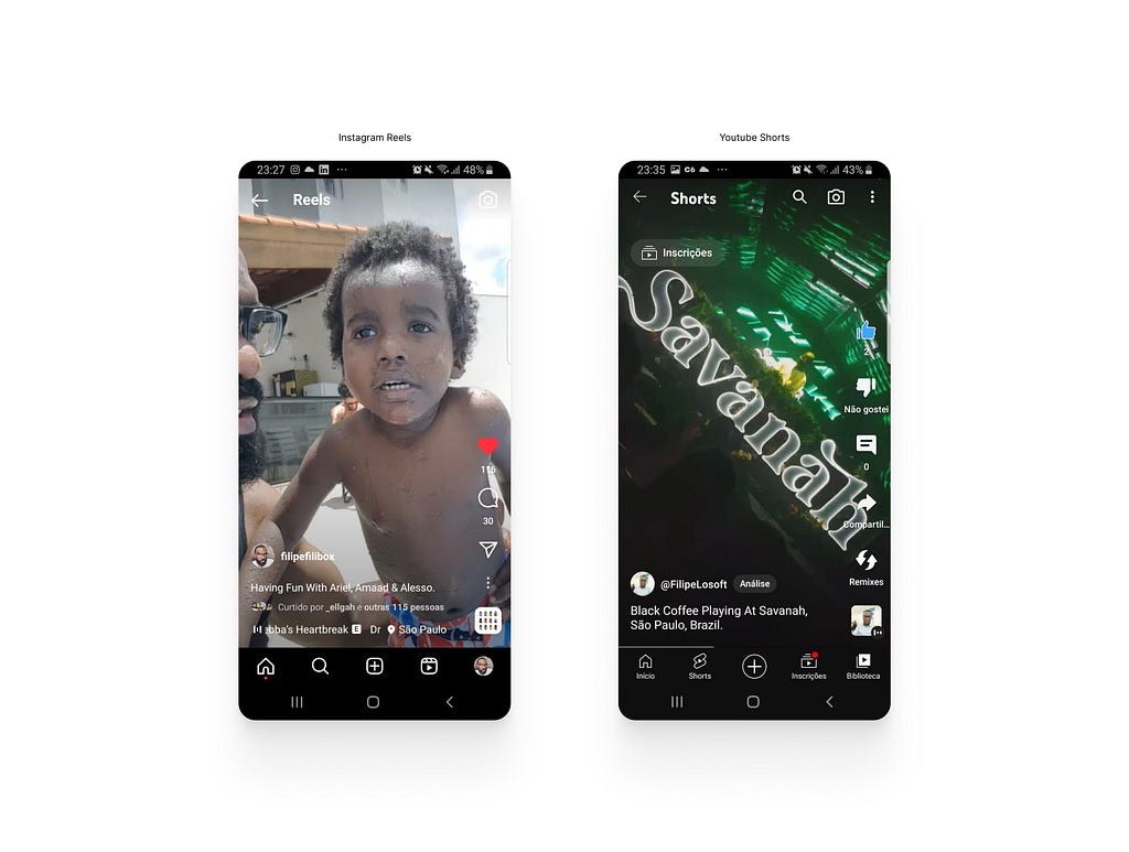
The design of Instagram reels and Youtube shorts mimics TikTok’s design pattern, with a similar layout and user experience that is focused on short-format videos. TikTok’s design pattern has had a significant impact on the way that social media platforms approach short-format video content and interface design.
So, it is important to recognize the value of building on successful design patterns, in this way, copying successful design patterns can be seen as a starting point for creativity and innovation, rather than a limitation.
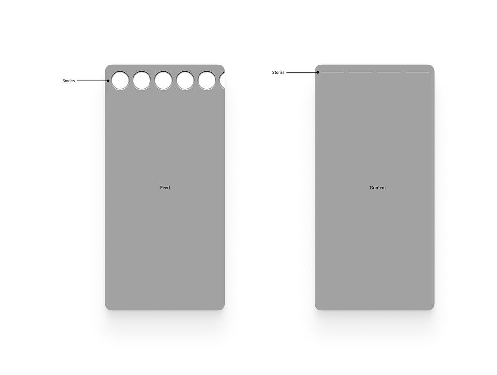
Another examples of copying successful design patterns is the concept of “Stories” The idea of temporary content that disappears after a set amount of time was originally introduced by Snapchat, but has since been adopted by other platforms such as Instagram, Twitter, LinkedIn, Facebook, and WhatsApp and many more.
While some may argue that copying successful design patterns is uncreative, there is value in building on existing ideas and adapting them to new platforms and audiences. TikTok’s success has led to the adoption of similar design patterns on various platforms. Overall, a balance between using established design patterns and creativity is important in creating successful and user-centered interfaces.
Creativity and Cognition
Design patterns are indeed ubiquitous in our daily lives, from the products we use to the interfaces we interact with, and they demonstrate the power of creativity by providing effective solutions to common problems or challenges. However, it is important to note that the power of creativity is not limited to design patterns alone, but can be seen in all areas of design, innovation, and problem-solving.
Design patterns don’t aim to cover all possible design problems, but rather address common issues that designers don’t want to waste time on (but often do, leaving them unable to apply efforts to innovation and instead spending energy on problems that have already been solved).
While design patterns do offer tried-and-tested solutions to common design problems, they are not meant to be strict templates that restrict creativity. Instead, they provide a starting point for designers and can serve as a reference or guide for making design decisions. They also allow designers to quickly identify and resolve common design problems and can help ensure consistency and coherence across different design elements. When used correctly, design patterns can enhance, not limit, a designer’s creativity.
So having a common understanding of design principles and solutions, designers can build on existing patterns and create new and unique designs that are grounded in proven and effective design practices. In this way, design patterns can help to foster and support creativity in design.
Reuse is taking advantage of any effort from previous work to reduce the effort needed to complete new work. (BOLCHINI, 2000).
We can use design patterns to reduce cognitive load when designing interfaces. From the user’s perspective, the interface should allow them to perform their tasks efficiently and effectively, which is closely related to the dimensions of usability.
Design patterns are essential in user interface design project; they can can improve the usability of an interface, making it easier for users to navigate, find information, and complete tasks. They also provide a visual language that can be easily recognized and understood, reducing the need for users to learn and remember new information.
For example, the use of clear and intuitive navigation, such as a menu or tab bar, can help users quickly find what they are looking for, reducing the cognitive load of trying to figure out where information is located. Similarly, the use of standard icons and familiar layout patterns, such as the placement of buttons and fields, can reduce the cognitive load of figuring out what information is needed and how to interact with the interface.
Reducing the amount of information and complexity that needs to be processed by the user, design patterns can improve the overall user experience and make the interface easier and more enjoyable to use.
Documenting Design patterns
For designers, the documentation stage can be boring sometimes, I know, but remember, documentation is an important tool for knowledge management. When information is documented, it becomes accessible to others at future times, allowing knowledge to be shared and reused more efficiently.
So It’s not enough just to create new design patterns, it is also necessary to document them, for me the design pattern documentation is the most important part of the design pattern concept. Because it is through this document that we can build a pattern language (Welie 2001, p.104) or a unique vocabulary that we can share between designers or a design community.
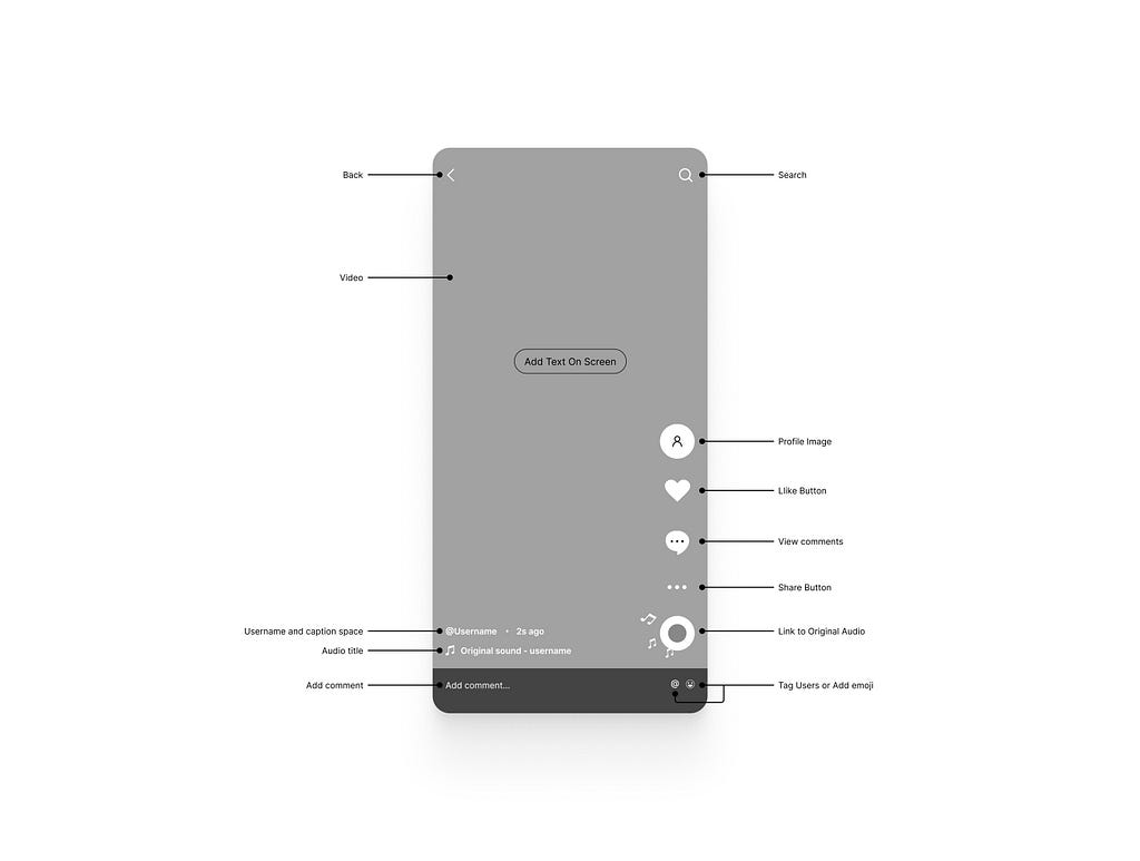
User interface pattern structure by Jenifer Tidwell
Jenifer Tidwell use a very minimalistic form to describe design pattern, this model is used throughout her book “Designing Interfaces” which suggests that the patterns are described through the following elements:
- Name: Describes the pattern’s intention and defines a unique reference number;
- Sensitizing Image: This image sensitizes the reader to the pattern’s solution;
- What: Short problem statement;
- Use When: Describes the context in which this pattern can be used;
- Why: Describes the design rationale
- How: Represents the solution part of the pattern;
- Examples: Screenshots of instantiated pattern with a short description.
Conclusion
In conclusion, design patterns play a crucial role in designing effective and user-friendly interfaces. By addressing common design problems, design patterns help designers to efficiently tackle recurring design challenges, freeing up time and energy to focus on more innovative aspects of design. Furthermore, they help reduce the cognitive load on users by providing a familiar and consistent structure, making interfaces easier to navigate and use. Whether you are a experienced designer or just starting out, understanding and utilizing design patterns is an essential tool for creating well-designed and usable interfaces. By leveraging the wealth of knowledge and experience captured in design patterns, designers can improve the user experience, increase efficiency, and ultimately create better products for their customers.
REFERENCES
- Alexander, Silverstein, Jacobson, Fiksdahl-King, & Angel. (1977). A pattern language: Town, buildings, construction. Oxford University Press.
- Tidwell. Common Ground: a pattern language for human-computer interface design.
- Welie & Gerrit. (2003). Pattern languages in interaction design.
- Welie. (2001). Task based user interface design, Doctoral Dissertation. Dutch Graduate School for Information and Knowledge Systems.
- Gamma, Helm, Johnson, Vlissides. (1994). Design patterns: elements of reusable object-oriented software.
- Nzongo. (2021). Design em escala, projetando sistema de design consistente. Viver Cultural.
- Venturini (2022). Disruptive design patterns — an uncharted territory.
- Laubheimer (2016) Cards: user interface component definition, Norman Nielsen Group.
- Babich (2016) Designing card-based user interfaces, Smashing Magazine.
- Whitenton (2013). Flat vs. deep website hierarchies, Norman Nielsen Group.
- Curtis (2009) Modular web design: creating reusable components for user experience design and documentation
- Lincoln. (2009). Design de artefatos digitais baseados em padrões e plataformas.
- Duyne, Landay & Hong. (2006). The design of sites: patterns for creating winning web sites.
- Taleb, Seffah & Abran. (2007). Patterns-Oriented design applied to cross-platform web-based interactive systems.
- Lafreniere, Daniel & Carr, David. (2001). A Pattern-Supported Approach to the User Interface Design Process.
- Adel Ali, Galal-Edeen, Khozium. (2008). Using a pattern approach for user interface design.
- Frøkjær, Erik, Morten, Hornbæk & Kasper. (2000). Measuring usability: are effectiveness, efficiency, and satisfaction really correlated?.
- Orozco (2022) Balancing cognitive load and discoverability, UX Magazine.
- Whitenton (2013) Minimize cognitive load to maximize usability, Norman Nielsen Group.
![]()
Patterns are good was originally published in UX Collective on Medium, where people are continuing the conversation by highlighting and responding to this story.