Before diving into the core topic let’s first understand what User Experience is?
User experience is the way a person feels when interacting with a particular product, system or service. It refers to all aspects of the end-user’s interaction with the company, its services and its products.
User experience design (UXD) is “the process of enhancing user satisfaction by improving the usability, accessibility, and pleasure provided in the interaction between the user and the product.” The goal of UXD is to make improvements within a business so that customers are more satisfied with their experience.
I hope the concept of UXD is now clear,
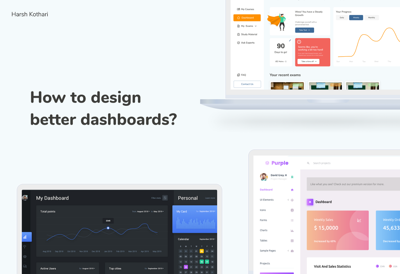
Now let’s understand what a dashboard is?
Technically, Dashboards are a system for displaying and analyzing data in real time.
Dashboards in business use is a visual display of the most important information needed for decision-making purposes. A dashboard usually consists of one or more monitors with charts, graphs and data feeds that provide a good view of how the company is performing in various aspects such as sales, production, etc.
In Layman’s terms: Dashboards are used to control back-end operations of web-apps, Saas products, etc. Furthermore a dashboard as the name suggests functions exactly like the car’s dashboard. Basically giving a preview or glance of all the important functions of the application, with an easy way to navigate to each of the functions accordingly. It acts as the control panel giving an overview of to-be-noticed things of all the features present in the application.
Designing a dashboard had been a nightmare for me, I encountered a lot of problems while freelancing with different clients and working with different startups who wanted to build Saas products, Management dashboards, etc.
These pointers listed below helped me in crafting a good dashboard design and overcome the fear and frustration of designing a dashboard:
Like all other products, dashboards must also have a purpose. If the purpose isn’t defined in an apt manner It may lead to a bad experience. To understand the motive of the dashboard you must first understand the types of dashboard present in the market.
Dashboards can be classified into 4 types:
- Operational: Shows shorter time frames and operational processes.
Example: ARC by Tekion, Customer Care services Dashboard, etc.
2. Analytical: Created to display a vast amount of data.
Example: Google Admob, Google Analytics, SEM Rush Tracking, etc.
3. Strategic: Focused on long-term strategies and high-level metrics
Example: Facebook AdManager, etc
4. Tactical: Used by mid-management to track performance.
Each type has a different type of UX associated with it.
According to the needs of your business choose 1 dashboard type out from the above 4 types.
Now you know the motive of your dashboard, let’s find out about the right way to represent data in the dashboard.
Different types of dashboard have different types of data to represent. Be it a simple graph or the complete Information architecture, everything has to be presented in a planned way that feels good.
Choose the right type of graph to display the particular type of data.
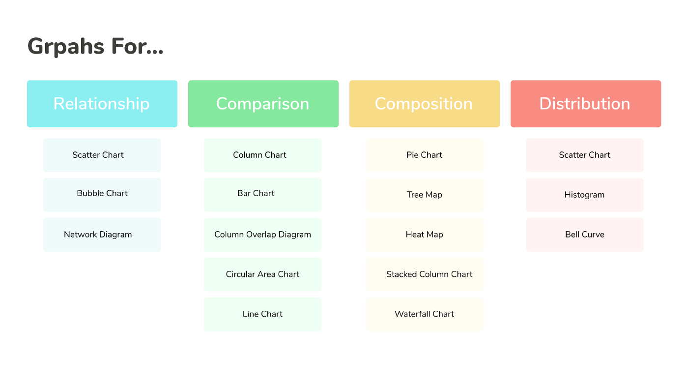
Choose the apt graph by imaginatively visualizing the graphs in accordance with the idea of representation and think about data to be presented.
So let’s be clear, as a designer you may think about eliminating some data which you may think is irrelevant, but No! It’s just your false census. A dashboard as discussed earlier is used to represented a large amount of relevant data. Follow a defined design pattern like F-shaped pattern to set a good layout of the dashboard.
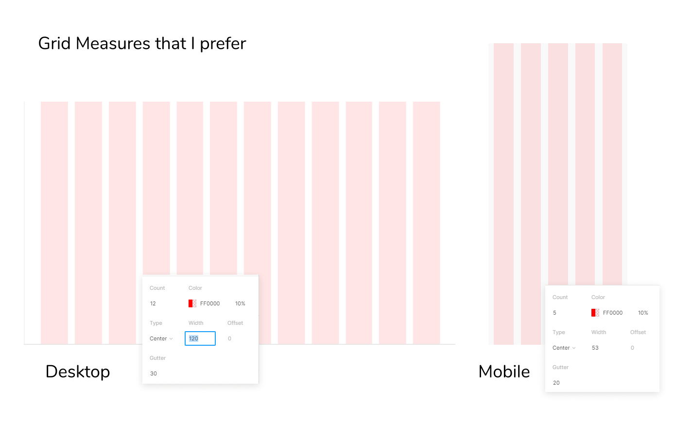
A secret to create uniform layouts: Use grids, invisible columns or rows or both, of varying but uniform widths used to help designers in creating uniform layouts.
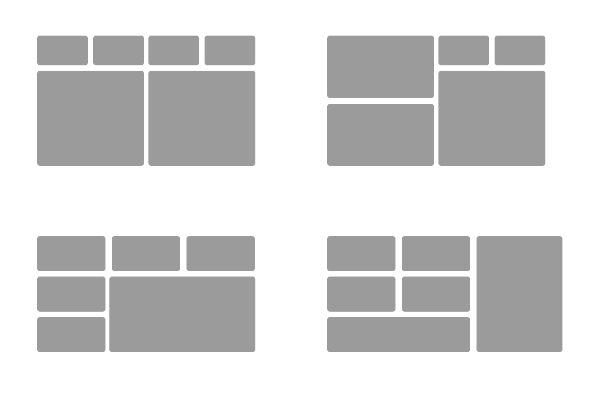
Some uniform layout structures that can be used for dashboards:
When designing the information architecture, keep this in mind:
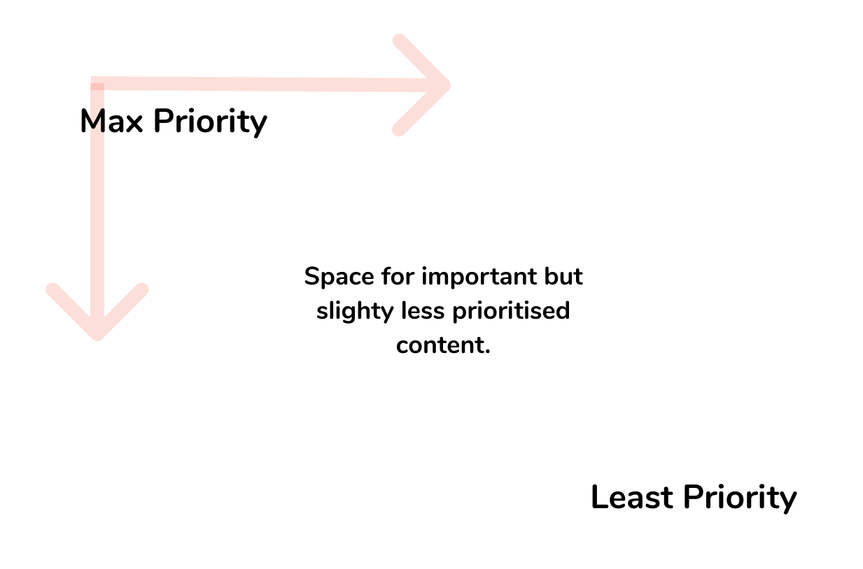
- Create a content repository and follow the inverted pyramid method to identify content priority. Mark or reposition the content in the repository according to the priority.
- The rectangular screen may seem all equal, but not with respect to UX. A screen has different priority points. The top left corner of the screen will naturally get more attention, according to F-shaped pattern. This is based on the way we read information, we scan from left to right. After completing first row, readers will move down to next one transitioning from right end to left end of the screen. Again this depends on the users the product is being designed for.
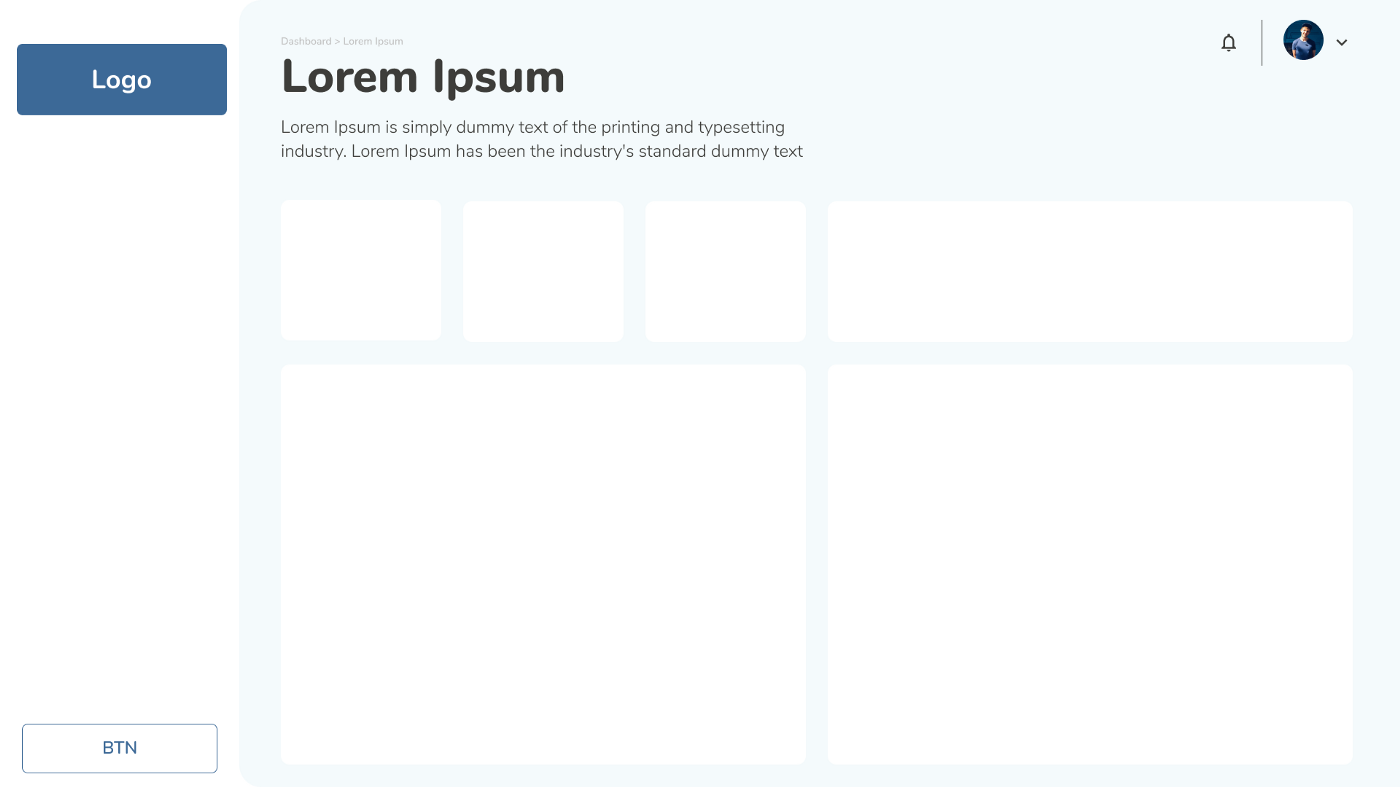
Use of cards based layout can be useful in terms of responsiveness. A dashboard will have many widgets, basically to represent the data. Cards being easy to arrange and re-arrange can be used to contain these widgets so that the whole layout gets re-arranged according to screen sizes.
Moreover, use of cards also makes the overall layout clean and uniform, as the spacing among neighboring cards is equal.
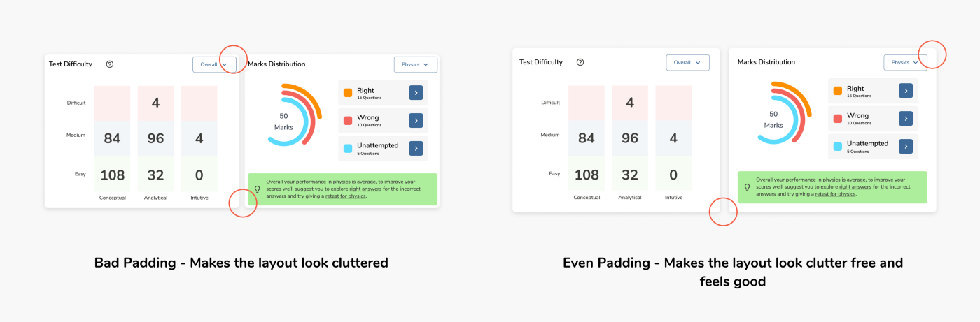
A clean layout is one with good white space, uniform margins and padding.
Having a uniform padding structure makes an interface look clutter-free i.e. less crowded. Also these are minor details no-one except designers notice it, but over a continuous use of the dashboard or any digital product, these minor details can be irritating for other humans too.
Below are 2 examples of interfaces having good and bad margin and padding structures respectively.
The purpose of the dashboard page is to give a glance of the entire application’s function. I agree that if an application has a lot of features and all of them are important to be shown at the first impression, but setting all of those on the dashboard will not only make the dashboard’s scrolling length long but also make user’s experience difficult, as there will be a lot of data to a take in until the required data is found.
Dashboard’s height should be kept around 100vh-120vh for desktop screen, must have the prioritized data and not all the important data.
Personalization:
Depending upon user’s interaction with the dashboard the priority of the data can be made to change on a timely basis. Some machine learning algorithms can be applied to restructure the layout according to user’s interaction with data. Most interacted data will be placed in the top-left position and least interacted data will be placed in bottom-right and so on. Implementing this will allow admins to dynamically personalise the experience and layout.
This seamless practice can make the experience of dashboard easier for so many users.
Customization:
Allowing users to alter the experience of the dashboard according to their needs by giving them the power to choose the features or widgets they’ll like to see on dashboard or even restructure certain parts of layout.
Through this not only the user may think that they are in power but we designers would also get the data required to understand the user and their interaction activities.