The driving force behind my relentless mission to create digital fonts for Afrikan writing systems, one letter at a time. In this case study I’ll walk you through the process of designing a font for the Bassa Vah Alphabet.
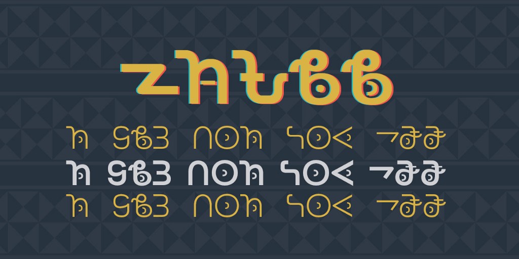
Background
Bassa language is spoken by about 600 000 Bassa people of Liberia and Sierra Leone. In the late 1800s, Dr Thomas Flo Lewis created the Bassa Vah alphabet to write the language, drawing inspiration from traditional Bassa symbols and motifs. Vah means ‘to throw a sign’. Interesting.
During the 1900s, Dr Lewis relentlessly worked towards the promotion of the alphabet; from type casting & establishing a printing press to creating an association to promote the script in the 1950’s. A school was also built to teach the Bassa Vah alphabet. Initially, the Bassa alphabet was written on slates with charcoal, and the writing could be easily erased with a leaf known as yan.
People began to write with pencils in the early 1940s & at that time, the writing direction of Vah alternated between right to left and left to right. From the 1960s however, the alphabet has fully adopted a right to left writing direction. The alphabet fell into disuse in the early 19th century but thanks to the efforts of organizations like the Christian Education Foundation of Liberia (CEFL), there are initiatives to revive the alphabet.
For TSG Bassa typeface, my goal was to create an accessible font suitable for both digital and print usage. A digital font can be helpful in promoting the alphabet on digital platforms. This also meant I had to dabble around with the font weights to create a truly versatile typeface.
Orthography, Sources & Ideation
Orthography! My favourite part of the research process. To design a font for an alphabet that you do not use or speak, a solid understanding of the target language orthography is a necessity. This was the case when I designed TSG Bassa typeface. Simplified, orthography is the set of conventions for writing a language, these rules inform & guide us to make informed design decisions. Below are some characteristics noted during the research phase for my Bassa Vah typeface:
- Bassa has a set of 23 consonant letters,
- Vowel set with 7 letters.
- 5 diacritical marks to show tonality of the vowels.
- The 5 tones are: high, low, mid, mid-rising & falling.
- Tone marks are positioned in the center of vowel letters.
- It is written horizontally from left to right.
- Words are separated by spaces
- ASCII digits are used (0–9)
- Western punctuation is normally used, notably the comma, period & question mark
- Bassa has a native full stop letter that can be used instead of the period.
Lot’s of work? What I love about this stage of the process is learning how other people think, invent and everything else about their culture transmitted via language. I have shared links to resources I found on Bassa orthography at the end of the article.
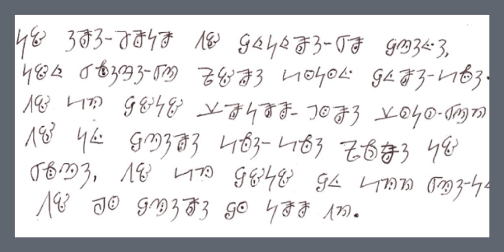
Upon completing the orthography research, I then embarked on the next step of analyzing text based sources and ideating. Text based sources are good references for investigating how letters are written by the users and checking common traits in orthography. They guide a type designer to make informed aesthetic decisions.
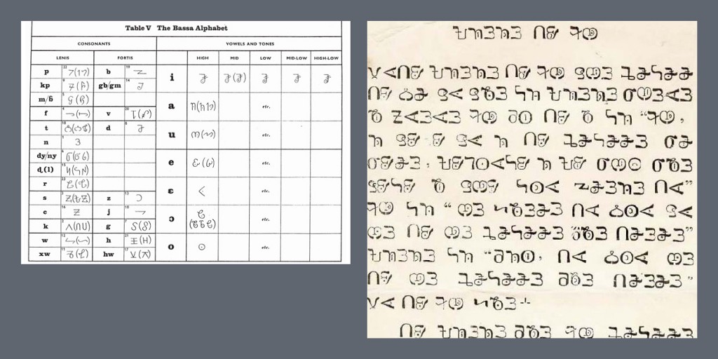
Observing the text sources I found, I noticed that some consonant & vowel letters had more than one symbol attributed to them. In the age of OpenType features however, the quick solution is utilizing glyph alternates, making it easier for users to choose a letter they are familiar with. I have to confess, I didn’t create any alternate characters, the idea just wound up in my head as I was writing this article. [An updated font with alternate characters will be released soon.]
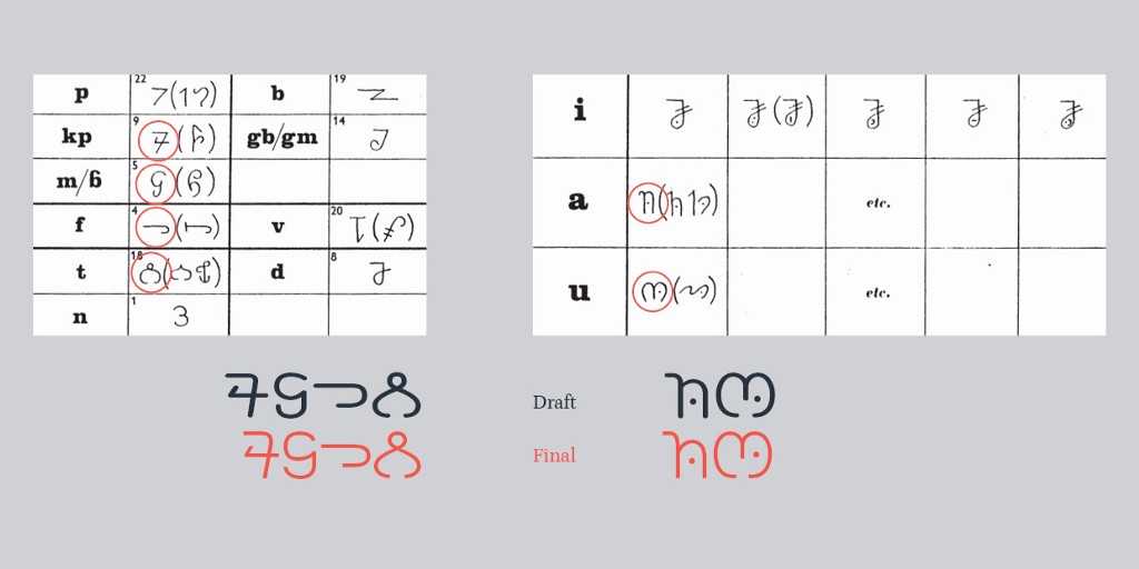
Since I didn’t think of creating alternate characters for the problematic letters, silly me, I had to choose one symbol to represent consonants & vowels that had multiple depictions. The selection method was largely influenced by the frequency of usage and functionality purposes considering the intended design goals. Above all, the decision had to be made while paying respect to Bassa culture thus radical altering of the letters was a no go area.
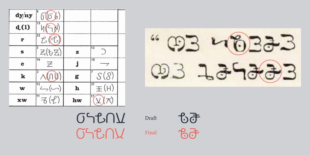
An interesting aesthetic I chose to adopt was the loop like swashes on some of the letters. This gave the script a natural handwritten like feel while maintaining the traditional letterform characteristics.
Final Results: Consonants.
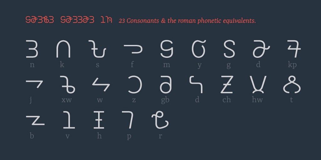
The resulting letterform designs maintain a clean & legible look while preserving the traditional aesthetics. Some consonant letters can be used to represent more than one sound, especially those that come before or after nasalised or non nasalized vowels.
Vowels and Tone marks.
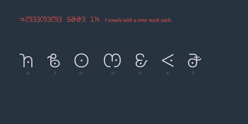
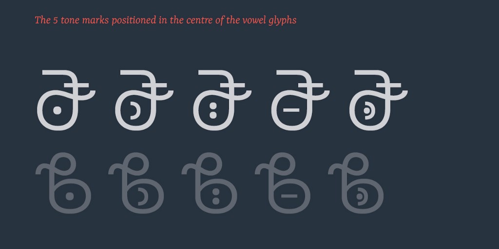
Bassa is a tonal language hence vowels carry tone markings or diacritics that depict the tone of the vowel. The tones include: high, low, mid, mid-rising and falling. Every syllable in Bassa should have a tonal mark and vowels are never written without indicating the tone being used. I had to take extra precaution when designing the vowel letters, securing some counter space to position the tone markings.
To facilitate correct shaping of the vowel-tone mark clusters, I made use of the OpenType Mark Positioning (mark) feature. The feature made it possible to position the tone marks/diacritics onto their respective positions within vowel letters. Below is a sample code for the ‘mark’ feature:
feature mark {
# GPOS feature : Mark Positioning
markClass u16AF0 <anchor 0 333> @m.u16AF0;
markClass u16AF1 <anchor -1 350> @m.u16AF0;
markClass u16AF2 <anchor 0 312> @m.u16AF0;
markClass u16AF3 <anchor -1 446> @m.u16AF0;
markClass u16AF4 <anchor 0 350> @m.u16AF0;
lookup markLTR {
pos base u16AE7
<anchor 448 273> mark @m.u16AF0;
pos base u16AE8
<anchor 412 197> mark @m.u16AF0;
pos base u16AE9
<anchor 417 350> mark @m.u16AF0;
pos base u16AEA
<anchor 686 374> mark @m.u16AF0;
pos base u16AEB
<anchor 286 198> mark @m.u16AF0;
pos base u16AEC
<anchor 517 350> mark @m.u16AF0;
pos base u16AED
<anchor 265 229> mark @m.u16AF0;
pos base uni25CC
<anchor 297 291> mark @m.u16AF0;
} markLTR;
lookup markLTR;
} mark;
Mark positioning seems not to work in some older versions of Adobe CC applications so the vowel & tone clusters may not be rendered correctly. A solution that has almost always worked for me is switching the shaping engine in Adobe CC Apps:
Edit>preferences>type>enable ‘show Indic options’…Save settings and go to Paragraph panel>options>select composer>choose either Adobe World Ready Composer or Middle Eastern & South East Asian Composer.
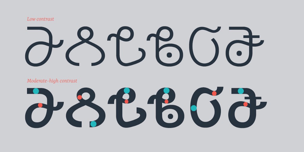
The positioning of tone diacritics also influenced the design aesthetics of the heavier weights. The bold weight for TSG Bassa has high contrast between the vertical and horizontal weight distribution. I took this direction to make space for the tone diacritics and this went on to affect other consonant letters to achieve a cohesive design look & feel. It also added a subtle hint of personality to the letterforms by enhancing the loops/swashes.
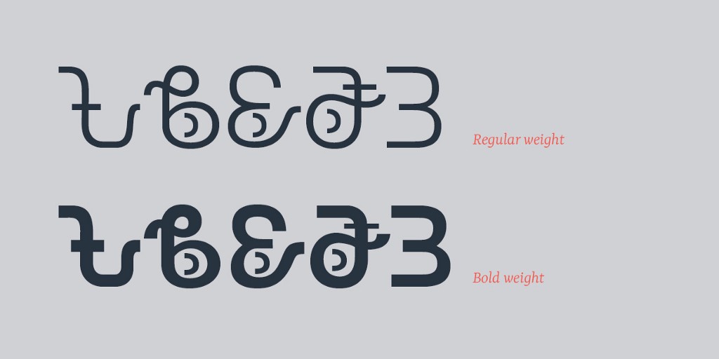
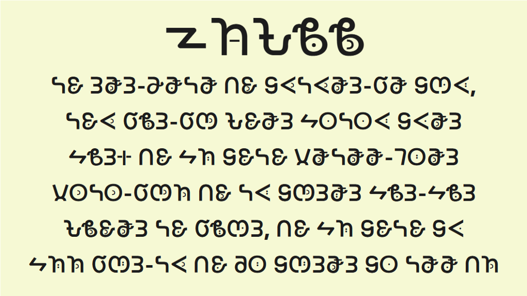
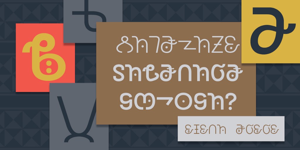
The resulting regular and bold weights are suitable for the intended design goals. The regular weight is more conducive for typesetting body text while the bold weight works better for headlines and other display purposes.
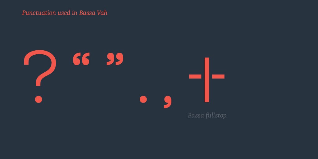
As mentioned earlier in the article, in Bassa orthography latin punctuation marks are often used, specifically the question mark, double quotation marks, period and comma. A native Bassa fullstop symbol is also used instead of using a period.
TSG Bassa typeface only has characters for the Bassa Vah script. Additional script support including the latin alphabet will be added in the near-future. The typeface is an open-source project and it can be downloaded for free from Github. Resources on Bassa Vah Orthography are at the end of the article.
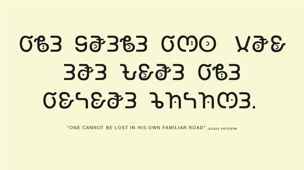
Please let me know if you have any questions, additions or corrections, I’m very much open to all feedback. You can check out the images below to see the font in use. Thank you!
Resources for Bassa Orthography:
- Phonology of Bassa by Bertkau
- Comparison of Three Bassa Orthographies by Bertkau
- Orthography of the Bassa Language of Liberia by Abba G. Karnga
- Bassa Vah Orthography Notes
Decolonizing typography: creating a font for Afrikan writing systems was originally published in UX Collective on Medium, where people are continuing the conversation by highlighting and responding to this story.