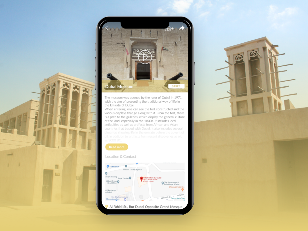
Ancient Districts iOS App
Project Brief
I was asked to do a 1-week design challenge to create a mobile app that allows users such as tourists, school kids, parents etc., to view historical sites around Dubai and learn more about them. Although it was a challenge to work on this project while working full-time and with such a tight schedule, the experience pushed me out of my comfort zone and exposed what skills I’m good at and what skills I need to improve and refine.
Process Overview

01 EMPATHIZE
Competitor Analysis
I will start by analyzing 3 well-established competitor apps (Lonely Planet / TripAdvisor / Visit Dubai) in order to identify their strategy, strength and weakness points, market gaps, and potential opportunities.
Analysis Scope: Competitor Profile — Marketing Profile — Core Business — SWOT Analysis — UX/UI — Performances — Content.



Visit Dubai / TripAdvisor / Lonely Planet
Surveys
The goal of surveys is to gather quantitative data about users by asking questions with a predefined hypothesis to validate/invalidate our assumptions about target users. For this activity, I will conduct online surveys using SurveyMonkey tool.
User Personas
To get in the mindset of the app users, I created 4 user personas to represent our potential target audience. I’ll dive into their backgrounds, goals, motivations, and pain points to understand how can the app serve them the way they expect and want.
These Personas are hypothetical and need to be validated. After conducting interviews with real users, the Personas will either be validated and confirmed, or refined and redefined.
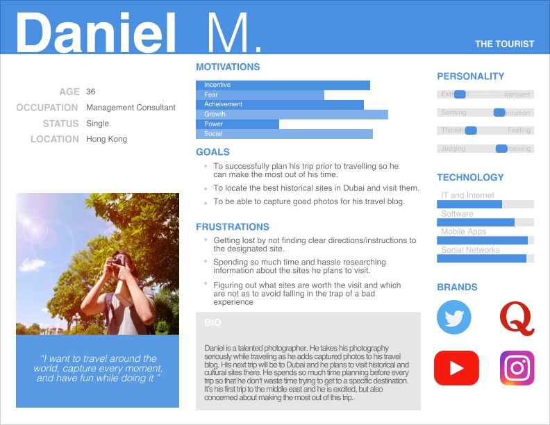
Persona 1: The Tourist
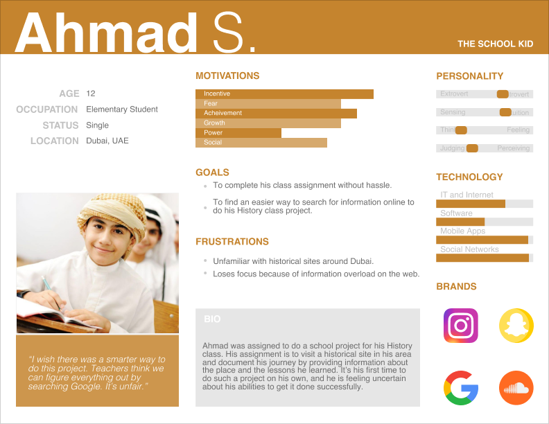
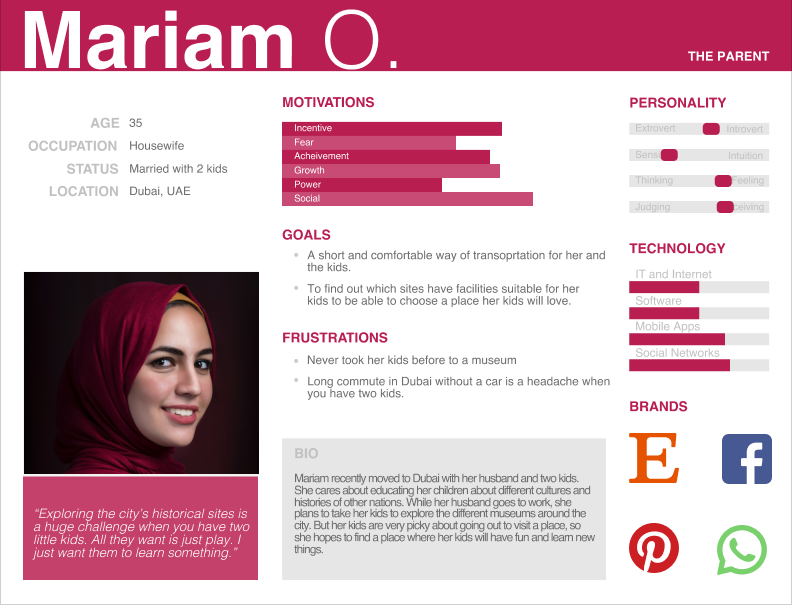
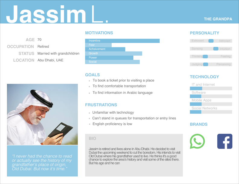
Perona 2: The School Kid / Persona 3: The Parent / Persona 4: The Grandpa
User Interviews
Next was to create a set of question to be asked during an interview with potential target audience in order to validate and refine Personas to better reflect how actual users are like and how Ancient Districts app will help them.
See questions here
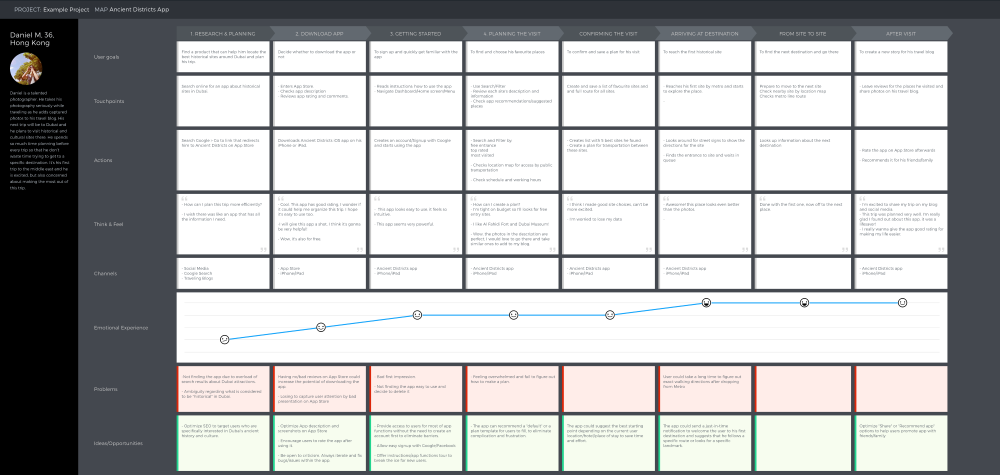
Customer Journey Mapping
Next step was to create a journey map for one of our main Personas (The Tourist) to try to understand their relationship with the app and illustrate their experience and story behind using Ancient Districts app.
02 DEFINE
MVP: Feature Prioritization
Based on the research done and the insights we got from our users, it is now time to find out what are the main features that would serve as an MVP for the app. These features should represent the intersection among business value, user value, and tech feasibility. One way to conduct this feature prioritization activity is Feature Value Analysis or Faceted Feature Analysis.
MVP Features:
- User Profile
- Search and Filter Categories
- Site Description and Details
- Create and Save a Trip
Information Architecture
Card Sorting
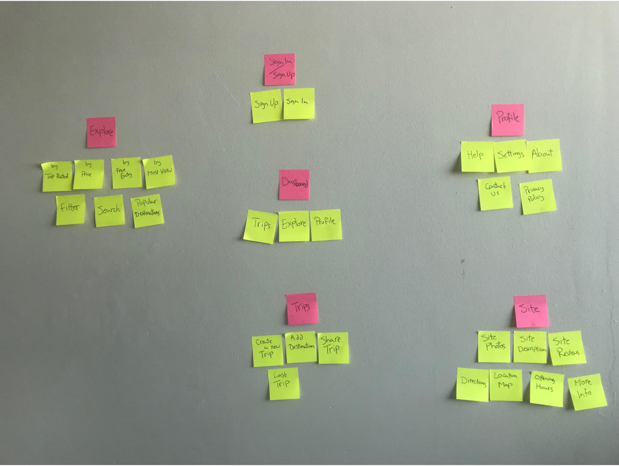
I started by brainstorming the IA elements that are expected to be included in the app navigation.
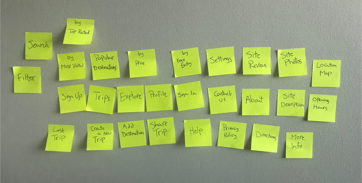
Cards
Then I used Card Sorting in order to figure out the best grouping combination that would be logical to users.
Result:
Sitemap
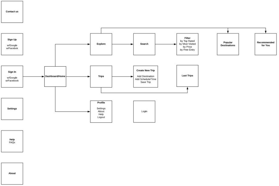
Keeping it simple and clean, I refined a digital sitemap to outline the exact structure and hierarchy of information in the app:
Sitemap
03 LOW-FIDELITY
Paper Prototypes /Wireframes
I made rough sketches for the app screens. I came up with different variations in order to show multiple ways to apprach the design and to not get attached to just one design.
SCREEN 1: Sign in/ Signup
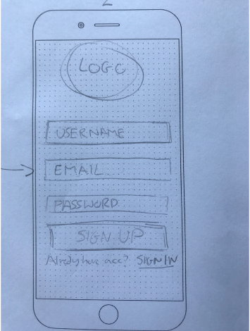
VARIATION 1
Pros: directly insert account information and signup.
Cons: No alternative ways to signup.
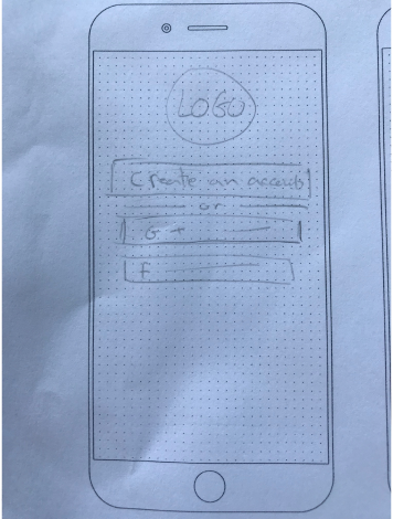
Variation 2
Pros: Create an account with Google and Facebook accounts for easy signup.
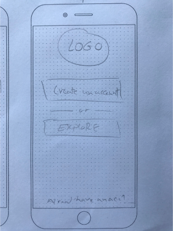
Variation 3
Pros: provides access to the app for non-members by tapping “Explore” to enter app.
Cons: Users may not create an account.
Solution: Variation 3 will be chosen to eliminate barriers to using the app, even if users do not create an account, they will get in-app requests to signup if they want to create Trips and save other information on the app like favourites list, etc. (Needs to be tested and validated)
SCREEN 2: Dashboard
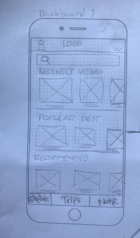
Variation 1
Pros: find easy to navigate categorization showing Recently viewed sites, Recommended sites, and Popular destinations with photos and quick description under each places.
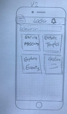
Variation 2
Pros: Simple categorization of historical sites. Users can select their favourite type of place, such as Museums, Temples, etc.
Cons: No bottom navigation bar which may limit app capabilities, considered its a native iOS app. Hamburger menu is becoming less useful for users as they want to see information right away.
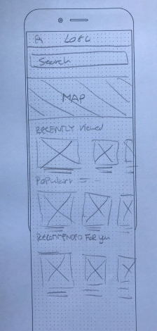
Pros: Provides city map on top to show locations of different sites across the city.
Cons: Users may get overwhelmed by too many location pins showing at one time.
Solution: Variation 1 will be chosen as it provides a clear way of categorization. Quick information about the items shown along with photos is more attractive to users and increases their tendency to keep exploring the app. (Needs to be tested and validated)
SCREEN 3: Site Description
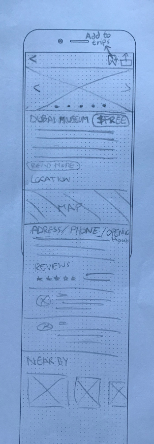
Variation 1
Pros:
- Switch between Photos
- Save to Favourites option on top navigation to add the current site to Favourites list.
- Full details about site including (description/location map/opening hours/photos/reviews/nearby places)
- Variation 2
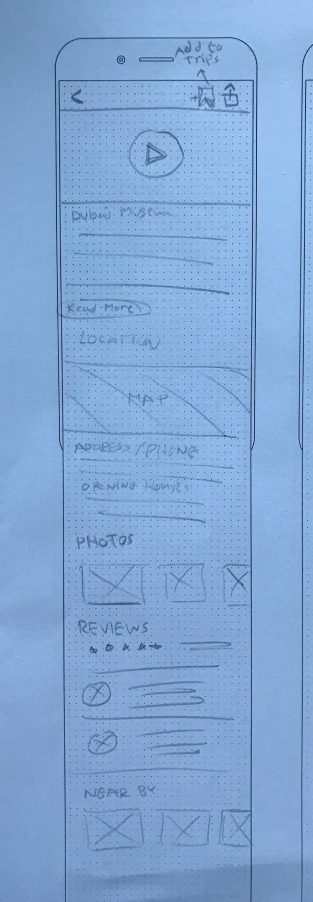
Pros:
- Video on top could work as an instant eye-catcher to engage users.
- Photos are available in addition to Video
- Add to Trips option on top navigation to add the current site to Destinations list on your trip.
- Full details about site including (description/location map/opening hours/photos/reviews/nearby places)
Solution: Variation 2 will be chosen as it offers Add to Trips options as well as both video and photos. (Needs to be tested and validated)
Usability Testing
Test early, test often. It is a rule of thumb during the design process. I will conduct Usability Testing using Paper Prototypes from the sketches I created. -I will recruit 3–5 potential users for each persona group. The end goal is to know if the app is usable and to apply the necessary iterations based on users’ feedback. Participants will be asked to perform a number of tasks and then measure the timing, success rate, and level of satisfaction.
04 HIGH-FIDELITY
Created high-fidelity prototypes for a number of screens, adding user interface and visual elements.
SCREEN 1: Sign in/Signup
I’m still hesitant between 2 solutions, so I will create A/B Testing using UsabilityHub tool to validate which variation is preferred by users. (Needs to be tested and validated)
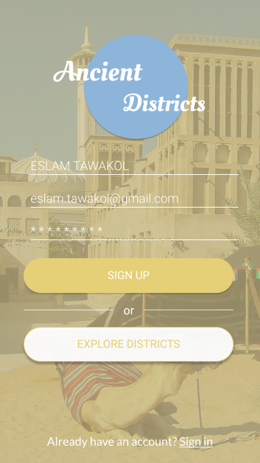
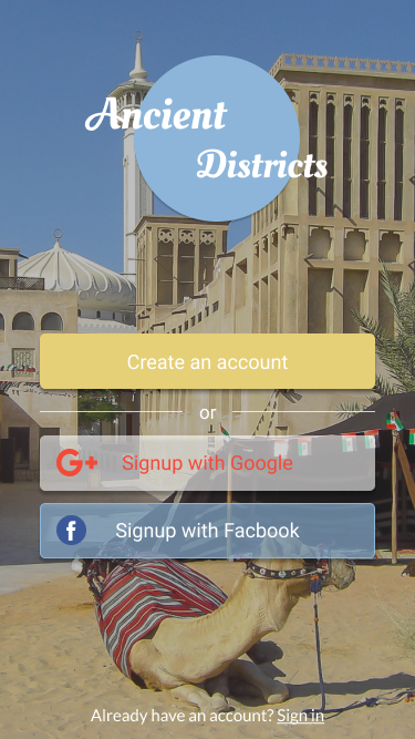
Variation Control
SCREEN 2: Dashboard
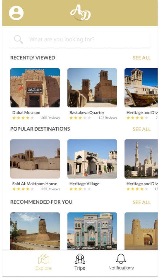
Dashboard
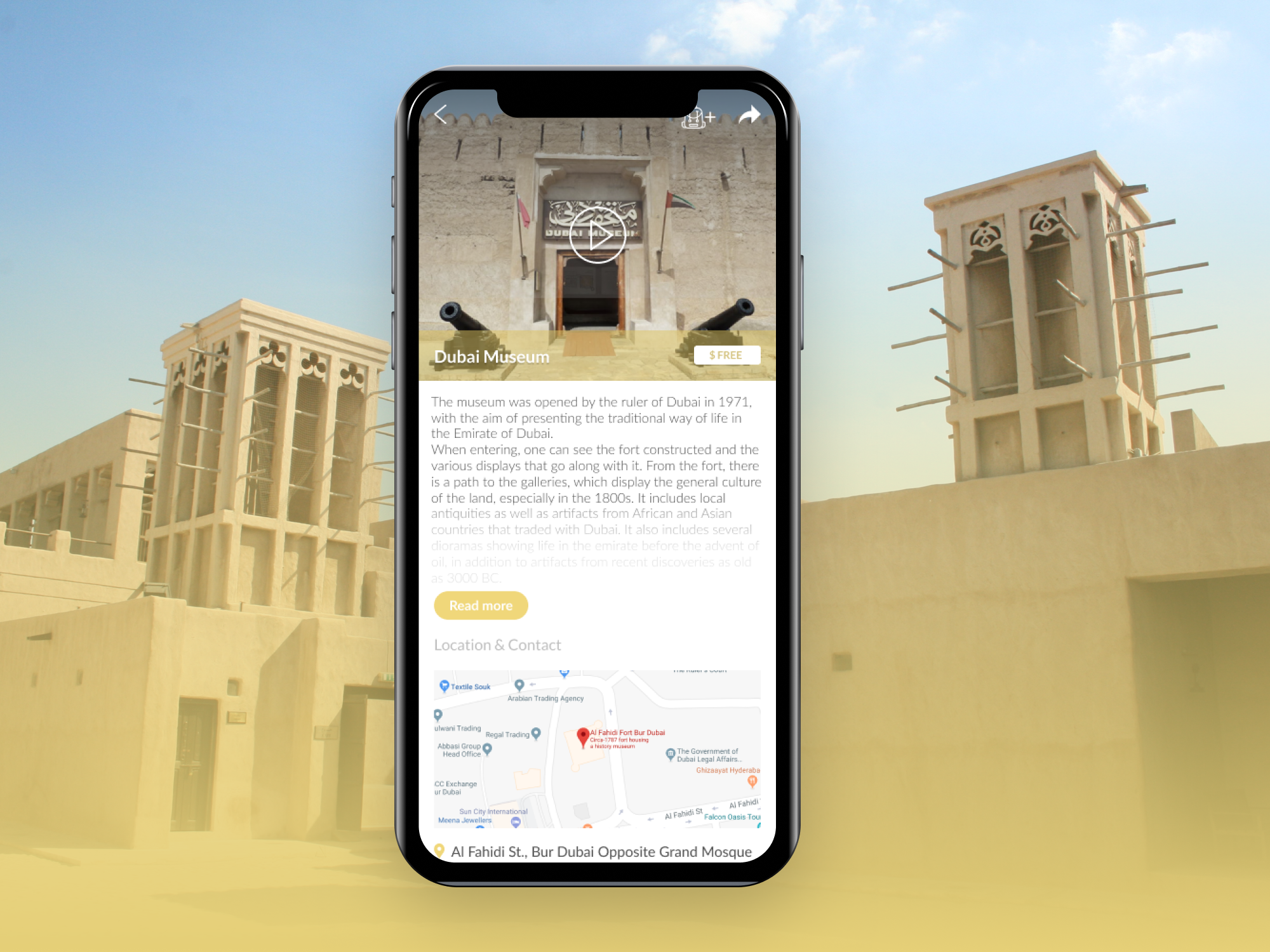
SCREEN 3: Site Description

Site Description
>>>View interactive InVision prototype here: https://invis.io/32FJU98UFRH
So, What’s Next?
- Create User Flows and Scenarios to brainstorm the different ways a user would interact with and approach the app.
- Wireframe the remaining MVP features (User Profile / Search and Filter / Create a Trip)
- Test and Iterate designs based on the feedback received from users.
- Add visual design and UI elements and create a Style Guide.
Thank you for reading!
