Apr 29
Background: This case study pertains to a joint project completed with Nicole Warden Le for DC-area startup Loro. Loro is currently in the process of bringing to market a companion robot featuring a 360-degree camera and accompanying app designed specifically for wheelchair users. The objective of the project was to redesign key aspects of the Loro website, make recommendations for information architecture and content, and ideate the on-boarding experience for the Loro app.
Days 1–3: Research
The first thing we did to tackle this project was gather as much information about the problem space and users as we possibly could. In a matter of days, we needed to learn the following:
- Nature of the business and product being developed by Loro
- Landscape of assistive technology in which Loro will operate
- Target users’ day-to-day experience, pain points, needs, desires
- Inclusive design and designing for accessibility
After collaboratively crafting our research questions, we immediately ran into our first major issue: how would we find the very niche target users and target professionals to interview for primary research in the very limited amount of time we had to complete our research?
To solve this problem, I quickly got in touch with somebody in my personal network that may be a potential user of Loro’s product, reached out to an Occupational Therapist I had previously worked with, and sent over a dozen interview invitations to local Assistive Technology Professionals via LinkedIn.
Within 48 hours, I had completed 3 targeted interviews full of rich data and deep insights. To add to this research, I sought out second hand information in the form of video testimonials of potential users on sites such as YouTube, Vimeo, and TED talks. Within 24 hours, I had supplemented my interviews by viewing almost a dozen testimonials as part of my secondary research, spanning in content from “A day in the Life” videos of potential users to assistive technology reviews and demonstrations.
Meanwhile, my partner completed the bulk of a competitive analysis of 9 direct and indirect competitor websites and 2 user interviews focusing on online purchasing.
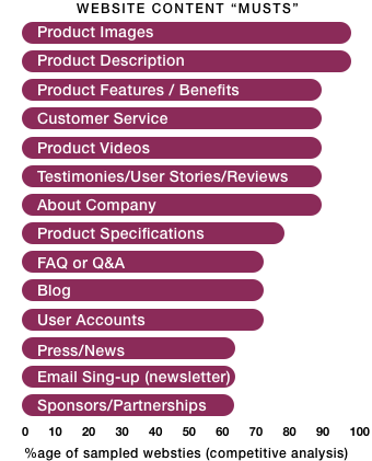
Based on our competitive analysis, we found that there were about a dozen features and items that we absolutely needed to include in the website redesign. These were features that over 50% of the websites we sampled in the competitive analysis included and highlighted. We believe that these features would both make Loro’s website competitive and meet users’ expectations for such a website.
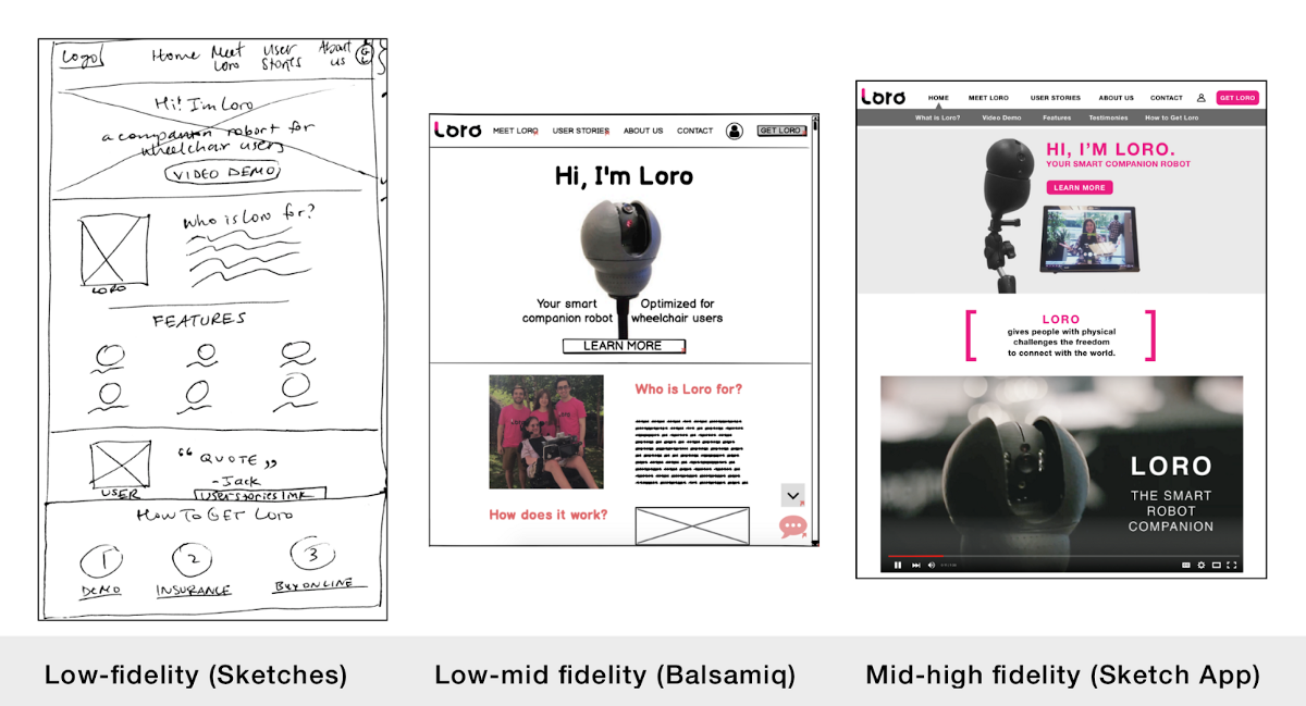
Naturally, as we were carrying out the research, we started to come up with ideas for both the website redesign as well as the app on-boarding experience. Using the basics of pen & paper, we sketched together to communicate our ideas. While my partner lead the app on-boarding design, I took ownership of the website redesign.
Days 4–7: Synthesis, Additional Research, Sketching & Prototyping
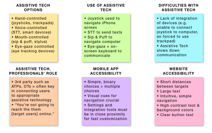
To synthesize our findings from the interviews, we jointly completed a round of affinity mapping and learned about which assistive technology potential users utilize and how, their difficulties with technologies, and the role of assistive technology professionals. From this, we were able to extrapolate general accessibility considerations, as well as specific web and mobile design considerations. For example, we learned that both the website and the mobile app needed to have large button targets for users that may be using eye gaze technology or even a stylus held in the mouth (in the absence of hand and finger motor strength and control) to navigate digital interfaces.
At the same time, we continued to read countless articles on inclusive design, accessibility, and assistive technology. As we neared the end of the 5th day, we began to be cognizant of a second issue: how would we organize our insights in a meaningful way in order to help us start designing the website and the app’s onboarding experience?
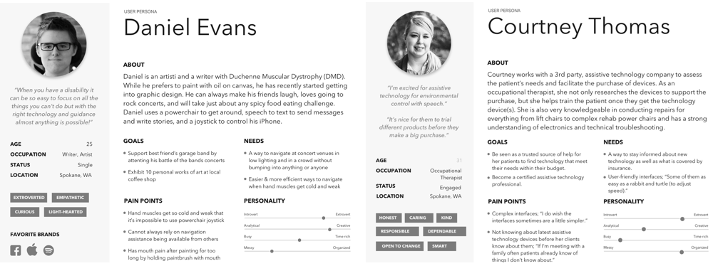
Having identified a plethora of insights, we decided it made sense for us to craft a customer journey map and a set of user personas to guide us as we began to design the web and mobile experiences. From our interviews and online research, it became clear that we had at least two sets of users: potential users of Loro’s product, and professionals responsible for researching and recommending assistive technologies to potential users. Since I had completed the majority of the research into and interviews with potential users, I created the user persona of “Daniel Evans”, a potential user of Loro’s product (including the app and the website), while my partner created the persona for “Courtney Thomas”, a professional operating within the assistive technology space and potential user of Loro’s website.
Following the creation of these personas, we conferred on what we created, discussed what this meant, and started reference our personas as we began the design phase. While Daniel was instrumental in helping guide my partner’s design decisions in creating the app, both of our personas were guiding lights for me once I got to work redesigning the website. As I started sketching and transferring my ideas to rough prototypes, I had to ask myself questions like “What would Courtney expect to find on Loro’s website?” and “How would Daniel navigate this website using a trackpad and speech-to-text software?”
In the meantime, my partner had come up with an idea for the app: what if we made the app and the on-boarding experience take the form of a hybrid between a chatbot and a personal assistant (not unlike Siri or Alexa). Instead of filling out a standard form, Loro would ask the user in a conversational way for information and introduce the technology in a friendly, personalized manner.
In particular, this idea spoke to the client’s wish for Loro to be “a smart, caring, playful, cool, and personalized companion for wheelchair users”. As we discussed the idea, we soon discovered that sketching was a far quicker way to communicate ideas than simply talking about them. This then morphed into a session of creating whiteboard wireframes of the first few screens of the app. The most challenging, yet the most rewarding, part of this exercise was having to adjust designs of a single screen at least half a dozen times to account for various user needs and accessibility considerations.