
Having a responsive website is a necessity for almost any business in 2016. As a designer, you’re always faced with the pressure to deliver quality results as quickly as possible.
Today we are reviewing some of the responsive design tools that will provide for a stellar user experience on multiple devices. These are the kind of resources that will help you design interfaces that scale from the smallest screens all the way up to the cinema displays. And do it fast.
1. Skeleton
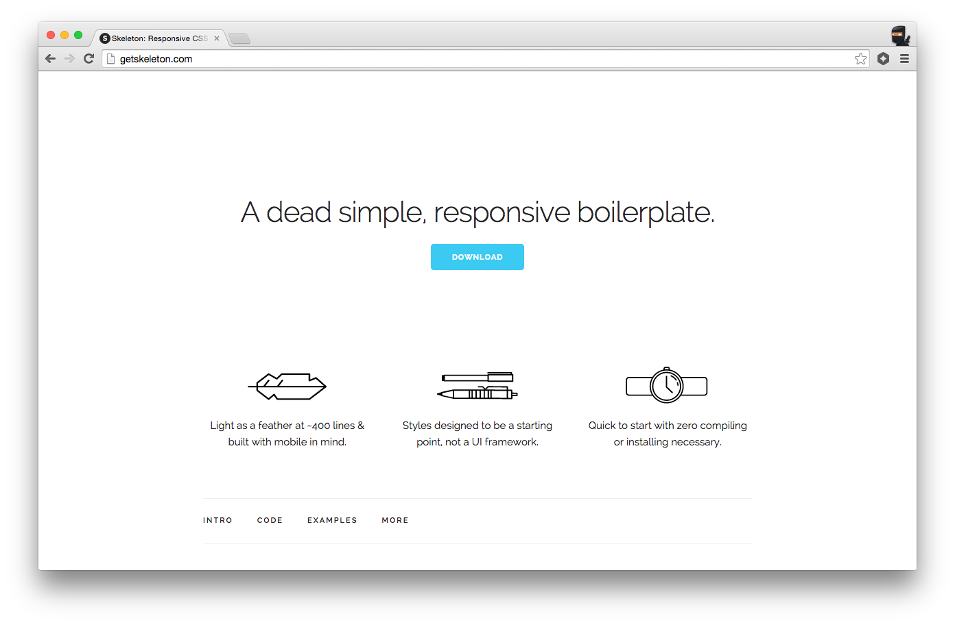
This framework is purely based on CSS and has gained a lot of credence in the field of web designing. The main reason for the popularity is that it does not require the developer to have a grasp of main core JavaScript. Using this tool one can easily and proficiently develop intuitive web designs.
2. Semantic Grid System
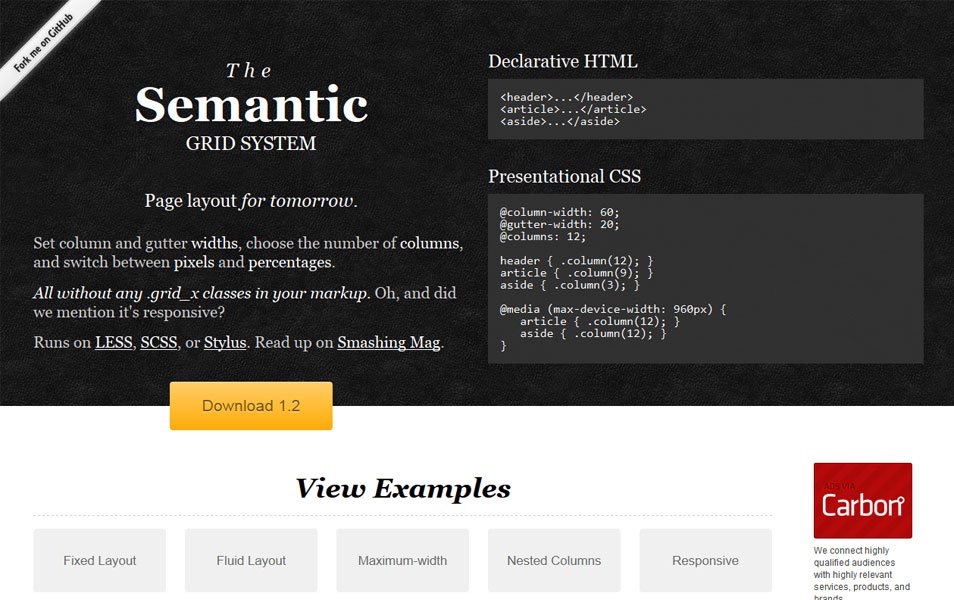
This tool serves as an excellent platform to create layouts for a responsive grid. It utilizes pre-processed extensions of CSS such as SCSS, LESS, or Stylus so as to render highly efficient designs. It allows the developers to select the width of the column and gutter, the number of columns and can also swap between percentage and pixels.
3. Adaptive Images
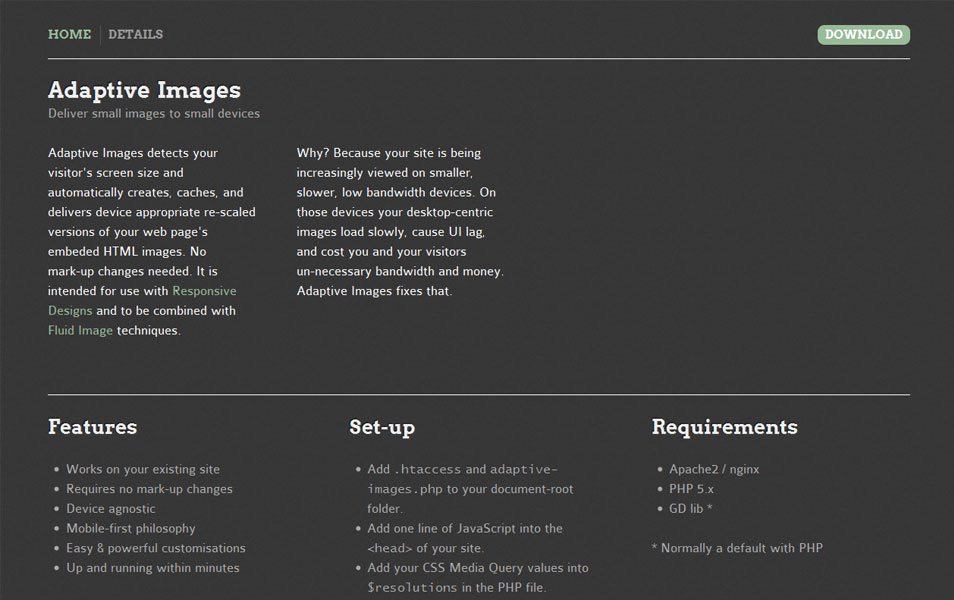
A technique can be to use Adaptive Images via integrating the technique of Fluid Image.
Moreover, you do not require markup changes and this also efficiently works on the scaling of the images displayed on your website and as per the size of the device screen on which it will be displayed. The best part of this tool is that it first reads the screen size of the visitors devices and then renders the image that is embedded HTML by the size of the screen.
4. Webflow- Responsive Web Design Tools
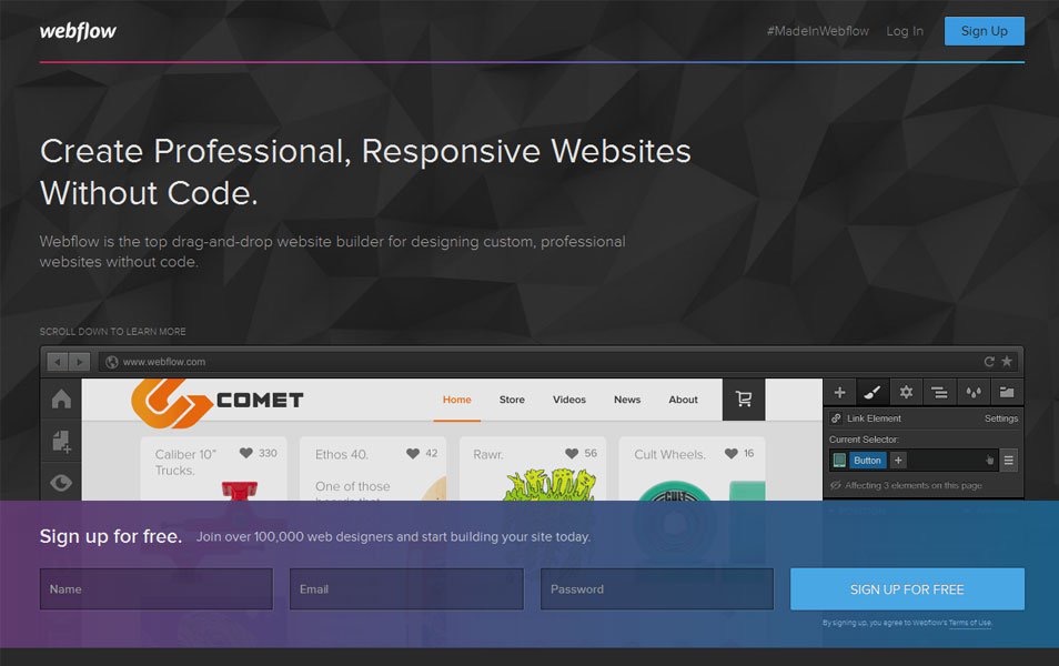
For those who do not have a grasp on coding can make use of Webflow, which is quite a simple tool for designing front-ends.
It allows the users to drag and drop the required elements to make a proficient website.
What it does is sends the code of the chosen elements to the coding end just like in Microsofts ASP.NET framework. Apart from this, it also renders you HTML and CSS, so that you can get your desirable design.
5. Inuit.css
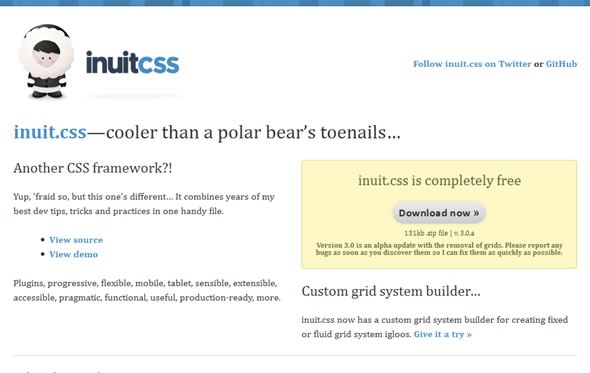
This is another CSS framework, which is designed to ease your designing process and even the rookies can handle them easily. The designer has designed it with minimalist design approach with focus only on the things that are required. Moreover, if you wish to extend the functionalities, you can make use of the plugins available for this tool.
6. Adobe Edge Reflow
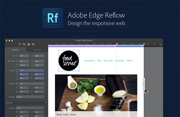
This is an amazing tool designed by Adobe, who has provided a great lot of design tools and not to mention the Adobe Photoshop.
This tool allows you to get into the intricacies and components of coding while creating your responsive web design.
The Adobe Edge Reflow is a tool which makes editing of your graphic quite easier, and along with that, it gives the leverage to the designers to work on responsive layouts with quite a perfection. The main purpose of this tool is to help the designers to work efficiently on media query handling, advanced CSS layouts, and grid systems.
7. 1140 CSS Grid
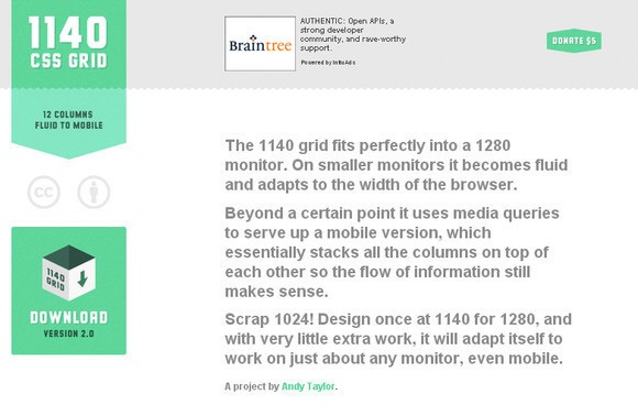
This is a wonderful CSS grid system that is created by Andy Taylor from Melbourne. It allows the designer that fits well at 1140px for big screen size and this layout will adapt seamlessly to other smaller screens without requiring any strenuous efforts.
8. Style Prototype
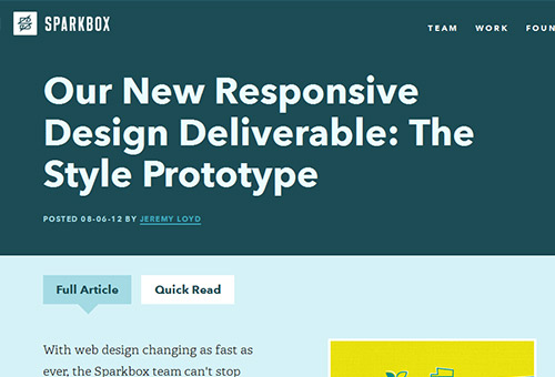
This tool has taken its inspiration from the Style Tiles and is developed by Samantha Warren, who is a designer herself. Style Prototype gives you the leverage to give a gist of animations, colors, typography, and other things. These all functionalities allow you to make sure it delivers satisfactory performance by your web design at the beginning of the project itself. This saves you from a whole lot of efforts that are required to make modifications in the future.
9. 1KBCSSGrid
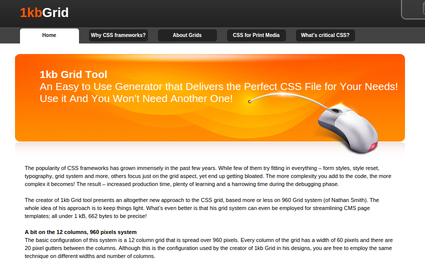
This tool is developed by Tyler Tate, and it is a quite a sleek generator of CSS Grid. 1kbGrid gives you the leverage to set your columns along with its width and also gutter width, and it also gives you a downloadable CSS to incorporate in the grid of your website.
10. Seamless Responsive Photo Grid
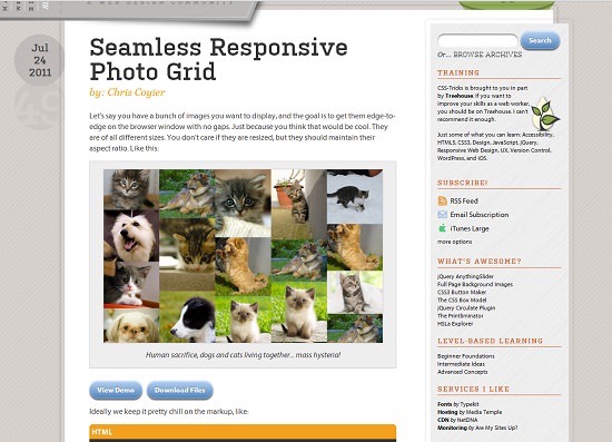
Those designers who wish to create a web design on a minimalistic approach that is one which is not much cluttered must opt for Seamless Responsive Photo Grid tool.
This responsive tool allows the users to display a group of responsive pictures aligned together without displaying any interstices in between the images.
11. Pears
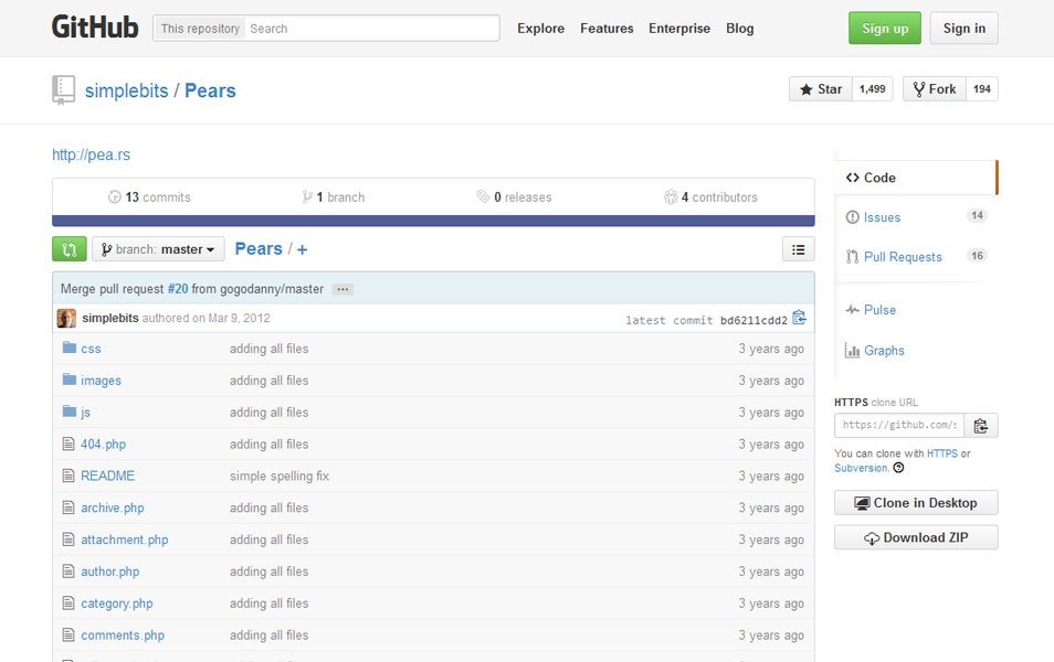
It is an open source theme which is for a huge WordPress repository, and this allows you to create a front-end design style of your own.
This allows you to perform the testing process quite easily, form a shared vocabulary, create an unfettered workflow and several other things. Using Pears, web designers have the leverage to a proficient design system and also have a chance to contribute to a shared pattern library.
12. Gridset
 /
/
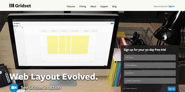
Developed by Mark Boulton, this is an incredible tool for creating grids of all the forms, for instance, ratio, asymmetrical, columnar, fixed, compound, responsive and others. Though still in its beta version, it seems quite promising. Moreover, the best part of this tool is that you can simply use it as an embedded link.
13. Bootstrap
This framework is developed by Jacob Thornton and Mark Otto. Those developers who wish to develop responsive web pages, can count on this efficient yet sleek front-end development framework. It offers an incredible JavaScript tools as well as web layouts and elements for the user interface. This intuitive tool which is available for free of cost can be used in a project to create an incredible web design easily.
14. Foresight.Js
The Foresight.js is a professional design tool for designing web pages that work on the concept of determining the device’s screen size and delivers a hi-resolution design only when the internet network of the user is strong. Web programmers and designers can make use of this tool to create an intuitive and alluring web design.
15. 320 and Up
320 and Up is a brilliant tool powered with CSS media queries. Designers can also use them as a starting template to get a responsive design. This boilerplate runs a reverse approach which is offered by numerous present in the market