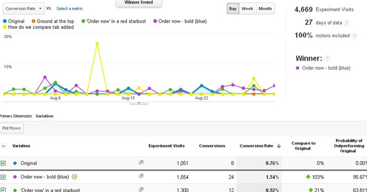
If you’ve kept up with design news the past 5-6 years then you should know about A/B testing. This is where two or more page designs are created and offered to a split percentage of visitors. Various metrics are tracked and designers can select a design style based on which features perform the best. It’s a wonderful technique for designers but does require some practice to fully understand.
These tips are geared towards designers who want to learn more about A/B testing as it relates to web design. Every designer is constantly trying to better himself or herself, but self-betterment takes work. You need to be confident with your existing skills and push forward to learn more about user experience design. A/B testing is just one of these skillsets which can improve your value as a web designer.
Layout Design for A/B Tests
Website design is always focused on the user. Interactive layouts are meant to be used, so the interaction should be swift and expectational.
After completing a new mockup design you’ll probably have doubts about certain areas. This is common and should be resolved through user testing – the most useful of which is A/B testing.
You can start by analyzing the layout for anything that doesn’t exactly serve its purpose. For example, take a look at individual buttons or input fields meant to drive attention. What can be done to increase visibility? What can be changed to get more people to interact with these elements?
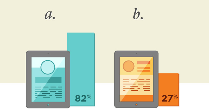
Illustration by: Philip Clark
It helps to understand some marketing techniques to combine with your keen sense of design. Elements that need to “pop” should stand out while others need to quietly blend in.
Figure out a couple different solutions to these individual problems and think about how to best fix them. You probably won’t come up with the perfect answer right away but you can at least put together a small list of possibilities.
How To Read Measurements
Each test will return different measurements based on how many changes were made. This also means the total number of days required for accurate tests results can vary wildly.
But in general, A/B tests are simply counting the percentage of certain actions taken by visitors. Two(or more) different layouts are presented at random to your regular audience. These people don’t know about the test since they’re only seeing one type of page.
Your goal is to witness an increase in the number of visitors who perform a certain action. This action could be anything from more user registrations, to reading for 5+ minutes, or increasing product sales.
![]()
Illustration by: Daniel Máslo
Take a look at this free duration calculator to get an idea of how long your test should run. This amount will vary based on how many differences are used in your design. Each platform will display results differently, but you should mostly be concerned with percent-based increases.
Debug and Solve UX Problems
The whole purpose of A/B testing is to debug potential issues within a design. You’ll want to determine which changes could be made to the interface to improve retention rate, or to increase clicks on a call-to-action button.
Before getting into split tests it’s a good idea to analyze the design in private. Consider which features may not work in legacy browsers, or which features may require backwards compatibility. Could these features affect retention rates?
A/B tests should be used when you’ve exhausted a design mockup and don’t know what else could be done to improve performance.
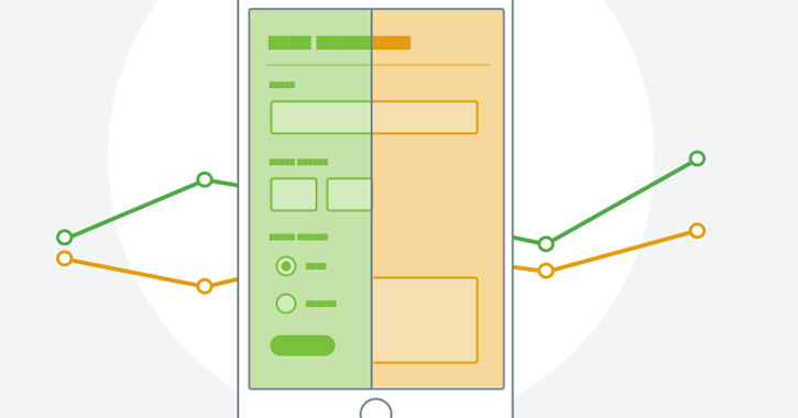
Illustration by: Aaron White
Aside from the actual split test results you might also try sharing your website with a small group of people to gather their opinions. This is a great strategy because you can walk away with some newfound info from a person(or people) who didn’t plan on sharing their ideas.
Debugging a design is not an easy task. It requires patience and continual feedback. When you’ve been designing something for days or weeks it can be hard to see the flaws for what they are. Take a break from your design and step away for a couple days to refresh your eyes.
Also don’t be afraid to check out what other websites are doing. You can learn a lot by studying UX techniques running on other websites in a similar niche.
Tips for Coaxing User Interaction
Some of the most common layouts for A/B testing are landing pages. These designs are meant to coax action from a visitor whether that means downloading an application or signing up for a newsletter.
It’s not easy to draw attention to certain areas of a page. This often requires some finesse and clever design ideas like icons, new flashy colors, larger text, or in rare cases rearranging the whole page. But don’t let design ideas cloud the main goal. Stay focused on what you want users to do and let the website’s design guide the user.
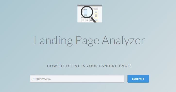
Visual Website Optimizer has a landing page analyzer built for this exact situation. You can gather some basic results for CTA buttons, banners, and important links.
But also keep in mind that not every user is expected to follow a marketing funnel. Social networks and forums may want users to post and reply more frequently. A/B testing can present two alternate designs and see if either one increases user activity.
The best tip for gathering helpful results is to know what you want. Understand the goals of each project and use well-crafted design to increase those goals. Numbers don’t lie so if you’re tracking A/B funnels then you’ll end up with verifiable data proving which design ideas are more practical.
Best Tools & Resources
Along with the previous tips I’d also like to share a small collection of tools for A/B testing. These tools are perfect even for designers unfamiliar with the process. A/B split testing gets a lot easier the more you spend practicing and researching.
Check out each of these suggested sites to see if their features match up with your goals. A/B testing can be great for client projects and even your own personal work. Just remember that in order to gather results you need to actually test valuable metrics.
Visual Website Optimizer
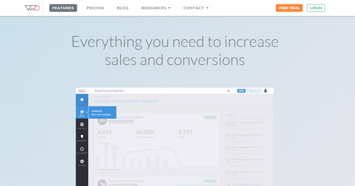
Designers and developers looking for a split testing platform should look no further than Visual Website Optimizer. Their website is full of case studies, how-tos, and intro guides for those just getting started. VWO has been online for years and provides an exceptionally high-quality service.
Dig into their features page which covers everything from A/B test integration to tracking statistics in the user dashboard. You’ll be able to check out which designs perform better based on your own custom metrics and even view the data in graphs or heatmaps.
Optimizely
Another credible online solution is Optimizely. Their platform is a little more complicated as it doesn’t just specialize in A/B split testing. You’ll be able to track analytics from any website or mobile app to see which areas pull the highest user interaction. You can also test how long visitors stay on each page and check to see if different interfaces alter these results.
Optimizely actually has a free plan with limited testing features. This could be a reasonable starting point for anyone who just wants to break into the world of UX tracking & analytics.
Unbounce
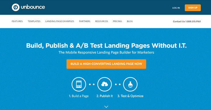
Unbounce is used much more by marketers and webmasters who don’t have a lot of technical knowledge. The platform isn’t just made for split testing, but also for launching websites and custom templates. You can build a simple landing page from scratch without any code and still gauge user reactions from different design traits.
This probably won’t be as useful to a professional designer but it’s still an option. Take a look at their A/B Testing page which includes more specific information regarding how the Unbounce platform works.
Google Experiments
Perhaps the quickest and cheapest solution for a newcomer would be Google Experiments. This is a free built-in split testing feature which runs through Google’s Analytics platform. You can find a lot of great info regarding the benefits of testing and how the results tie into your website.
You’ll want to have some familiarity with Google Analytics before jumping into Content Experiments. If you’ve never used their platform before this may present a steep learning curve, but it’s well worth the effort if you’ll need A/B testing in the future. Those who want to get started might try following along with this tutorial covering Google’s Experiments platform in great detail.
Final Thoughts
Web designers have also been pushed towards the role of developer and now even marketer. But this isn’t necessarily a bad thing because A/B testing can help you improve your design techniques. If you follow along with these tips and resources you’ll be running influential split tests in no time.
For more useful tips, check out:
Vandelay Design

