Documentation is instrumental for concepting, designing, creating and measuring the performance of products. But it shouldn’t be done just for the sake of maintenance. After all, there’s nothing about a thick stack of paperwork which resembles the experience of your real product.
As Lean UX advocate Jeff Gothelf describes in a piece for Smashing Magazine, thick deliverables created simply for future reference regarding the user experience become obsolete almost as soon as they’re created. In today’s Lean and Agile world, the experience should be the focus — not deliverables. Whether you choose lightweight or more detailed processes, the key is that your documentation should help move the design forward (rather than being just a lagging indicator).
The following is an overview of product design and development documentation, individual elements, and the respective phases to which they belong. Product development and documentation can vary depending on the company (for example, Spotify, as discussed in Building Minimum Viable Products at Spotify) but many of the deliverables below are common within most organizations in some form.
We’ve chosen the methods that we think work best, but feel free to pick only what works.
How They All Relate
When it comes to product design documentation, theory and practice are two very different things. We all know basic tenets of user-centered design. We recognize different research methods, the prototyping stage, as well as the process of documenting techniques in our rich methodological environments. The question you probably often ask yourself, though, is “How does it all work in practice?”
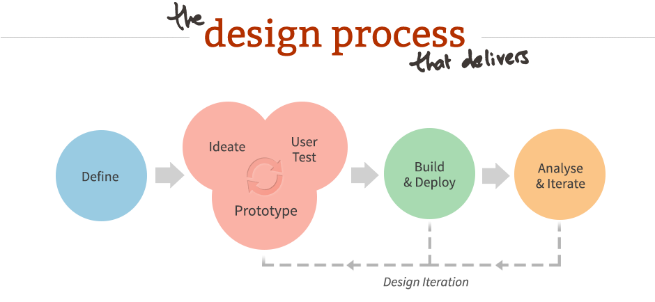
Image Source: The Design Process.
Simply put, it’s all about making documentation complementary rather than supplementary to the design process. Before we go into detail, it might help to take a quick birds eye view of documentation during product design and development. Below, we’ve given a practical explanation of how every step of design documentation ties together:
- During the initial phase of product definition, you’re brainstorming the product and how to execute on the project at the highest level with all necessary stakeholders. This might result in project kickoff plan, a lean canvas, and a bunch of really early concept maps and mockups of what you’re looking to build.
- Moving into research, your team refines assumptions and fills in the blanks. This stage varies based on complexity of the product, timing, resources, level of existing knowledge, and many other factors. In general, however, it’s good to build out competitive and market analyses and conduct customer surveys. If you have an existing product, reviewing analytics, heuristics, content, product context, and user tests are also quite helpful.
- In analysis, the product marketing data collected so far provides the foundation for personas, experience maps, and requirements documents such as prioritized feature spreadsheets and user-task matrices. At this point, the product definition, product priorities, and product plan has been defined and are ready for more formal design deliverables. As discussed in the Guide to UX Design Process & Documentation, sketches and diagrams are also likely constantly being generated throughout this time.
- From this output, scenarios, concept maps, and mockups may be created, leading into the design phase. Common documentation includes sketches, wireframes, prototypes, task-flow diagrams, and design specifications. For example, competitive analysis and personas created during research and analysis feed into the mockups, concept maps, and scenarios. In turn, these pieces influence intermediate and advanced deliverables such as wireframes, storyboards, and detailed mockups. Some companies treat the Research, Analysis, and Design phase as one large process, as you can see in this overview graphic.
- During implementation, code and design assets are assembled to create a product that follows the product design specifications.
- Upon launch of the live product, feedback data such as support tickets, bug reports, and other analytics continue to drive product refinement through subsequent iterations, and upgrades. With the offering in production mode, data should be continually generated and monitored in the form of analytics and reports to ensure continued success.
- Continual, data-driven product improvement is achieved through measuring and iterating the offering in production, using performance dashboards and analytics.
Guiding Principles
Now that you’ve seen how each stage is connected to each other, let’s look at some helpful principles for moving the product along each stage. We’ll explain how to use design sprints so that the process evolves over time instead of being defined only in the beginning.
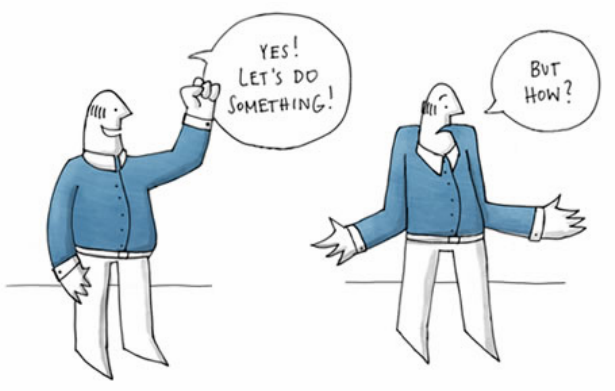
Image Source: Source: User-Centered Design.
Similar to its Agile software counterpart, design sprints are 1-3 week sprints that focus on solving specific product and design issues.According to Alok Jain, UX Lead at 3Pillar, the three key elements to design sprints arecollaboration, reduced handover friction, and team focus . In a nutshell, your documentation is a collaborative effort that must always focus on the user itself. Because you move quickly between each stage, you build momentum and minimize waste. More importantly, you’re tackling smaller problems which allows for more exploration and risk-taking.
An extremely lean version of the complete cycle can be found here, but we’ll describe in detail below how to apply this thinking as you understand the product, design the product, and release and improve the product.
1. Understanding the product
Before you can build a product, you need to understand its context for existence. Why should stakeholders, the company, and the users care about moving forward with your idea?
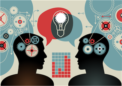
Image Source: Achieve Shared Understanding.
According to Smashing Magazine, you need to include activities that address business requirements, user requirements, and the best design solution to satisfy both. The keyword here is “activities”, because while documents like the Business Model Canvas and Lean Canvas are important, you need to energize stakeholders — otherwise you just have a bunch of expensive people talking about stuff everyone already knows. These activities are efficient and invite collaboration:
- Stakeholder interviews — Using this template, you can have each team member interview 3 stakeholders. How will the product make customers feel? What should they do? By recording how stakeholders think customers will think, feel, and do, you’re setting a benchmark to compare against usability testing and user analysis.
- Requirements workshops — Get stakeholders together, discuss the project plan, and start discussing how concepts feed into product and
technical requirements. You can start with a blank Business Model Canvas or Lean Canvas and complete it with the team. - Crazy 8s — Grab some markers and get everyone to sketch 8 product or feature ideas in 5 minutes. Have everyone score each idea, and
you’ll start to see trends and preferences. This was actually Step 2 in the redesign process for Google Ventures. For additional ideas, check out this list of brainstorming activities.
Once you’ve laid out the groundwork, talk and test with tons of users so you have real field data for research and analysis.Marcin Treder, CEO of UXPin, dove deep into customer development and usability testing after identifying the problem and scope. Back when UXPin was just a paper prototyping tool, Marcin documented (on paper and video) over 50 user interviews and in-person usability tests with UX superstars like Brandon Schauer, Luke Wroblewski, Indi Young and others. The product team then used these insights to create personas, write dozens of user stories, and eventually, outline the product requirements.
At Amazon, an alternative “working backwards” approach is used in which the first step is drafting an internal press release for the finished product. This approach helps to work backwards from the customer, rather than trying to bolt customers to an idea. By iterating the press release until it sounds appealing, the product team gets an immediate reality check as well as a quick benchmark document for later design and development.
2. Designing the product
As discussed in the Guide to Minimum Viable Products, once you have a sense of the
product purpose, your main goal is to build a prototype. Whether your team likes to draw on napkins, create high or low fidelity wireframes, you should ultimately end up with something functional. What’s unique about this stage is that for most of the deliverables, the documentation is the design.
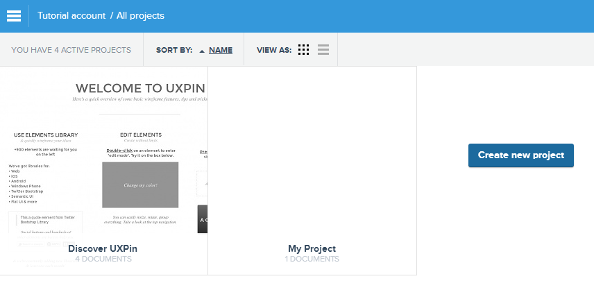
Image Source: UXPin.
According to Cennydd Bowles, Design Manager at Twitter, the product team should research two iterations ahead, design one iteration ahead, and review the previous iteration. If you’re trying to stay Agile, he advises diving straight into low-fidelity prototypes as a way of prioritizing “interactions over processes”. If you want to get a bit more detailed but still want to stay somewhat lightweight, you can start with concept maps or sketches, then iterate to low-fidelity wireframes, and finally create a high-fidelity prototype. Regardless of your method, make sure you test with stakeholders and users.
If budget and timing allow for it, you can also create experience maps to highlight where the product meets or fails user needs and task models to provide insight into activities users perform to reach their goals. While these aren’t part of the design, they are complementary since you also need to see where your product fits into mind and market. Interestingly enough, Yelp takes their design stage a step further by creating a style guide that includes common lines of code, allowing the documentation to literally be built into the product.
At UXPin, our process is to hold a group sketch session with sharpies on gridded paper, then cull that down to a few wireframes, and then add detail until we have a high fidelity mockup. If user testing is involved, we will build the mockup into a high-fidelity prototype. For large feature releases, we conduct extensive user testing so the ratio is about 70/30 in favor of prototypes.
3. Building and launching the product
As you start to do the heavy technical lifting, it’s important to create documentation that helps you see the overall vision. Specific requirements may change as you refine the product, but your documentation should help you understand priorities as your product goes into the wild.
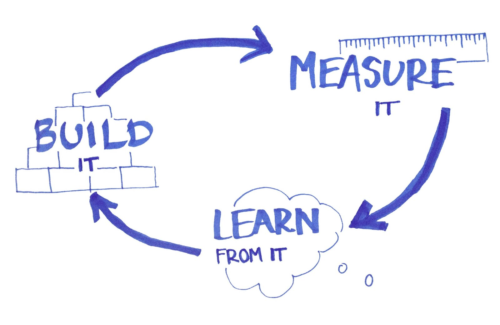
Image Source: The MVP Campaign.
Kristofer Layon, UX Manager at RedStamp, believes that you can visualize product requirements and technical specification documents as a roadmap. The product road map shows user stories and helps prioritize the features you’ll build to satisfy them. Sometimes, specific dates may be added into the roadmap so that it also works as a timeline. The elegance of the roadmap is that helps you prioritize what you’re building, making it complementary to the “how” defined by your product requirements and technical specs. When deciding features, you can use the Kano Model to evaluate them in 3 categories:
- Basic Attributes — These are absolutely required just for the product to work. For example, a laptop’s basic attribute is the keyboard or screen.
- Performance Attributes — These can be compared between different products as a KPI. For example, a laptop is judged on CPU speed and hard drive space since people tend to prefer fast computers that can store lots of data.
- Delightful Attributes — These are subjective depending on customer preferences. For example, the Macbook Air is extremely thin and smooth to the touch. The right customer would find it a great selling point while others are unimpressed.
By scoring features on a 1-5 scale based on this model, you can then plot them out on a prioritization matrix to help you start envisioning what your product roadmap will look like. At Apple, the “Rules of the Road” and “Apple New Product Process” serve as the product roadmap by defining responsibilities, stages of creation, and significant milestones from inception to launch. In fact, the Rules of the Road is taken so seriously that losing it can result in immediate termination (it’s even stated in the document).
4. Improving the product
As you build (and ultimately launch) your product, the documentation also needs to focus on defining and tracking sales and other KPIs. After all, you can’t improve the product if you don’t know what metrics you want to optimize.
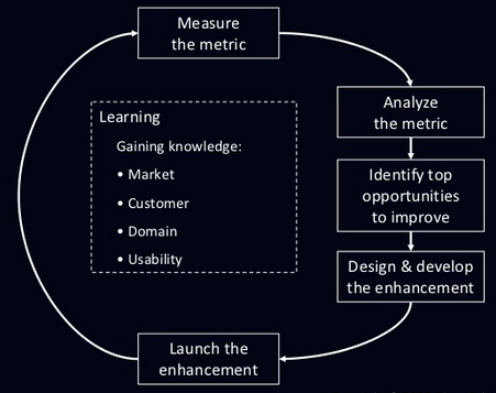
Image Source: Product Management by Numbers.
Dave Daniels, Founder of LaunchClinic, advises that you write down the launch goals (e.g. 30,000 downloads in 30 days) and verify that you have the right tools to document progress. Using metrics tools and bug reporting software, you can set up recurring reports to keep tabs during the first few weeks of launch and beyond. On the customer side, you can also segment users and send them custom surveys to gauge where you may want to iterate.
At Spotify, the iteration phase is the longest stage of product development. The product team uses current metrics and prioritization matrix (likely created during the Design stage) to weigh benefits vs. effort of improving certain products beyond their “local maximum”. If they determine the effort is worthwhile, they will then return to the Definition stage to revamp the product for it’s “global maximum”.
Objective Processes In a Subjective Environment
When it comes to product design documentation, there is no single magic bullet. Almost all companies that use our product employ bits and pieces of the tactics we’ve described above. While product development and UX design are highly subjective spaces, your processes and documentation don’t need to be. After all, the end goal of a product is revenue, and there’s nothing subjective about that.
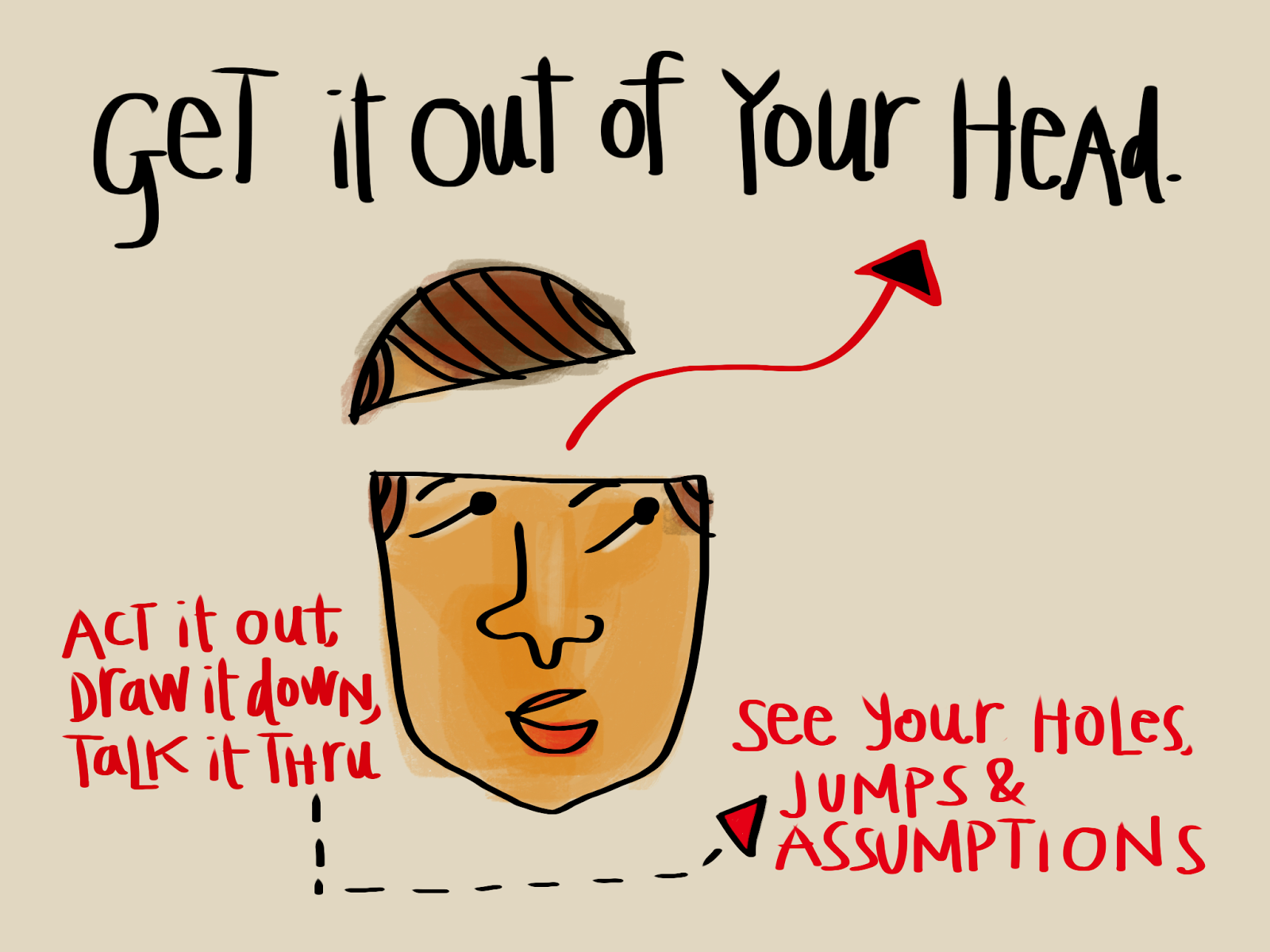
Image Source: Design Process Notes.
Whether you go lightweight or prefer more detailed documentation, the goal is all the same — get it out of your head and onto paper (or the screen) so your team can interact and react. Documentation should be a compass for the product, not rules carved in stone. Some of the stages we discussed may happen in slightly different order or even parallel, but they all exist to provide method to the madness. Use what works, scrap the rest, and evolve your documentation as your product evolves.
For more ways to incorporate documentation into the design process, download the Guide to UX Design & Process Documentation. Expert advice is featured from Aarron Walter, Laura Klein, Ian McAllister, and dozens others. Visual examples are also shown from companies like Vurb, MailChimp, Apple, Google, and many more.
