
Professional designers incorporate many different ideas related to composition. One of the lesser-discussed but vitally important ideas relates to symmetry. This is the process of adjusting page elements so that they align in exactly equal parts.
Creating a layout using balanced symmetry aligns certain elements together into groups. There is also value in using asymmetry to stand out against other page elements. Both techniques are valuable in web design and should be used accordingly.
Heading & Navigation
There’s no doubt that a website’s header is one of the most important areas of the entire page. When new visitors land on your website their first impression will be created based on the header and overarching layout.
From the top of the page visitors decide if they want to continue scrolling to read more. Incorporating a balanced header design into a layout improves the chances of an easier browsing experience and gives off a more professional vibe.
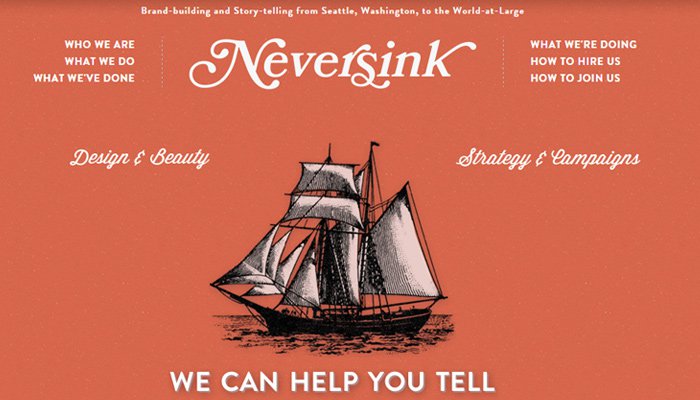
Looking at the top navigation for Neversink you’ll notice an interesting pattern. The central logo behaves almost like an anchor point for the header while navigation links are more symmetrical. The symmetry is actually created by surrounding this central logo with similar fonts, colors, and spacing.
What I like most about this heading is that it’s simple. You can recognize it from any page and you never feel lost browsing through the site.
A good balanced header will always be right where you expect it to be without any funny business.
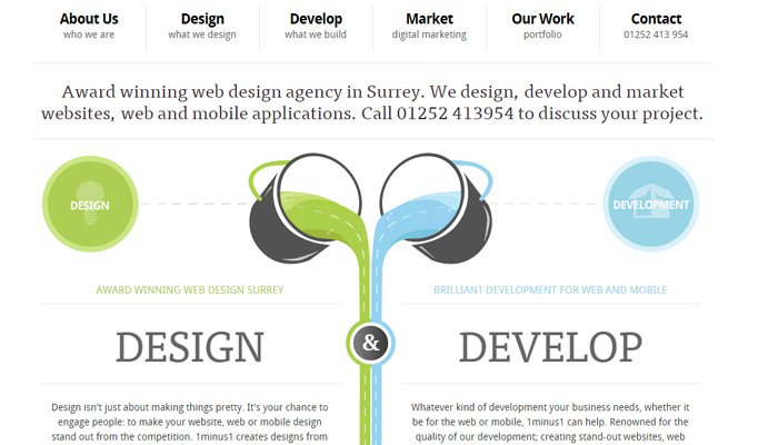
Also take a look at the agency homepage for 1minus1. Their layout incorporates both horizontal and vertical symmetry starting at the navigation bar.
Links are spaced horizontally in a similar fashion using the same content style. Then scrolling down the page you’ll notice two vertical sections aligned beside each other – one explaining design while the other details development.
There is naturally some asymmetry to be found, but primarily this homepage feels symmetrical. It gives a sense of completion; a general feeling of being “whole”. Websites that focus on balanced symmetry can give off a more professional look by keeping the page content readable and somewhat predictable.
In-Page Elements
Most websites are built around typography but also feature elements in various locations. These elements might be call-to-action buttons, feature lists, or graphics related to the content. Symmetry will help to blend these elements into the page with a more natural balance of whitespace.
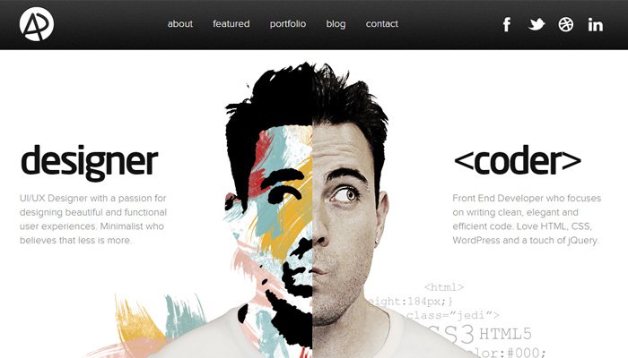
One colorful example can be found on the portfolio website of Adham Dannaway. His homepage uses a dynamic photograph split down the middle – half is the creative and colorful side while the other half is more of an analytical developer persona.
Both sides of the photo lead to individual pages which go into detail about each skillset.
This is an interesting combination because the photo itself is just one image. But the way it takes up the page is by creating two separate pieces of the image which lead to different areas in the page. Symmetrical content should be balanced and usually has a series of alternative options rather than just a single link.
Another similar example can be found on the Hostoople homepage which has a series of pricing tables. There are 3 tables listed with only 2 using a blue header bar. The central pricing table uses a yellow-orange header to stand out among the options.
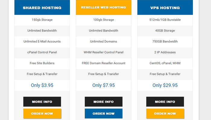
In this way symmetry is created through alternating color values with equal spacing. Table structure is almost identical so the differences lie primarily in content.
Typography Setup
All websites are created with some form of typography. This is seen as the backbone of information sharing via the Internet since anyone is capable of creating written content.
As a designer it’s important that you imbue a sense of symmetry among headings, paragraphs, and page links. Note that a paragraph in the main layout will probably have a more diverse style compared to a paragraph in the sidebar or footer area. Typography is malleable and easily adapts to new page sections like a chameleon.
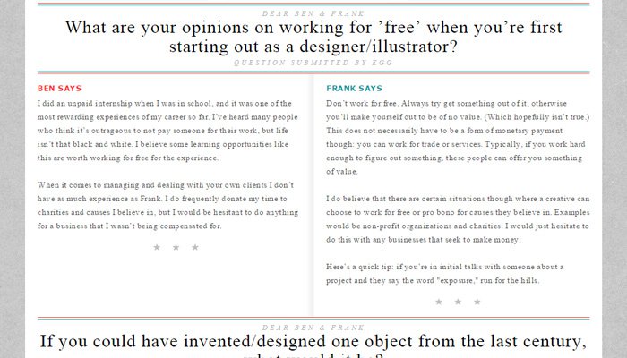
The Questionable Characters homepage uses a series of two-column paragraphs. These are actually questions & answers from readers and they’re split down the middle to draw attention.
Notice that many features in the layout seem to operate on duality. The layout is split down the middle and typography ranges from compact to grandiose in font size. Most websites should avoid following a two-sided layout, but this can be useful to ingrain a symmetrical look.
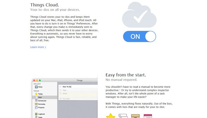
Another really cool example is the Things for Mac landing page. All navigation links are organized on a horizontal bar with easy-to-read text. Most of these links are small compared to page content which is considered much more valuable.
Then as you scroll down you’ll notice that features are balanced in a symmetrical pattern. One side of the page has some content and next to the content is an icon or graphic. The content & graphic alternate between the right/left side as you scroll past each feature.
It may seem odd but typographic symmetry can be created with graphics or additional page elements. Stick to design patterns that work well in the layout and keep attention focused on content.
Footer Symmetry
Designing a great footer is hard work. Although symmetry is a design tool it’s just one of many in the toolbox of high-quality footer design. It’s really difficult to give specific advice when it comes to footers because some companies only need 4-5 links while others need over a dozen.
An important point to remember is that footers are not set in stone. You can make them timid and out of the way, or you can make them a large part of the overall layout. It depends how much content needs to squeeze into that section of the page.
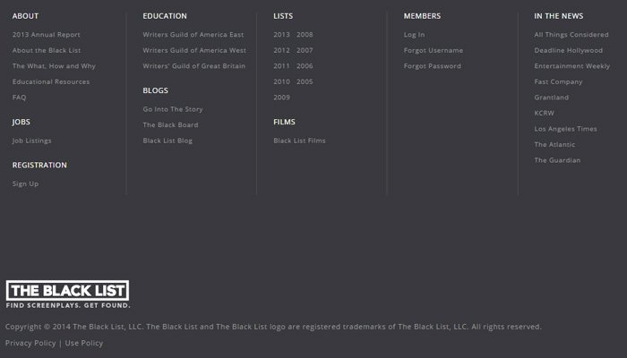
One example of a larger footer can be found on The Black List. Their footer is tall vertically and uses vertical lines for column spacers.
The Black List’s footer layout is quite interesting based on these horizontal link columns. Large corporations and startups often prefer this style because it saves room on the page while offering plenty of space for required links.
What draws my attention to this footer is the use of whitespace. Extra space is added between links and between columns, along with extra space above the copyright info.
If your footer is somewhat larger try to incorporate plenty of whitespace. An even amount of space in any footer gives off a natural impression of symmetry.
And since the footer isn’t generally considered a location for prime content, you’re free to experiment with font sizes and line-height values in search of the perfect whitespace value that works for your project.
Closing
Unfortunately there is no way to make a designer fully understand symmetry without practice. It’s very similar to driving a car where you can read and study for weeks on end, but nothing can beat real-world experience. So if you want to improve your layout compositions get out there and keep building websites. Over time you’ll learn how to match symmetry using typography, icons, and distinctly creative page elements.