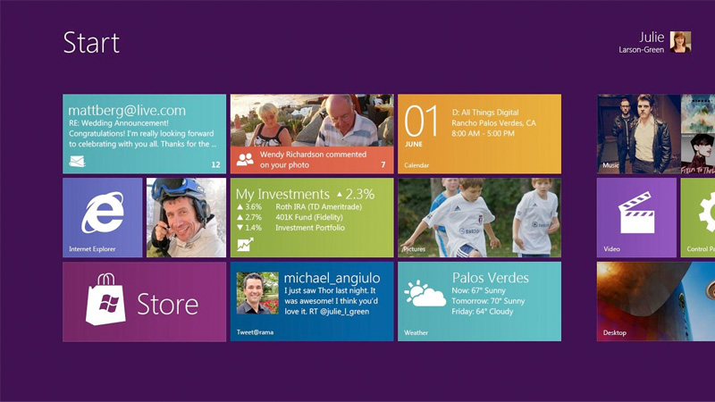
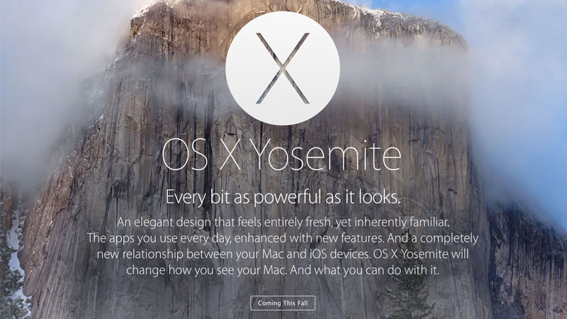
Flat design has made a huge name in the designing world by completely taking over the graphic design in a short period of time. The biggest interface to go flat was Windows 8 but, it was also left behind when Apple released its iOS 7 in summer 2013.
With the launch of Apple’s iOS 7, there was a huge increase seen on website interfaces, and applications. Before then, the majority of web designs were based on Skeuomorphism that included various 3D effects, gradients and unique textures.
The look of flat design is very trendy and modern which is why it has been getting a huge buzz in the design industry for the past few years. However, not all the marketing buzz is positive because many users are not satisfied with the look of ‘flat design’ and they don’t hold in with this trend either.
Jakob Nielson, co-founder of a user experience based research company Nielsen Norman Group calls it a ‘fashionable design’ that is hurting many companies and users all around the world. People have now started to think that flat design is becoming boring and similar.
Therefore, design that is being criticized on a huge basis needs to be examined carefully. All the designers related to user interface and user experience need to proceed with caution while creating flat design for their websites or applications.
So should we completely avoid using flat deign? The answer is a big ‘No’. Although flat design is getting some bad reviews, it certainly has more good attached to it. Therefore, we cannot just drop this trend and move to another one.
In today’s post, we will take a close look at the flat design trend to find out why many people are finding it difficult to carry on with. Also, what can be done in order to work against the problems of flat designs? Let’s start with the meaning of this term ‘flat design’.
What is flat design?
Flat design is a very classy and flexible image of what we know as minimalism. Flex design can look more interesting and stylish when created within the parameters of minimalism. However it can also create complexity because of the sharpness and clarity.
This kind of clarity that we see in flat design can only be achieved by eliminating the 3D effects from websites or applications. There are two basic objectives of flat designs:
- Assuming the actual limits of the screen size and working according to it rather than trying to cover up everything.
- Making everything as simple as possible in order to make websites faster and more reliable for users.
The overall purpose of flat design is to serve users with a design that is simple, minimal and offers a clear perspective. It is very hard to argue a case that is against flat design. You will see everything in the designs that are based on the flat design concept.
Flat design includes everything that is simple and minimal. It uses low contrasting color combinations that are easy on human eyes. Sans serif fonts being the most popular create a unique feel and clarity for users.
Eliminating all the unwanted elements from a website leaves us with only what is important to the website and users. The most important things that we as a user need to see on a website include colors, shape, and the content.
This technique presents a very effective method through which both minimalism and simplicity can be experienced. Minimalism is also gaining popularity because most users are now converting to mobile sources for logging in to their favorite websites.
What is the Idea behind flat design?
The idea of flat design is very simple; it allows users to understand about the functions of different buttons and important elements without the need of real-world appearance. Anyone looking to design a website can concentrate more on the important aspects in flat design.
Is flat design hurting usability?
The one big problem that flat design seems to have is the ongoing battle with usability. Adding minimalism in order to provide a more simple and user-friendly design is a very good thought. But, going too minimal can start to create issues related to usability.
For example: The iPhone control center is way more than flat, it sometimes gets hard to tell if any of the icons are buttons or not. The common complaint about flat design is that it is very confusing to the users who visit the site.
iPhone Control Center Interface
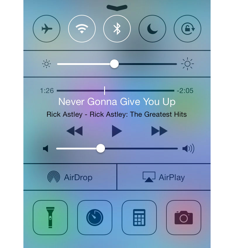
Interface and websites can become very disturbing for users when they don’t have any kind of visual clue for defining which icons are buttons. The flat design that was created by Windows 8 was especially built for tablets because the interface was based on touch screen.
However when it was launched for desktop users, many people were facing troubles in learning how to properly use the interface. People were complaining about not finding their files due to the poor navigation, icons are poorly placed and don’t look like buttons.
This simply concludes that everything is about usability now. No matter how good the minimal design is; if users are not able to properly navigate on the website, the design is a total fail.
This is where we see a little danger for flat design. Everyone admires the beauty of flat design but this can also lead designers to a trap that will destroy their design objective. Flat design can be very tricky if you don’t consider these major problems while designing it!
Too much minimalism
The philosophy behind flat design is to apply the Swiss style of design on the web. This concept gives a heavy emphasis on applying minimalism among all things. There is nothing wrong with a minimal design when it comes to serving clean and simple websites.
Also, minimal designs lower the stress on low power systems and devices when loading any particular website. Therefore, it becomes easy to cross the line where minimalism loses it worth and starts to look boring and dull to users.
Let’s start with an example of a website mnmly. In this website, you would expect the person to showcase their talent through different images. But, you will see an ultra-minimal design that is lacking some creativity. Colors are simple, and the site only explains what the person does.
Although, it fulfills its purpose but it surely doesn’t inspire us about the talent. That is only a single website among plenty of others that are making the same mistake. Adding too much minimalism will only lead you to non-creativity.
Mobile first design – Excessive emphasis
The great thing about flat design is its accommodation for mobile devices. According to a recent survey, more than 28 percent of web traffic is now generated through mobile. So, every designer will obviously make sure that their website is fully responsive.
As mentioned above, flat design works on the minimal concept and drops the heavy graphics and all the unnecessary items so that it looks like a complete simple design. But, the majority of designers have forgotten that most prople are still using the web through PC.
A very good example is, again, the Windows 8 interface. Microsoft wanted to create a unique experience across all the devices. They totally utilized their ‘Metro’ interface on the mobile, tablet, Xbox and also on the PC. The Metro interface was a huge hit on mobile and tablets.
When it was launched on the PC, it was predictable that people would either love it or hate it. There are many off screen gestures and on screen gestures that are more suited for the touch system than a mouse. So, Windows 8 became the total opposite experience for PC users.
The majority of websites have started to design a similar interface to Widows 8 in order to give the same experience over all devices. But, unfortunately that experience looks more superior on one device than on the other.
Fear of Being Left Behind
With this much success, everyone seems desperate to join the flat design trend so that they are not left behind. The flat design trend is so popular now that your website might be called ‘old fashioned design’ if it is not running on a flat design.
This is why; it is no surprise that everyone seems to be interested in making their websites and applications according to flat design. A huge rise has been seen in the generically designed sites that are based on the flat design parameters.
Designers are not taking any kind of creativity risk when designing a website and look like they are comfortable with using the same style as everyone else. This mentality is without any doubt also changing the core concepts of creativity and innovation.
People fear to change and want to play safe like all others. There is no need to change anything when everyone is extremely happy with flat design. But this mentality is strongly hurting the creativity that was once the major factor of any website.
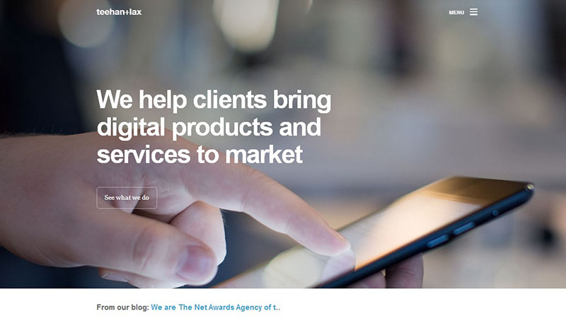
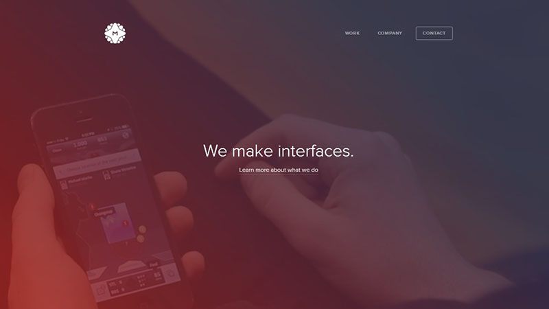
For example: The two websites Teehan+Lax, and Meta Lab Design are among the two top web design agencies that everyone expects to be full of creativity. But there is nothing creative on their websites; instead both the websites look similar when it comes to the visuals.
The placement of all the elements are very similar, even the company logo and down to the menu options are similar to each other. It seems like the templates are slightly customized in order to give a different look but nothing has been done in terms of creativity.
Will this popularity become a downfall for flat design?
There is no doubt that great flat design is always eye candy to look at. And with so many people being happy with the design, we can safely say that this design is not a fad. The only big issue that we see with flat design is linked with creativity.
We are in a situation where creativity is being kept quiet and more preference is given to the templates that will do the job. More and more sites are becoming generic and usability is not given the importance that it deserves because flat design is doing the trick.
There are two major reasons for which flat design is becoming more famous on the web:
- People are only following the trend that is inevitable when new things are introduced.
- The need of gradients, textures and shadows are reducing in the user interface.
People seem to be happy and comfortable with the devices that they are using. This is because it doesn’t feel like something they are not familiar with.
What’s the solution?
There is no doubt that flat design can provide users with a more pleasant experience. But, the real problem comes when flat design becomes too minimal and doesn’t involve any visual clues that will help the user to identify what the particular element means.
This is why we are seeing a new user interface for the Windows 8.1 where Microsoft allows users to get rid of the modern user interface and use the new desktop version of Windows. The look is now completely different and feels more alive.
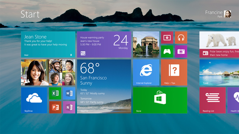
Plenty of websites have also started to use effects such as highlighted text which can be easily seen and clicked on by users. So the ultimate solution for too much minimalism is to go flat but give proper visual clues to the users so they know which elements are clickable.
Conclusion
Flat design is not a ‘hard design’ to follow actually. But there are some issues that designers usually forget about while designing a flat web design. Hopefully this post was useful to you in learning about the problems that flat design can bring.
Please share the article with others. If you’d like to share your thoughts about it, feel free to comment in the section below.

