Everyone has their own guilty pleasure where it comes to web design; with me, it’s big typography. I love reading on the web when content is presented with large, unapologetic type. Couple that with cleverly used color, confident whitespace, and well designed typefaces–I’m hooked. This week’s inspiration pulls together some of my favorite examples.
Font-Size 1rem
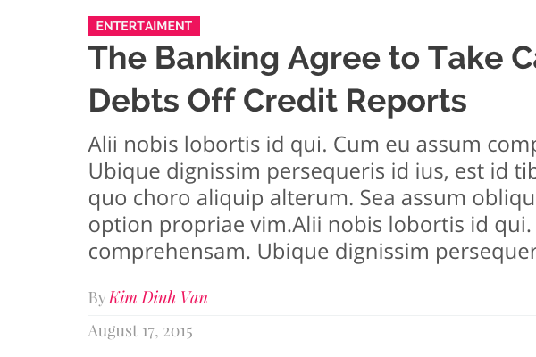
If a website is going to make this list, it has to have body copy of at least 16px, preferably much more. We’ll begin at the lower end of the scale with digg, whose feature articles use a healthy 18px:
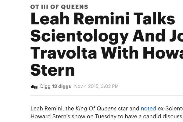
Headings and body use different weights of Graphik, though the headings are a slightly darker, heavily contrasting #191919 compared to the easier #232323 used for the main reading.
Another example of 18px (1.125em) is London’s Royal Drawing School, which uses an aptly chique font combination:
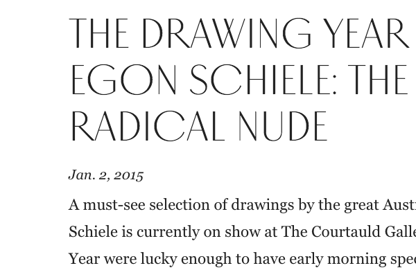
The font used for the headings here is called Vinter; Art Deco in personality, with heavily contrasting modulated strokes (strokes which vary in thickness). Read more about its design on the Monokrom website.
System Fonts
I prefer the boldness of digg’s feature to The Verge’s, though this one also makes the list for its generous whitespace and the focus given to the content itself:
The body copy in this case is at 16.5px on large screens, and relies on system fonts (Helvetica, Arial), even though the headings and blockquotes stump for Playfair Display. It’s big reading, but could always be bigger as far as I’m concerned.
The Washington Post also uses a system font (Georgia 18px) as its work horse, though the headings and captions use Postoni (a condensed serif, something you’ll see used by a lot of newspapers) and ITC Franklin respectively.
Heading for Impact
Hats off to Wondersauce, the agency behind The FADER’s redesign. How’s this for making a statement with an article’s heading?
“we never got in the way of readers with unnecessary additional content or superfluous design. Content reigned as King; a very well dressed King.”– Wondersauce
Beautiful! 120px of striking orange Neutral font (we’ll ignore the fact that this heading is marked up as <div class="bigPinkText">).
The sub-heading too, Freight Text Pro in a very in-your-face 48px. In fact, these headings are so massive, they make the body text look tiny, when it’s actually displayed at 19.2px (1.2rem) on large screens!
Edenspiekermann use a massive 1.92rem to welcome us to their website:
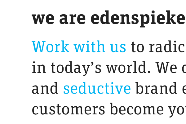
The font in question is “Espi”; an in-house version of their own FF Unit (by Christian Schwartz and Erik Spiekermann) which is equally at home as a display or body typeface. And it will come as no surprise that, even though they’re no editorial publication, Edenspiekermann also use lavishly big type for their blog.
Easy on the Eyes
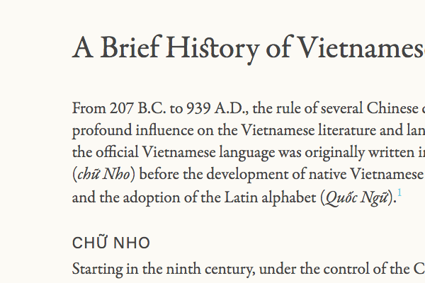
A quick hat-tip goes to Jason Pamental for recommending Donny Trương’s History of Vietnamese Typography. Large body type (1.1875em or 19px), quality font combinations (take a look at the OpenType ligatures), and muted contrast between type and background, make these pages very easy to absorb.
More easy-on-the-eye colors can be found on Vox, where the body is given a healthy 19.5px (or equivalent) font-size. Just let your eyes relax, and read..
The topic of color combinations brings us to our next subject: The Forecaster. This website was built to accompany a documentary about the financial advisor Martin Armstrong and his predictions on the world economy.
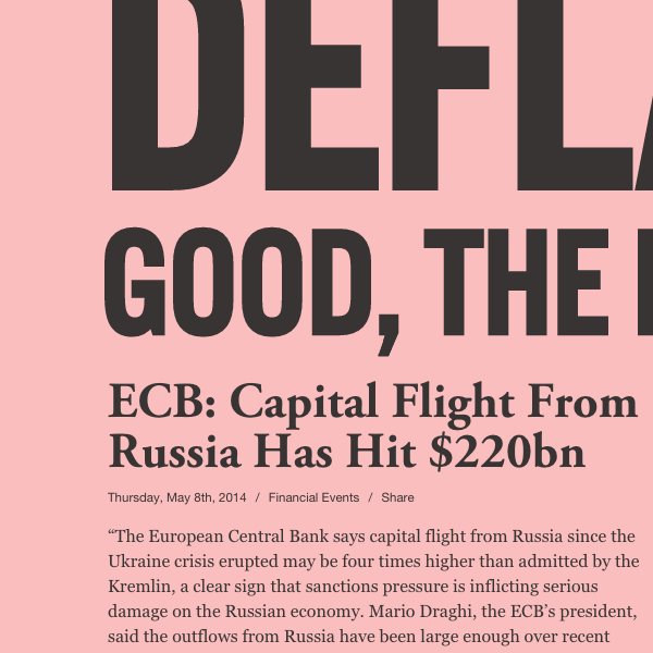
Inspired by the classic “salmon” used by the Financial Times, this pink dials down the contrast and improves the reading experience. It’s certainly distinctive, which is one of the reasons attributed to the FT’s original decision to print on colored paper. A perhaps more appropriate theory is that the pink tint was cheaper, owing to less extensive bleaching of the paper.
Regardless, the colors are great and the type is massive. The body comes in at a conservative 16px, but the headings stretch to fill the available space (using a technique similar to FitText).
Envato Market
Disclaimer: the following examples are taken from themes for sale on our sister site Envato Market.
To Conclude
As I mentioned early on; I love big type. I love the details it allows and I love it when designers put reading content at the top of their priority lists. I hope this collection inspires you to be bold and think big!