The term ‘Flat Design’ gets thrown around a lot. It seems like it would be easy enough to understand, but flat design is really the culmination of a long tradition of minimalist design that has found its perfect place in modern web design.
What started off as a way of shearing away the clunky aesthetics of older websites has evolved into a fully realized, user-focused method of design. Today, flat design isn’t just about visuals, it’s about making sure that users get the best possible experience when navigating a website, guided by color, influenced by typefaces and pushed forward through intelligent layout structure.
Influenced by traditions of art as well as science, flat design owes just as much to the German Bauhaus movement and Modernists as it does to the science and evolution of UX design.
First Layouts.
It’s easy to see the effect and legacy of 20th century art styles on flat design. Take, for example, one of Kazimir Malevich’s suprematist paintings – some of the first inklings of flat design (granted, for wildly different reasons) – there was a distinct focus on geometric shapes, favoring the simplicity of perfect, clear shapes over patterns. This style of painting was the antithesis to its predecessor, baroque stylings and overwrought design that characterized much of 19th century art, as much couched in rebellion as a genuine desire to experiment.
This is a rabbit hole we need to avoid going down. If we really wanted to figure out the actual origins of what we consider flat design, you’d have to read several lengthy tomes on the foundations of New Objectivity, Expressionism, various manifestations of Modernism in both Europe and North America. Down you’d go, quickly find yourself not really reading anything related to your initial question.
Jumping ahead to the early 2000s, up to around the time just before the release of the first iPhone, we start to see a modern-day iteration of flat design.
At this point there are huge numbers of people being exposed to the Internet for the first time, across all age groups. Web designers are scrambling to figure out the best way to get people to take note of their site, and the only options available for the amateur were places like Geocities. It was a dark time, where garish designs were everywhere and a highly skilled community of designers hadn’t yet been given the skills or tools to begin making the Internet beautiful. They faced many challenges, among them PowerPoint-like graphics and one of the ways they sought to resolve this was through skeuomorphism.
The Skeuomorphic Peril.
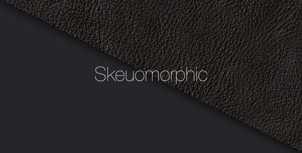
Skeuomorphism refers to the aesthetic concept of making items represented on the design canvas resemble their real-world counterparts. In software terms, this was most apparent in an older version of iOS and is still present on many websites. It’s the idea of adding things like notebook spirals on note-taking apps, leather imprinting and stitching on calendars, or shadowed buttons on calculators. There’s no reason to incorporate these as visual elements and a part of their initial inclusion was to help people who might be new to the digital space to understand with what they were interacting.
Think about why the old version of Apple’s Game Center looked like a green felt poker table; they felt that their users might be overwhelmed by the stark whiteness of what we now consider modern design. It’s astounding what a few years’ difference can make.
Looking back, skeuomorphism wasn’t so much a bad design philosophy (Apple was taking the experience of their users into account when making that decision) as it was a reflection of the average user’s digital literacy.
What we consider natural and user-friendly was learned only through years of observation and experimentation, through many small iterations and attempts to make navigating websites as efficient and enjoyable as possible. Furthermore, web design is a relatively new art, there is still much we don’t understand about what really makes a site pleasant to navigate and easy to use.
Reddit is a fairly ugly site, but it’s one of the most visited sites in the world, most users can use its features and are able to interact without much difficulty. Information is delivered clearly and efficiently. As Louis Sullivan said, form follows function, implying that design should emerge from the function, not the other way around. Think about what your site is meant to do and then create an impactful design around that concept.
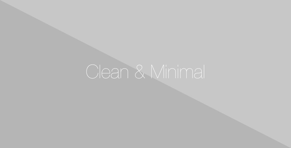
Modern Flat Design.
Flat Design itself is nothing new. Dieter Rahms pioneered this iteration of minimalist design and redefined it in a context focused on the user. His design style and aesthetic, but moreover philosophy, are embodied in his 10 principles of good design.
A disciple of Rahms and Apple’s SVP of Industrial Design since 1997, Jonathan Ive infused these principles decades later into Apple’s devices, producing product design and intuitive interfaces setting the stage for generations of designers to come.
The characteristics of flat design as we know it now really came to the forefront when Google started to redesign their sites. During a time when skeuomorphism was still going strong, Google started rolling out buttons and icons with no gradient, drop shadows and really nothing other than colors and lines to separate the content.
While Google wasn’t the first to use flat design, they stood out for how they were using this design style. It was all about the interface. There were little to no distractions yet the brand language and design aesthetics remained prominent. The industry followed suit. Effects such as gradients, drop shadows and bevels made way for direct, user-friendly design that became increasingly popular with the rise of mobile usage.
This design language owes as much to the sharp eyes of artists as it does to UX engineers who toiled away to figure out the exact way in which we interact with the digital world and how to maximize that experience.
Today, two of the biggest components comprising modern flat design are color and typeface. These two work in tandem to create an illusion of text popping from the screen while keeping the overall aesthetic of a design clean and minimal.
Reimagining The Color Palette.
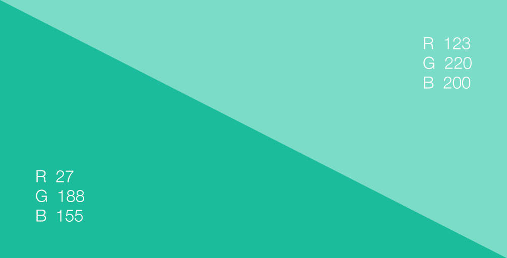
Palette generation in the context of flat design has gradually shifted away from the traditional rules – using only one or two shades – in favor of a widened color spectrum. It’s simple enough when you want a pair of colors, just look at any color wheel and generate a palette. But, when you start to add additional colors or complex juxtapositions,
Furthermore, matching tone and saturation, choosing complimentary shades mirroring each other and deciding between primary or secondary combinations or another part of the color wheel completely, are all considerations to take into account to create a cohesive and beautiful design.
When it comes to modern flat design, designers are often choosing to go bold and bright with super-saturated hues and expanded palettes. The traditional rules about pairing and matching are being re-written as this burst of color, along with other trends such as retro and monotone palettes become more pervasive, both on websites and in themes.
A Serif-Free Design Language.
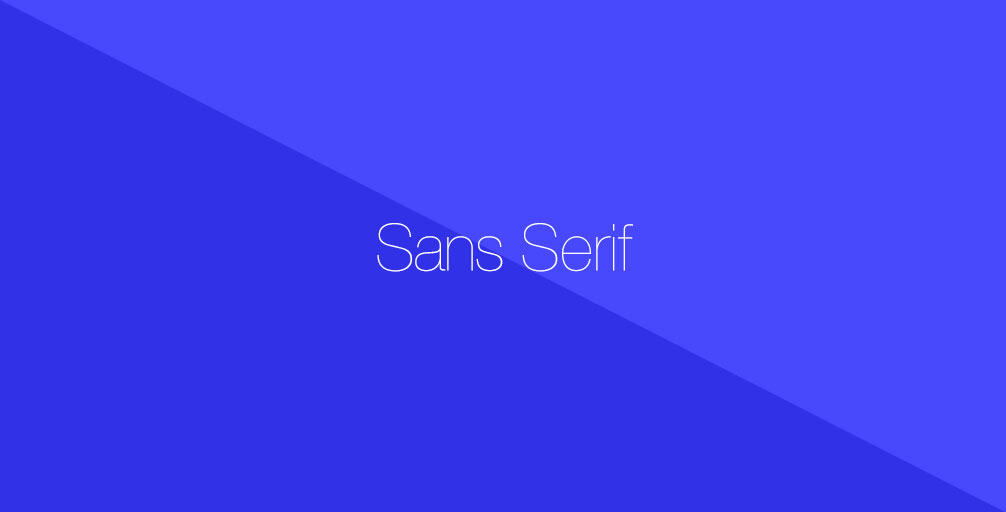
Another key component of flat design is a focus on typography. Many people have the misconception that typography is simply a matter of choosing between different font types to make a website look pretty. While beauty may be an added bonus, the main focus should be on readability, returning yet again to Dieter Rahms’ principles of good design and primary focus on the end user. Combined with the colors of a site, typography is an extremely powerful part of your flat design toolbox.
As flat designs place emphasis on simplicity and minimalism, choosing a suitable typeface becomes ever so important. Flat design is inherently minimalist and as such, it works well with simple
Typefaces that are sharp, crisp and have clean lines with even strokes tend to fit well with flat design schemes while giving a minimalistic feel. Emphasis and readability are derived from size and boldness. Sans-serif typefaces with uniform widths are preferable to serifs as they are typically too ornate in comparison with the design aesthetic.
Space and size are the main considerations in combining color with typography. Color palettes and fonts families aside, designers should think about flat design’s minimalist roots and give each element room to “breathe” while encouraging usability and flow above all else.
What does the Future Hold?
Looking at the present day, we see a distinct parallel between the morphing standards of design and the development of medium on which we design (now,
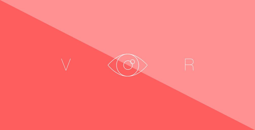
We are in the middle of a minimalist renaissance, but who’s to say this will stay with the rapid improvements in technology and how we view information…enter virtual reality (VR).
Certainly the current direction of flat design is leading us to an increasingly efficient Internet where most information is intelligently displayed, but it’s also being driven by our use of touch screens and mobile devices, on which flat design scales across with minimal effort. One could ask if this newest design standard has reached its current height of popularity because it’s actually good, or if it’s simply easy to implement.
Imagine, for instance, that in three years virtual interaction has become the big new draw. Websites begin to try and integrate some form of VR; perhaps Amazon might develop a way for people to see potential purchases in a VR space. It may be a bit of a stretch, but if one technology becomes prevalent and begins to dominate how we interact with media, then it stands to reason that web design would respond.
How does flat design respond in this sort of situation, its very existence is built around reducing the illusion of 3D and presenting itself as purely 2D? If you were to create a 3D world in the style of flat design, you would end up with a sterile, disconcerting world that would look more like an exhibit on alienation at the Metropolitan Museum of Art than any kind of welcoming digital space.
Going forward, we should never allow flat design to become too obscure. You can reduce and reduce and reduce some more, but eventually you’ll end up with a site that looks like it was built by a robot. There’s a distinctly human touch to messiness, if only a hint. There’s also the issue of usability. Going too far into the doldrums of flat design can actually make things more difficult than had they been affected by some additional design styles. When choosing elements of flat design, it’s important to really think about the content you’re presenting and how accessible it is to users.
These are all things to think about, but it can’t be done in isolation. Whether you’re making your first website or signing on to update the landing page of a major corporation, feedback is king above all else. Get people talking, discuss the best ways to engage and make functional, beautiful websites.