Gradients are making a sneaky comeback. For a while they belonged to the world of Miami Vice and Tequila Sunrise, then they added depth to 1980’s magazines, then there was Geocities–ok, let’s not dwell on the past.
Nowadays gradients are being used on the web in bold fashion; mixing highly saturated colors for extremely rich effects (though it’s not to everyone’s taste).
Looks like everyone’s using a diagonal gradient again like it’s 1995. The same one at that (L: Stripe, R: Google). pic.twitter.com/j3cXyWo9tq
— Eli Schiff (@eli_schiff) November 24, 2015
Let’s look at a few examples I’ve stumbled across recently and see if we can draw inspiration from them.
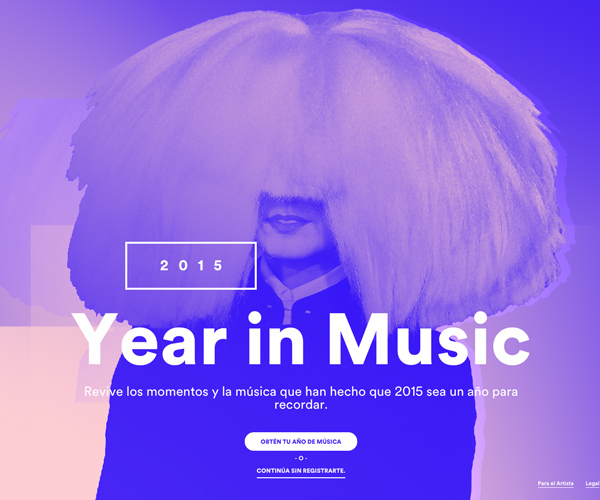
You won’t be surprised to see Spotify in this list. Their graphics over the last six months have been filled with duotone images and rich gradients, concluding with their Year in Music feature.

Combined with strong type, Spotify’s visual brand doesn’t just tap you on the shoulder at the moment, it holds your head against the amp and cranks up the volume.
Atomic used a similar approach with their recent retrospective on 2015 design articles.
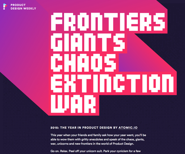
Here, the purple and fuchsia (angled at 45 degrees) give some lovely isometric depth and make a real spectacle of the page.
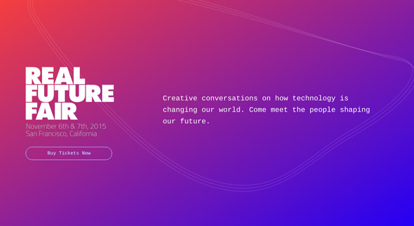
realfuturefair.com use an equally spectacular color range, again at a diagonal angle, with a <canvas> generated wave graphic:
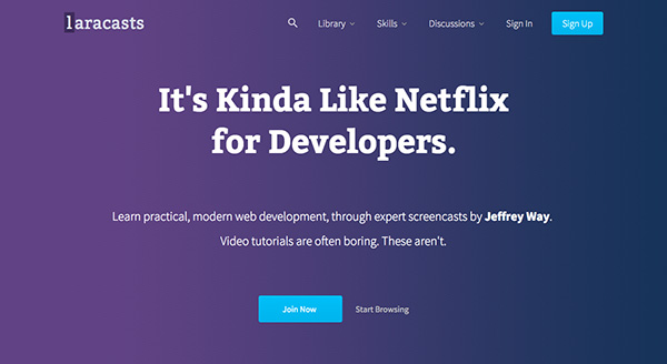
My former colleague Jeffrey Way has gone horizontal, using a subtle purple to indigo on laracasts.com:
Comment use a less retro aesthetic, instead opting to place a semi-opaque gradient image over the main page background:
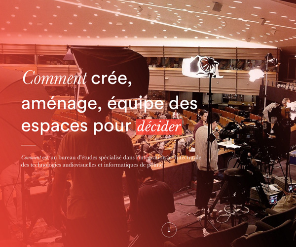
This could have been done more resourcefully–the extra image adds another http request and 75kb to the page–but it’s a stylish effect.
Gradients and Borders
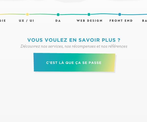
Web conference Web Afternoon use a recurring blue-to-purple gradient on their page, which is particularly effective as the borders of buttons:
Hover over the link and the whole background adopts the gradient. So how’s this done? After some basic styles, the border of the button is given a linear gradient with the border-image property. This effectively allows us to cast an image on the border, instead of relying on the normal stroke, though you can declare standard border properties first in order to leave a fall back if border-image is unsupported.
You’ll then notice that the border-image property is followed by border-image-slice: 1;. This determines where the background image is sliced, in order that it should scale with the element. The value of 1 takes the first pixel along the left, the top, the right, and the bottom of our gradient “image”, and maps those slices to the eight regions of the border. Read more about slicing on MDN.
Then, for the hover state, the same gradient is applied to the background fill. Here it is in action:
Rough it up
So far we’ve covered smooth gradients; two or more colors flowing into each other along a perfect transition. CSS makes this process relatively straightforward and maintainable nowadays. But gradients can also be given character in the form of texture:
On worldseasiestdecision.org this rough drawing texture is used to give their gradients more personality. Nice job.
www.viens-la.com also use images (as opposed to CSS) to allow their gradients a bit of personality:
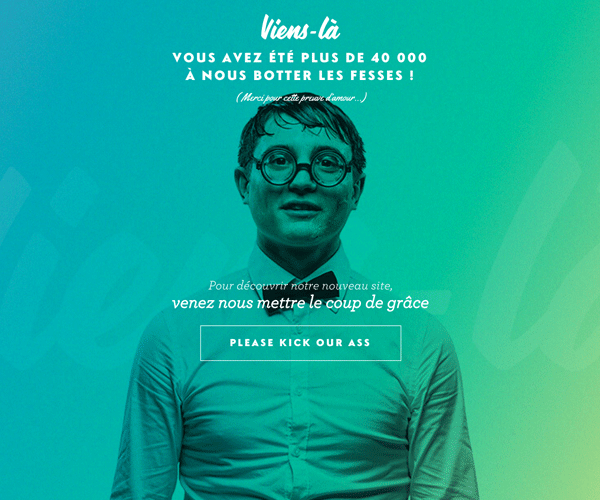
A similar gradient can be seen repeated in the details throughout their site:
Type
Gradients aren’t only restricted to backgrounds and borders, they can add an element of interest to typography too:
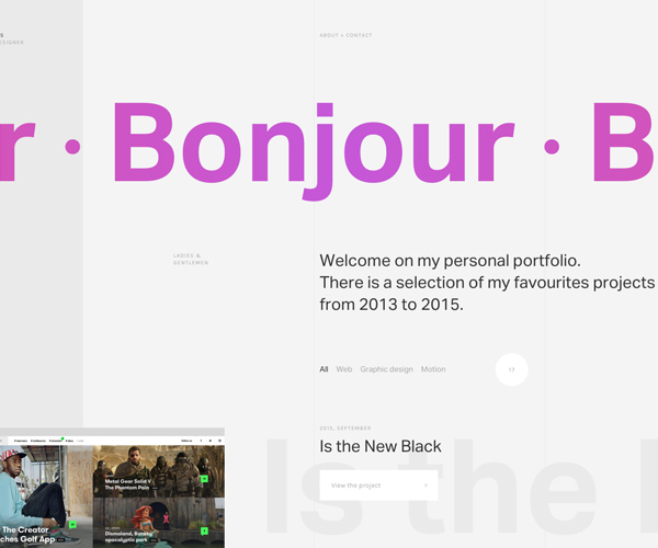
Here Pierre Georges uses a gradient on the background of the “Bonjour” paragraph block, then uses the background-clip property to restrict the painted area to the text. -webkit-text-fill-color: transparent; then makes the actual text transparent, so the gradient is visible from underneath.
Here’s how the (webkit) syntax looks:
p {
    background-image: -webkit-gradient(linear, left top, right top, color-stop(0, #f24a70), color-stop(0.5, #c557d8), color-stop(0.99, #f24a70));
    -webkit-background-clip: text;
    -webkit-text-fill-color: transparent;
}
Envato Market
Need some more inspiration? Checkout these files available on Envato Market: