 Each month we publish a roundup of the best new portfolios, launched in the previous four weeks, by freelancers, agencies, and other creative professionals.
This month’s edition is packed with color and animation. Almost every site in this list animates some part of its interface, and many are dependent on animation entirely. You’ll find tons of great interaction design, but the real trend in 2020 is that personality is making its way back into our sites.
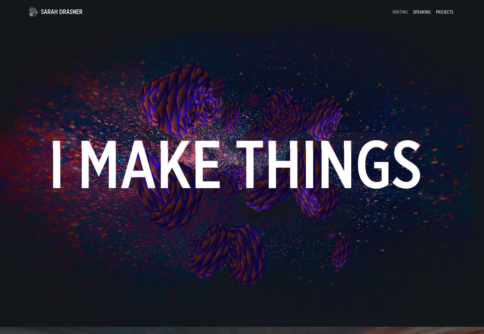
Sarah Drasner
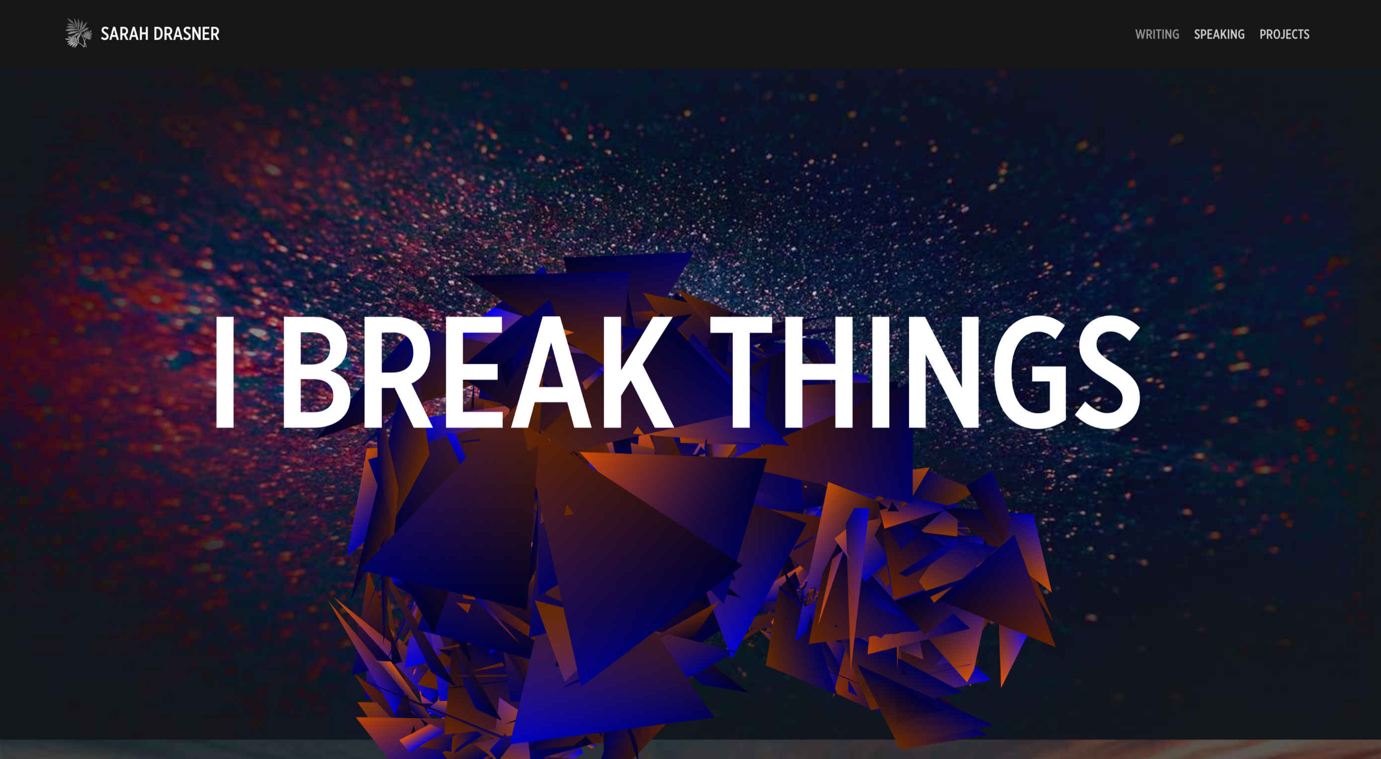
Sarah Drasner’s personal portfolio site is wonderful because it conveys the simple joy she feels in technology. It opens with large type stating, “I Make Things.” But hover over it and you’ll find that she also says, “I Break Things”. The coded flowers that burst open for the break animation are delightfully rebellious. The whole site is packed with personality.
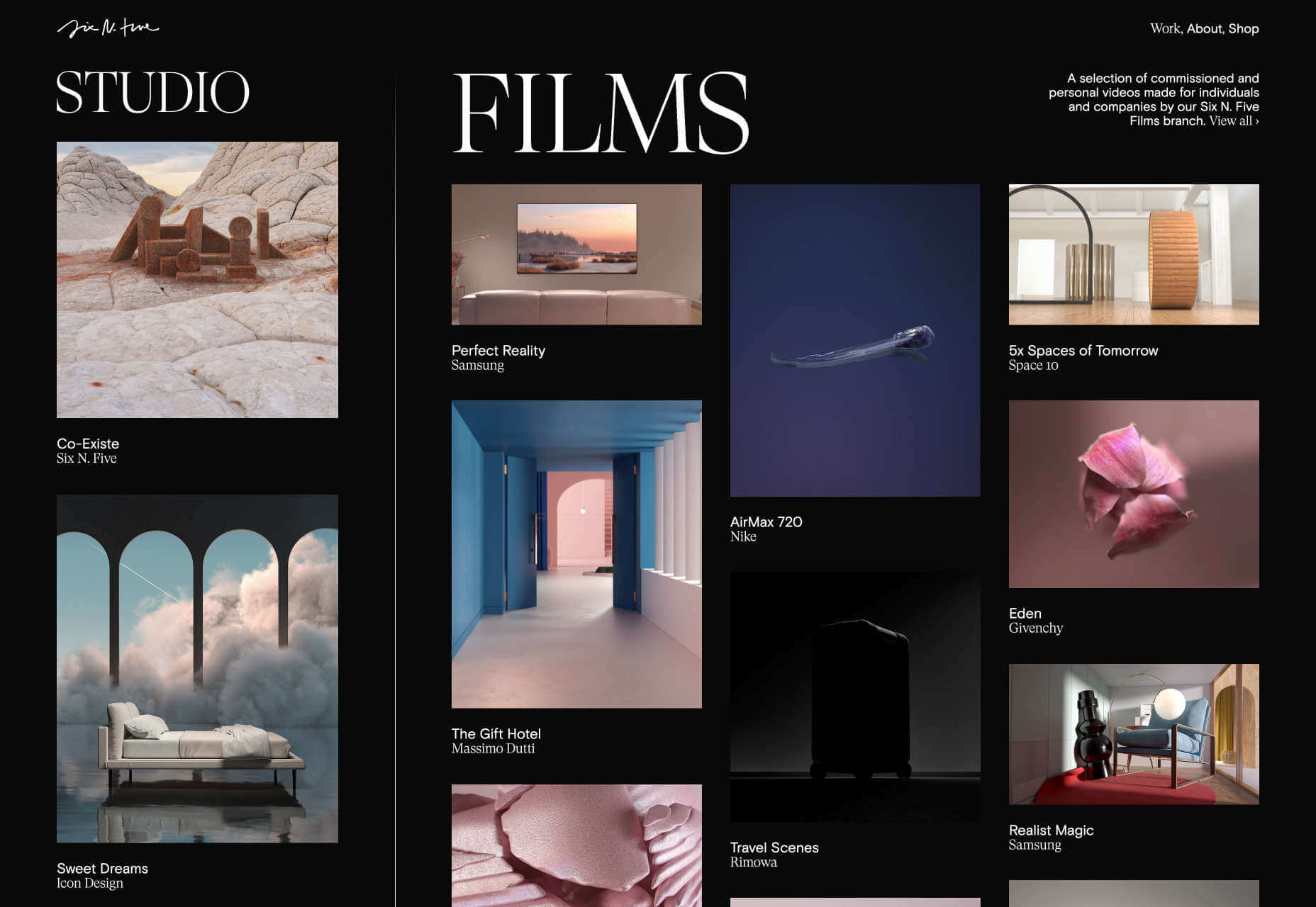
Six N. Five
The interaction design, especially the light-dark transition on Six N. Five’s portfolio site is something to behold. Cursor to the left, or right, to switch from studio work to films. Scroll through some exceptional work, and hover over thumbnails to see a preview. What we really love is the simplest of touches: when you scroll past the bottom of a case study, it automatically returns you to the home screen.
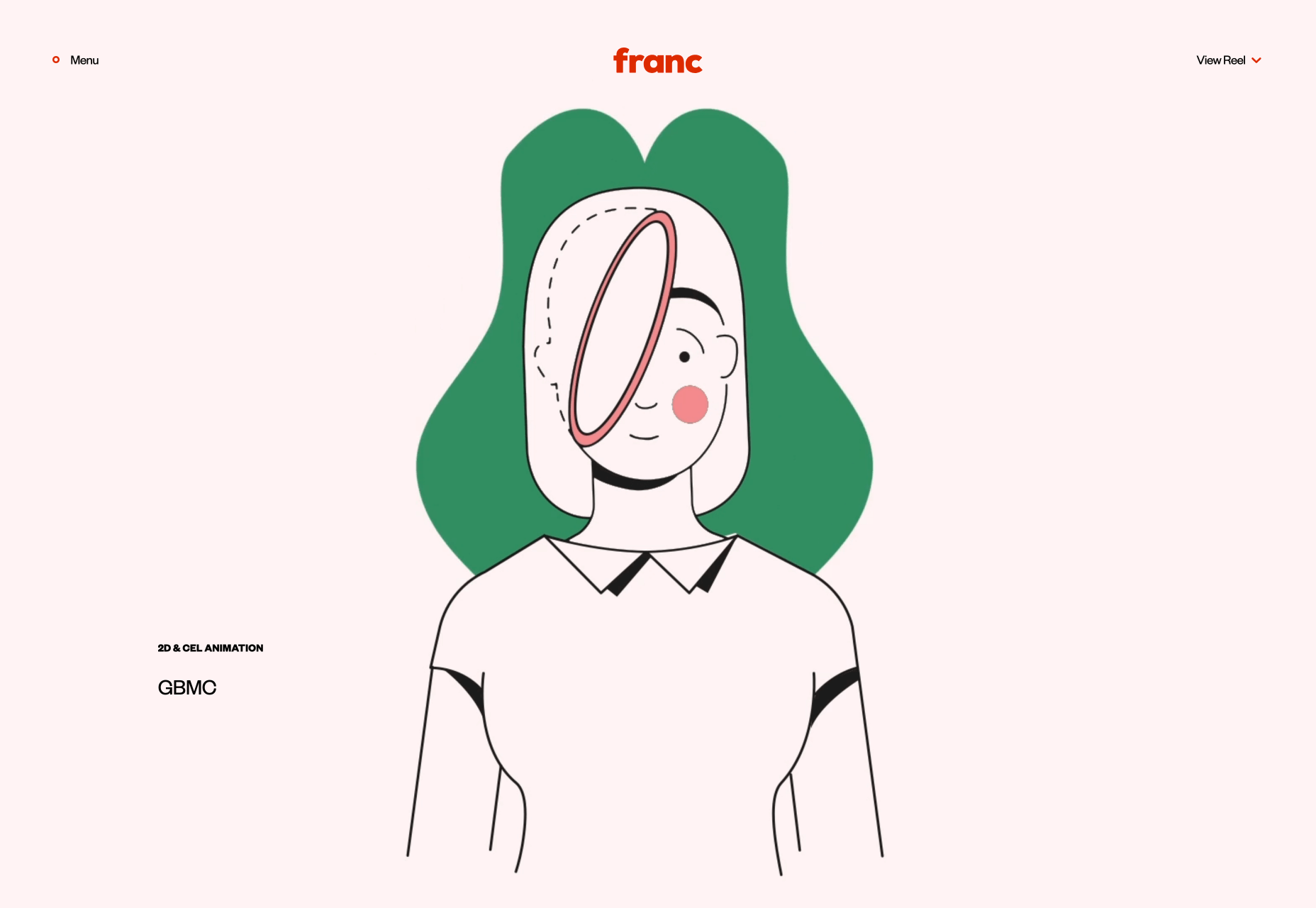
Franc
We have two agencies called Franc/Frank this month. This time, it’s an animation studio with a uniquely engaging, linear style. Franc’s work includes cell animation, which appears to be increasingly rare these days. The contemporary edge is provided by the very 2020 color palette, with bold hues cutting into softer, ice-cream pastels.
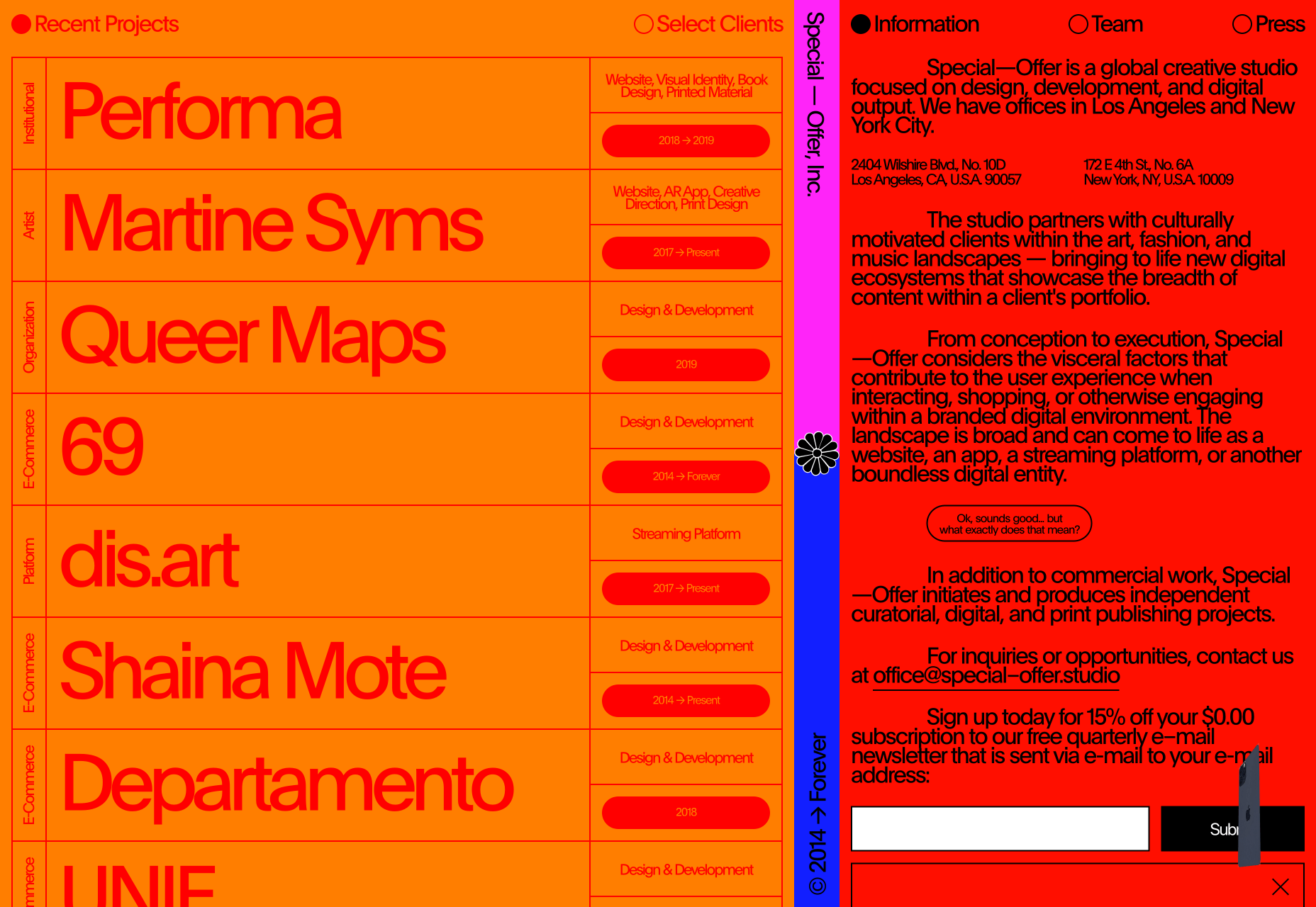
Special Offer, Inc.
The portfolio for Special Offer, Inc. could be a prototype for the colorful brutalism trend that we’ve carried over from 2019. The red on orange typography is by most measures, a real no-no, but as a way of searing the site into your eyeballs it does an awesome job. The overwhelming amount of content is part of the confident attitude, a minimalist site just isn’t right for many agencies, and it’s great we have so many options in 2020.
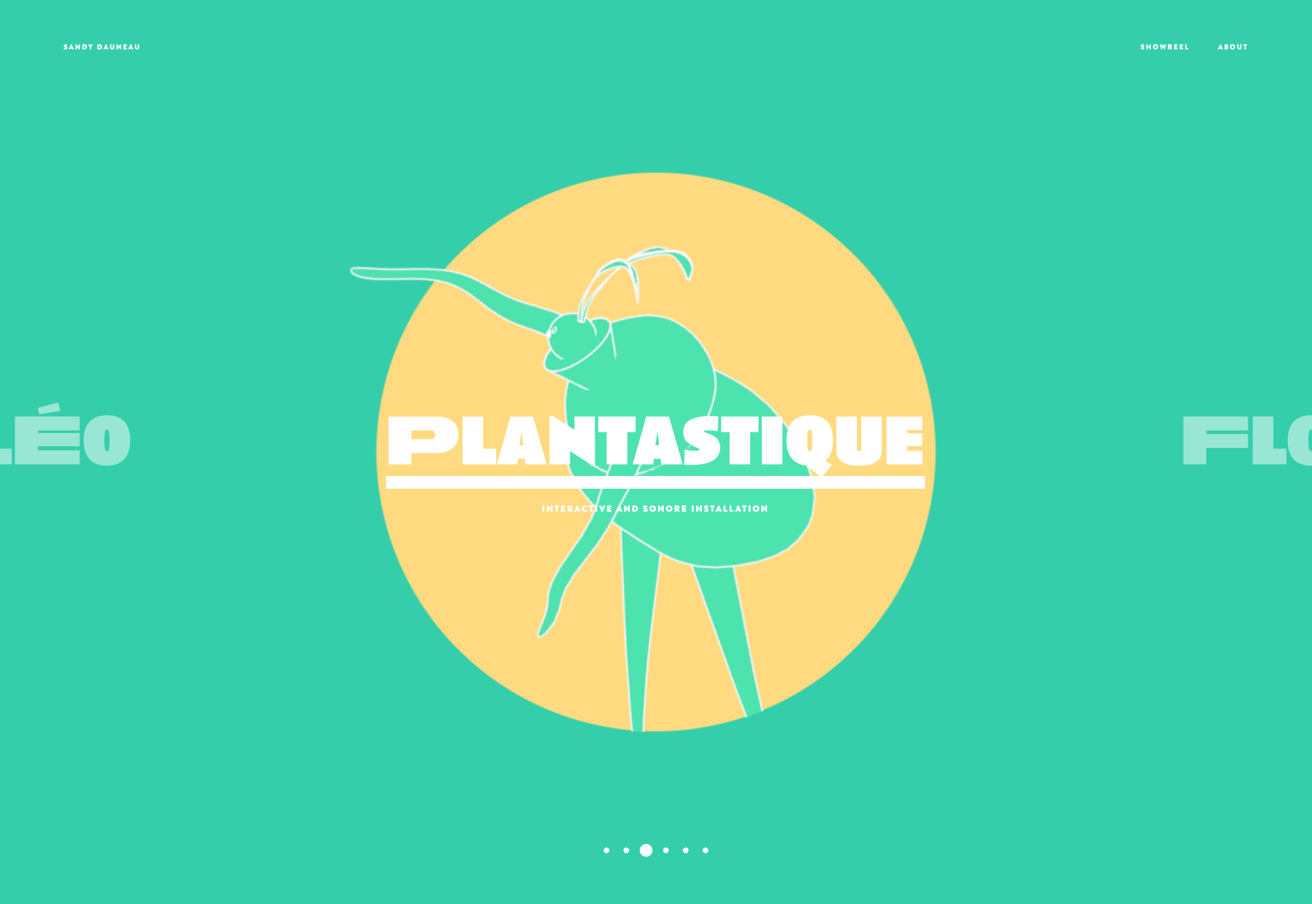
Sandy Dauneau
Sandy Dauneau’s portfolio is centered around her beautifully emotive animation, with a slider that offers various projects to enjoy. It features some really expressive typography, but nothing here outshines her delicate, and expertly observed animation. Make sure you check out her showreel, which really convey’s the best of her current work.
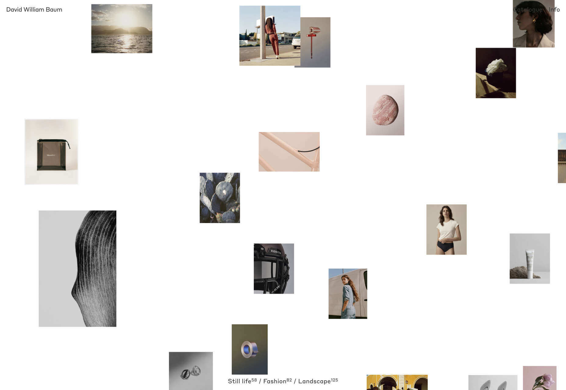
David William Baum
It’s difficult for photographers to come up with new ways of presenting their work. There’s only so many ways you can present a grid of thumbnails. The portfolio of David William Baum does an excellent job of solving this, with a moving grid of photos that responds to your cursor, then a stack of images to scroll through when you click a set, which feels a lot like flicking through a collection of printed hand-held photos.
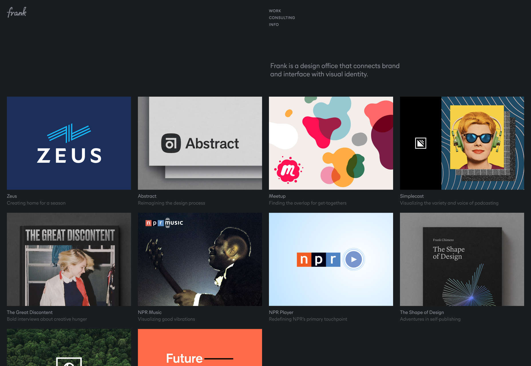
Frank
When we’re designing portfolios, it’s easy to get carried away with all kinds of different effects like liquid effects and hover states. Fancy effects help get you noticed by design agencies, but if you’re a design agency selling to business, what works is simplicity. Frank has done an amazing job of keeping its portfolio simple, not because simplicity like this is difficult, but because it’s brave.
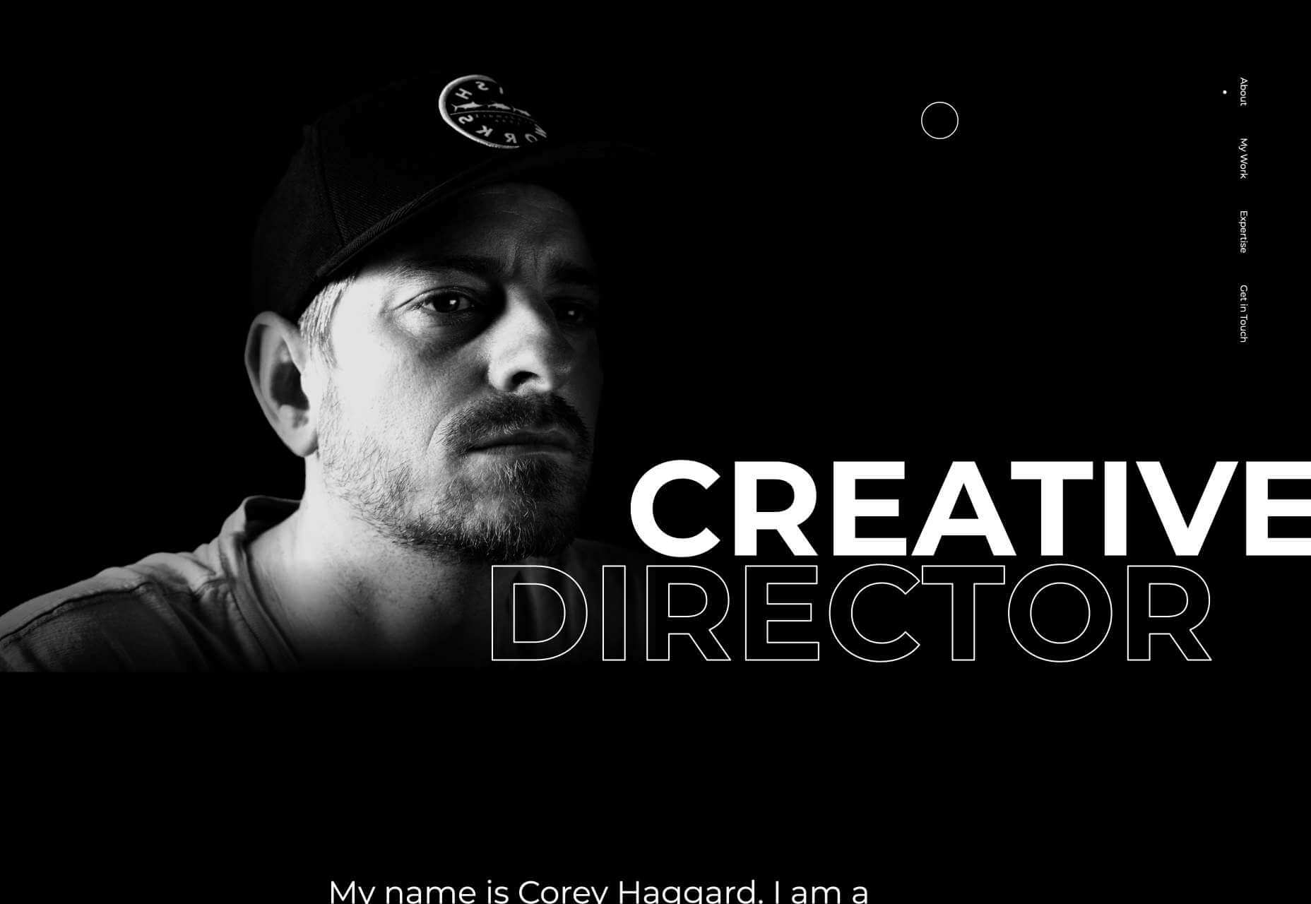
Corey Haggard
Corey Haggard has taken more of a traditional single-pager approach to his portfolio. He’s hopped on the out-sized typography trend, and if you click on any of the thumbnails on his site you’ll be rewarded with a flag-style enlarge effect, but basically this is a no-nonsense portfolio that shows off some inspiring work, and is well-worth a few minutes browsing.
Victor Costa
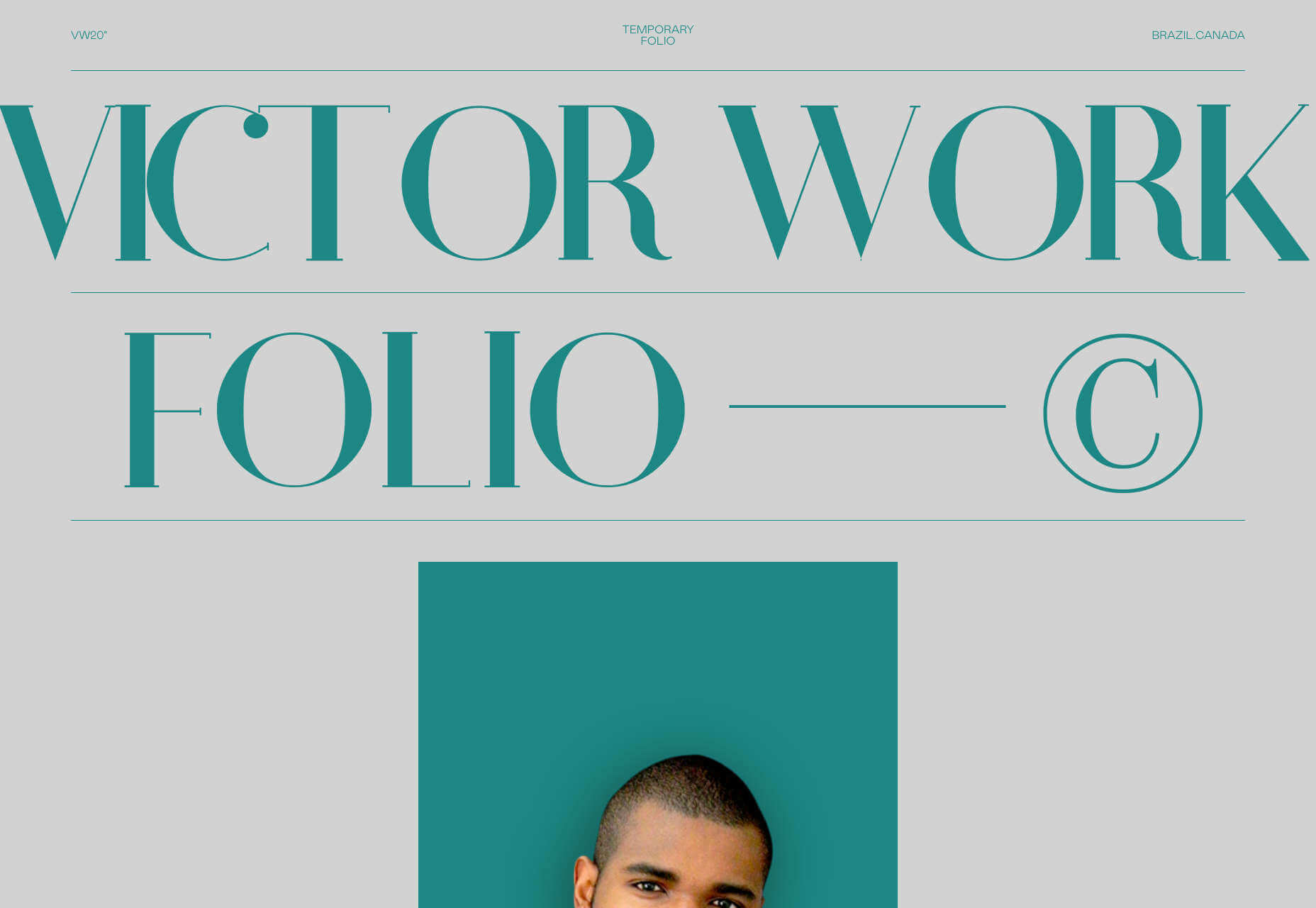
Victor Work 20’ is the 2020 portfolio of Victor Costa, a Brazilian designer/developer based in Toronto. Scroll through and you’ll find some nice flag effects on the portfolio thumbnails. What we really like is the cool wavy line transitions as you scroll from one area of the site to the next — it’s an awesome way to section sites, without subjecting us to hard, horizontal lines.
Davide Baratta
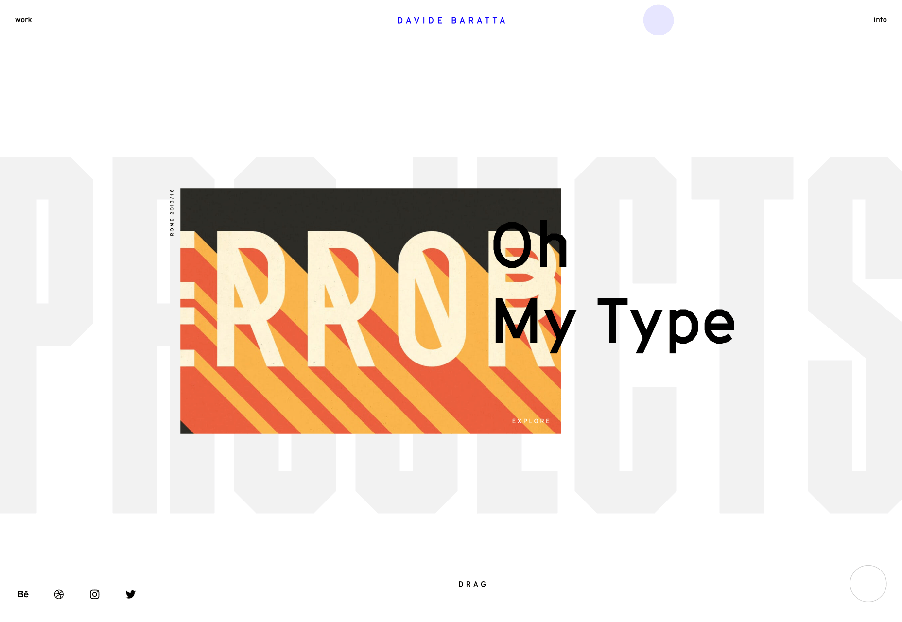
Davide Baratta’s site is one of the new breed of portfolio sites that really only work well on touch screens. If you check it out on a tablet, or a large-screen mobile device, it’s awesome. The simple slide back and forth, with taps for further exploration, feels like a native experience. A lot of time and effort has gone into making this site feel effortless. There’s also some great lettering in there.
Pierre Mouchan
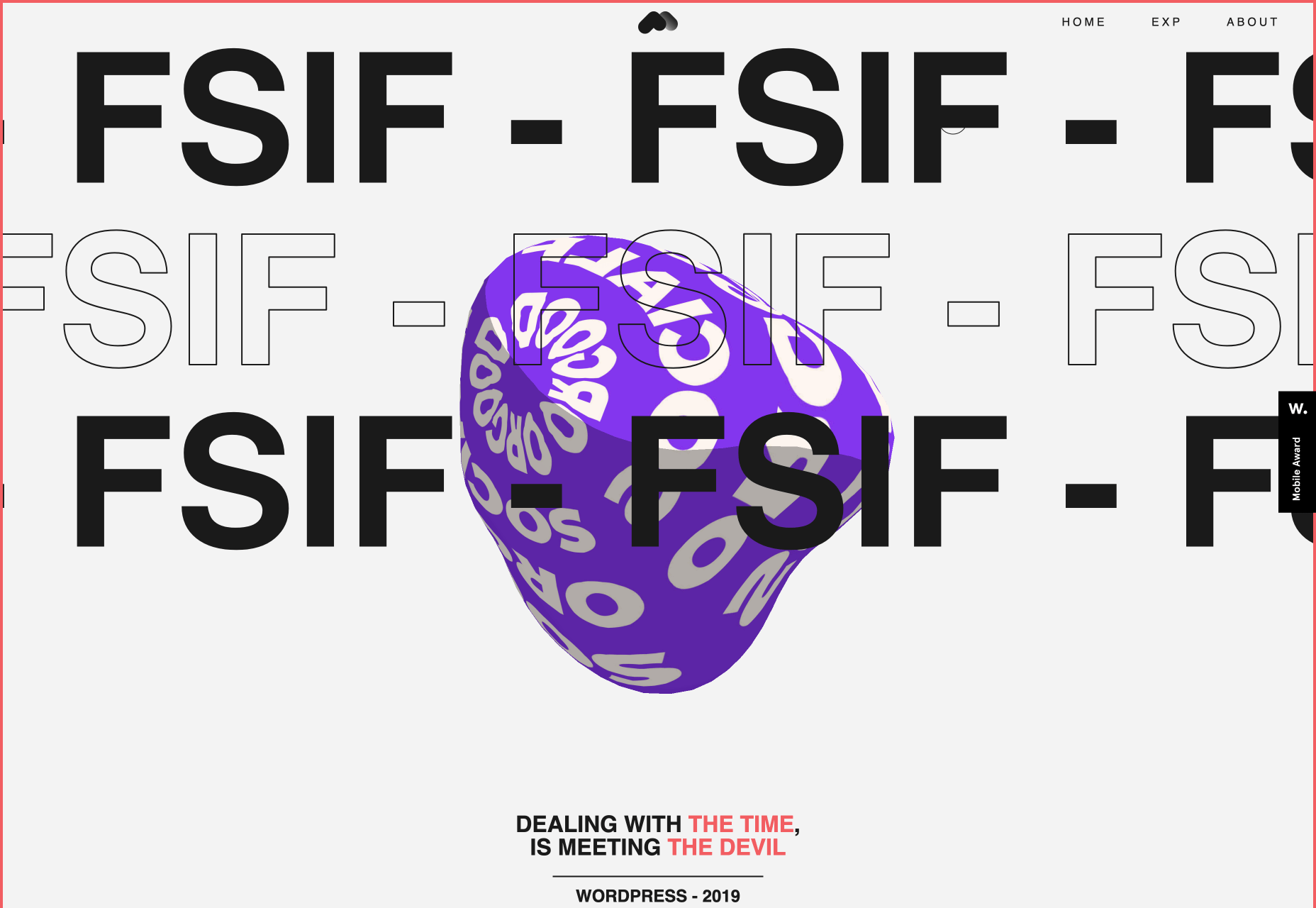
It’s all about generative art these days, and Pierre Mouchan’s site is no exception. With a nod towards out-sized typography, what really grabs your attention is the giant pulsing blob in the center of the screen; it’s enough to trouble Steve McQueen. Each blob on the site represents a project and you can click on each for more info. It even works surprisingly well on mobile.
A Color Bright
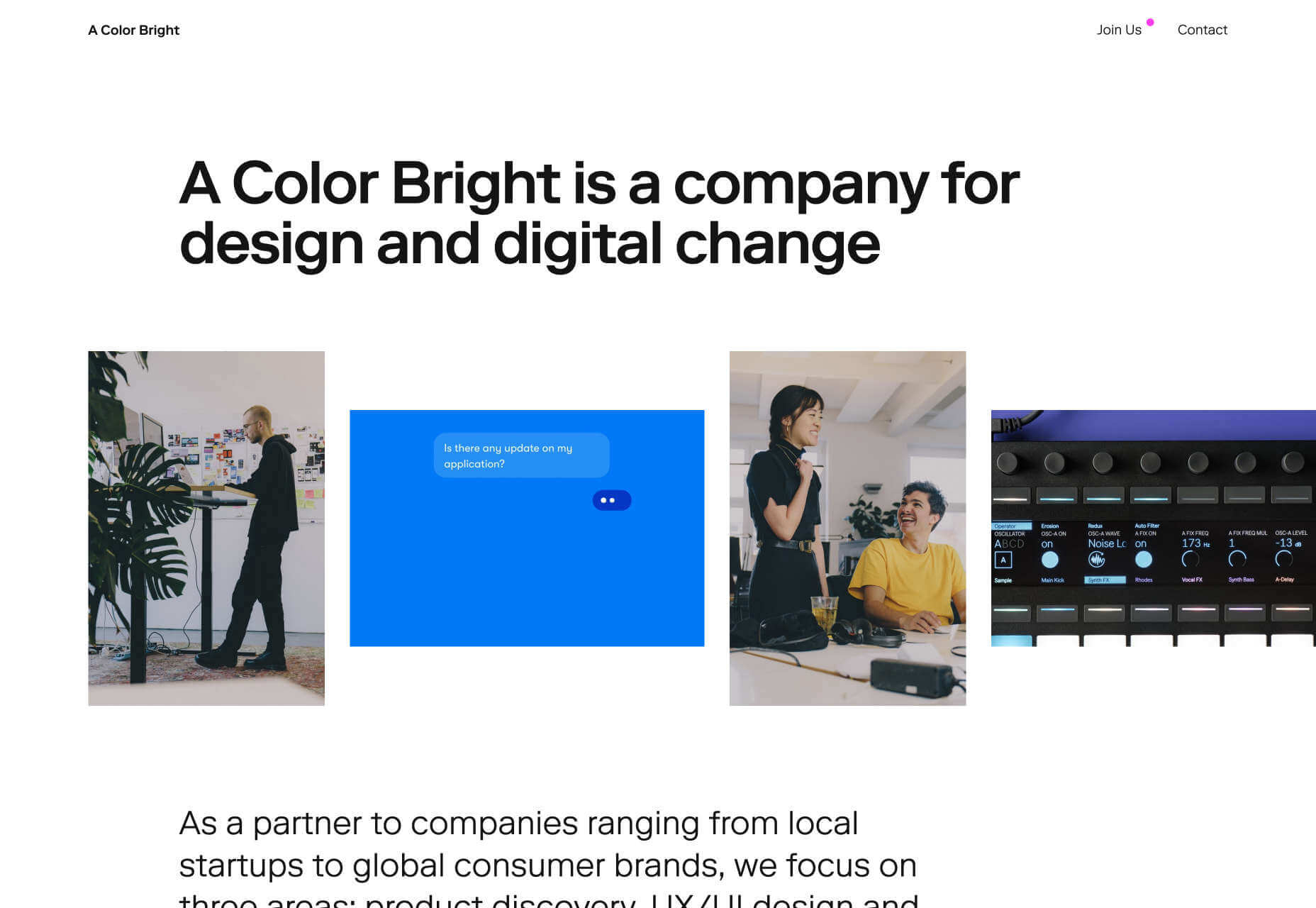
It’s all very well presenting beautiful animation if that’s your focus, but what if your focus is on user experience? A Color Bright is a Berlin-based design agency that provides UX/UI design, product development, brand growth, and other digital design. Its portfolio is all about the potential of the user, with a focus on the dynamics of the team you’ll be working with if you hire them.
The Mill
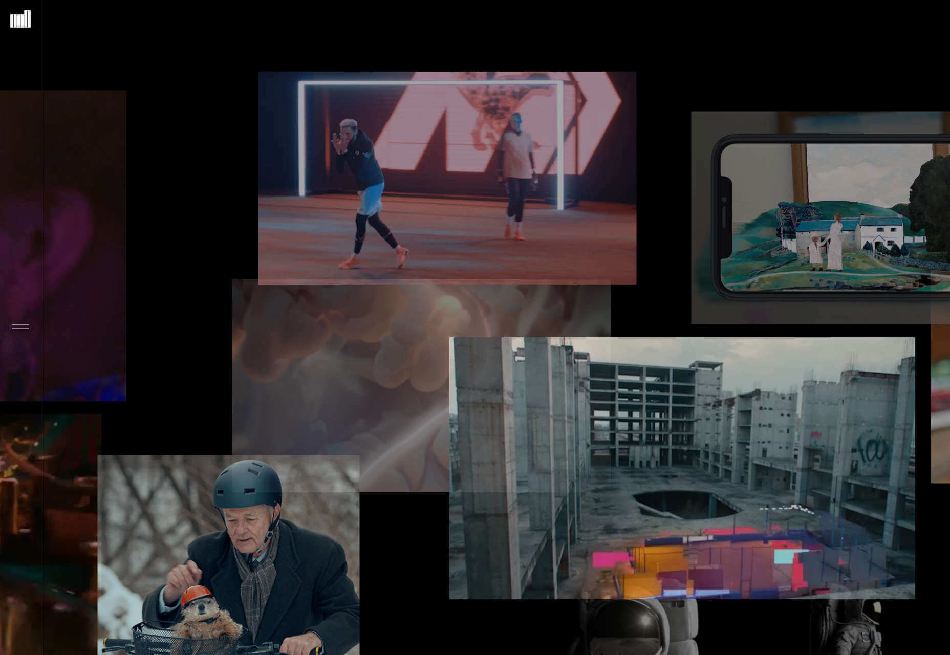
The Mill’s site is a visual overload of motion design, VR, animation, and video. It works as a collection precisely because the lack of hierarchy allows you to delve in on a whim. Each video thumbnail links through to a case study, and the quality of the clients (Nike, Jeep, HBO, Spotify…) means that wherever you click you’ll be rewarded with a high-profile project.
Oxana Bayra
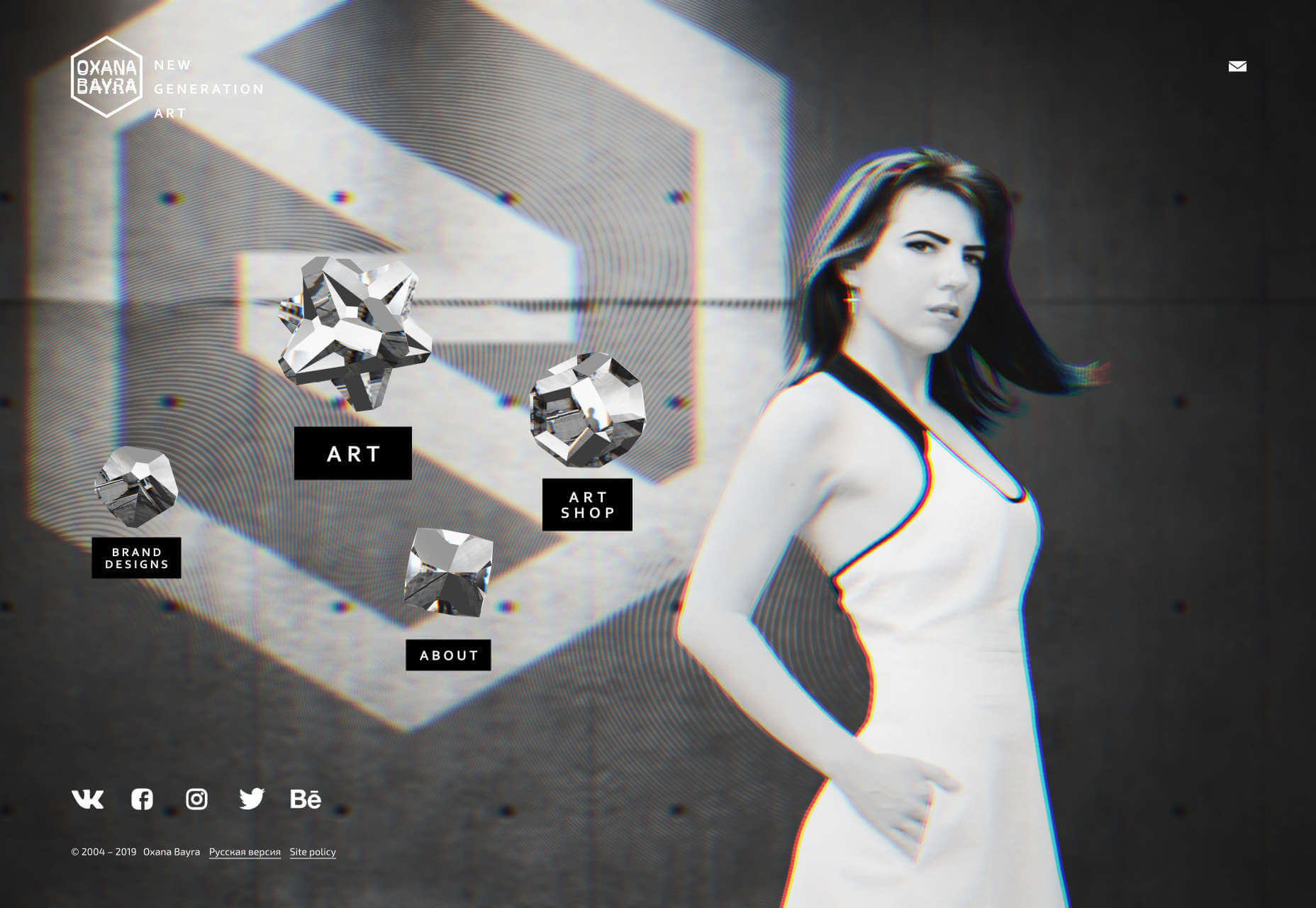
Oxana Bayra’s portfolio opens with glitch-effect artwork that’s growing increasingly popular. Cursor over one of the crystalline objects — each of which features expertly coded artwork — and the glitch-effect grows stronger. Bayra’s won dozens of awards for her generative art and design work, and much of it is on display in her portfolio.
Kevin van der Wijst
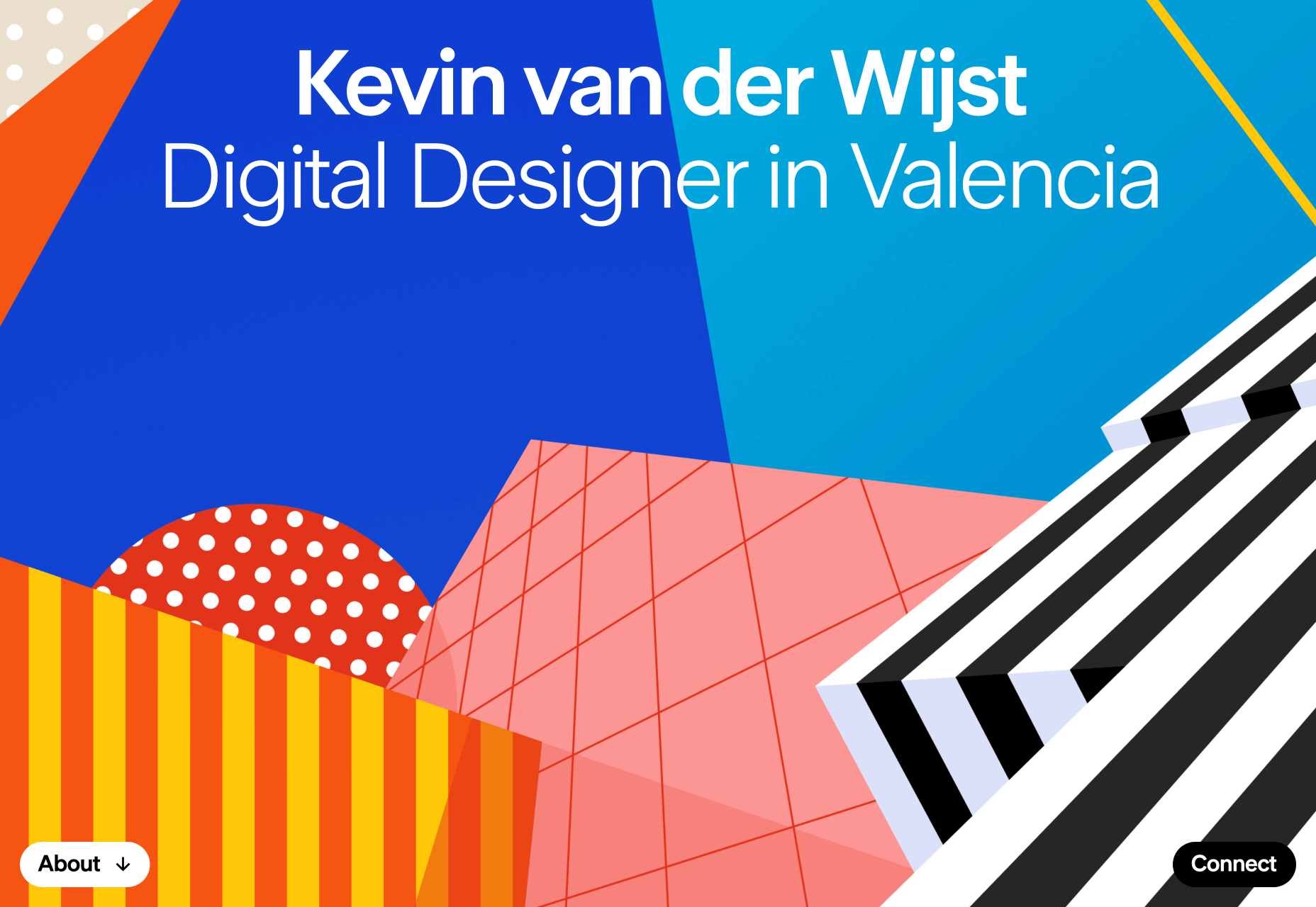
Kevin van der Wijst is a digital designer based in Valencia, and you can feel the influence of that sunny Spanish city in his site. In recent decades Valencia has become known for some of the most extraordinary public architecture in the world, and the geometric shapes of van der Wijst’s portfolio echo the shapes of sunlight on buildings. If you cursor over it, you’ll see there’s a liquid mouse trail effect, as if the buildings were reflected in pooled water.
p img {display:inline-block; margin-right:10px;}
.alignleft {float:left;}
p.showcase {clear:both;}
body#browserfriendly p, body#podcast p, div#emailbody p{margin:0;}
