
In this tutorial were going to play with CSS transitions to create a new style navigation menu. The effect we are aiming for is having a number of navigation boxes, and when the mouse hovers over a box this will grow and shrink the other boxes. We can even add an icon to animate into the box to represent the page on the navigation.
View the demo to see this effect.
The HTML
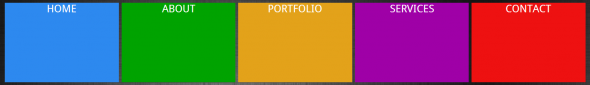
First were going to start off with the HTML for the navigation boxes. This consists of a wrapper div element with the boxes inside. Each of the boxes will have text for the page and an image icon to represent the page.
<div class="nav">
    <div class="box home">	<a href="#home">HOME 	<span><img src="./images/home.png" alt="" /></span></a>
    </div>
    <div class="box about">	<a href="#about">ABOUT 	<span><img src="./images/person.png" alt="" /></span></a>
    </div>
    <div class="box portfolio">	<a href="#portfolio">PORTFOLIO 	<span><img src="./images/folder.png" alt="" /></span></a>
    </div>
    <div class="box services">	<a href="#services">SERVICES 	<span><img src="./images/screw-driver.png" alt="" /></span></a>
    </div>
    <div class="box contact">	<a href="#contact">CONTACT 	<span><img src="./images/mail-back.png" alt="" /></span></a>
    </div>
</div>
Styling The Boxes
The CSS will provide all the functionality for the navigation bar. We start off by styling each of the individual boxes, we set the height and width of the boxes to what ever we want to fill the screen. Add a display: inline-block so that the box will display next to each other instead of on top of each other.
As we are going to animate in an icon we want to make sure that we hide anything that overflows this element by using the overflow:hidden property.
Then we can add the transition for the width of the box so that on the hover event we can change the width of the boxes.
.box {
    display: inline - block;
    float: left;
    height: 200px;
    overflow: hidden;
    width: 20 % ; - webkit - transition: width 1s; - moz - transition: width 1s;
    transition: width 1s;
}
Now we can style the background colours of the different boxes.
.box.home {
    background - color: #2d89ef; } .box.about     { background-color: # 00a300;
}.box.portfolio {
    background - color: #e3a21a;
}.box.services {
    background - color: #9f00a7; } .box.contact   { background-color: # ee1111;
}
As we want the entire box area to be clickable we have to change the anchor link into a block element by using the display: block property and making the height of the link 100% of the box. This will make the entire box area a clickable link.
.box a {
    color: #FFF;
    text - decoration: none;
    text - align: center;
    vertical - align: middle;
    height: 100 % ;
    display: block;
    padding - top: 20px;
}
We want to make an icon animate into the box when you hover over the box, this will use CSS transitions to change the top property of a span tag, inside the tag will be an image we can use for the icon. At the start we need to move this image outside of the element, which will make it hidden by using the overflow: hidden property on the box element. Then we can use the position: relative property with top of 100% to move the span outside of the element.
Adding a transition on to the top property will animate the icon into the box when you hover over.
.box span {
    display: block;
    position: relative;
    top: 100 % ;
    text - align: center; - webkit - transition: top 1s; - moz - transition: top 1s;
    transition: top 1s;
}
The Hover Event
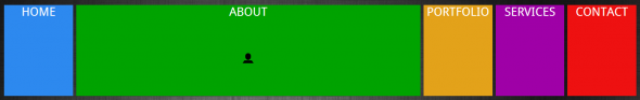
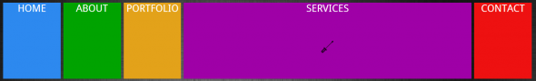
Creating the hover event for the navigation, when a user moves the mouse over the box 3 things will happen.
- First all the boxes are going to shrink to 10% width.
- The box that we are hovering over will be expanded to be 60% width.
- Then the box we are hovering over has a span tag inside, this will then change the top property back to 25% bringing the element back into view.
.nav: hover.box {
    width: 10 % ;
}.nav.box: hover {
    width: 60 % ;
}.box: hover span {
    top: 25 % ;
}