
With this tutorial I would like to show you a few tricks on creating clean lines and edges when working with the flat design trend, in Adobe Illustrator. Simple layered styles and reusing Graphic Styles to help your workflow are most efficient, so you should be able to create a set of matching icons in no time.
1. Setting Up Your Document
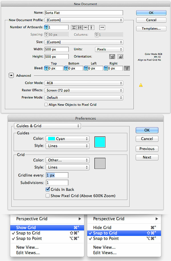
To start, let’s create an art board that is 500 x 500px. Since our icons are rather module and have a lot of straight lines it would be best to work with a grid to ensure perfect pixel crisp shapes. So let’s create a grid that is 1px and then show and Snap to Grid as outlined below.
2. Create a Magnify Icon
While making your icons try to keep in mind the use of the icon itself and where it will be placed. For these icons I’ll be sticking with a general size of 128 x 12px which is pretty common in the icon world. Since we’re following the flat design trend we’ll stick with basic colors and sharp 45º angles with exaggerated shadows.
Step 1
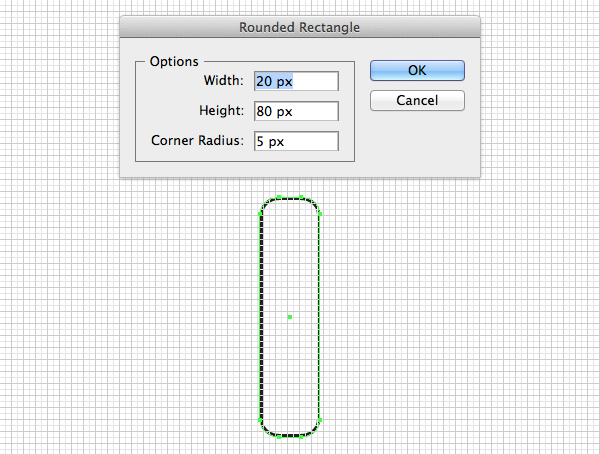
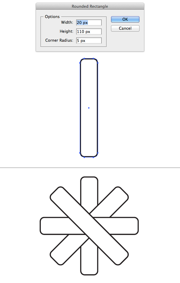
I’ll be creating the wireframe of these icons with basic shapes then adjusting the style of the shapes using a handful of Graphic Styles. So to begin select the Rounded Rectangle Tool and create a rectangle that is 20 x 80px and snap it to the art board.
Step 2
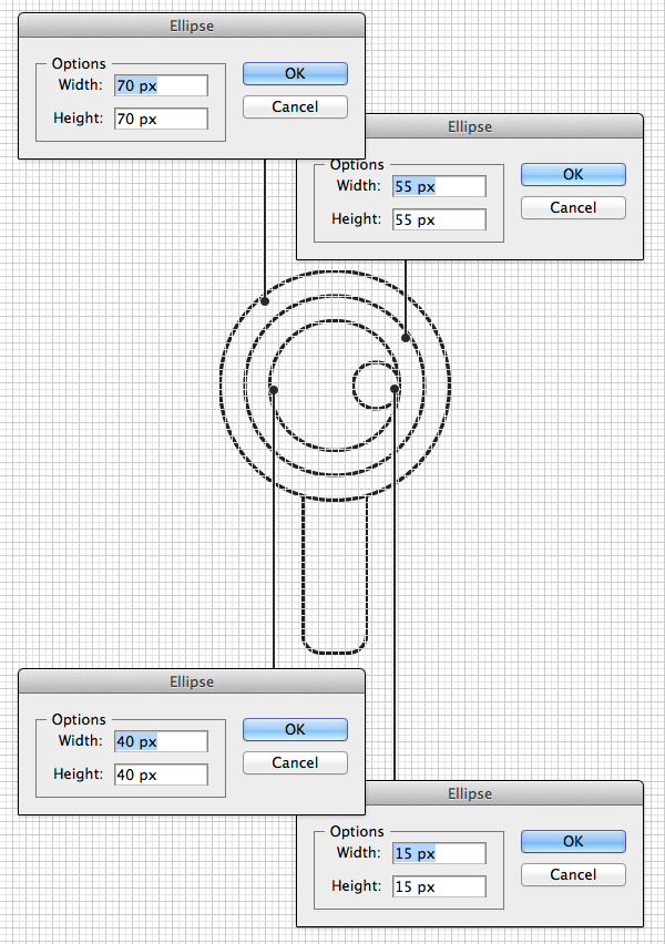
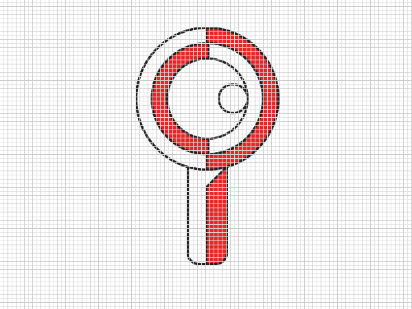
Next, select the Ellipse Tool (L) and create several concentric circles. The first one being 70 x 70px, then 55 x 55px, then 40 x 40px, and finally 15 x 15px. Now arrange them as you see below.
Step 3
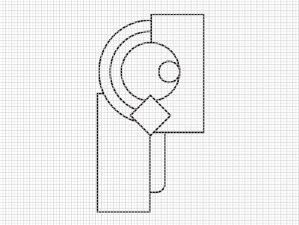
Select the Rectangle Tool (M) and draw a few that cover half of the shapes we just created. We’ll use these to crop off shapes that will later become shadowed areas. The height/width does not matter, just ensure that they align exactly to the centre of the other shapes. We’ll also be making a cast shadow so draw a square and rotate it 45º and place it so that the edge of diagonal line meets the bottom of the outer most circle and the bottom rounded rectangle.
Step 4
Using the Pathfinder panel we’ll use a combination of Unite, Minus Front, and Intersect to change these rectangle shapes into our shadow overlays. Remember when using these tools that it will affect the shape so you will need to duplicate these objects in order to create the desired outcome. In the screenshot below I’ve applied the color red to the object and the white layer will be our shadows later on.
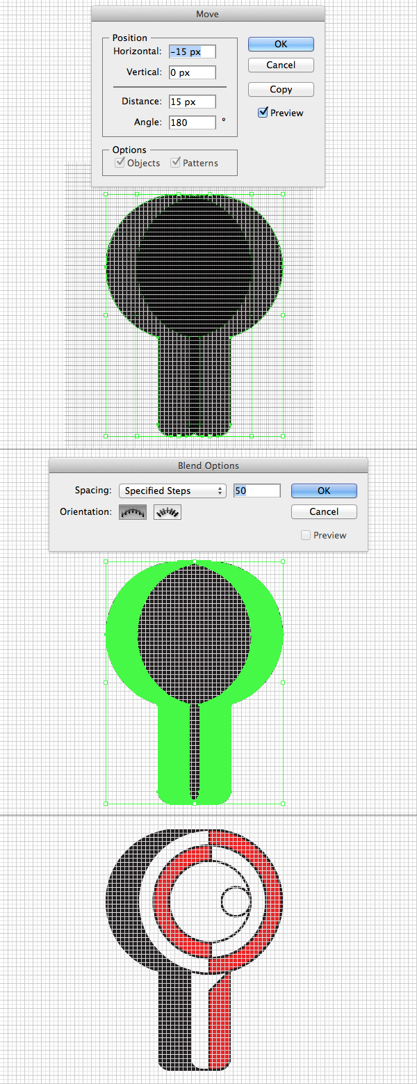
Step 5
We’ll now need to make the cast shadow. Begin by duplicating the bottom most handle and largest circle shapes then Unite them into one object. Duplicate this new shape and nudge it to the left 15px. Visit Object > Blend > Blend Options… and enter enough steps so that there is a smooth transition (I’ve stuck with 50), then Make the blend. Now Expand the object and Unite them to form a single shape. Zoom in to the shape enable the Direct Selection Tool (A) and select the extra points that are not needed and remove them, making sure to close the paths (Command + J) once you’re done. Finally align this object to the back of all your other shapes if you haven’t already done so.
Step 6
Since our icons are only ‘Sorta Flat’, let’s make some highlights. Select the main element shapes (the ones in red) and duplicate them twice. Using the arrows on the keyboard, nudge the top most duplicate over 1px. The direction you nudge the top most element depends on the direction the color is. So, for the bottom handle shape, nudge it to the left, but for the inner round shape, nudge it to the right towards the red area. Select the two duplications and use Minus Front to leave a sliver of highlight. You can see this in green in the screenshot below.
Step 7
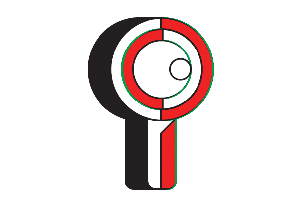
With our main shapes completed let’s style them. Select all the elements that make up the magnifying glass and rotate them 45º counter clockwise.
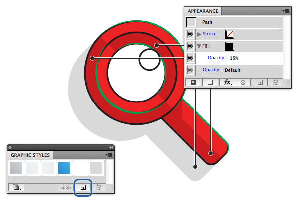
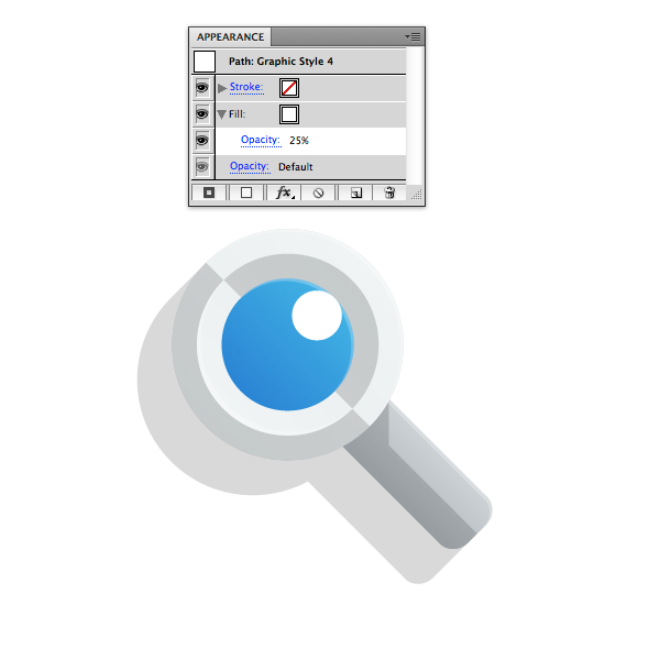
Now select all the elements that will make up the shadows. These are the white parts on the handle and the outer rings, as well as the long cast shadow. Fill these with flat black and drop the Opacity to 15% and make sure to remove any borders you may have. Once that is done, go to Window > Graphic Styles and when that window appears click the New element button on the bottom right next to the trash icon to create a graphic style out of this effect.
Step 8
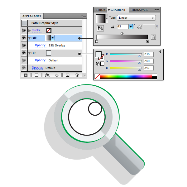
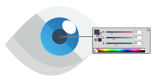
Select the handle area and navigate to your Appearance (Window > Appearance) panel and enter the information seen below. The base color will be a flat grey color, then we’ll add another layer on top of that filled with a black to white gradient set to 45º with an Opacity of 25% and Blending Mode set to Overlay. Once completed save this as a Graphic Style as well.
Step 9
Select the bottom most circle and we’ll be applying pretty much the same style, only we’ll be using a lighter shade of grey. Once again, save this as a Graphic Style.
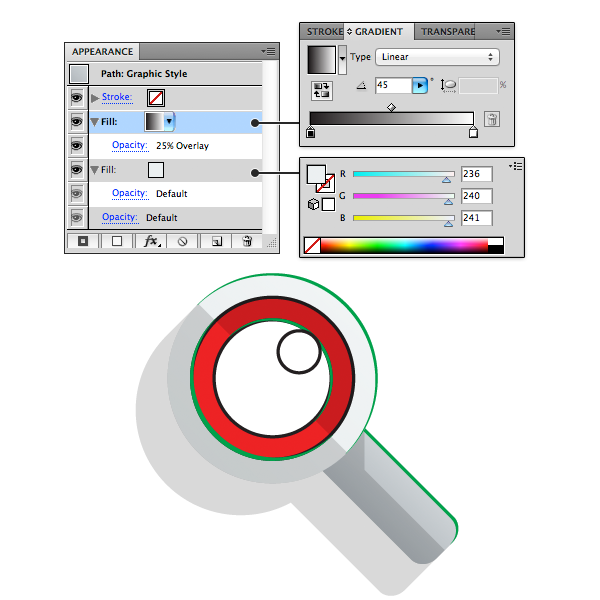
Step 10
Select the inner circle and apply the same lighter style we just made only, reverse the gradient so that it is from light to dark.
Step 11
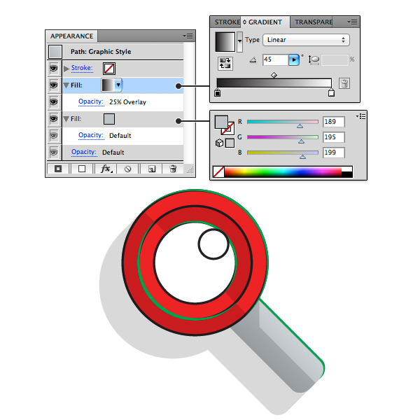
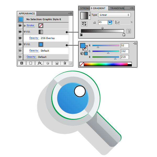
Select the inner most circle that will be our lens. The same style will be used for this shape as well, only instead of grey, we’ll use an accent color of blue. Make sure to also create a Graphic Style of this as well.
Step 12
Finally, we’ll add our highlights. Select all the green elements and fill them with flat white then drop the Opacity down to 25%. Making sure to save this as a Graphic Style as well. The last circle left on the shape is a hard highlight so we’ll leave that as white at 100%, just make sure and remove the border.
3. Create a Gear Icon
Step 1
Let’s create the notches for our gear shape. Select the Rounded Rectangle Tool and create a rectangle that is 20 x 110px and snap it to the art board. Now duplicate this shape three more times and rotate them at 45º angles to make a flower shape.
Step 2
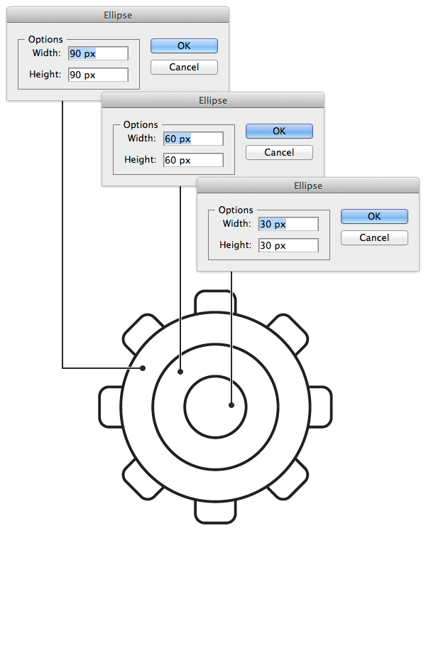
Next, select the Ellipse Tool (L) and create several concentric circles. The first one being 90 x 90px, then 60 x 60px, and finally 30 x 30px. Now arrange them as you see below.
Step 3
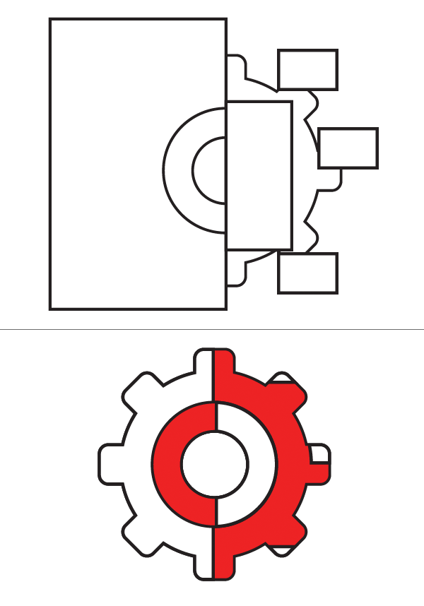
Select the flower shape and the bottom most circle and Unite them. Then select the smallest circle and duplicate it. Now select one of the small duplicated circles and the larger shapes and Minus Front to leave a whole in the middle.

Step 4
Now let’s make some shadows again. Start by creating rectangles that cover half the shapes. Since we have the extra gear ends we’ll also add some shadows to those. Line up the corners for the gear shadows at the point where the circle meets the gear end.
Step 5
Now create the cast shadow. Duplicate the bottom gear shape and nudge it over 15px like our previous icon. Blend the two shapes then Expand and Unite them.

Step 6
Now create the highlights. Remember to nudge towards the red color

Step 7
Finally, rotate the shapes 45º and apply our Graphic Style from earlier. This icon is fairly easy so we’ll just be using the darker grey style, making sure to reverse the gradient for the inner circle.

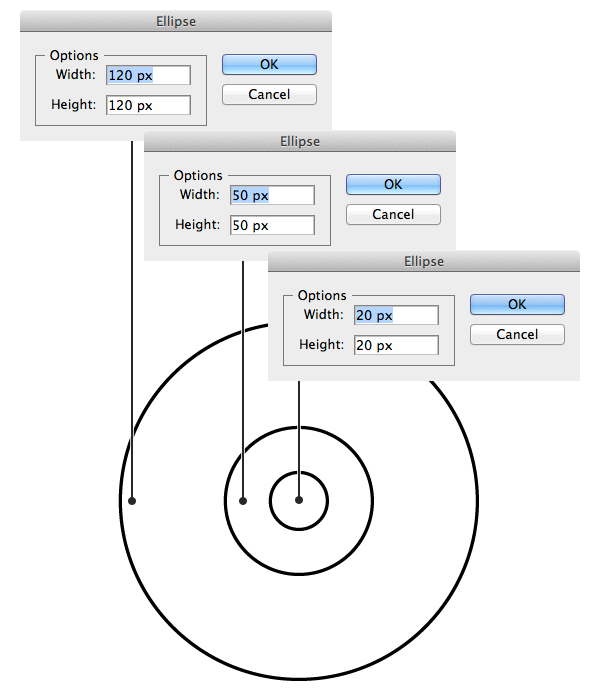
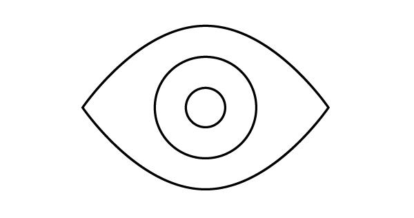
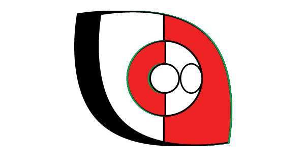
4. Create an Eye Icon
Step 1
Our eye icon uses a lot of circles. So, select the Ellipse Tool (L) and create several concentric circles. The first one being 120 x 120px, then 50 x 50px, and finally 20 x 20px. Now arrange them as you see below.
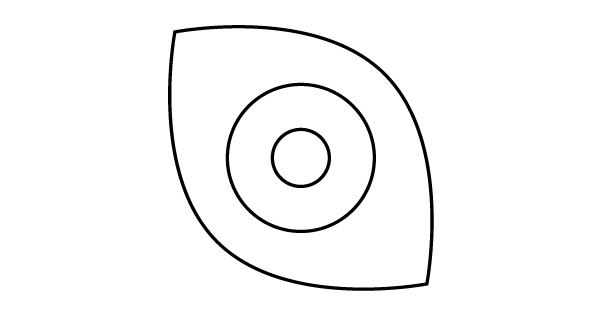
Step 2
Select the largest circle and switch to the Convert Anchor Point Tool (Shift + C). Select the two points on both the left and right, and click to make them sharp points. Now select the Direct Select Tool (A) nudge the top curved anchor down 20px. Repeat this for the bottom as well, only, nudge it up instead.
Step 3
Now select all of these shapes together and rotate it 45º clockwise. After we get our shadows and highlights in place we’ll rotate it back so they’re in proper perspective.
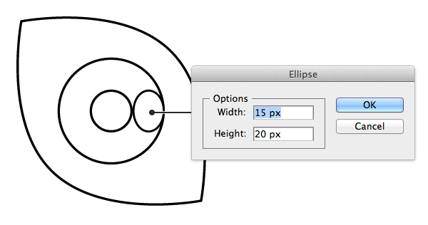
Step 4
Select the Ellipse Tool (L) and create an oval that is 15 x 20 px and align it as seen below.
Step 5
Create the shadows and highlights as we’ve done before. Splitting the shapes in half with rectangles and using the Pathfinder panel.
Step 6
Select all our shapes once again and rotate them back 45º, then apply our graphic styles. Using our lightest grey color for the main eye part, the blue with the gradient reversed for the iris and a dark grey that we’ll introduce now for the pupil.
5. Create a Chat Icon
Step 1
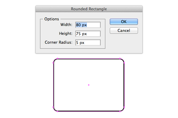
We’re halfway done with our icon set! Let’s create one that represents chatting, or comments. With the Rounded Rectangle Tool create a rectangle that is 80 x 75px
Step 2
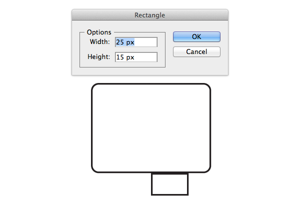
Now with the Rectangle Tool (M) create a rectangle that is 25 x 15px then align it to the bottom and 15px from the right.
Step 3
With the Ellipse Tool (L) create three circles that are 15 x 15px and align them to the centre of the rounded rectangle as seen below.
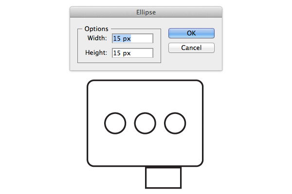
Step 4
Enable the Direct Selection Tool (A) and select the bottom left point that makes up the bottom rectangle then remove it to form a right angle triangle, making sure to close the path when you’re done.
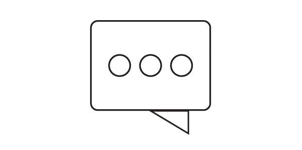
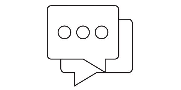
Step 5
Select the rounded rectangle and the triangle and Unite them to make one full shape. Once united, duplicate this speech bubble shape and flip it horizontally and nudge it down and to the right 15px below the other shapes.
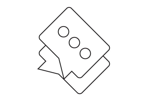
Step 6
Like we did with the eye icon, select all the shapes then rotate it 45º. We’ll work on the shadows and highlights in this angle so that when we rotate it back they’re cast correctly.
Step 7
As in previous icons let’s create sharp edges to indicate shadows and highlights. Be aware of your shadows. You want to create the illusion that the circles are casting a really long shadow across the bubble and that the top bubble is casting a shadow over the bottom one. For the cast shadows from the circles I’ll simply use a rectangle that is the same height as the circle and wide enough to fit over the bubble then remove the excess.
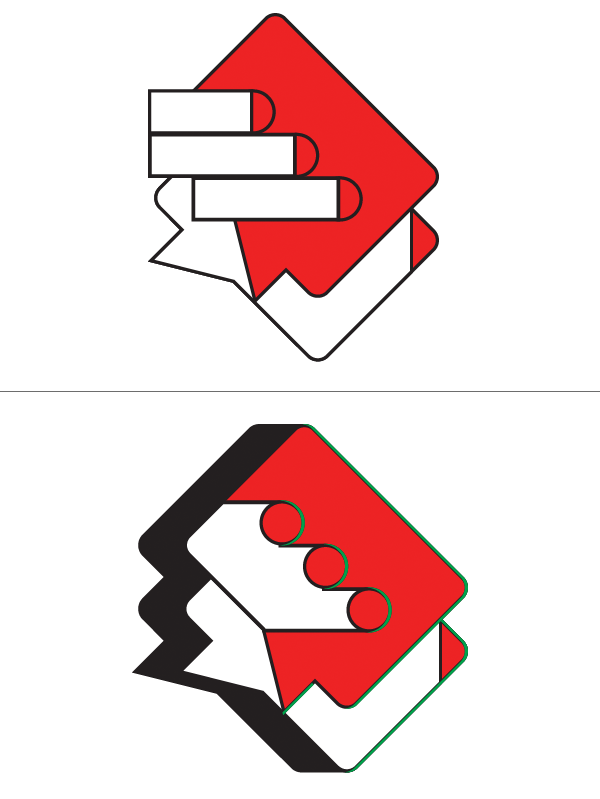
Step 8
Now rotate the shapes back and apply your graphic styles. The bottom bubble will be our darker grey, while the top one will be our lighter grey and the dots shall be our accent blue color

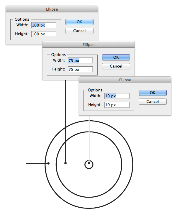
6. Create a Clock Icon
Step 1
Let’s move on to our clock. With the Ellipse Tool (L) create several concentric circles. The first one being 100 x 100px, then 75 x 75px, and finally 10 x 10px. Now arrange them as you see below.
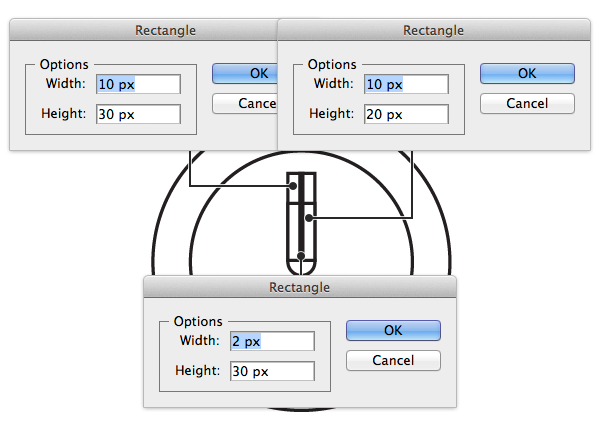
Step 2
Now we’ll create the clock hands. Select the Rectangle Tool (M) create a rectangle that is 10 x 30px, another that is 10 x 20px, and another that is 2 x 30 px. Now align them so that the bottom of the rectangles meets the middle of the circles.
Step 3
Switch to the Rotate Tool (R) and select the long skinny rectangle. Position the cursor over the centre point of the shape then click and drag that dot to the bottom of the rectangle ensuring that is stays in the very centre and snaps to the bottom. Now rotate the shape 135º clockwise. Repeat this step for the shorted rectangle piece, only rotate it counter clockwise.
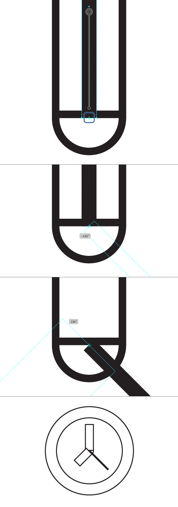
Step 4
Select the smallest circle in the centre and the long skinny hand and Unite them together and place them above the other hands. Now select all the shapes and rotate 45º
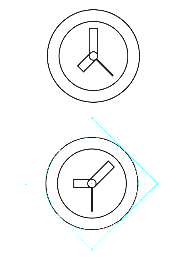
Step 5
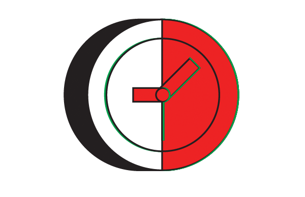
Cut the shapes in half as we’ve done before and create our cast shadow as well as the highlights. For the highlight however, I liked the idea of having a highlight inside the dark area that would fall on the bottom section. this gives it a pop of dimensionality that wouldn’t be there should be use the way we have been doing.
Step 6
Rotate the shapes back and apply your Graphic Styles. The face will be the light grey, the outer edge, and minute and hour hands will be our darker grey, and the second hand will be our accent color

7. Create a Calendar Icon
Step 1
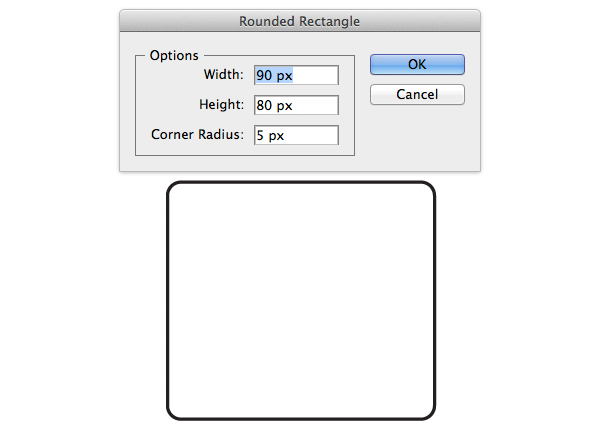
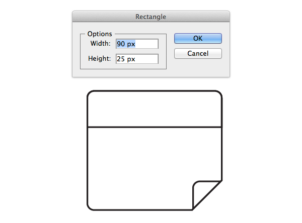
For our last icon let’s create a calendar. Select the Rounded Rectangle Tool and create a rectangle that is 90 x 80px.
Step 2
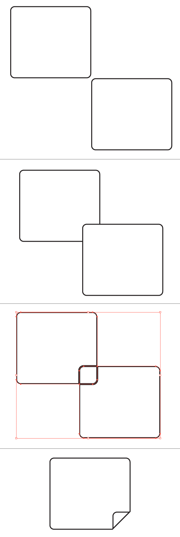
Duplicate this rounded rectangle and align it to the bottom right corner. There are no points to it won’t line up exactly but the snapping feature should a let you know when you’re close. Once there, nudge the duplicate up and over to the left 20px. Now in the Pathfinder panel choose Divide from the list of icons on the bottom. Then switch to the Direct Selection Tool (A) and select the outside bottom shape and remove it. Then remove the curved bottom right corner so you’re left with a straight 45º edge.
Step 3
Select the Rectangle Tool (M) create a rectangle that is 90 x 25px and align it to the top of the shape. After duplicating the bottom large rounded rectangle select both the top straight rectangle and the rounded one and use Intersect from the Pathfinder panel.
Step 4
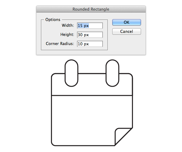
Next, create two Rounded Rectangles that are strong 15 x 30px and the corners are rounded enough to make a pill shape. Then align them to the top of the element as seen below.
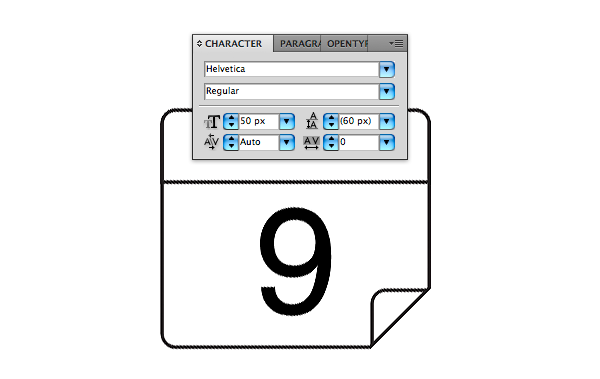
Step 5
Switch to the Type Tool (T) and type out a number. Anyone you wish, I’ll be using “9″ as it’s the first one that came to mind. For the font let’s use “Helvetica” with a size of 50px. No go to Object > Expand and convert the type to a path.
Step 6
Select all the shapes and rotate it 45º. Now add your shadows and highlights as we’ve done before. Keep in mind that the fold we created in the bottom corner will cast a shadow. For this we’ll just make a rectangle that is the same height as the fold and Intersect it from a duplication of the bottom rectangle.
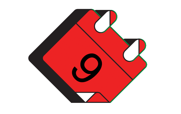
Step 7
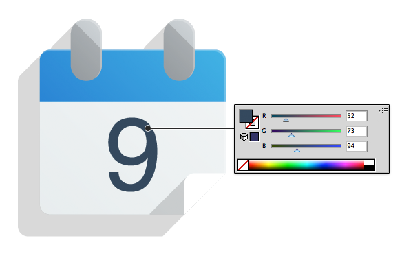
Finally rotate the shapes back and apply your graphic styles. The bottom rounded rectangle will be our light grey, the fold will be a flat white, the pill shapes will be our dark grey, the top rectangle will be our accent color, and the number will be the same dark grey from our pupil in the eye icon we created.
Great Job, You’re Now Finished!
And with that our icon set is complete. I’ve gone ahead and added a flat background color using a dark grey to help the icons stand out. Feel free to space these as you please on your art board.
I hope I was able to show you that even though flat icons are inherently “flat”, they don’t have to be without style. What other icons can you come up with?
